

Từ 24.900 ₫
This is a resource set aimed directly at the production process of manga, vertical comics, black and white webtoons, and comic illustrations in Procreate or Photoshop. Instead of focusing on a single brush type, the collection gathers many tool groups often sought individually: dot screentone, halftone grids, line patterns, tone gradients, hatching brushes, light flares, speed lines, smoke/explosions, speech bubbles, and various sketching support strokes. Based on the provided images, the total number introduced is around 380 brushes, sufficient to build a workflow from composition, black-and-white blocking, shading, adding dialogue, to finishing action effects.
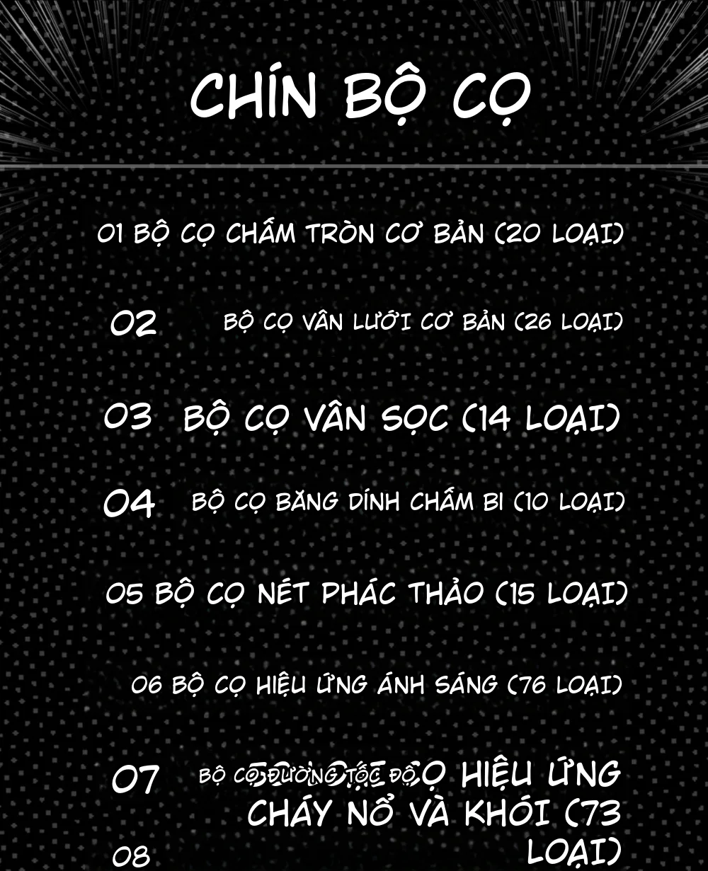
The most notable point is that the brush set does not just provide decorative textures but closely adheres to the visual language of Japanese manga. The brush groups are organized by function, helping artists choose the right tool for each stage instead of randomly trying hundreds of presets. For regular comic creators, this organization can significantly reduce time spent on backgrounds, shadows, motion, and expressions.
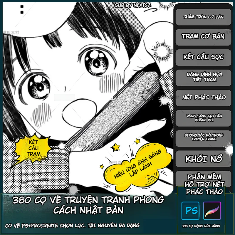
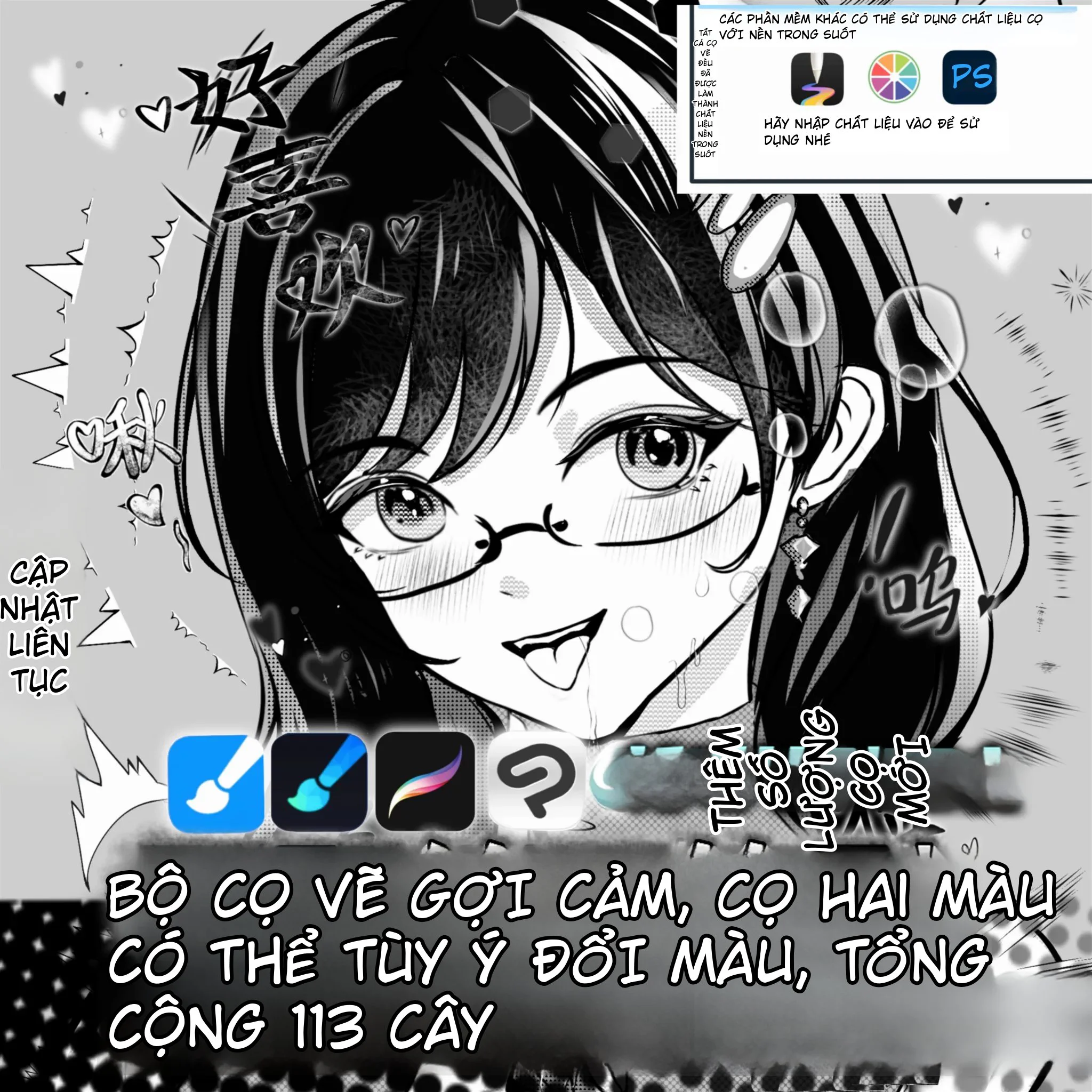
From the classification table in the image, the set includes many major groups: 20 basic dot brushes, 27 screentone grid brushes, 14 line pattern brushes, 10 halftone tape brushes, 15 sketch or hatching brushes, 76 light flare brushes, 50 speed line brushes, 74 smoke/explosion brushes, plus various speech bubbles and auxiliary groups. The large total number does not mean every brush must be used in one piece. The practical value lies in each group having many variations in density, shape, thickness, and motion direction, allowing artists to maintain a consistent style while avoiding repetitive effects.
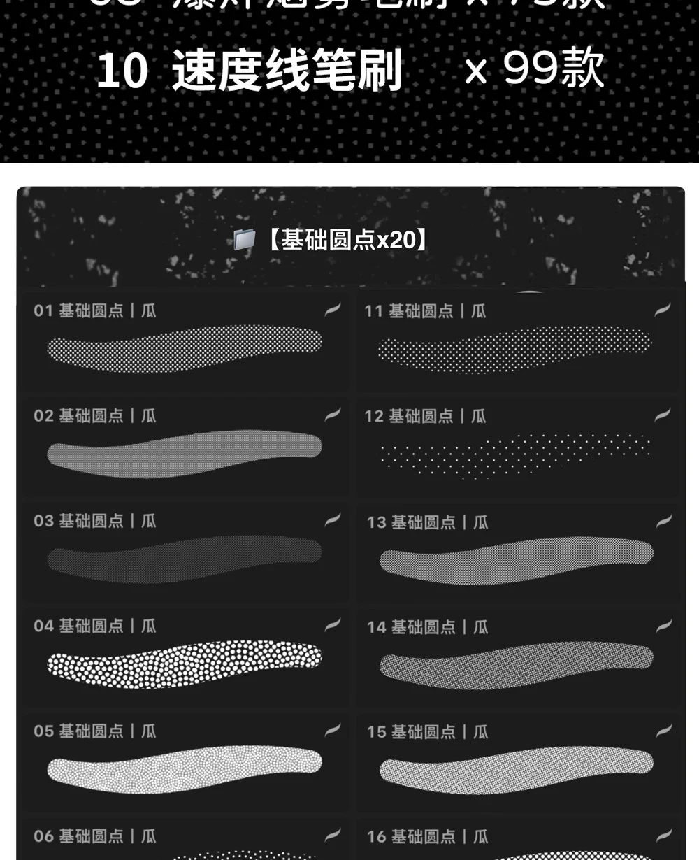
Dots are the most common screentone type in black and white manga. In the image, the presets differ in grain size, point spacing, brightness, and the gradient along the brush tip. Some samples create uniform tone layers, while others have areas where the grain gradually thins at the edges, suitable for soft shading on cheeks, necks, clothing, or backgrounds behind characters.
When used in Procreate, it is advisable to place screentones on a separate layer and keep the brush size relatively stable within the same panel. If you zoom in and out too much, the grain density between areas will become inconsistent, making the page look uneven. In Photoshop, artists can combine layer masks to erase tone by area without damaging the dot structure.
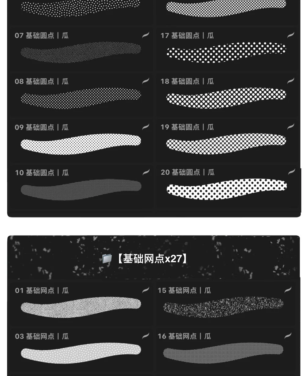
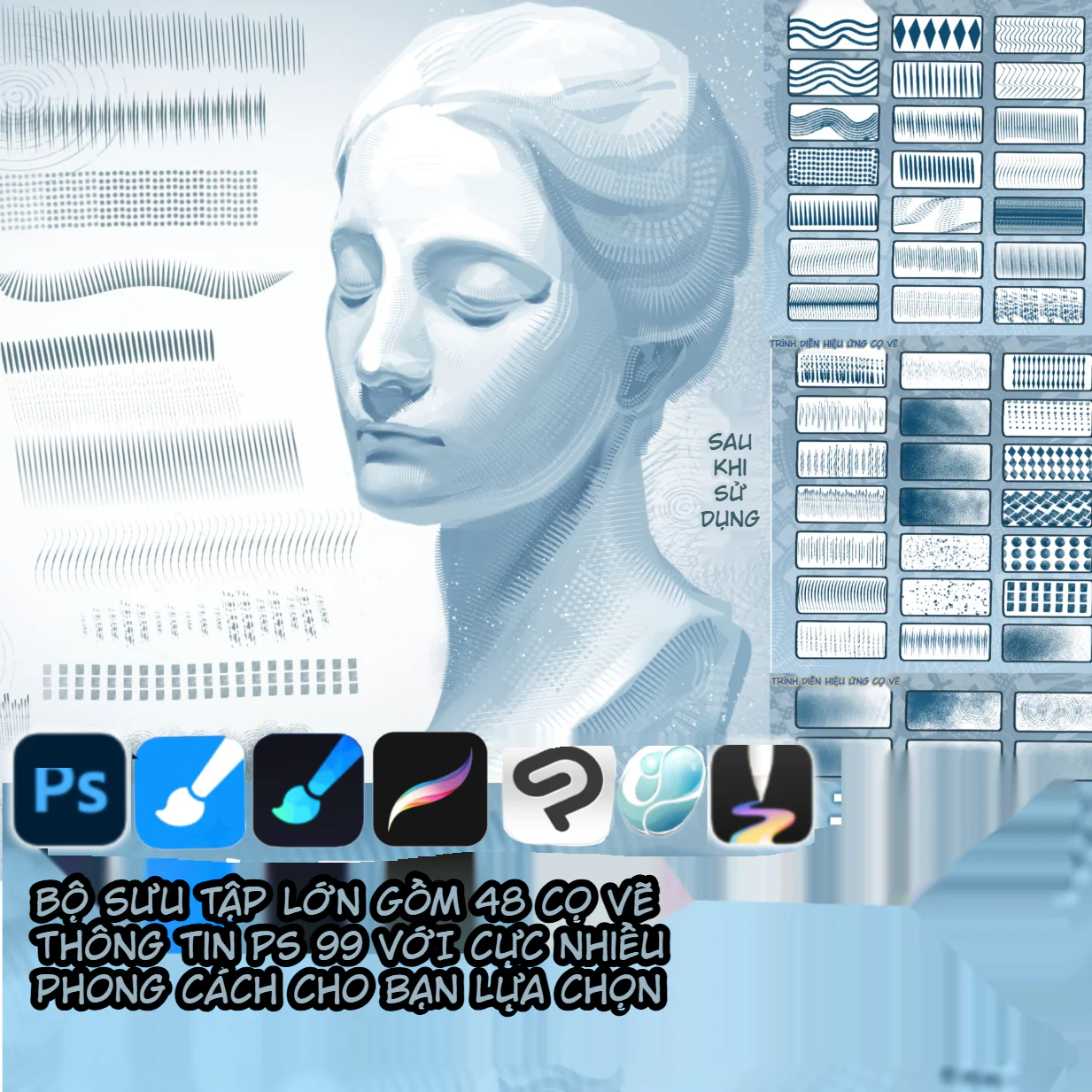
Compared to the plain dot group, the grid group has a more complex structure. Some samples resemble newspaper print grain, some are smooth like noise, some give a woven fabric feel, and some have a transition from dense to sparse. This group is suitable for distinguishing materials: wall textures, rough fabric, hair shadows, skies, dark areas behind characters, or areas needing reduced flatness.
When publishing at small sizes, check for moiré effects. Screentones that are too fine can create interference patterns when the image is compressed or scaled down. A safe workflow is to preview at the actual publication size, rather than only evaluating while zoomed in on the canvas.
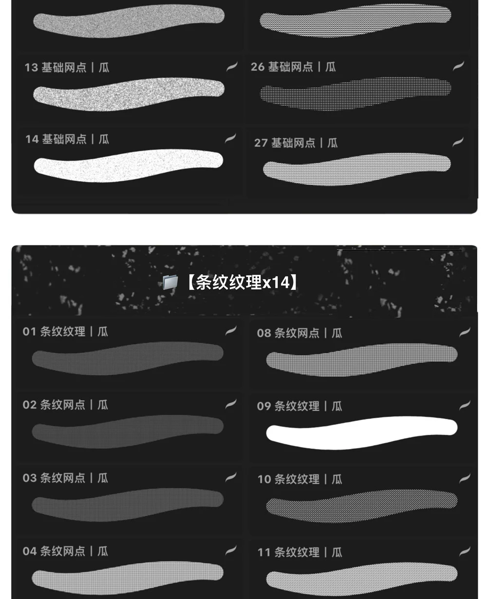
Line pattern samples can be used to create shading in a print-comic style, add subtle speed emphasis, or differentiate surface materials. Horizontal lines often feel static, cool, and stable; diagonal lines help add movement; thick, high-contrast lines suit tense scenes or graphic background areas.
Avoid covering an entire character with line patterns. A more effective use is to limit them to a purposeful area, such as the shadow part of clothing, a background zone behind a face, or a flashback panel. When the line direction matches the form direction, the shape becomes clearer; when opposite, the effect can become harsh and noisy.
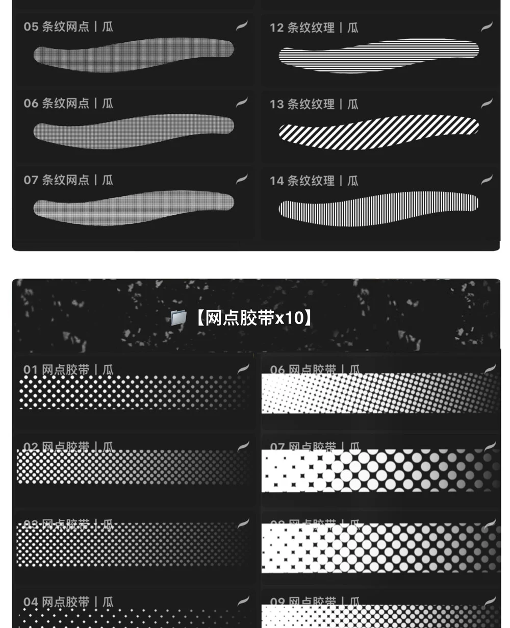
This group produces pre-graduated dot strips, similar to tone tape cut to length. Artists can drag a stroke to create an area that transitions from dark to light, saving time compared to filling tone and erasing gradually. They are useful for long drop shadows, text backgrounds, dividers, subtle speed effects, or decorative bands along panel edges.
Since the brush shape is a long strip, pay attention to the stroke direction. The start and end of the stroke may have different densities, so it is advisable to test on a draft layer. In many cases, using Transform to rotate the tone strip after drawing yields more accurate results than trying to draw manually at a difficult angle.
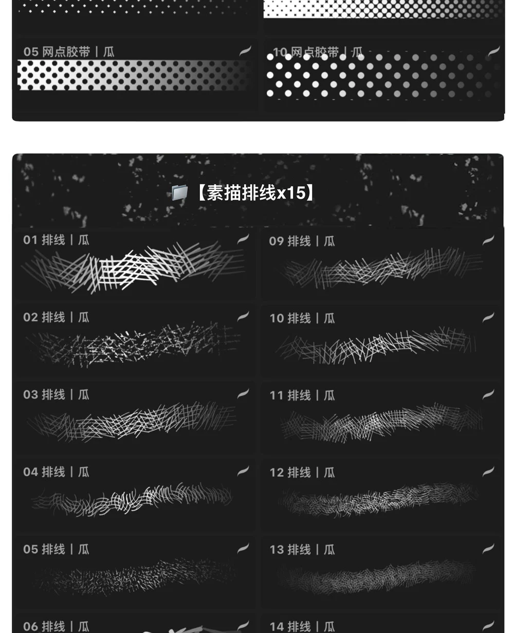
Hatching is an important tool when artists want to retain a hand-drawn feel rather than an overly clean screentone surface. The presets in the image create various stacked stroke styles: short strokes, diagonal strokes, chaotic grids, dense hatching areas, and soft scratches. They are suitable for under-chin shadows, dark hair, weathered surfaces, tense backgrounds, horror comics, or sketch-style comics.
To avoid a stamp-like feel, vary the brush direction and erase some areas. You can combine a large hatching layer as a base, then add a few real hand-drawn strokes on top. This method maintains speed while preventing the surface from looking too mechanical.
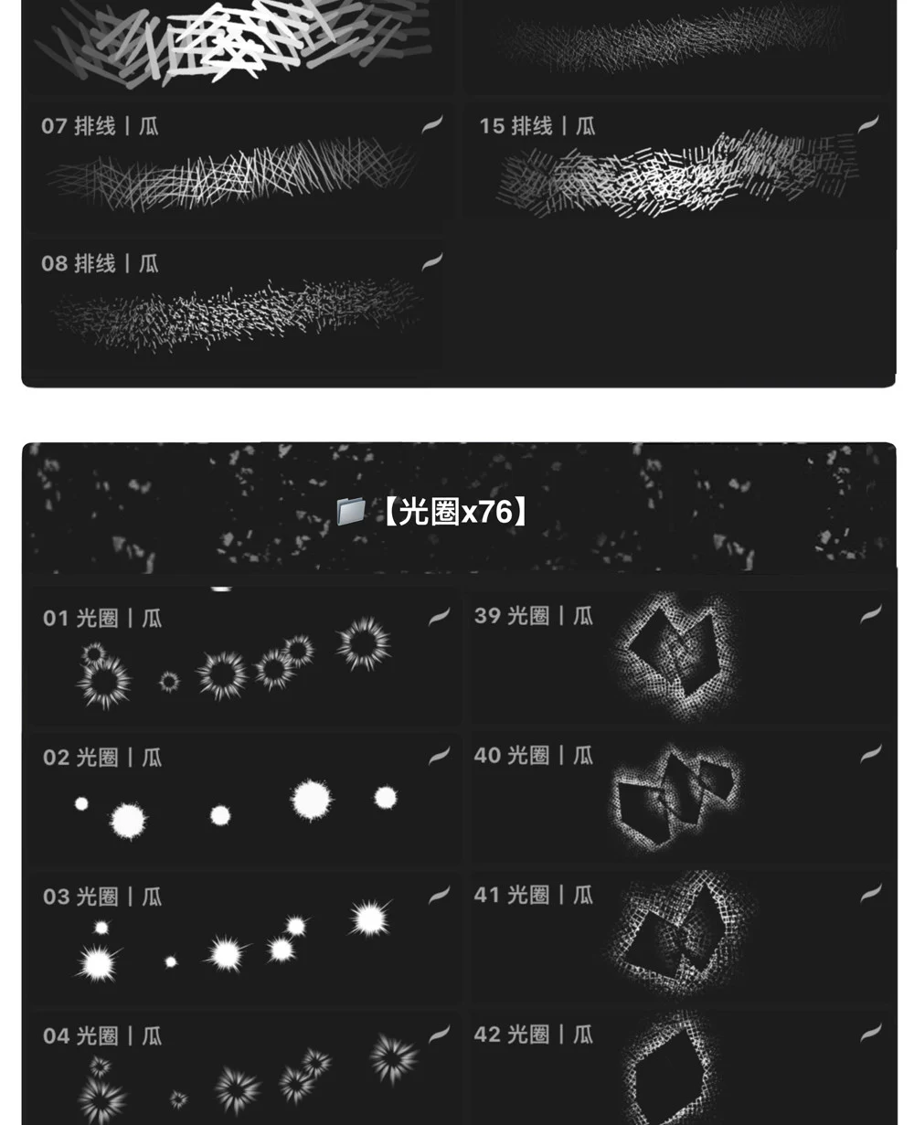
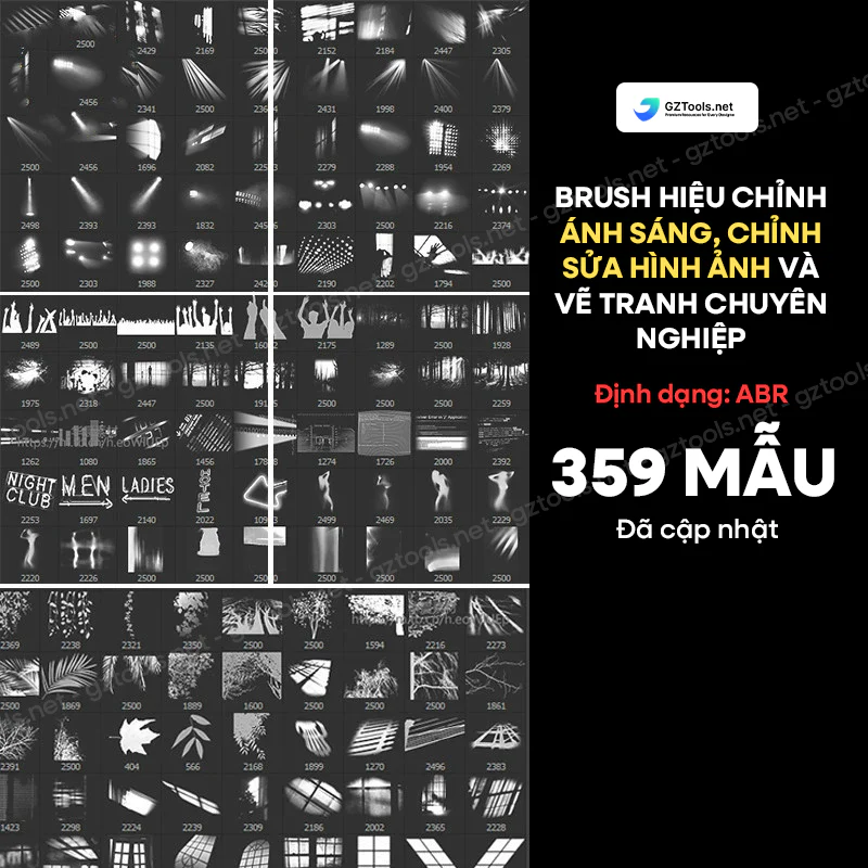
The light flare group is large in number, indicating that the brush set caters to action manga, fantasy, and emotional effects. Besides burst-like sparkles, there are geometric halo textures, soft glow rings, and reflective blocks. On black backgrounds, these effects create strong focal points; on white backgrounds, blend modes or color inversion can be used depending on the workflow.
Light effects should serve as accents, not replace overall lighting. For a single panel, usually one or two main halo types are sufficient. Using too many different samples in the same scene will make the image lack coherence.
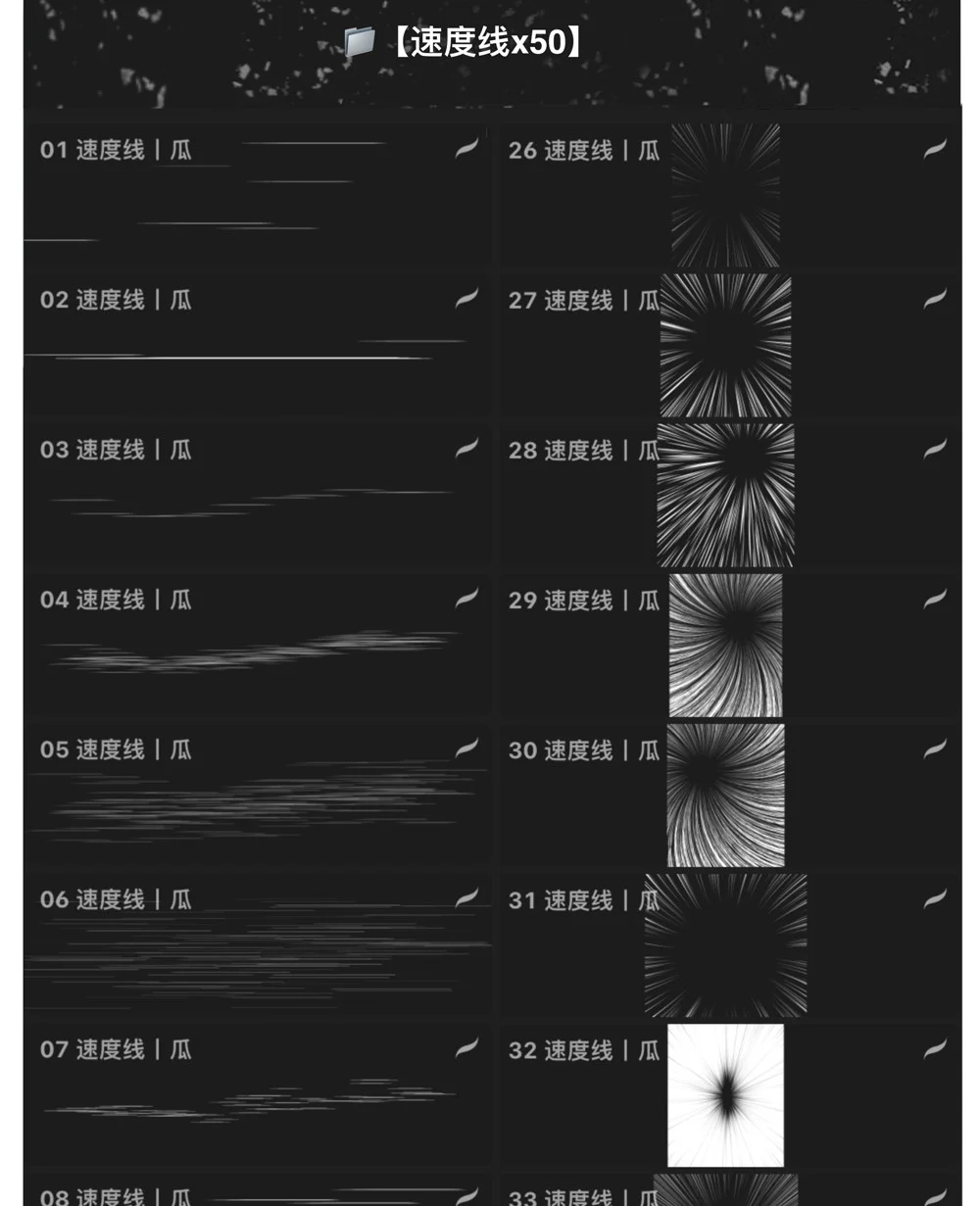
Speed lines are one of the most recognizable elements of action manga. This set includes horizontal streaks for linear motion, converging ray clusters to draw the eye to the character, radial bursts for punches or surprise moments, and long tear-like trails for extremely fast movement.
Before placing the brush, determine the vanishing point and motion direction. If converging rays do not point correctly at the face, fist, or main object, the effect may be strong but the storytelling becomes difficult to read. It is advisable to place this brush group behind the lineart, use a mask to protect the character silhouette, and reduce opacity near dialogue text.

The smoke/explosion group includes solid silhouettes, black-and-white outlined forms, small dust puffs, smoke columns, and circular blast bursts. These are useful for impact scenes, magic, combat, moving vehicles, or simply foot dust when a character runs. The many variations allow choosing the right scale: small dust for subtle movement, large smoke clouds for climaxes.
For depth, divide into three layers: a foreground layer with sharp edges and strong contrast, a mid-layer with moderate detail, and a blurred background layer. A single stamp often looks flat; layering two or three samples at different sizes creates a more natural result.
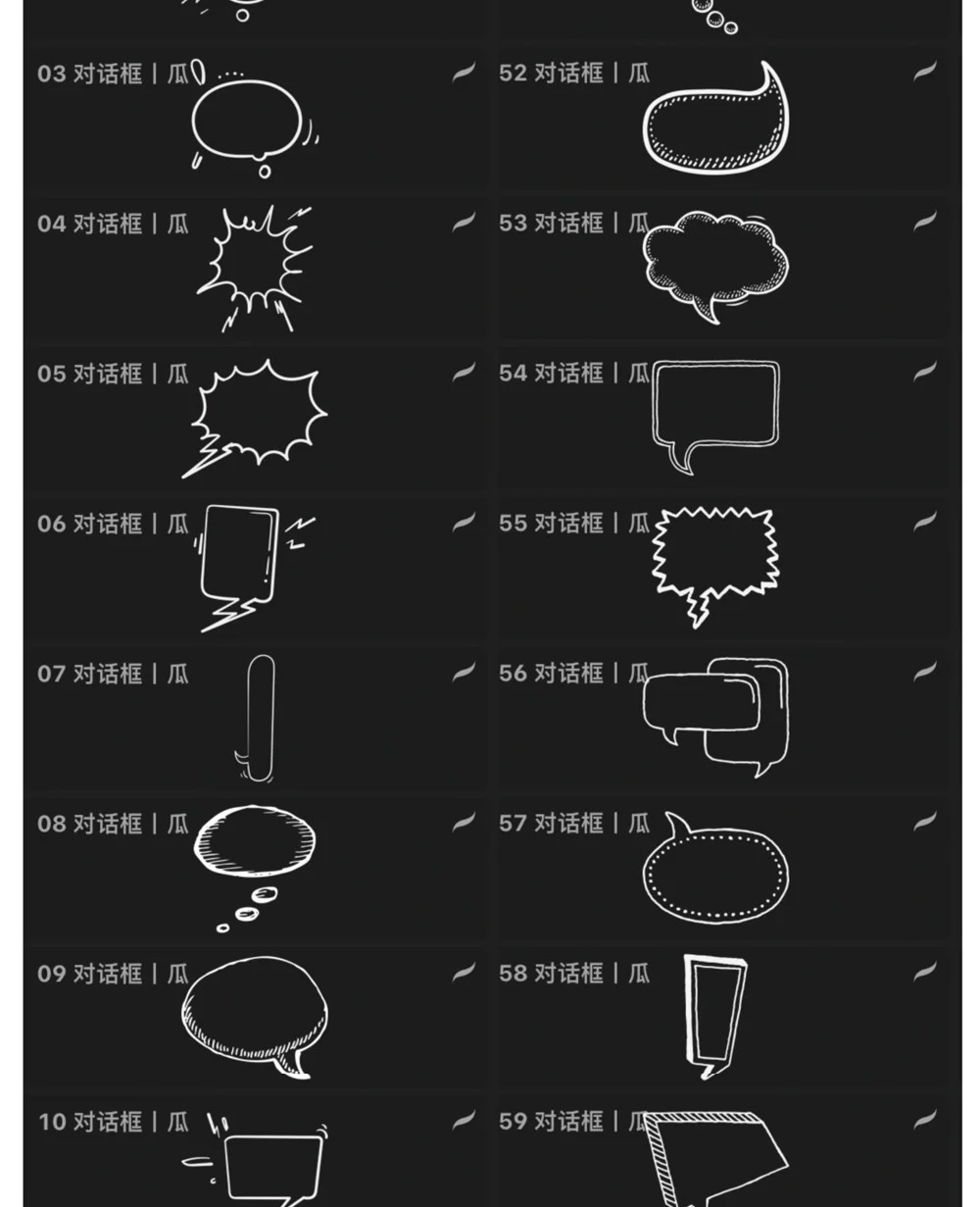
The illustration shows many dialogue frame types: soft ovals for normal speech, clouds for thoughts, jagged edges for shouts, rectangles for narration, and layered frames for conversation or announcements. This group significantly speeds up page layout, especially in Procreate, which lacks a dedicated balloon system like specialized comic software.
Even when using stamp brushes, artists still need to check text proportions and breathing space. Do not squeeze text too close to the edges. The tail of the speech bubble must point toward the speaker but should not cut across eyes, mouths, or important details. For vertical comics, keep balloons compact and arrange them following the top-to-bottom reading direction.
This resource set is introduced for Procreate and Photoshop. In Procreate, the advantage is quick operation, convenient for drawing comics on iPad, and easy stamping of effects with Apple Pencil. In Photoshop, artists gain additional benefits from masks, smart objects, layer management, and processing large page sizes. For different brush formats, users need to check the downloaded files correspond to each software before importing.
The suggested workflow consists of six steps: create thumbnails and panel layout; sketch the characters; clean lineart or keep sketch lines; block in black areas; add screentones, hatching, and textures; finally add speech bubbles, speed lines, lighting, and smoke/explosions. This order ensures effects do not obscure the main content.
This brush set is best suited for creators of black and white manga, monochrome webtoons, vertical comics, fan comics, storyboards, or illustrations with a Japanese comic language. Beginners can use the brush groups to familiarize themselves with screentones and effects; experienced artists will better leverage the ability to combine multiple brush groups into a consistent visual system.
This is not a brush set that replaces skills in composition, anatomy, or tone control. Its value lies in reducing repetitive actions and providing a sufficiently broad library of effects so that artists can focus more on storytelling, expression, and page rhythm.
With a structure of approximately 380 brushes and many specialized groups, this is a more comprehensive manga tool set than individual screentone packs. Its strength lies in integrating tones, textures, hatching, dialogue, and action effects into one system. If reorganized into favorite sets by workflow stage, users of Procreate and Photoshop can turn this resource pack into a faster, clearer, and more consistent comic production workflow.
Browse more resources in the same collections.
Từ 24.900 ₫
PayPal checkout supports PayPal balance and eligible international cards.
 PayPal balance
Discord cộng đồng Digital Art
Real ratings from NextGZ members
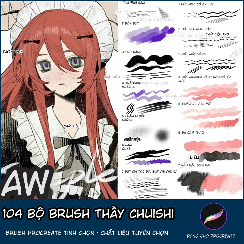
104 Bộ Brush Thầy Chuishi - Procreate
Chia Sẻ Bút Vẽ Và Quy Trình Procreate
Hướng dẫn đổ bóng nhân vật Anime từ A–Z: Form Shadow, Cast Shadow, Ambient Occlusion và kiểm soát cạnh
Share Free Bộ 11 Brush 画世界Pro Cho Digital Art | NextGZ
Share brush Procreate cho vẽ anime: hướng dẫn dùng bộ cọ phác thảo, đi nét, tô màu và tạo chất liệu
Bình luận
0 bình luận
Đăng nhập để tham gia thảo luận cùng cộng đồng!
Đăng nhập ngayĐang tải bình luận...