 Procreate
 Brushes & Tài nguyên




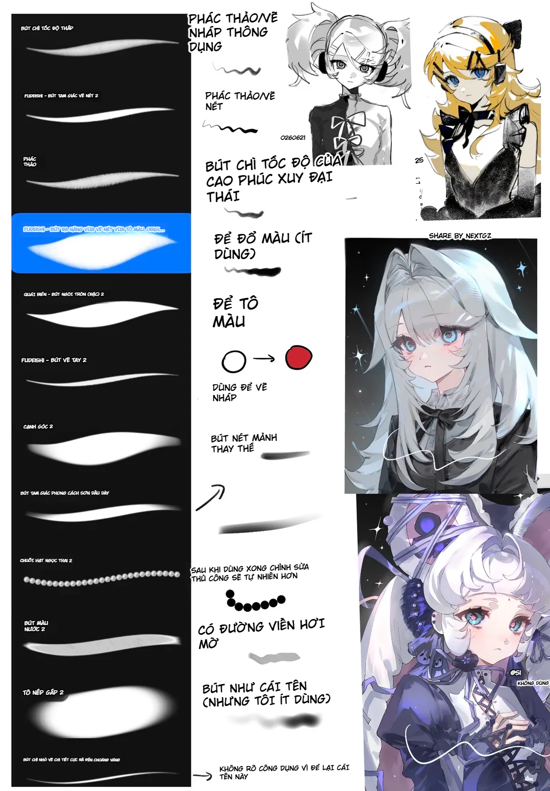
16. "Shade Folds 2": large brush for soft shadows and fabric mass
"Shade Folds 2" creates a large, soft, nearly oval mark. This type is suitable for establishing the main shadows on clothing before drawing fold details. You can place a large shadow under the chest, under the sleeves, on the side, or in layered skirt areas, then use a smaller brush to cut the edges.
A common mistake when shading clothing is drawing too many small folds right from the start. Remember that fabric folds still need to fit within a larger light-and-shadow mass. A large soft brush helps you maintain that structure.
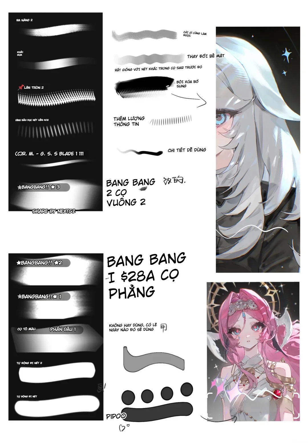
17. "Multi-purpose 2" and textured surface brushes
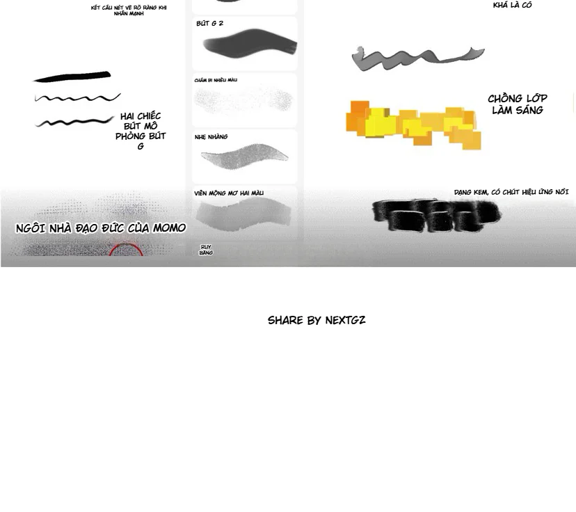
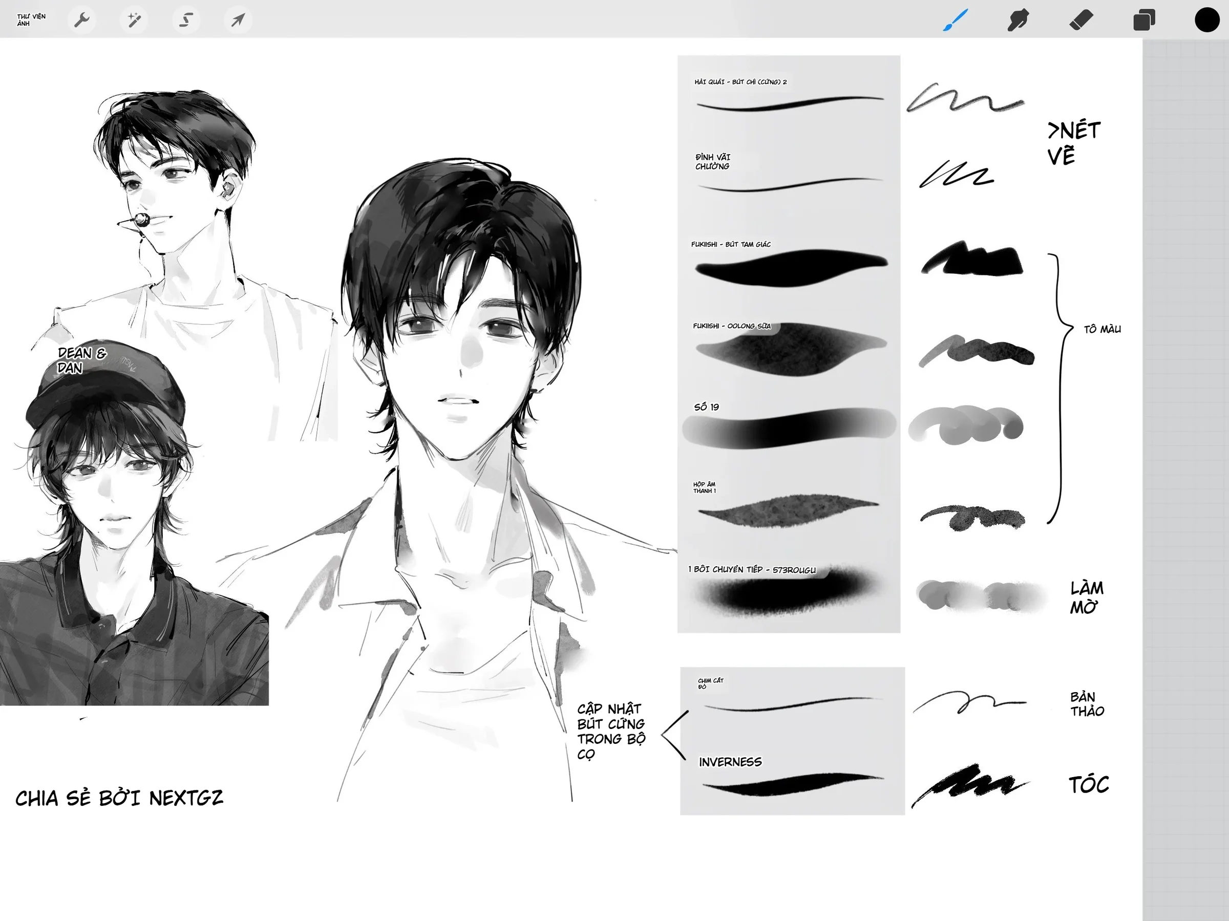
In the second image, "Multi-purpose 2" gives a more visible grainy stroke, similar to a streak of chalk or a dry brush. This type is very useful for adding texture to areas that are too clean, such as cheeks, hair, backgrounds, fabric, or large shadows.
When you want a modern illustration feel, you don't necessarily need to add noise to the entire painting. Just a few surface areas with slight grain are enough to create contrast with clean lineart. For example: keep the eyes, lashes, and front hair sharp; add grain to the back hair, background, and clothing shadows.
18. "Solid Oval 402": repeating elongated marks for directional texture
This pattern consists of long, narrow marks that repeat evenly along a line. It can be used for directional patterns, small highlights, fabric texture, fur, or hair areas with many small reflective highlights.
However, because the pattern is very recognizable, after stamping it you should erase part of it or use a mask to limit its visible area. A good texture should support the form, not draw the viewer's attention to the brush itself.
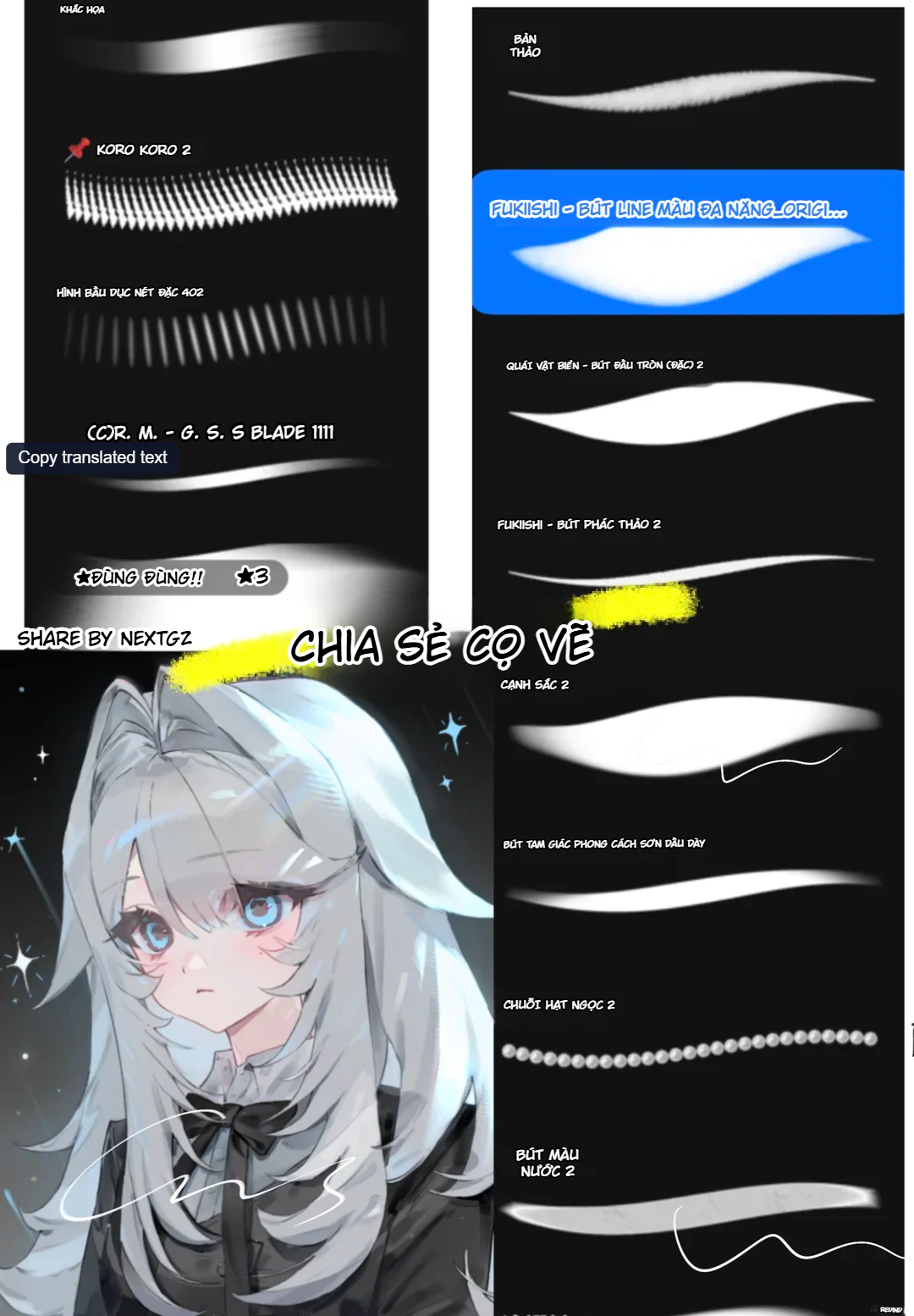
19. "Blade" brushes: sharp strokes for highlights and material edges
In the image, there is a brush named roughly "G.S.S BLADE", with a thin, sharp stroke, a bright middle, and tapering ends. This brush type is ideal for sharp highlights on hair, metal edges, eyes, accessories, or long reflective streaks.
To avoid fake-looking highlights, only place them where the surface actually changes direction or where the light source is strong. A few strokes in the right places are always more effective than dozens of white strokes spread evenly.
20. How should the "Auto inking" and "Auto inking 2" brushes be used?
The two patterns at the end of the second image have very solid bodies, clean edges, and stable width. This group is suitable when you need clean shapes, such as flat backgrounds, silhouettes, graphic shapes, or certain lineart parts with fixed thickness.
If used for character lineart, be careful because overly uniform strokes can make the artwork look stiff. A better approach is to combine them: use stable brushes for geometric lines or clothing, and use pressure-sensitive brushes for hair, faces, and organic lines.
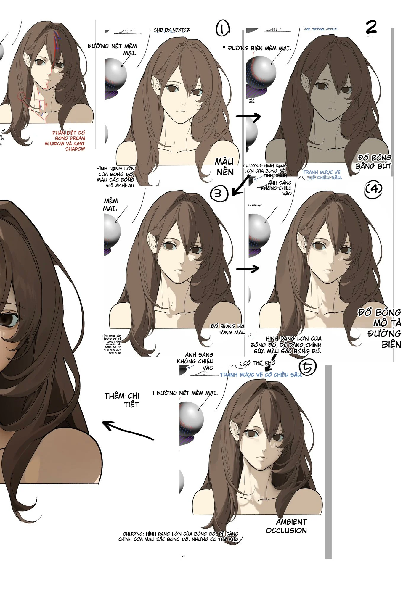
21. How to combine brushes to draw anime hair like the example image
First, use a sketching brush to build the overall hair mass. Don't split into strands too early. Then use a broad shading brush to lay down the base color. Next, use a flat brush or BangBang to place large shadows at the back of the head, under the bangs, and beneath each layer of hair.
Once the light and shadow are stable, use FUDEBISHI or a hand-drawn brush to cut the silhouette into main strands. Finally, use a Blade brush or a thin brush to add a few highlights and loose strands. If you want a softer surface, you can very lightly overlay a grain or watercolor brush in the shadow areas.
This process gives hair three levels: large masses, medium strands, and small details. If you only use thin brushes from start to finish, the hair tends to look like "noodles" because it lacks mass.
22. How to use the brush set for faces and eyes
For the face, you should use fewer brushes than for hair. Sketch with a pencil brush, lineart with a thin FUDEBISHI brush, base skin with a soft flat brush, and add blush with a watercolor brush. For eyelashes, use a line brush with pen pressure so the lash roots are thick and the tips are thin.
For anime eyes, the lineart needs to be sharper than the skin and the hair behind it. The pupils, upper eye line, and lashes should have high contrast. Eye highlights only need a few small marks; avoid too many shiny spots, which make the eyes lose focus.
23. How to use the brush set for clothing and folds
Clothing should start with the silhouette and large shadow masses. Use a shading brush or BangBang to place shadows under the neck, under the chest, in the armpits, elbows, and deep folded fabric areas. Then use "Shade Folds 2" or a rendering brush to create the transitions.
For straps, bows, or clothing trim, use a thin hand-drawn brush. For rough fabrics or fantasy costumes, add a very light grain brush to distinguish the material from the skin.
24. A complete process with only 6 brushes
If you find the brush set too large, you can reduce it to six core types. One: grain sketching brush. Two: line brush with pressure variation. Three: solid flat brush for coloring. Four: soft brush or BangBang for large shadows. Five: grain texture brush. Six: fine thin brush for highlights and details.
Just these six are enough to complete almost an entire character painting. The remaining brushes should be seen as specialized tools: bead strings for jewelry, circular roller for repeating texture, Blade for sharp light, oil pastel for special surfaces.
25. How to avoid "brush addiction" when drawing in Procreate
Beginners often think every problem needs a separate brush, so they keep switching brushes. As a result, the strokes and surfaces of the painting lack consistency. Choose a core set and use it for 80% of the painting. Only switch to a special brush when you truly need an effect the current brush cannot create.
An effective practice is to complete a painting using only three brushes: one sketch brush, one versatile line/fill brush, and one soft brush. Once you are familiar with pen pressure, size, and edge control, you can add texture and effects.
26. How to tell which brush suits your hand pressure
The same brush can feel very different between two people because hand pressure differs. If you have to press too hard to create a thick stroke, the brush will cause fatigue. If just a light touch creates too large an area, you will struggle to control details.
So when trying a new brush, draw a series of strokes from light to strong, a long curve, a circle, a clump of hair, and a filled area. If the brush lets you do all these actions without "fighting" your pen pressure, it is the right brush for you.
27. When should you adjust a brush instead of looking for a new one?
If you like the surface of a brush but feel the strokes are too shaky, too thick, or the tip does not taper as you want, you do not need to look for another brush right away. Try lightly adjusting factors related to stroke stabilization, size, opacity, and pressure response in Procreate's brush settings.
The principle is to change only one factor at a time. If you adjust too many parameters at once, it will be hard to know what made the brush better or worse. After adjusting, always test it on an actual painting area, not just on a straight line.
28. A 30-minute exercise to get familiar with the whole brush set
First 10 minutes: try all the brushes with short, long, and curved strokes, pressing hard and light. Note which brushes suit sketching, line work, filling areas, and texture. Next 10 minutes: draw a simple character bust using only three brushes. Last 10 minutes: use special brushes such as bead string, BangBang, watercolor, and carving to finish.
After the exercise, you should have a short list: "main brushes", "secondary brushes", and "effect brushes". You do not need to remember all the names; remembering the shape and feel of the stroke is more important.
29. Which brushes should be pinned at the top of the library?
If your Procreate has too many brushes, prioritize placing the ones you use often in an easy-to-reach position: one sketching brush, one versatile line brush, one fill brush, one soft brush, one texture brush, and one detail brush. Brushes like bead string, roller, or effects can be kept in a separate group.
This kind of organization greatly reduces the time spent searching for brushes and helps you focus on shape, lighting, and color instead of constantly opening the brush library.
30. Common mistakes when using anime brushes
- Line too uniform: every stroke has the same thickness, making the character look stiff.
- Texture covering the whole painting: the grain surface loses its effect because there is no clean area left for contrast.
- Using a soft brush for every shadow: the image becomes blurry and lacks structure.
- Using a small brush to fill large areas: it wastes time and the surface becomes uneven.
- Overusing repeating brushes: the pattern becomes the first thing viewers notice.
- Too many highlights: hair, eyes, and accessories compete with one another.
- Switching brushes constantly: the painting loses consistency and the process becomes slow.
31. Suggested brush setup for each goal
Clean anime drawing: light pencil brush for sketching, FUDEBISHI for line work, flat brush for color, soft BangBang for shadows, Blade for highlights.
Anime with material texture: grain sketching brush, versatile brush, "Versatile 2", watercolor brush, and carving brush.
Quick character concept drawing: sketching brush, large versatile brush, BangBang, and one detail brush. Prioritize mass and light/dark values over finished line work.
Fantasy costume drawing: line brush, flat brush, carving brush, pearl bead string, circular roller, and sharp highlight brush.
32. The most important thing when using this brush set
The strength of the brush set in the image is not that it has a lot of exotic brushes, but that it covers many different types of edges and surfaces: sharp edges, soft edges, strokes with pressure, textured strokes, flat areas, repeating patterns, and highlights. If you understand the function correctly, you can use very few brushes and still achieve rich imagery.
Remember three phrases: sketching needs freedom, inking needs control, coloring needs block-thinking. Brushes are just tools to support those three steps. A beautiful brush used at the wrong stage can still make a painting messy; a simple brush used at the right time can handle a great deal of work.
Conclusion
The "Procreate share brush" set in the image series is quite a diverse brush pack for anime and character illustration artists. The pencil and sketching group helps with construction; the FUDEBISHI brushes handle variable linework; the flat and BangBang brushes are suitable for building shapes; the watercolor, detailing, and oil pastel brushes add surface variety; repeating brushes like the bead chain and roller support details; the Blade brush and fine tips are used for finishing highlights.
If you're just starting out, don't try to use everything at once. Pick 4–6 main brushes, finish a few paintings with them, and then expand. Once you understand how a brush reacts to hand pressure, you'll realize that brush control skills matter more than the number of brushes you have.
In particular, the illustrations in this post should be used as a visual reference sheet: look at the stroke shapes, guess the function, test on a small area, and decide whether the brush fits your drawing style. This is the fastest way to turn a large brush set into a truly useful toolkit in your daily Procreate workflow.



Bình luận
0 bình luận
Đăng nhập để tham gia thảo luận cùng cộng đồng!
Đăng nhập ngayĐang tải bình luận...