 Digital Painting







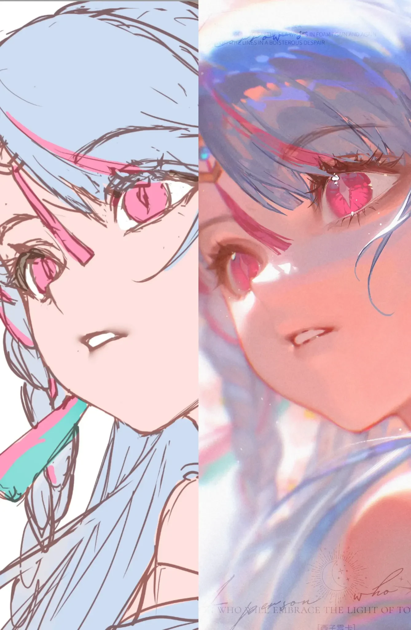
The six images in the post show a very clear transformation process: from structured line art, to flat colors, dividing into large light and dark areas, then finishing into a soft, clear, and glowing anime portrait. The most valuable lesson here lies not in the number of final effects, but in how each stage retains information from the previous one. The line art still controls the form; the flat colors still preserve character recognition; the large light and dark areas still determine the volumes; and bloom, sparkles, and color grading only appear once the foundation is solid.
The character uses a dominant blue – pale purple palette, combined with deep pink eyes, pink streaks in the hair, and peach-toned skin. The final version features strong backlighting, blue-white edge lights, warm skin transitions, multi-layered reflections in the eyes, and a soft atmospheric haze around the character. This is a semi-painterly anime render style — still retaining the language of line art, but using soft edges, reflections, and environmental lighting to create a deeper sense of depth than pure cel shading.
Source scope: the article is built directly from the six images provided by the user. The image set does not display software names, brush names, blend modes, opacity, or official layer order. The image descriptions are direct observations; the layer process, brush settings, and practice methods are NextGZ's practical interpretations for recreating similar effects, not the original author's parameters.
1. Reading the entire process from the six images
The six images can be read as a logical workflow sequence:
- Clean line art: locks in the three-quarter face, large eyes, braided hair, pointed ears, shoulders, and accessories.
- Flat color: sets skin color, light blue hair, pink eyes, pink decorative areas, and teal details.
- Light block-in: reduces line details, groups hair, skin, and clothing into large masses; places bright white areas and purple-gray areas.
- Local rendering: deepens eye sockets, increases iris clarity, transitions skin tones, handles hair and rim light.
- Color grading: pushes the blue-pink contrast, increases warmth in the skin, lowers contrast in distant areas.
- Final: adds bloom, sparkles, reflections, glow on hair edges, and light streaks surrounding the character.
This sequence demonstrates an important principle: don't render details before the large masses are correct. If the line art isn't solid, flat colors will only make the flaws more visible. If the values aren't right, bloom will only make the image blurry. If the environmental color isn't unified, sparkles and highlights will look like scattered decorative layers.
2. Line art stage: lock in the structure before thinking about lighting
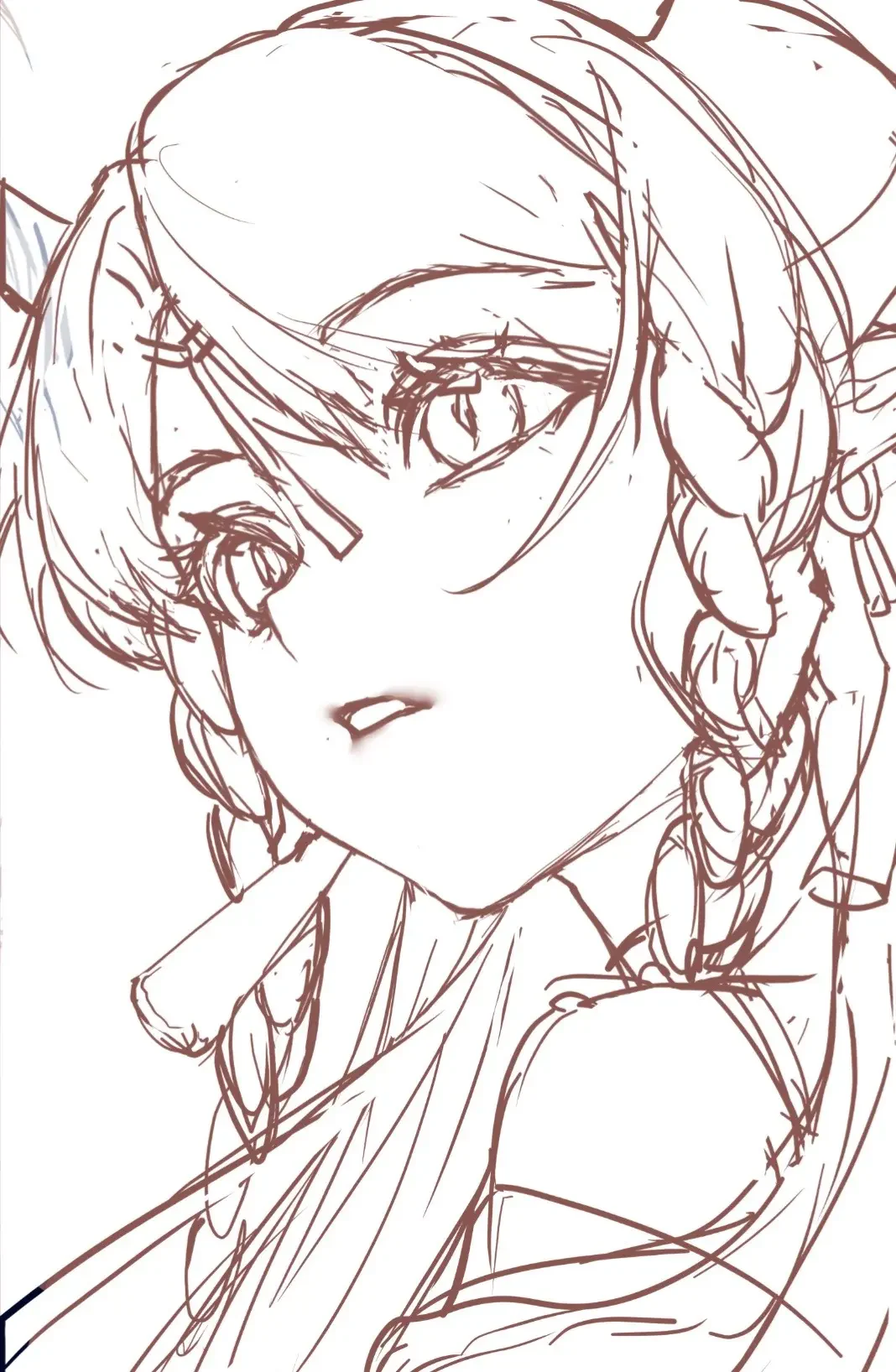
The line art shows that the author resolved most structural issues before coloring. The face is in a three-quarter angle, the chin is pointed, the near eye is larger and clearer, and the far eye is foreshortened. The hair not only surrounds the skull but is divided into multiple clusters, with bangs covering part of the eye and braids creating vertical rhythm on both sides of the neck.
Silhouette should be readable even without color
Zoom out on the line art. The viewer should still recognize the head direction, face angle, braids, ears, and shoulders. If hair clusters blend together or eyes are buried in too many lines, coloring later will be very difficult to salvage.
Maintain line hierarchy
In the image, the outer contour and eye area are thicker than internal lines. This is how hierarchy is created:
- The silhouette of the face, hair, and shoulders keeps clear lines.
- The upper eyelid, eyelashes, and pupil are the heaviest line areas.
- Inner hair strands use lighter lines.
- Skin folds, mouth, and shoulder details are restrained.
If every line is equally thick, the final piece will look "dirty" even with nice colors. If every line is too thin, the structure will easily dissolve when bloom is added.
Check volumes before cleaning lines
Before inking clean lines, there should be a separate construction layer for the skull, eye axis, nose bridge, jaw, neck, and shoulder direction. This is especially important because the final uses a lot of soft lighting; when edges are blurred, the underlying structure must be solid enough to prevent the image from collapsing.
3. Flat color: limit the palette and preserve recognizability
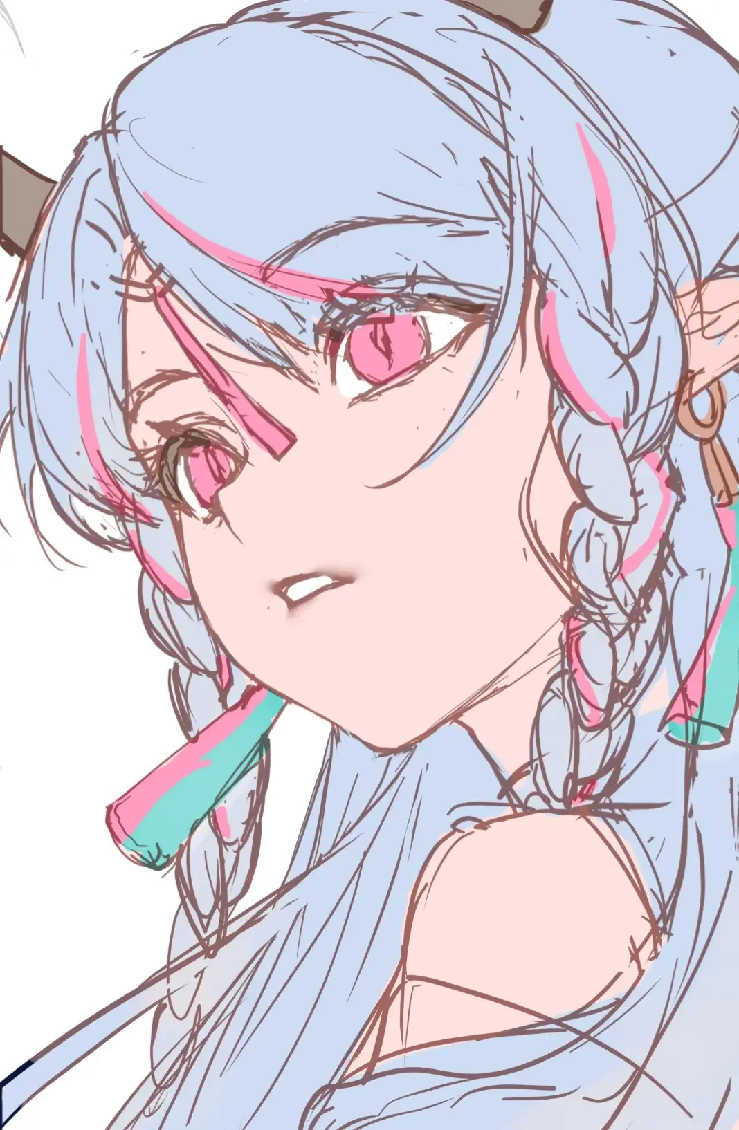
At the flat color stage, the palette is kept very clean: light blue hair, cream pink skin, pink eyes, saturated pink streaks, and teal accents in accessories. This is a good decision because the final has many effects; the clearer the base palette, the easier it is to control the lighting layers.
Separate colors by material
Create separate flat areas for:
- Skin.
- Main hair.
- Pink hair streaks or accessories.
- Eyes and whites.
- Clothing.
- Metal, jewelry, or special materials.
Don't draw everything on a single layer if you still need to make adjustments. Groups and clipping masks allow you to change hue, increase saturation, or adjust values without affecting other areas.
Don't choose flat colors that are too bright
The final has strong white highlights. Therefore, flat hair and skin need to leave room for brightness. If the hair is already near white from the start, you have no space left for rim light. If the base skin is too bright, bloom will cause the nose and cheek planes to disappear.
Keep saturation peaks for focal areas
The pink eyes are the most saturated area. The pink hair streaks help guide the viewer's eye toward the face. Other areas are desaturated to avoid competition. This is a principle worth keeping in any image with many effects: choose only one or two of the most vibrant color zones.
4. Light block-in: divide the image into large masses before softening
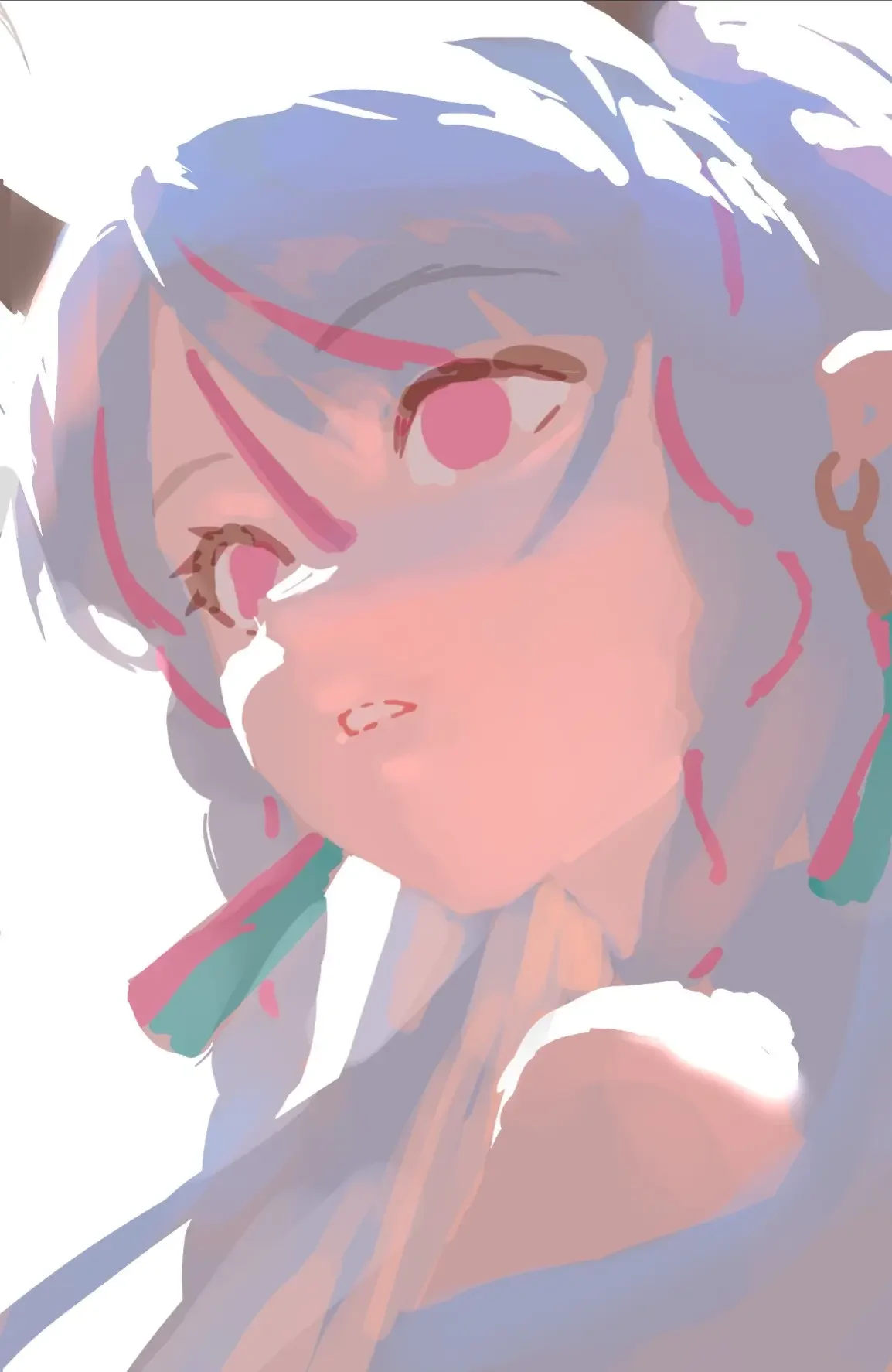
The block-in image is the most important data for understanding the process. Many line details are temporarily reduced, while white, blue-purple, and pink areas are pushed into large masses. This shows the author is checking values and light direction, not refining details.
Three main value groups
- Brightest group: hair edges, white background area, light-catching shoulder, and some reflections on the face.
- Midtone group: most of the skin, gray-blue hair, and clothing.
- Darkest group: hair roots, eyelids, pupils, eye sockets, and hair gaps.
A glowing image doesn't mean everything is bright. On the contrary, highlights only stand out when there is a sufficiently solid dark area nearby.
Big lighting comes before small lighting
Before drawing eye highlights, determine the main light source. The final image shows a strong blue-white light coming from behind and around the character, while the face still receives warm light from the front. So there are at least two components:
- A warm or neutral key light hitting the face.
- A cool rim light from the background surrounding the hair and shoulders.
These two light sources create a warm-cool temperature pair, helping the warm skin stand out from the blue-purple hair.
Block with a hard brush first, soft later
Use a round hard brush or a brush with a clear edge to place the masses. Once the shape is correct, then use a soft brush, smudge tool, or glazing to blend some edges. If you start with an airbrush, it's hard to tell where the main planes are and where the secondary lighting is.
5. Skin rendering: from flat color to peach skin with depth
The skin in the final doesn't use a uniform gradient. It has warm pink areas on the cheeks, nose, lips, and chin; cool shadows in the eye sockets, face edges, and under the hair; and blue-white reflections on the lit edges. Hue changes are just as important as value changes.
Place shadows according to facial volumes
Main shadows typically appear at:
- Under the bangs.
- Eye sockets and upper eyelids.
- One side of the nose bridge.
- Under the tip of the nose.
- Under the lower lip.
- Jaw edge and under the chin.
Don't use gray-black shadows. Gray-purple, reddish brown, or light blue-purple will blend better with the palette.
Blush is an area, not two circles
The pink tone in the final spreads across the cheekbones, the lower nose bridge, and the middle of the face. It is soft, broad, and increases gradually in intensity. You can refer to the article How to render soft and clear anime facial skin to build a skin color system, under-eye bags, and reflections before adding bloom.
Lips keep a lost-and-found edge
The mouth line is darker in the middle and at the corners, then fades into the skin. The lower lip receives a soft highlight. If the lip contour is closed and uniform, the mouth will look like a sticker. If you blur it entirely, the expression will be lost.
Keep some hard edges
Soft skin doesn't mean every edge is blurred. Keep clear edges at the eyelids, nostrils, mouth line, and hair shadow cast on the face. Soften at the cheeks, forehead, chin, and the transition area to the neck.
6. Eye rendering: create depth with dark layers, clear color, and hierarchical highlights
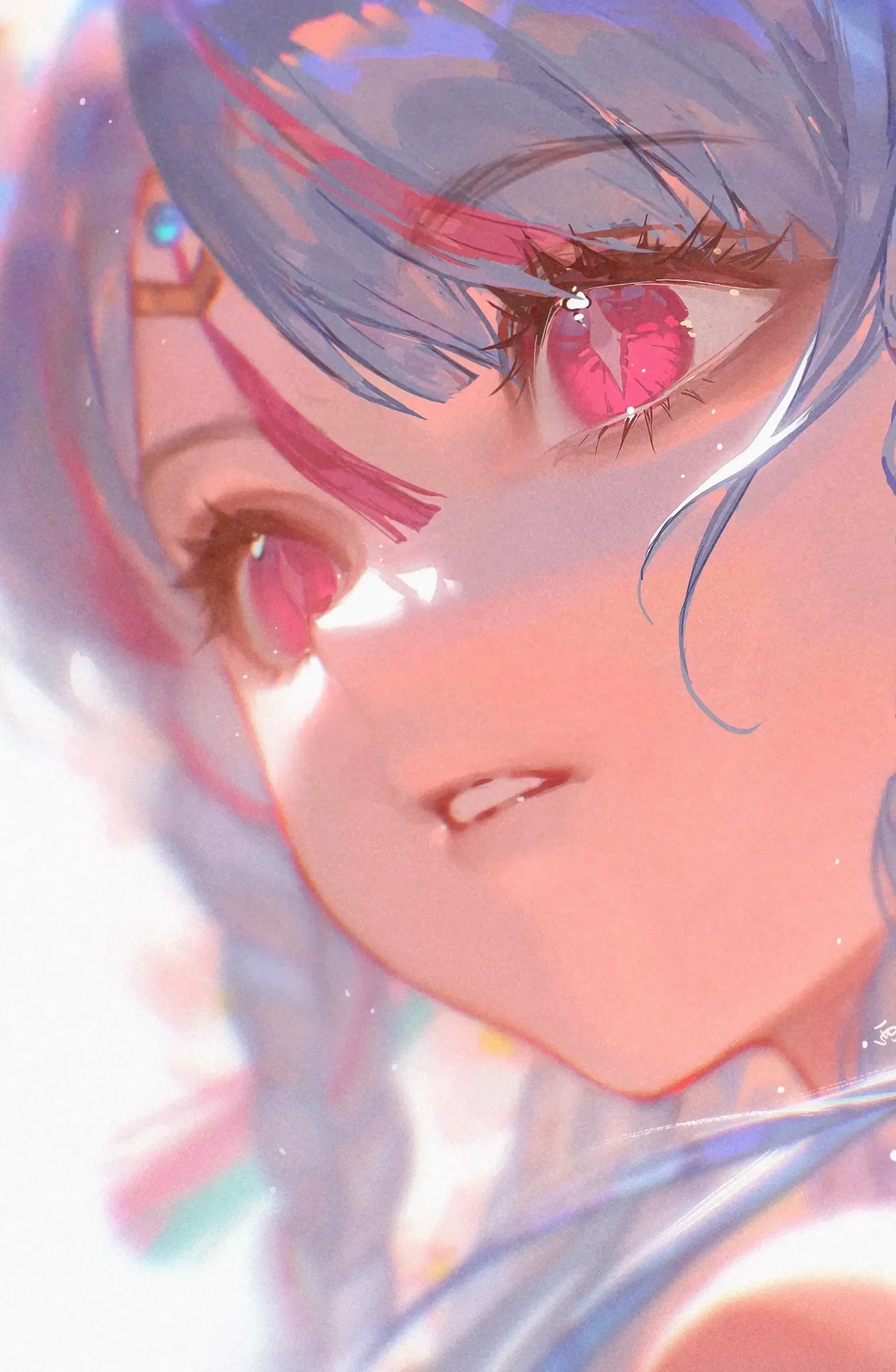
The eyes are the main focal point. The pink iris has multiple layers: a dark top area, a bright bottom area, the pupil, the iris ring, a large highlight, and small sparkles. The upper eyelid is very dark, framing the iris and enhancing the sense of depth in the eyes.
Dark top – bright bottom structure
The upper eyelid and eyelashes cast a shadow over the top half of the iris. The bottom half is brighter and more saturated, giving the eyes a clear, glassy feel. The pupil remains the darkest spot. If the entire iris has the same brightness, the eyes will look flat.
Main highlight and secondary highlights
Use one large highlight to represent the main light source, then add a few small dots of varying sizes. Don't scatter bright dots evenly like beads. The highlights in both eyes must face the same direction.
Keep the lower eye line lighter
The upper eyelid is thick, while the lower eyelid is thin and broken in places. This keeps the eyes clear and avoids an overly heavy frame. The article Guide to drawing anime eyelids and eyelashes explains in detail how to group lashes and control the eyelid curve.
Reflections around the eyes
The skin under the eyes receives pink and white light, but still needs small shadows so that the under-eye bags and eye sockets don't disappear. A few bright spots outside the iris can create atmosphere, but they shouldn't cover the eyelid structure.
7. Hair rendering: large volumes first, small strands later
The final hair retains a medium blue-purple color, not too bright in the core areas. Areas near the light transition to bright blue, white, and pink reflections. The large hair clusters remain clearly readable despite the bloom.
Divide hair into three levels
- Overall volume: the hair silhouette around the skull and braids.
- Large clusters: bangs, side hair, braids, and back hair.
- Accent strands: a few bright lines or small locks that break the silhouette.
If you draw small strands too early, the hair will look messy. If you only have large volumes without rhythm, the hair will look plastic.
Rim light doesn't run uniformly around the hair
The rim light is strongest on the edge opposite the bright background. Some sections are missing, some sections are almost burned white. This lost-and-found quality makes the lighting more natural. A uniform bright edge like a stroke will make the hair look like a sticker.
Use pink to connect hair with eyes
The pink streaks in the hair echo the iris color. This is a way to create color harmony. However, the pink in the hair has a smaller area and lower saturation than the eyes, so the focal point remains on the face.
--- ---8. Rim Light, Bloom, and Atmospheric Effects
The final image has strong bloom around the hair, shoulders, and background. Some white areas almost lose detail. This effect creates a dreamy, soft, and light-rich feel, but only works because the dark masses in the eyes, hair roots, and face edges are preserved.
Rim light first, bloom second
Rim light is a specific line or patch of light on the edge of an object. Bloom is the glow that spreads around that bright area. If you blur a white area without rim light first, the light has no source.
Limit the burned-out areas
Only a few areas are allowed to be nearly pure white: the edges of hair, eye reflections, shoulder edges, and background light streaks. If skin, hair, and clothing are all burned white, the image loses its hierarchy.
Light particles must have rhythm
The final image uses many small white dots, but with varying sizes and density. Larger particles concentrate near the focal point or bright areas; smaller particles are scattered sparsely. Avoid using brush scatter to cover the entire canvas evenly.
Blur according to depth
Areas near the face should retain detail; distant hair, background, and backlighting can be softer. This creates depth of field without using complex perspective.
9. Color Grading: Unified Blue-Violet and Peach Pink
In the final image, the entire piece is covered in a common atmosphere. Blue hair shifts to purple in dark areas, skin is warmer at the center of the face, and the background has teal and pastel pink. Color grading is not just placing a color layer on top; it's balancing each group of materials within the same environment.
Keep skin warmer than hair
Skin is a warm area, hair is a cool area. The temperature contrast helps the face stand out without needing to boost the value too much.
Shadows should not be neutral
Hair shadows can lean purple, skin shadows can lean red-purple or cool blue depending on location. Neutral gray should be used sparingly as it easily makes the image look dirty.
Reduce saturation in distant areas
Braids, distant shoulders, and background can have lower saturation so that the eyes and face maintain the leading role. Don't let every pink point be as vibrant as the iris.
10. Suggested Layer Workflow to Reproduce the Effect
- Construction: skull, face axis, neck, and shoulders.
- Clean line: line art with hierarchy.
- Flat skin.
- Flat hair.
- Flat eyes and accessories.
- Major shadows: Normal or Multiply, gray-purple color.
- Warm light on skin: Normal/Soft Light with peach pink.
- Cool light on hair: Normal/Screen with light blue.
- Eye render: iris, pupil, eyelid shadow, highlight.
- Hair render: hair clumps, rim light, accent strands.
- Reflected light: pink and blue from the environment.
- Bloom: duplicate bright areas, blur, and reduce opacity.
- Particles: selective light dots.
- Color grading: Curves, Color Balance, Gradient Map, or a low-opacity Normal layer.
Blend mode names may differ between Procreate, Photoshop, Clip Studio Paint, IbisPaint, or 画世界Pro. The principle remains the same: separate shadows, light, and effects to edit independently.
11. Recommended Brushes and Edge Control
Hard round brush
Use for flat color, block-in, eyelids, hard shadows, and hair edges. This is the main brush during the structural phase.
Soft brush
Use for cheeks, forehead, bloom, ambient light, and deep transitions. Do not use to build the entire image from scratch.
Light texture brush
Use at the end to break up an overly clean surface, creating small grain on skin, hair, or background. Texture must be lighter than the main structure.
Smudge or blending
Only blend edges after the color patches are correct. Pull smudge in the direction of the hair mass or skin plane, not randomly.
Three edge types
- Hard edges: eyelids, pupils, lip line, hair shadows, some shoulder edges.
- Medium edges: nose, chin, hair clumps, skin-to-neck transition.
- Soft or lost edges: cheeks, forehead, bloom areas, distant hair, and background.
12. Common Mistakes When Trying to Create a "Glowing" Image
Using airbrush from the start
The image becomes soft but lacks form. Block in with a hard brush first.
Not preserving dark areas
Highlights don't stand out because the whole image is bright. Keep hair roots, upper eyelids, pupils, and clothing crevices dark enough.
Rim light runs evenly around the character
Rim light becomes a stroke. Let the rim light fade in and out and vary in width.
Bloom obscures eyes and nose
Reduce blur or use a mask to protect the focal point. Eyes, nose, and mouth must be readable when the image is shrunk.
Pink appears everywhere at the same intensity
Keep the eyes as the area with the strongest pink; hair and background only repeat it at a secondary level.
Rendering individual hair strands
Hair becomes messy and lacks volume. Go back to large clumps first.
Line art is pure black and never changes color
Lines can be changed to brown-purple, blue-black, or a color close to the object to blend into the final. Keep near-black only for eyes and deep crevices.
Adding light particles to hide structural errors
Particles cannot fix misaligned eyes, flat hair, or a face lacking volume. Turn off effects and check the base image.
13. 90-Minute Practice Exercise
- 10 minutes: check line art and silhouette at a small size.
- 10 minutes: fill flat colors for skin, hair, eyes, and accessories.
- 15 minutes: divide into three major value groups, no blending yet.
- 15 minutes: handle skin: shadows for eye sockets, cheeks, nose, lips, and chin.
- 15 minutes: render eyes following the structure of dark on top, light on bottom.
- 10 minutes: divide hair clumps and add rim light.
- 5 minutes: add pink and blue reflected light.
- 5 minutes: create bloom with a mask.
- 5 minutes: add light particles and color grading.
Every 15 minutes, turn off the effect layers. If the base image still reads well, you're on the right track.
14. Pre-Final Checklist
- Does the line art have hierarchy, or are all strokes the same weight?
- Are flat colors sufficiently separating skin, hair, eyes, and accessories?
- Does the image have three distinct value groups when converted to grayscale?
- Are the eyes the first focal point?
- Does the skin have warm areas and cool shadows instead of a single gradient?
- Does the hair have large masses before small strands?
- Does the rim light fade in and out, or does it run evenly?
- Does the bloom have a specific light source?
- Are the dark areas in the eyelids, pupils, and hair roots still strong enough?
- Is the pink in the eyes stronger than other secondary pink points?
- Do the light particles have rhythm and focus, or are they evenly scattered?
- When shrunk, are the face, eyes, and head direction still clearly readable?
Conclusion
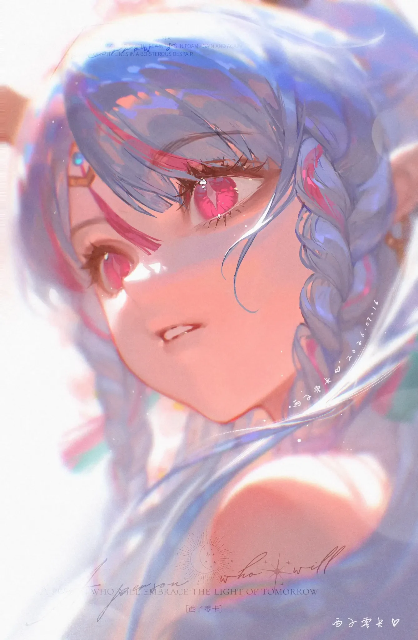
This set of images demonstrates a very clear lesson: beautiful glow effects are not created with a single Add layer. They are the result of a sequence of ordered decisions: solid line art, clean flat colors, clear values, reasonable major lighting, depth in eyes and skin, hair that retains volume, and only then adding rim light, bloom, particles, and color grading.
Software or brush presets may change, but the logic does not. Keep structure before effects, large masses before details, hard edges before soft edges, and light source before bloom. When these foundations are done correctly, the image remains convincing even with all glow turned off; when effects are turned back on, the light truly elevates the quality instead of covering errors.
Illustration source: six images provided by user. No author or software information confirmed in the image set; the article does not speculate on this data.
---






Bình luận
0 bình luận
Đăng nhập để tham gia thảo luận cùng cộng đồng!
Đăng nhập ngayĐang tải bình luận...