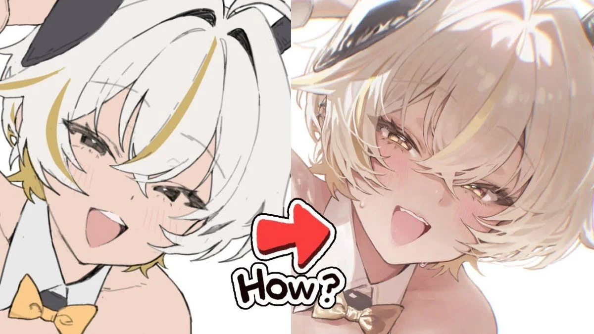
Exercises that are a bit "annoying" but boost your skills super fast
Today, I'm sharing a way to practice digital art that's low on color, low on tricks, but hits straight at the foundation of observation – light – material.
 Free
Free
cre@winter_parasol
Today, I'm sharing a method for practicing digital art that uses few colors and tricks, but hits directly on the fundamentals of observation, light, and material.
The formula is extremely simple:
1 familiar motif + 1 unusual material element = 1 exercise to upgrade your visual perception
Examples exactly like in the images:
– apple + transparent → glass apple/jelly apple
– flower + metal → golden-hued flower/metallic rose
– hair + water → hair as if melting into a flow
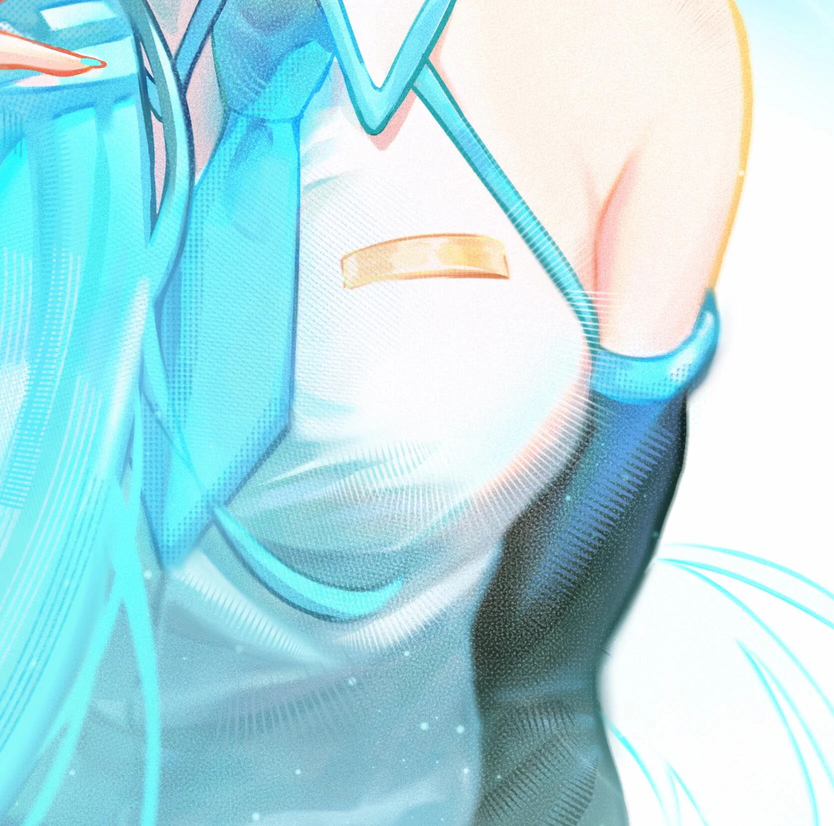
– shoulder + hologram → a "virtual – crisp – reflective" fantasy-style material
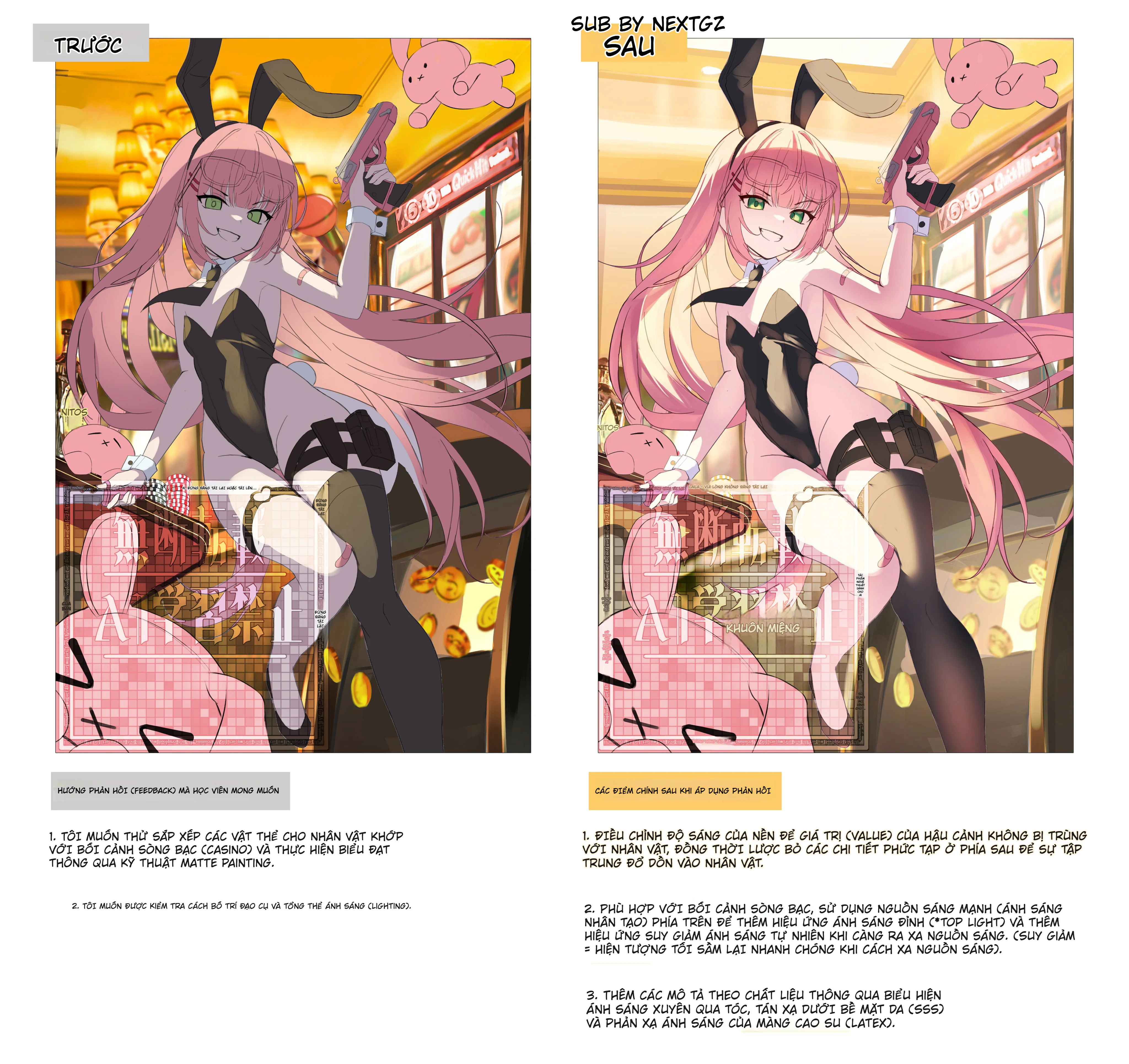
Why is this exercise effective?
You are forced to keep the original form accurate, *then* "apply the material" on top. This means you can't just color it prettily and hope the material quality emerges. This is a practice for when you want to tighten up your fundamentals.
The concise and accurate method:
Draw the original motif at a stable level, don't overcomplicate it.
Lock in 1 main light source. If you don't lock the lighting, this exercise fails immediately.

Identify 3 characteristics of the new material:
– glossiness (sharp gloss or soft gloss)
– transparency/opacity
– reflective color (the color the environment will "cast" onto the surface)
Mix 30–50% first. Don't "pour the full material" from the start.
Draw 3 versions:
– normal version
– version with light material added
– version with clear material added
Compare them and you'll see your weaknesses exposed very clearly.
Quick tips for the "transparent" part (in the spirit of the apple image):
– Transparent doesn't mean uniformly pale.
– You must still keep dark areas for the object to have weight.
– The brightest areas are usually the light-catching edges and areas near the light source.
– If you're new to this, just 2–3 levels of light/dark is enough to look good.

Who should try this exercise:
– You're experiencing "pretty coloring but the material doesn't come through"
– You want to practice observation and lighting quickly, without drawing a big scene
– You like the fantasy/anime vibe but want your painting to feel more solid
Suggested 7-day plan:
Day 1–2: fruit + transparent
Day 3–4: flower + metal
Day 5: hair + water
Day 6–7: choose any 1 motif and mix 2 materials yourself
#genzacademyvn #gztools #DigitalArt #digitalpainting #luyenvetexture #chatlieu #anhasang #procreate #clipstudiopaint #photoshop #vietartist #hoaminhhoa
Đánh giá bài viết
More from author
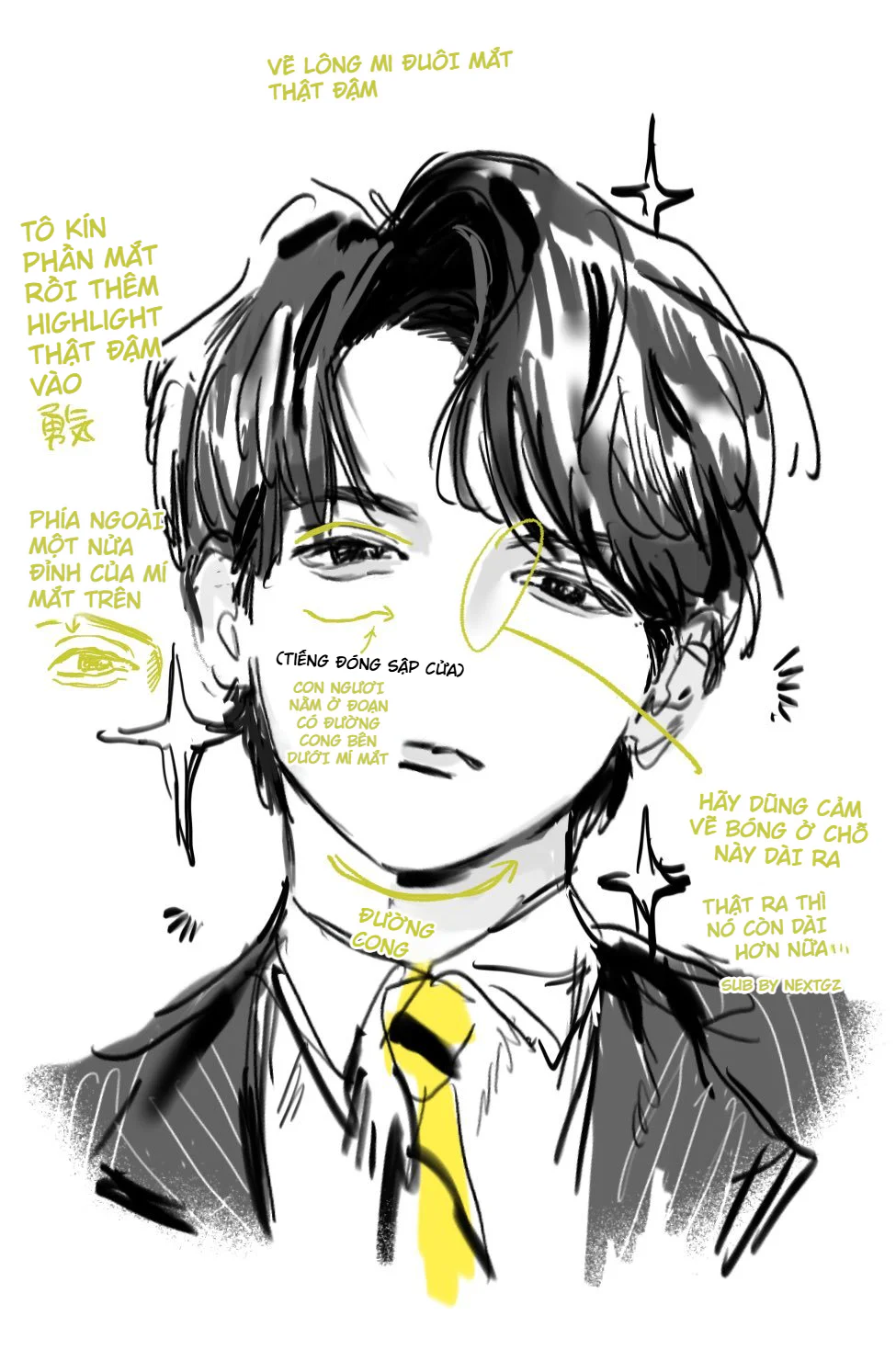
Cách vẽ nhân vật nam manga ngầu bằng mắt cụp, tóc đen bóng và halftone
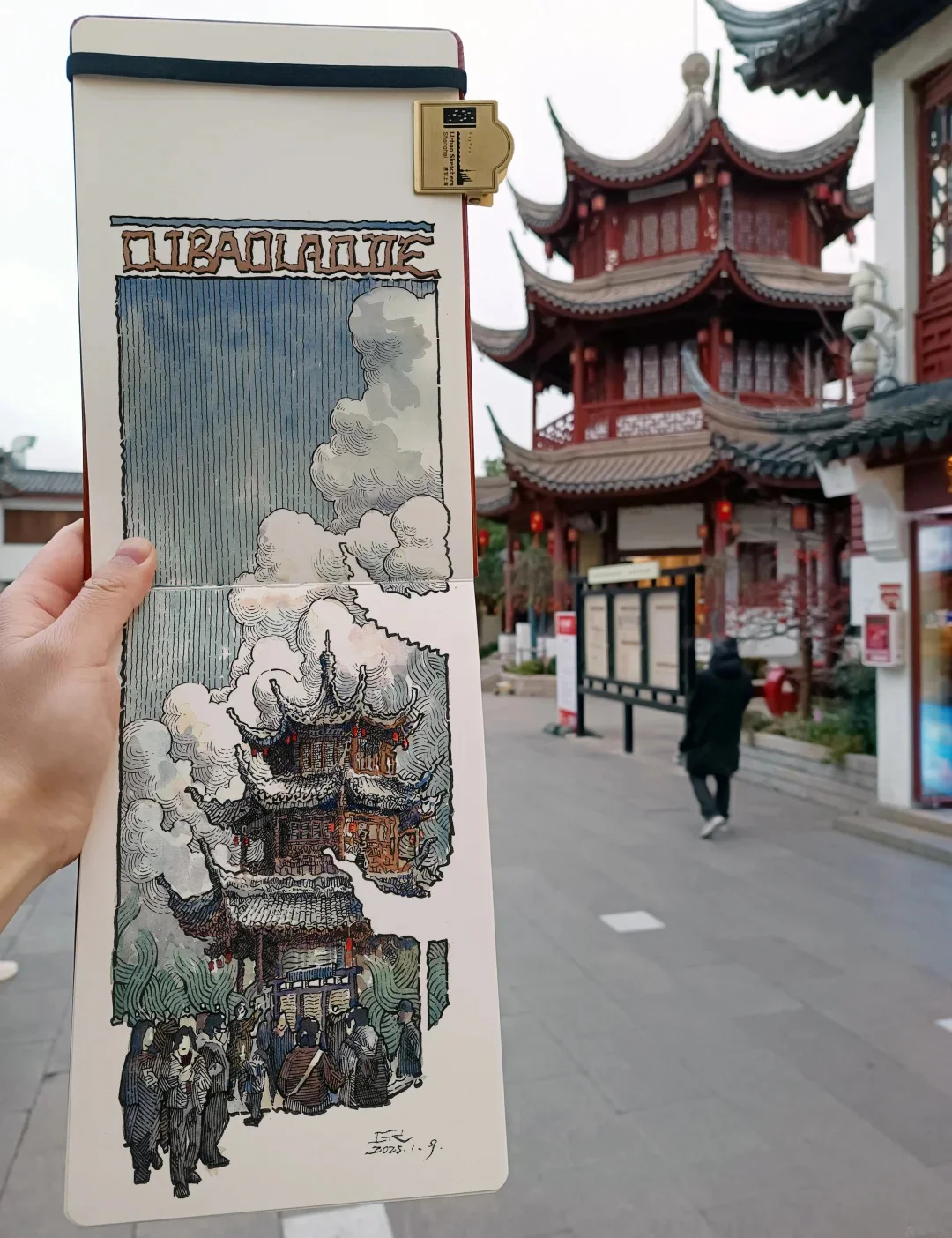
So sánh các cách học Mẹo Vẽ Ký Họa Cảnh Đường và cách chọn hướng
Tự Học Clip Studio Paint Cơ Bản: Hướng Dẫn Toàn Diện Cho Người Mới Bắt Đầu
Bộ Sưu Tập 48 Brush Information Volume Tạo Chi Tiết Và Texture Cực Đỉnh Cho PS, Procreate, CSP
You might also like
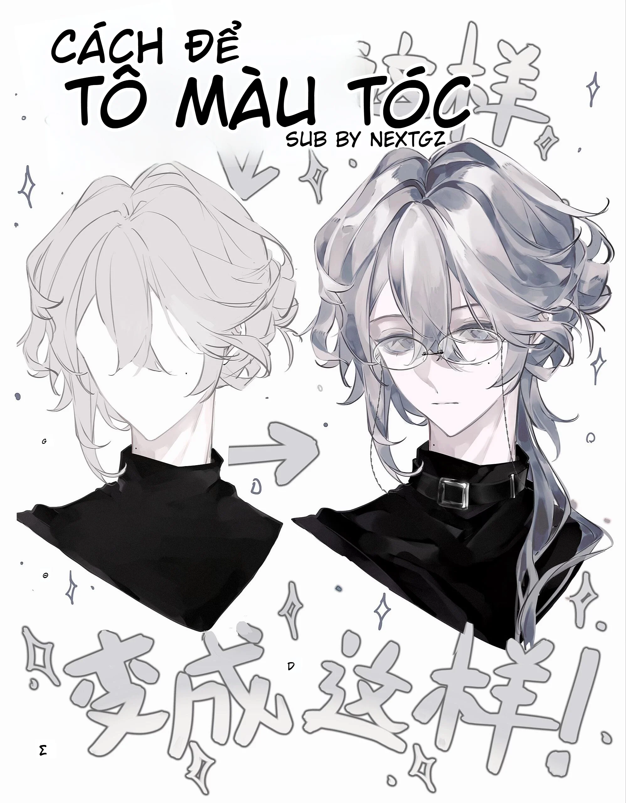
Cách tô màu tóc bạc anime: quy trình đổ bóng, hòa màu và hoàn thiện tóc xám đẹp hơn
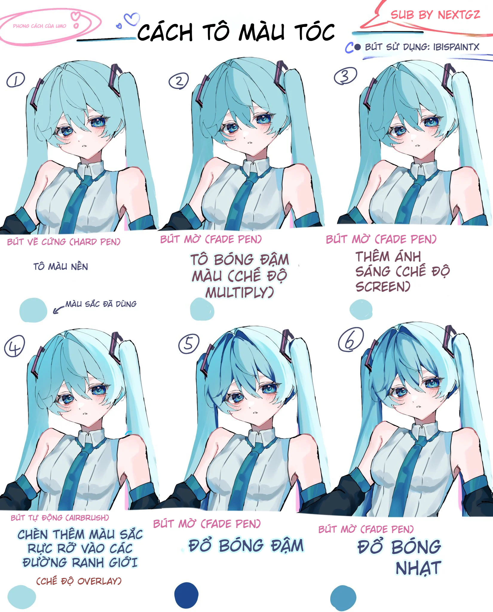
Cách tô màu tóc anime trong ibisPaint X theo quy trình 12 bước, lên khối đẹp mà không bị bệt
Hướng dẫn sinh tồn Cho Digital Artist 2026: Khi Kỹ Thuật Gặp Cá Tính
Bình luận
0 bình luận
Đăng nhập để tham gia thảo luận cùng cộng đồng!
Đăng nhập ngayĐang tải bình luận...