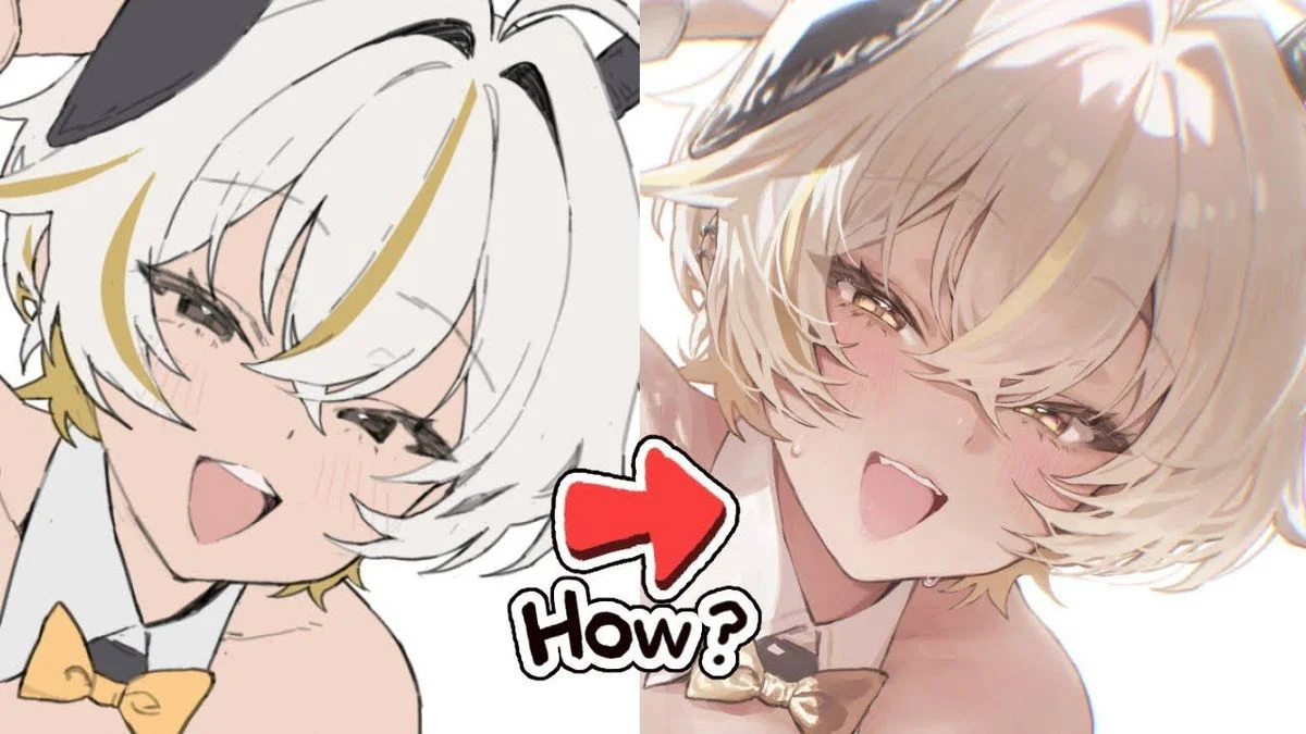
How to Color Anime Hair in ibisPaint X in a 12-Step Process, with Beautiful Shading and No Flatness
What makes this photo set worth saving is not just that it's visually appealing, but because it teaches exactly what needs to be learned: beautiful hair coloring is about building the right rhythm of volume first, while effects are merely the final finishing layer.
 Free
Free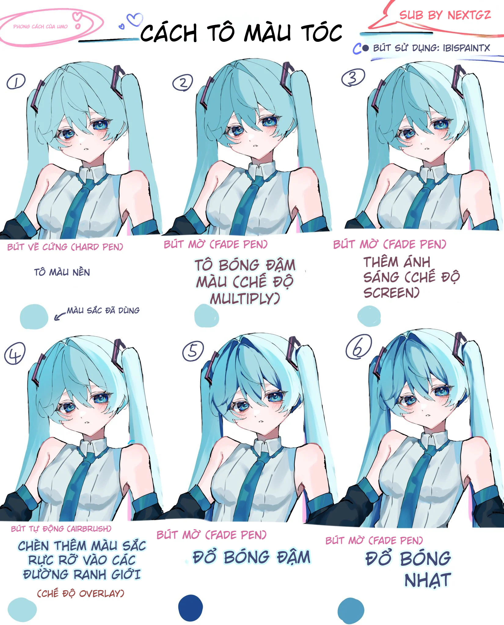
Hair coloring is one of the most fun yet easiest parts to mess up when drawing anime characters. The sketch looks cute, the skin coloring is fine, but when it comes to the hair, problems start: the color looks flat, the shading doesn't define the form, the highlights are placed awkwardly, and the lineart is pitch black, making the whole head look stiff like plastic.
This tutorial set is quite worth learning because it doesn't teach random, scattered tips. It follows a relatively concise digital hair coloring workflow: locking in the base color, building dark shadows, adding light, inserting accent colors, creating rim lighting, handling highlights, changing the lineart color, and finally adding hair strands. This method aligns perfectly with ibisPaint's layer logic, where you can use blend modes to control how the top layer affects the bottom one, while also using clipping to keep the color within the hair shape.
Why is anime hair so prone to looking flat?
The problem usually isn't about choosing the wrong shade of blue or pink, but rather the coloring mindset. Many people see hair as a single colored area and just sweep a few white highlight streaks over it. That method might be fine for quick sketches, but if you want hair to have softness, volume, and light-catching ability, you have to see hair as a collection of large forms.
That means, before thinking about individual strands, you need to think about:
which side of the hair catches the light
which areas are in shadow
where the boundaries are between hair layers
which edges need rim lighting
where the lineart color should be changed to reduce harshness
Step 1: Color the base cleanly and neatly
The tutorial starts with a fairly bright teal base layer, using a hard brush to lock in the entire silhouette of the hair. This step seems simple but is very important. When the base color is clean, it's easier to read the shape, to see how the bangs, side hair, and tail hair are divided into sections.
At this stage, it doesn't need to look perfect. The most important thing is that the hair shape is neat, without smudges, gaps, and that the main flow direction of the hair is visible.
Step 2: Use dark shadows to divide the hair forms
Right after the base layer, the author adds dark shadows using the Fade Pen on a Multiply layer. This is a very logical choice because Multiply is a blend mode commonly used for shadows; in ibisPaint's documentation, Multiply is explained as the top layer's color "multiplying" with the bottom layer, making it especially suitable for building rich, dark areas without making the artwork look muddy like regular coloring.
At this step, you can see the hair starting to have:
darker roots
clearer gaps between strands
more depth in the shadowed areas under the bangs
Simply put, step 2 is when the hair starts transforming from a "flat color patch" into a "form."
Step 3: Add light with Screen to give the hair curvature
After dividing the dark forms, the tutorial uses the Fade Pen with Screen to add highlights. In ibisPaint's blend mode system, Screen is in the lightening group and is a very commonly used mode. For light-colored anime hair like teal, Screen helps the bright areas stand out while still feeling translucent, without becoming harshly overexposed white.
The clever part of this step is that it doesn't just "brighten the hair," but reveals the curved surface of the hair. When the light is placed correctly on the bangs and the outer surface of the tail hair, the viewer can naturally read the form's direction.
Step 4: Insert vibrant colors at the transition areas
This is a very valuable step to learn. The author uses an Airbrush to add vibrant colors in the transition zones between light and shadow, then sets it to Overlay. ibisPaint has its own tutorial on using the Airbrush on a clipped layer to create soft gradations; also, the app's blend mode section categorizes Overlay as a commonly used contrast mode. Thanks to this, this step makes the hair less flat without destroying the forms built in the previous two steps.
If you only have a green base + dark green shadow + light green highlight, the hair can easily look monochromatic. But when you insert streaks of cyan, blue, or soft pinkish-purple, the hair feels much more "alive."
Steps 5 and 6: Tighten with dark shadows, then soften with light shadows
This is where the tutorial creator shows a good understanding of hair coloring logic. After adding vibrant colors, the overall look can become diluted, so the author goes back to add more dark shadows to regain weight in necessary places. Then, immediately after, they add light shadows so the transitions aren't too harsh.
It is precisely this pair of steps that makes the hair look smooth. Many beginners only know two states: dark or light. But beautiful artwork often lives through its intermediate tones.
Steps 7 and 8: Create rim lighting and push accent colors
Once the hair forms are stable enough, the author adds sidelight – that is, rim lighting on the edges of the hair. This part is very suitable for character art with bright backgrounds or illustrations aiming for a sparkling effect. It helps the character stand out from the background better, while also giving the hair a translucent feel, especially on the outer edges of the bangs and the two long tail ends.
After that comes the step of adding more vibrant colors. This isn't about rebuilding forms, but about "enhancing the mood." Looking at the final result, you'll see the hair isn't just blue but has shades of dark blue, bright cyan, and a hint of pinkish-purple on the edges. That's why the hair looks both cool and deep.
Step 9: Add shading and highlights
ibisPaint has its own tutorial on Create Highlights and Shadows, where the app guides you to place highlights on a separate layer, choose a lightening blend mode, enable clipping, and adjust opacity to control the light intensity. This is very similar to what this tutorial is doing: highlights are only handled after the base, shadows, light, and accent colors are done.
This is a key point to remember: highlights cannot save a poorly constructed hair form. Highlights only look good when the foundation beneath them is built correctly.
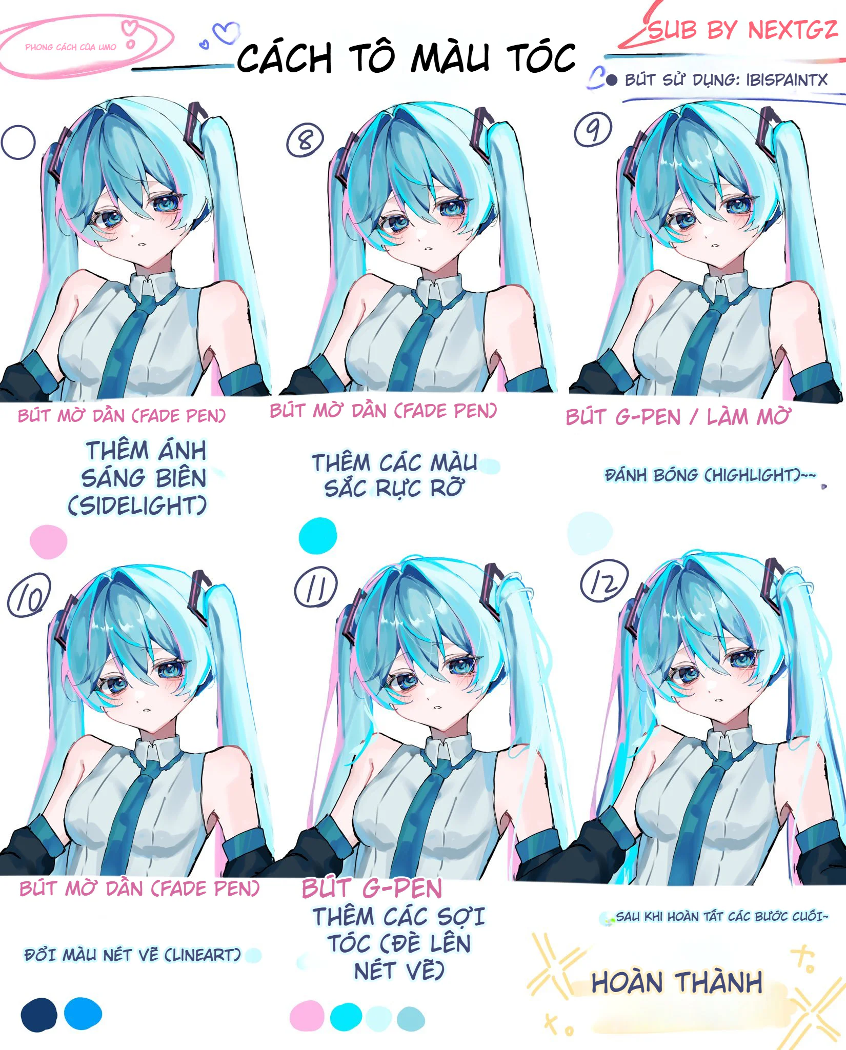
Step 10: Change the lineart color to soften the artwork
This is a step that many people skip. Meanwhile, ibisPaint has a dedicated Change Drawing Color filter to change the drawing's color, and the app's documentation clearly states that just changing the lineart color can significantly alter the overall impression of the artwork.
Light-colored hair that still keeps a hard black outline often suffers from being:
harsh
heavy
disconnected from the skin
lacking a sense of translucency
When the lineart is changed to a dark blueish-purple or a blue-gray, the hair immediately becomes softer without losing its form.
Step 11: Add a few loose strands to break the overly clean look
After everything has been built using forms, the author uses a G-Pen to add a few loose hair strands. This is a small step but extremely important. It makes the hair less "graphic," less like every strand is cut cleanly like plastic.
The trick here is not to add too many. Just a few places:
the edges of the bangs
the tips of the tail hair
the intersection between two large strands
is enough to give the artwork more breathing room.
Step 12: Finalization
The final product yields a hairstyle very characteristic of current social media character art: bright, cool, soft, clean, with rim lighting and just the right amount of gloss. What I like about this tutorial set is that it doesn't overuse effects. The hair still has clear forms, isn't blown out by highlights, and doesn't turn into a mess of patchy white streaks.
Tips for Applying This Formula to Other Hair Colors
The formula in the tutorial uses teal hair, but you can easily switch to other colors:
Blonde hair: Keep a light beige-yellow base, use cool brown for shadows, and a creamy yellow for highlights.
Pink hair: Keep a light pink base, use plum-purple for shadows, and peach-pink or pinkish-white for highlights.
Silver-gray hair: Keep a blue-gray base, use grayish-purple for shadows, and silver-blue or cool white for highlights.
The important point is to keep the same logic: base first, dark shadows first, then accent colors and highlights.
Mistakes to Avoid When Learning from This Tutorial
First, don't use Overlay too strongly in the vibrant color step. Overdoing it will make the hair look like fake neon.
Second, don't place white highlights on every single strand. Doing so will make the hair look more like metal than hair.
Third, don't change the lineart to a color that is too light. The lines still need to hold the form.
Finally, don't draw too many hair strands in the final step, as all the effort put into building the initial forms can easily become messy.
Conclusion
What makes this tutorial set worth saving isn't just that it looks good, but that it teaches the right thing to learn: beautiful hair coloring is about building forms in the right order first; effects are just the final finishing layer.
When you follow the correct sequence:
base color
dark shadows
light
accent colors
highlights
change lineart color
add hair strands
then the hair will have softness, translucency, and won't look flat.
Đánh giá bài viết
More from author
Tự Học Clip Studio Paint Cơ Bản: Hướng Dẫn Toàn Diện Cho Người Mới Bắt Đầu
Bộ Sưu Tập 48 Brush Information Volume Tạo Chi Tiết Và Texture Cực Đỉnh Cho PS, Procreate, CSP
Hướng dẫn tinh chỉnh tranh vẽ: Sửa lỗi phối cảnh mắt và tô bóng chuyên nghiệp
Cách Vẽ Mắt Digital Art Bằng Brush Đơn Giản: Từ Line Art Đến Highlight Long Lanh
You might also like
Cách tô màu tóc bạc anime: quy trình đổ bóng, hòa màu và hoàn thiện tóc xám đẹp hơn
Hướng dẫn sinh tồn Cho Digital Artist 2026: Khi Kỹ Thuật Gặp Cá Tính
Cách Vẽ Mắt Digital Art Bằng Brush Đơn Giản: Từ Line Art Đến Highlight Long Lanh
Bình luận
0 bình luận
Đăng nhập để tham gia thảo luận cùng cộng đồng!
Đăng nhập ngayĐang tải bình luận...