 Digital Painting







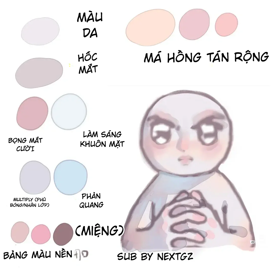
A soft, clear, and lively anime face is not created with just one light skin tone. The two illustration panels in the article show that the skin is built from multiple color layers with different functions: a warm base color, gray‑purple shadows, cool eye sockets, diffused blush, smiling under‑eye bags, a bright central face area, light blue reflected light, lip color, and a final tone‑lifting layer.
The most instructive point of this method is its organization of color temperature. The middle of the face is kept bright and warm; the eye sockets, sides of the face, neck, and hidden areas shift to gray‑purple or cool blue; the cheeks, nose, fingertips, and lips receive pink tones. Thanks to this, the face remains very luminous without being flat, washed out, or appearing as a single solid color mass.
Source scope: The article is built directly from two color palettes provided by the user. The images only indicate certain color functions and the Multiply mode; they do not provide color codes, software, opacity, or specific brush settings. The practice parameters in the article are suggested ranges for recreating the effect, not mandatory original specifications.
1. What are the two palettes teaching?
The first palette presents the main color groups and illustrates the result on a chibi character with a round face, large eyes, and two hands clasped together. The annotations can be divided into eight groups:
- Skin color: a bright, slightly warm, low‑saturation color as the overall base.
- Eye sockets: a light gray‑purple used to push the eyes into the facial structure.
- Diffused blush: peach, dusty pink, and coral pink shades at different intensities.
- Smiling under‑eye bags: a light pink‑gray or pink‑purple placed below the eyes.
- Face brightening: very pale blue‑white or white used to open up the central area.
- Multiply: cool gray‑purple used for main shadows and layered shadows.
- Reflected light: light blue used on hidden areas so the skin does not look dead.
- Lip and background colors: three brown‑pink shades for lips, paired with a background palette of pink‑beige and purple‑brown.
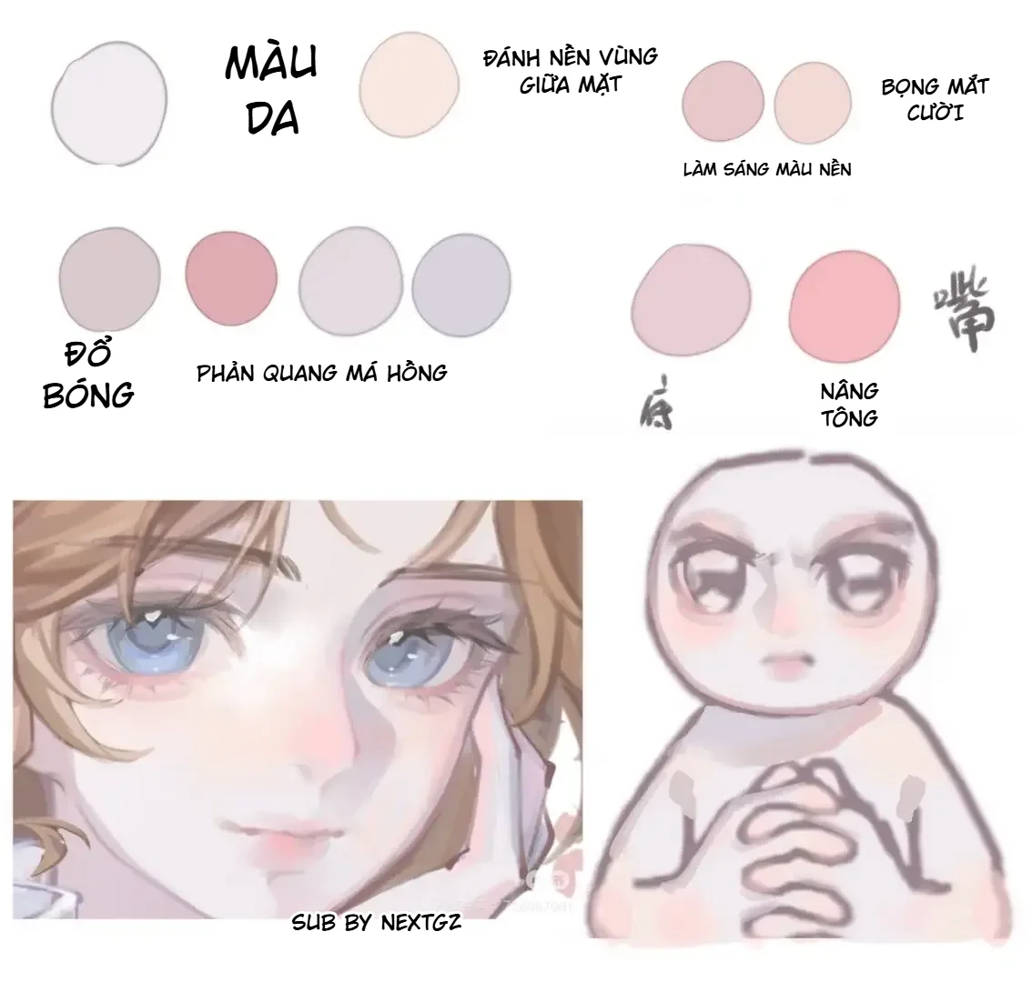
The second palette expands the placement: base for the mid‑face area, base color brightening, smiling under‑eye bags, shading, reflected light, blush, and tone lifting. Below it there is also a semi‑realistic portrait example for comparison with the chibi version. This shows that the method is not only for chibi; it can be applied to anime, semi‑realistic, and soft‑color character illustrations, provided the level of simplification is adjusted.
2. Core principle: bright skin does not mean using only light colors
When beginners start coloring anime skin, many pick a light beige and then add a darker shade of the same hue for shadows. The result is often clean but flat. These two palettes take a different direction: each area of the face is modified in brightness, hue, and color temperature.
The main highlight areas use a light skin tone or cream‑peach. The eye sockets, sides of the nose, under the chin, and neck shift to gray‑purple. The cheeks and nose receive warm pink. The hidden areas or areas near blue materials can get a light blue reflected light. When these colors are kept at moderate intensity, the viewer does not perceive them as “separate color patches,” but still feels that the skin has clarity, circulation, and spatial depth.
Three axes to control simultaneously
- Brightness: the center of the face is brighter than the sides; eye sockets and neck are darker.
- Saturation: cheeks, nose, and lips can be more saturated than the base skin; large shadows are often desaturated.
- Temperature: lively areas lean warm, hidden areas lean cool.
If only one axis is changed, the effect will be weak. For example, lowering brightness without shifting hue makes shadows look like dirty skin. Switching to gray‑purple but keeping it too bright makes the structure unclear. Increasing pink too strongly without lowering saturation in surrounding areas makes the face look heavily made up.
3. Building the color palette before painting
The illustration shows that the palette is organized by function, not just by lightness‑darkness order. This is a very effective way to organize. Before drawing, create a swatch group that includes:
- Base skin color.
- Center brightening color.
- Gray‑purple shadow color.
- Eye socket color.
- Soft blush color.
- Strong blush color.
- Under‑eye bag color.
- Blue reflected light color.
- Three lip colors: base, main pink, and dark accent.
- Three environment colors or background colors.
You don’t need to choose too many colors. Each color must have a clear purpose. If a color cannot be explained where it is used, remove it or merge it into the nearest group.
Relationship between background color and skin color
The first palette includes three background colors: pink‑beige, pastel pink, and purple‑brown. This suggests that skin color does not exist in isolation. If the background leans pink‑purple, the skin shadows can take on gray‑purple; if the background is cool, a blue reflected light becomes more logical. Choose the environment first, then lock in the skin palette, because light and background color determine how the skin changes hue.
4. The complete workflow for soft anime skin coloring
Step 1: Prepare line art and flat color areas
The line art needs to be clean enough so that skin areas do not mix with hair, eyes, clothes, and accessories. However, the soft coloring style in the images does not require perfectly sharp black lines. A purple‑brown, gray‑pink, or cool brown line will blend better with the skin palette.
Create one flat color layer for all skin, including the face, ears, neck, arms, and hands. Carefully check the finger gaps, hairline, eye rims, and the collar area. If the flat color leaks, the Multiply or reflected light layers underneath will expose the background and create dirty edges.
---Step 2: Apply a light, low-saturation base skin tone
The base skin tone in the photo leans toward pinkish white or very light lavender cream. It is not pure white. Pure white leaves no room for highlights and makes blush difficult to blend.
For a chibi style, you can keep the base tone almost uniform. For anime or semi-realistic faces, make the forehead, nose bridge, upper cheeks, and chin slightly lighter than the temples, jawline, and neck.
Suggested practice range:
- Low to medium saturation.
- High brightness but still with room for highlights.
- Avoid overly strong orange-yellow if you want to maintain the cool pink feel of the photo.
Step 3: Base shading for the mid-face area
The second panel clearly states “base shading for the mid-face area.” This step keeps the center of the face brighter and warmer than the edges. The mid-face area includes the center of the forehead, nose bridge, sides of the nose, area above the lips, and the front of the chin.
Use a light peach cream or pinkish beige color with a large soft brush and low opacity. Sweep it in a soft vertical strip from the forehead down to the chin. Do not turn this area into a streak of bright white. The goal is to create the feeling that the front of the face is facing the viewer, while the sides recede slightly.
Step 4: Apply large shadows with grayish purple on Multiply
The image clearly notes the “Multiply (shadow/layer overlay)” group. The accompanying color is cool grayish purple. These are the large shadows used to describe the light direction and main forms.
Create a clipping layer over the skin color and set it to Multiply mode. Use a light grayish purple, not a dark purple. Place the shadows in these areas:
- Both temples if the light comes from the front.
- Under the hair.
- Eye sockets and under the brow area.
- One side of the nose bridge.
- Under the tip of the nose.
- Under the lower lip.
- Under the chin and around the neck.
- Between fingers, under overlapping fingers, and the hidden parts of the palm.
Do not apply Multiply evenly over the entire shaded area. Paint the shadow patches according to structure. Edges near the eye sockets, nose, and finger gaps can be sharp; edges on the upper cheeks and forehead should be softer.
Step 5: Build the eye sockets with a separate grayish purple
The eye sockets in the panel have a slightly warmer grayish purple than the Multiply shadows. This makes the eyes look deep without resembling dark circles. Place the color around the lower brow, inner corners of the eyes, upper eyelids, and the area under the eyes close to the lash line.
For large anime eyes, the eye sockets do not need overly realistic anatomical detail. Just create a soft dark strip around the eyes to make the irises stand out. If the color spreads too far down onto the cheeks, the face will look tired. If it is too dark at the inner corners, the character may appear bruised.
Step 6: Create the smiling under-eye bags
Smiling under-eye bags are an important feature in both images. The color used is grayish pink or light pinkish purple. It sits just below the lower lash line, concentrated from the middle to the outer corner of the eye.
To make the under-eye bags look natural:
- Paint a slightly curved bright or light pink patch under the eye.
- Place a very soft shadow line below that patch.
- Do not stretch the under-eye bag from the inner corner all the way to the temple.
- Reduce intensity on the far eye or on the shadowed side.
In the chibi style, under-eye bags can be simplified to a soft pink strip. In the semi-realistic style, you need to clearly distinguish between the raised plane and the shadow underneath it.
Step 7: Apply blush over a wide area
The caption “blush spread wide” indicates that the pink is not just two circles on the cheeks. The color should extend over the cheekbones, lower nose bridge, tip of the nose, and sometimes very lightly to the ears.
Start with a pale dusty pink using a large soft airbrush. Sweep a horizontal band across both cheeks and the nose. Then use a deeper coral pink on the center of the cheeks and the tip of the nose. Keep the area under the eyes slightly brighter so the cheeks don’t feel heavy.
The three blush levels in the image can be understood as:
- Bright peach color to create a warm base.
- Dusty pink to expand the cheek area.
- Coral pink to accent areas with strong blood flow.
Do not use the strongest color for the entire area. The strong color should only cover a small area.
Step 8: Lighten the face with blue-white
The first panel uses a blue-white color for the function “lighten the face”; the second panel also has a pair of colors for lightening the base and lifting the tone. Cool light helps balance the blush and creates a translucent skin feel.
Place the color in these areas:
- Center of the forehead.
- Nose bridge.
- Area just under the eyes but not overlapping the under-eye bags.
- Top of the cheekbone facing the light.
- Chin.
- Back of the hand or the edge of fingers receiving light.
Do not use blue-white as a sharp highlight everywhere. Most of it should be a soft lifting layer with low opacity. Only small points like the tip of the nose or the inner corners of the eyes need clear brightness.
Step 9: Add light blue bounce light
The bounce light in the image is a very light blue. It is used on hidden faces that still receive ambient light: the jawline, under the chin, neck, edges of the arms, underside of fingers, and areas adjacent to blue clothing.
The bounce light should not be brighter than the main light-receiving areas. It only needs to be enough to separate the object from the shadow and give color to the dark areas. Place it on a Normal layer or Add/Screen mode with very low intensity depending on the software. If using Add, lower the opacity significantly to avoid making the skin glow like metal.
--- ---Step 10: Adjust lip color with three shades
The first image has three lip colors: beige pink, bright pink, and brownish purple. Their functions can be broken down as follows:
- Beige pink: base lip color, close to skin tone.
- Bright pink: the middle area of the lips or the lower lip receiving light.
- Brownish purple: the mouth line, corners of the mouth, and shadowed areas.
Do not outline the lips with a uniform dark line. The mouth line can be clear in the middle and then fade toward the sides. The upper lip is usually darker than the lower lip; the lower lip can have a soft patch of light. For chibi, a short mouth line and two small pink patches are enough.
Step 11: Match hand color with face color
The character in the image places both hands in the foreground, so the hand color should follow the same skin tone system but may differ in intensity. Use grayish purple shadows for finger gaps, undersides of fingers, and palm areas; apply pink to fingertips and joints; areas facing the blue outfit can pick up a light blue reflection.
Since the hands are closer to the viewer, the line art and contact shadows can be more defined than on the face. However, the hands should not become too much darker if the face is the focal point.
Step 12: Brighten tone and unify everything
"Brightening the tone" in the second panel can be understood as the final adjustment layer to make the skin brighter, rosier, and more uniform. You can use a Soft Light, Overlay, or Normal layer with a very light pink color at low opacity.
Before brightening, check the following:
- Are the eye sockets too gray?
- Does the blush overlap the nose shadow?
- Are the reflections brighter than the main light source?
- Is the center of the face light enough to create a focal point?
- Do the neck and hands share the same color temperature as the face?
The brightening layer cannot fix structural errors. Only use it after the light and dark masses are clearly defined.
5. Analysis of color placement on the chibi face in the image
The chibi face has very large eyes and small nose and mouth. Therefore, the color areas must be simplified:
- The eye sockets become a wide grayish-purple ring around the eyes.
- Blush stretches horizontally across the lower part of the eyes and the bridge of the nose.
- The nose only needs a small pink patch and one shadow edge.
- The mouth uses a short dark line, with a bright pink lower lip.
- The center of the forehead and the middle of the face are kept bright so the head doesn't look like a flat sphere.
- The neck is covered by a scarf, so the shadow under the chin needs to be clear to separate the head from the body.
A key point is that large eyes occupy a lot of dark area. If the eye socket shadow is also too heavy, the overall face will feel heavy. Reduce the saturation of the shadow and lightly brighten the area under the eyes.
6. Application to semi-realistic anime style
For example, the portrait in the second panel has blue eyes, brown hair, and very light skin. The color structure is similar to the chibi version but is broken down more finely:
- The forehead and nose bridge have a soft highlight strip.
- The grayish-purple eye sockets are more defined on the upper lid and inner corner.
- Blush is not a circle but spreads along the cheekbone plane.
- The nose has a pink tint on the tip and a cool shadow on one side.
- The lips have three color layers, with the lip edges appearing and disappearing instead of a uniform outline.
- Blue reflection from the eyes and cool environment appears lightly in shadowed areas.
When transitioning from chibi to semi-realistic, don't add many new colors. Keep the same color groups but distribute them with a more subtle structure.
7. Suggested layer structure
- Line art.
- Skin flat.
- Lighting on the center of the face.
- Multiply – major form shadows.
- Eye sockets and local shadows.
- Base blush.
- Accent blush and nose tip.
- Under-eye bags (smile lines).
- Blue reflection.
- Lips.
- Small highlights.
- Overall tone brightening.
It's recommended to put all skin color layers in one group and clip them to the skin flat. This allows quick color adjustments and prevents bleeding into the eyes, hair, or clothing.
8. Brushes and blending techniques
Large soft brush
Used for the center of the face, broad blush application, tone brightening, and reflections. The brush size should be larger than the area to be painted to avoid circular edges.
Medium round brush with soft edges
Used for nose shadows, eye sockets, under-eye bags, and lip areas. After placing the color, use light blending to control the edges.
Small hard brush
Used for the mouth line, eye corners, nostrils, finger gaps, and structural accents.
Do not blur every edge. Soft skin does not mean the entire image is blurry. Keep sharp edges at the eye crease, nostril wings, lip line, and contact shadows; soften the cheeks, forehead, and chin transitions.
9. Common mistakes and how to fix them
--- ---White but flat skin
The reason is only using base color and a shadow of the same hue. Add gray-purple for shadowed areas, pink for circulation areas, and light blue for reflected light.
Blush resembling two circles
Use a larger brush, blend across the bridge of the nose and pull the color along the cheekbones. Keep the strong pink area small.
Eye sockets like dark circles
Increase brightness, reduce saturation, and narrow the color to the upper eyelid, inner corner, and the area directly under the eyebrow.
Multiply shadow looks dirty
Don't use dark gray. Choose gray-purple that relates to the base. Reduce opacity and adjust hue directly if the shadow area lacks vitality.
Too strong reflected light
Reflected light must be weaker than the main light. Lower opacity, reduce the area, and keep it on the edge of shadowed areas.
Lips detached from the face
Use a lip base color close to skin tone, only increase pink in the middle of the lips. Soften part of the lip line into the skin.
Face and hands have different color palettes
Use the same set of base, Multiply, blush, and reflected light. Only change the intensity according to position and distance.
10. Practical exercise in 45 minutes
- 5 minutes: create a palette of 10 colors by function.
- 5 minutes: apply flat skin color and lock skin areas.
- 5 minutes: establish a light strip down the middle of the face.
- 8 minutes: place Multiply shadows according to forms.
- 5 minutes: handle eye sockets and under-eye bags.
- 5 minutes: blend blush across both cheeks and nose.
- 4 minutes: add reflected light and highlights.
- 4 minutes: paint lips and fingertips.
- 4 minutes: adjust tone, zoom out the painting, and fix any imbalances.
11. Completion Checklist
- Does the skin base color leave room for highlights?
- Is the center of the face brighter than the sides of the face?
- Do the shadows lean toward purple-gray instead of dark gray?
- Are the eye sockets deep enough without looking like dark circles?
- Are the under-eye bags positioned correctly below the lash line with a secondary shadow?
- Is the blush blended across the nose instead of forming two separate circles?
- Is the bounce light weaker than the main light source?
- Do the lips have three levels of value, with the edge both blurred and visible?
- Does the skin tone of the hands match the face?
- When scaled down, do the eyes and the center of the face remain the focal points?
Conclusion
The two color palettes reveal a very clear formula: a bright, low-saturation skin base, purple-gray shadows, cool-toned eye sockets, broadly diffused blush, soft under-eye bags, blue bounce light, and a final airbrush lift layer. The value of this method lies not in replicating a specific color code, but in how each color fulfills a distinct function.
When the artist controls brightness, temperature, and saturation zone by zone, anime skin can be very luminous yet still have form, soft without being muddy, and rosy without looking overdone. This is a foundation that can be applied to chibi, standard anime, and even semi-realistic styles.
Illustration source: user-provided images, annotation bearing watermark "Sub by NextGZ".
---





Bình luận
0 bình luận
Đăng nhập để tham gia thảo luận cùng cộng đồng!
Đăng nhập ngayĐang tải bình luận...