 Digital Painting







7. Step 6: Adding detail to the iris without making it messy
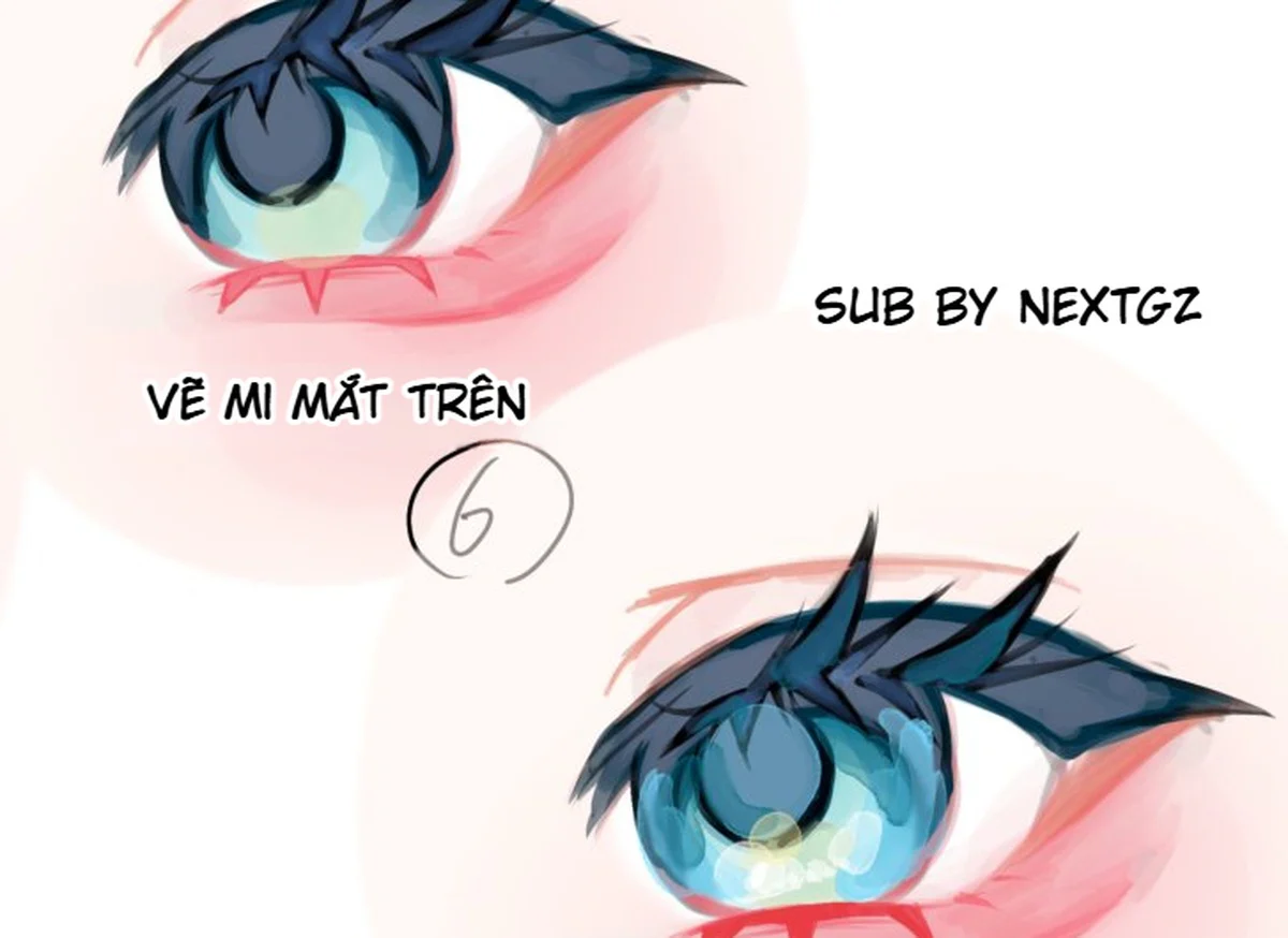
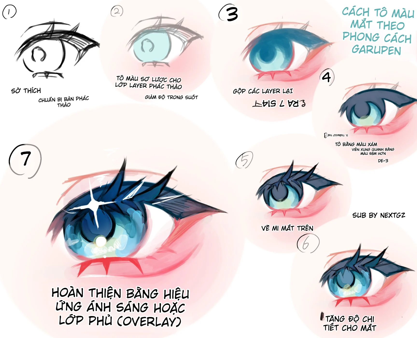
In step six, the iris gains cyan, light blue, yellow-green patches, and many bright strokes. The eye begins to feel wet, translucent, and reflective of the environment. However, the detail still stays within the dark-on-top, light-on-bottom structure.
Iris bottom reflection
The lower area is brighter and has green-yellow tones. This is the area where light passes through the cornea and reflects back. It should be wider than the white highlight but have a lower value than the highlight. The upper edge can be soft and uneven.
Main highlight
The large highlight should represent a specific light source. In the final version, there is a large white star at the upper left. This stylized shape is a design choice; it still needs to be consistent with the light direction on the skin and eyelid.
Secondary highlights
Add a few small light blue or white dots below and beside the iris. Sizes should vary. Do not scatter them evenly around the circle. Focus them around the reflection area or along a curve to keep rhythm.
Iris texture
You can use curved strokes, semi-transparent patches, or bright dots. Texture should point toward the pupil or follow the spherical surface. Avoid using a repeating stamp, as the eye will look like a decorative pattern.
Keep the pupil and dark areas
Even with plenty of light, the pupil and upper half of the iris must remain dark enough. If the entire eye has the same brightness, the highlight no longer stands out and the gaze weakens.
8. Step 7: Finishing with light or Overlay
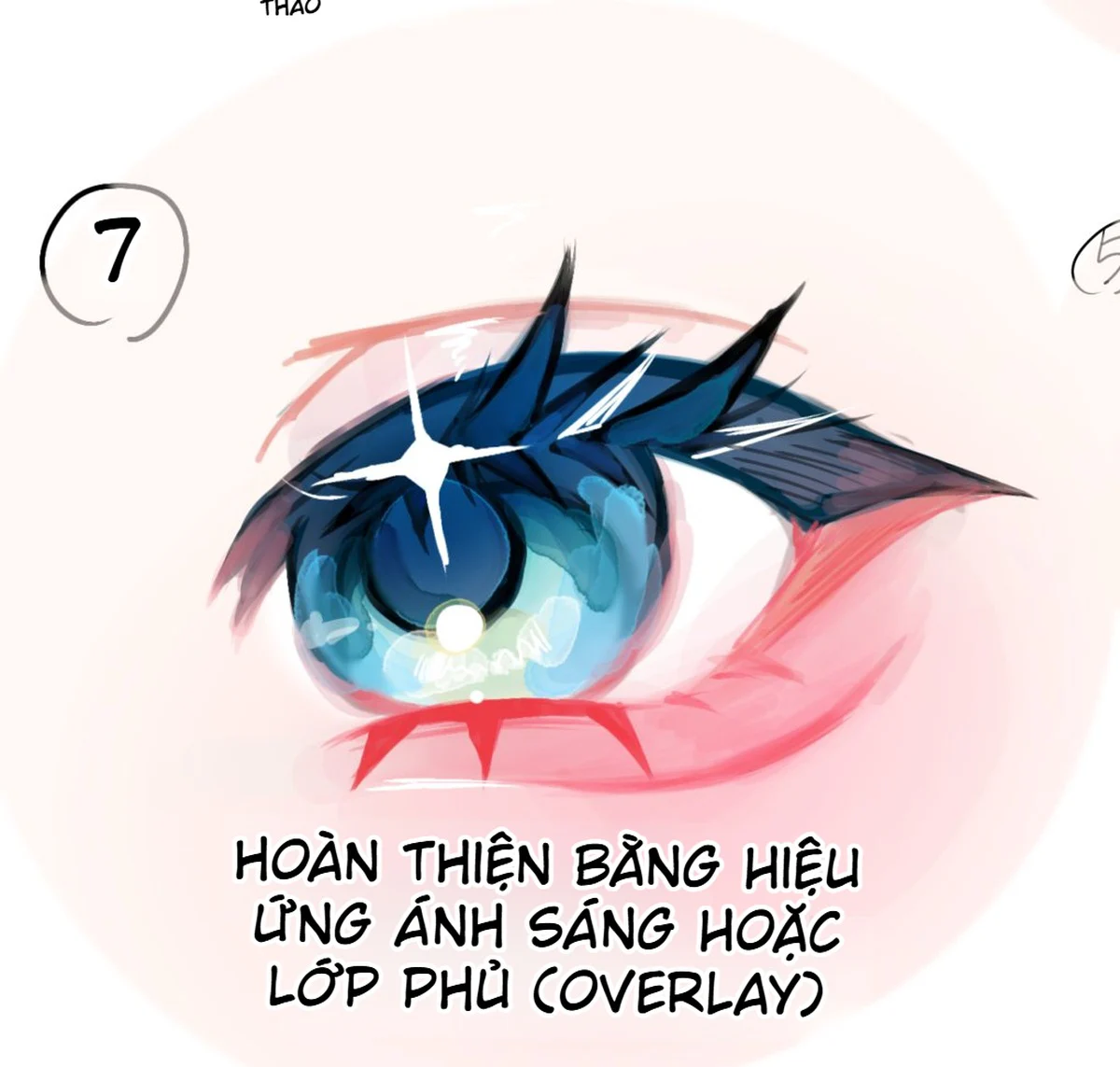
The recording is completed with light effects or an Overlay layer. Overlay can increase contrast and saturation, helping cyan, navy blue, and skin pink connect more strongly. However, Overlay cannot fix incorrect values. It only amplifies existing relationships.
What is Overlay used for?
- Increase the blue in the iris.
- Add warm tones to the skin around the eye.
- Increase contrast between the dark eyelid and the bright iris.
- Push the reflection color at the bottom of the eye.
- Unify colored light across multiple areas.
Keep opacity low and use a mask. If you cover the whole image with Overlay, the skin can become too red, the iris too neon, and the white of the eye tinted. Only use it where you need more impact.
Three-tier light hierarchy
- Colored light patches: cyan or yellow-green, relatively broad in area.
- White highlights: smaller, with clear edges and describing the light source.
- Soft glow: wide in area but low opacity, only used when a glowing feel is needed.
Do not let glow hide the eyelid structure or the pupil. If a large highlight obscures too much of the iris, reduce its size or use a mask to reveal the color underneath.
Adjusting line art color at the final stage
The initial sketch lines can be replaced with blue-black, gray-purple, or pink-brown depending on the area. The lash line stays near black; the lower eyelid and skin use lighter colors. Line color helps the eye blend into the face without losing sharpness.
9. Suggested layer structure
- Sketch.
- Base skin around the eye.
- White of the eye.
- Iris base.
- Upper eyelid and lash mass.
- Shading on the upper half of the iris.
- Iris bottom reflection.
- Pupil and transition ring.
- Main highlight.
- Secondary highlights and texture.
- Line color or paint-over.
- Overlay/Soft Light for color adjustments.
- Glow or Add for strong bright spots if needed.
- Final color correction.
The workflow in the image merges layers at step three. You can do the same after saving a copy. If you want more flexibility, keep groups separate until the end. What matters is knowing which layer does what, not the number of layers.
10. Recommended brushes
Sketch brush
A pencil or round brush with pressure, easy to build overlapping strokes. It does not need to be too clean.
Paint-over brush
A hard or medium-edged round brush with opacity tied to pen pressure. Use it to push shapes, fix the eyelid silhouette, and blend in a controlled way.
Lash brush
A brush with clear tapering and a hard edge. Draw large clumps first, then trim the lash tips with an eraser or tapered strokes.
Reflection brush
A medium-edged brush or a light airbrush for the bright area at the bottom. Do not use an airbrush for the whole iris.
Highlight brush
A small hard round brush for bright dots; use a custom shape brush if you want a star highlight. Highlights need clean edges.
Eraser or mask
Use it to create negative space between lash clumps, soften the iris rim, and reduce Overlay in areas that are too intense.
11. How to adjust the workflow for different eye colors
Blue eyes
Keep the upper shadow navy, the bottom cyan or teal, and highlights white-blue. You can add a little purple in the dark areas to increase depth.
Red eyes
Use a pink-red base, red-purple upper shadow, and orange-pink or yellow at the bottom. Avoid using black too broadly, as the eye can easily become heavy.
Purple eyes
Base lavender, blue-purple shadow, and pink or cyan reflection. Purple Overlay should be used lightly to avoid making the whole iris neon.
Yellow eyes
Base cream-yellow, olive or cool brown shadow, and lemon-yellow at the bottom. The dark pupil creates strong contrast, so highlights do not need to be excessive.
Brown eyes
Base beige-brown, brown-purple shadow, and amber at the bottom. Add a very light cyan reflection if the environment is cool so the eye does not look monochromatic.
12. Common mistakes
Sketch is not correct but layers are merged too early
Proportions and gaze direction become hard to fix. Save a copy and only merge when the drawing is stable.
Upper eyelid is just a black line
The eye lacks weight. Build the eyelid as a mass with lash roots, an upper surface, and lash clumps.
Iris rim runs evenly around the circle
The eye looks like a ball with a stroke. Vary the thickness and let the rim fade in bright areas.
Highlights appear before the value structure
The eye sparkles but looks flat. Lock in the dark-on-top, light-on-bottom structure first.
Too many bright dots scattered
The focal point falls apart. Keep one main highlight, a few secondary points, and plenty of dark areas.
Overlay covers the entire eye
The color becomes neon and the white of the eye gets tinted. Use a mask, low opacity, and increase it only where needed.
Pupil is not kept dark
The gaze weakens. The pupil and lash roots need to belong to the darkest group.
Skin around the eye is too red
The character looks irritated. Reduce saturation, widen the pink area, but lower its intensity.
Lower eyelid is too dark
The eye becomes boxed in. Use a light, broken line and a lighter color than the upper eyelid.
13. 75-minute practice exercise
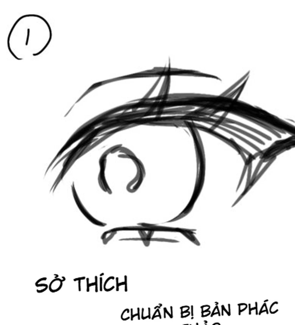
- 8 minutes: sketch the upper eyelid, lower eyelid, iris, and lash clumps.
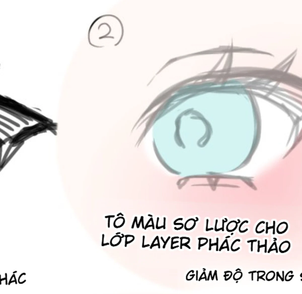
- 7 minutes: apply base colors, lower the sketch opacity.
- 8 minutes: check the gaze direction and merge a duplicate of the layers.
- 10 minutes: push the gray rim, upper-half shadow, and pupil.
- 10 minutes: build the upper eyelid mass along with lash clumps.
- 12 minutes: create the bottom reflection, texture, and color transition areas.
- 10 minutes: place the main highlight and secondary bright dots.
- 5 minutes: adjust the line color and the skin around the eye.
- 5 minutes: use a light Overlay, zoom out, and fix the final.
Save at least four snapshots: sketch, base colors, structure pass, and final. When comparing, evaluate eye shape, gaze direction, value, lash rhythm, and highlight hierarchy.
14. Final checklist
- Does the eye aperture match the expression?
- Is the iris reasonably covered by the upper eyelid?
- Is the gaze direction clear at thumbnail size?
- Has the sketch been replaced with color and edges, or is it still showing too much?
- Is the upper eyelid a mass and not just a line?
- Do the lash clumps have a large–medium–small rhythm?
- Is the upper half of the iris dark enough?
- Is the bottom reflection wider than the white highlight?
- Does the main highlight have a clear light source?
- Are the secondary highlights restrained?
- Does the iris rim fade in and out instead of running fully around?
- Does the Overlay enhance color without breaking the white of the eye and the skin?
- Are the pupil and lash roots still the strongest dark points?
- Is the lower eyelid lighter than the upper eyelid?
15. Continue learning related skills
To better understand how to use Overlay, Multiply, Screen and Color Dodge, see the article guide on layer blend modes in digital painting. When you need to expand the eyes into a complete render with rim light and bloom, refer to the workflow for rendering glowing anime art from line art to final.
Conclusion
The workflow in the image shows a flexible approach: it doesn't rely on perfect clean line art, but instead uses a sketch as the base, brings in color early, merges layers once the shape is stable, and continues paint-over using shadow masses, lash clusters, reflections along with Overlay. The result feels richer in brush quality than a workflow that merely fills color within closed line art.
The most important point remains the order. Lock the shape first, big colors later; establish the crease and values first, highlights later; use Overlay to enhance the effect, not to replace structure. When you maintain dark on top – light below, dark lash roots, reflective iris, and highlights with hierarchy, the eyes will have depth even before adding many effects.
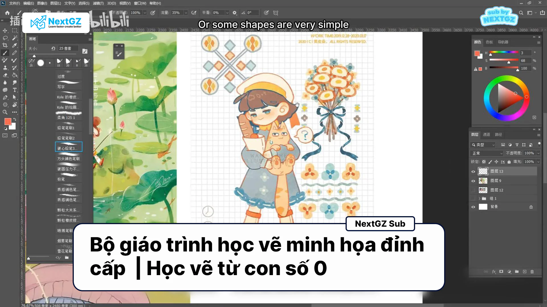
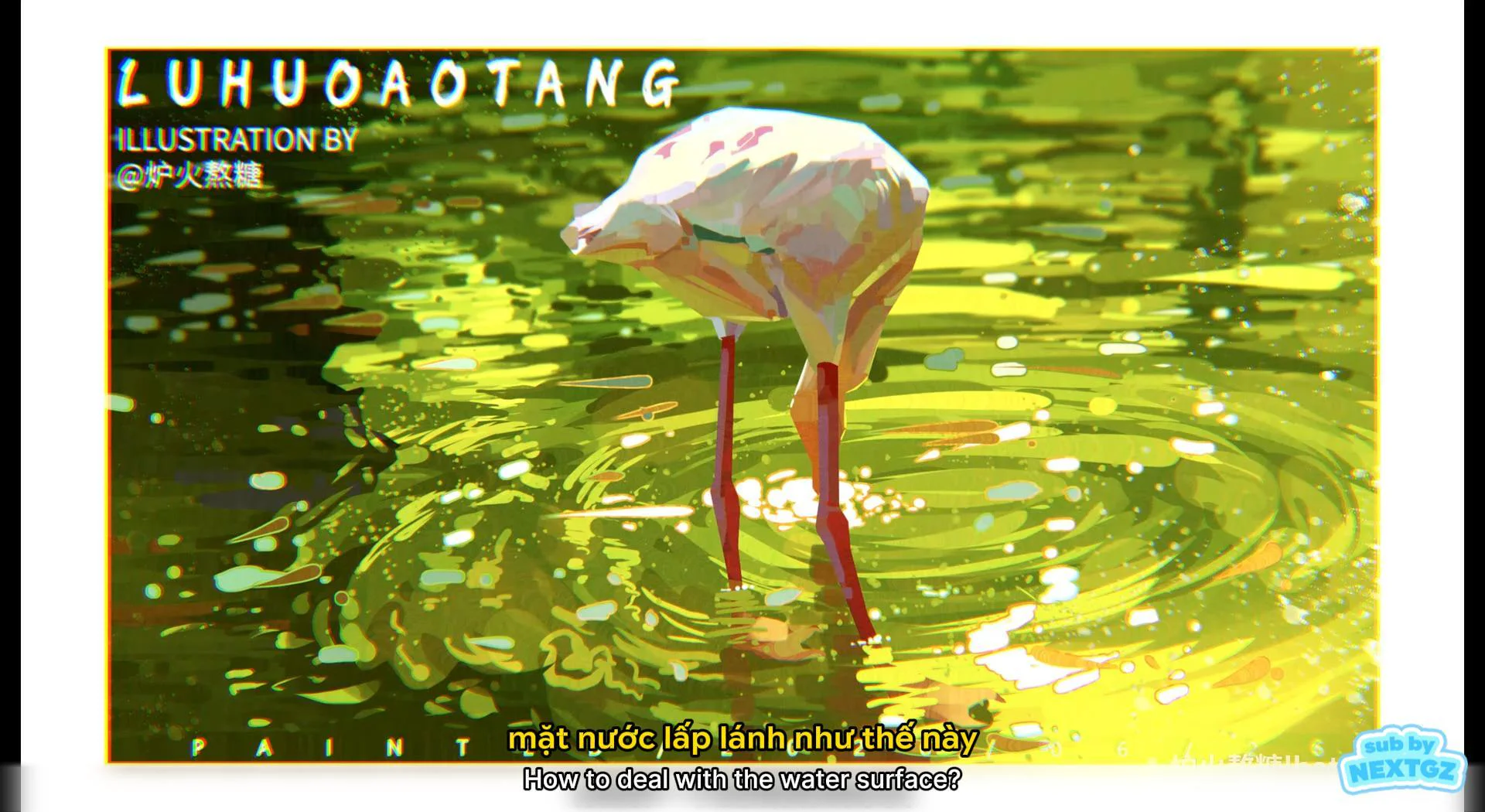
Illustration source: images provided by the user, bearing the watermark "Sub by NextGZ" and the line "How to color eyes in Garupen style". This post does not speculate about the author, software, brushes, or parameters that do not appear in the image.







Bình luận
0 bình luận
Đăng nhập để tham gia thảo luận cùng cộng đồng!
Đăng nhập ngayĐang tải bình luận...