 Digital Painting








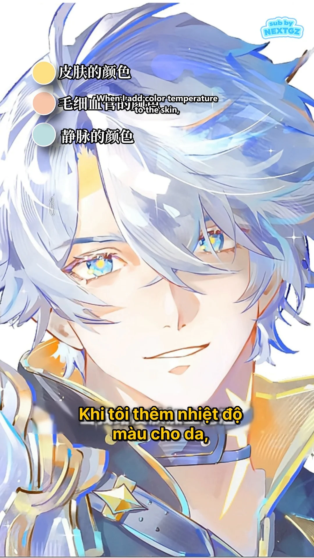
Natural-looking anime skin doesn't come from picking the right "standard skin color," but from how warm and cool tones are distributed across the face. The demo video uses an additional color layer over a light skin base, then places blue in the eye sockets, red on the cheekbones and nose, yellow on the chin area, reduces opacity, and refines it so the color patches blend together.
This tutorial breaks down the entire process shown in the video and turns it into clear, actionable steps, suitable for beginners learning digital art, anime drawing, or character illustration.
Core Principle: Natural Skin Is a Balance of Color Temperature
Human skin is not a uniform patch of color. Even in anime style, a face becomes more convincing when there is subtle variation among three color groups:
- Base skin color: the dominant light tone, determining the overall value of the face.
- Warm colors: red, orange, or pink, often appearing in areas with visible blood circulation, such as the cheekbones, tip of the nose, and around the lips.
- Cool colors: blue, blue-violet, or blue-gray, used very lightly in the eye sockets, brow area, and other shadowed regions.
- Yellow: acts as a transitional tone, preventing the chin and lower part of the face from looking cold or pale.
The key point is that these colors should not be visible as separate paint patches. They must be softly blended, reduced in intensity, and merged into the base color.
Step 1: Prepare the Base Color and a Color Temperature Adjustment Layer
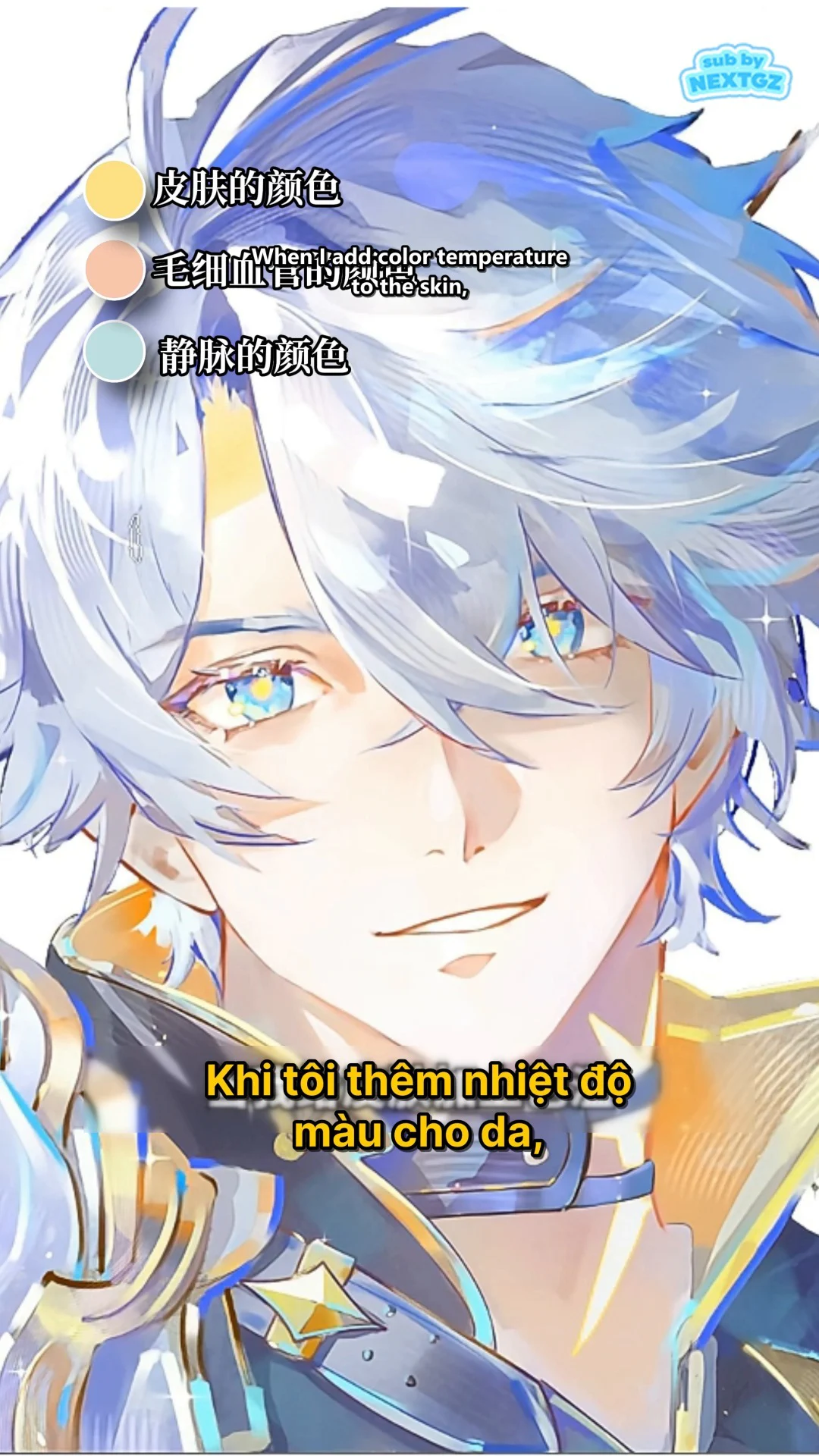
Before adding warm and cool tones, finish the base skin color relatively cleanly. The base skin in the video is high brightness, slightly cream-toned, suitable for a bright and clear anime style.
Create a new layer above the skin layer. You can use a clipping mask or lock alpha to prevent color from spilling onto the hair, eyes, and clothing. The video doesn't clearly show the blending mode, so a safe method for beginners is to use Normal mode, then control it with the brush opacity and layer opacity.
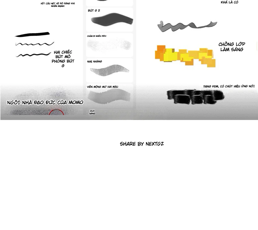
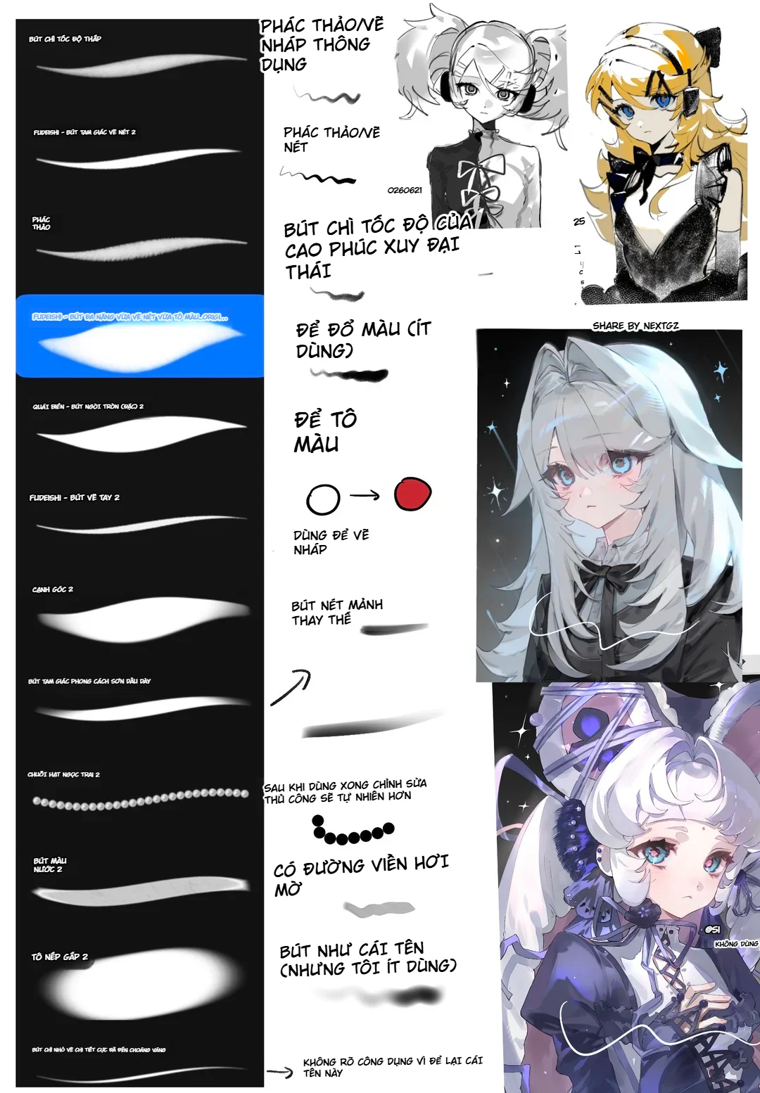
Recommended Brush Settings
- Soft brush or soft airbrush.
- Brush size larger than the area to be painted to avoid hard edges on the color transition.
- Low to medium brush opacity; build up with many light strokes instead of applying too heavily in one go.
- Do not use pure saturated colors. Mix blue, red, and yellow so they are close to the skin base color.
Step 2: Add Blue to the Eye Sockets and Brow Area
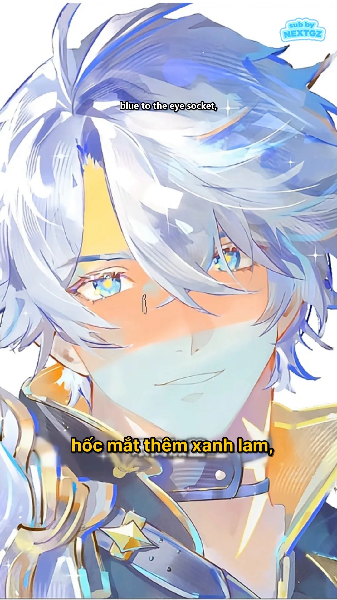
The video starts the most noticeable transformation with a layer of pale blue in the eye socket area and near the eyebrows. This area is typically in shadow, and since the skin is thin, a slight cool tone helps give the face depth.
How to Apply the Color
- Lightly sweep blue from the start of the brow down into the eye socket.
- Focus more on the hollow area, gradually fading as you move toward the cheekbone.
- Keep the whites of the eyes, irises, and eyelids clean so the gaze doesn't look murky.
- Do not cover the entire half of the face evenly with blue; cool tones should only serve as colored shadows.
If the blue appears as distinct patches, use a larger soft brush to blend the edges or reduce the layer opacity. The goal is for the viewer to sense that the eye area is deeper, but not immediately recognize "this is blue."
Step 3: Add Red to the Cheekbones and Tip of the Nose
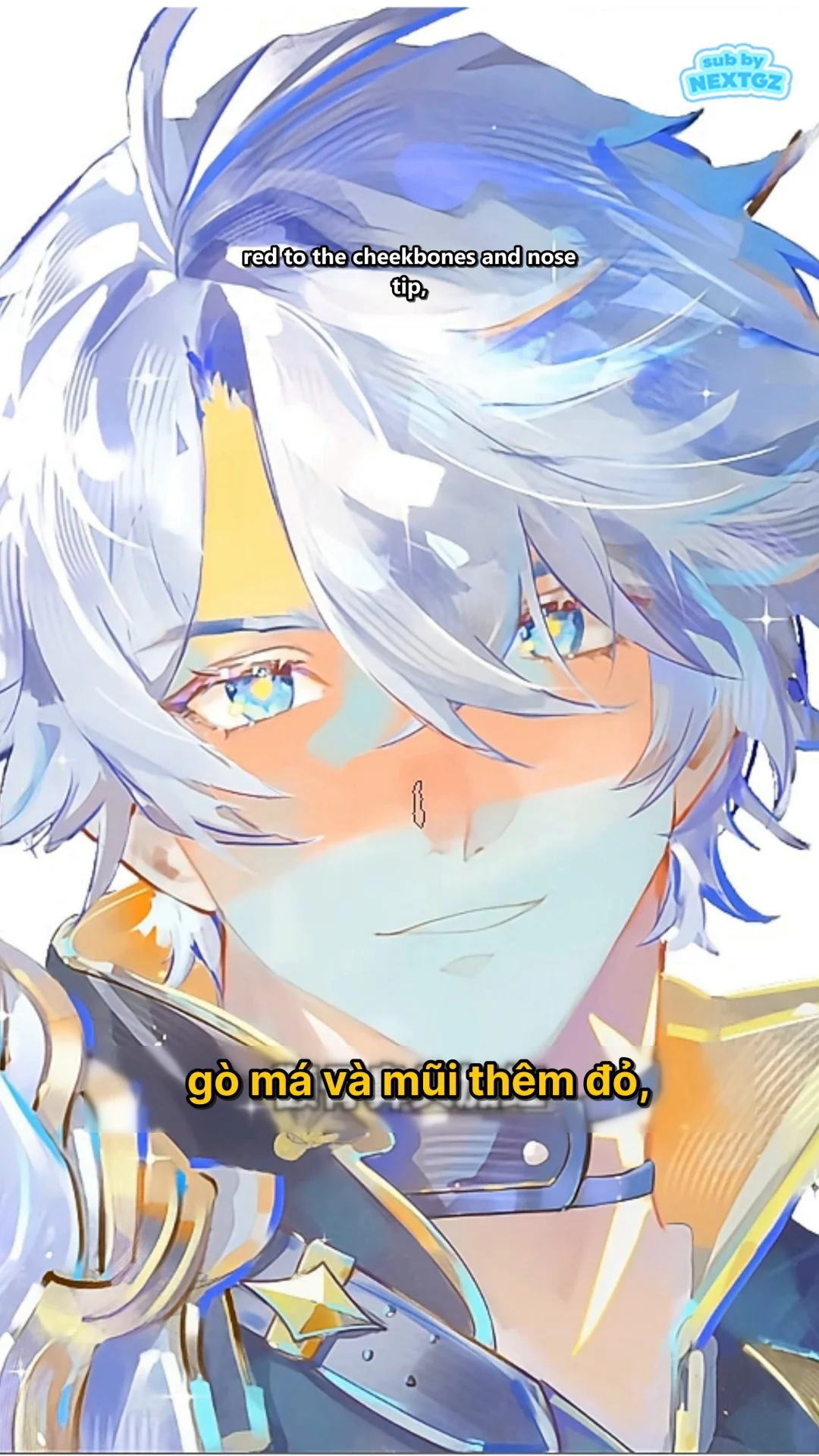
After the cool tone, the video applies a red-orange color to the cheekbones and nose. This step creates a sense of vitality, preventing the face from looking pale and balancing out the blue in the eye sockets.
Areas to Paint
- The top of the cheekbones, prioritizing the part near the eyes but not directly touching the lower eyelid.
- Both sides of the nose wings and the tip of the nose.
- A very small amount can spread toward the middle of the cheek to connect the color areas.
Don't turn this step into applying blush. In a natural anime drawing, the red needs to blend into the facial structure. Use broad brush strokes, light pressure, and avoid creating a clear, circular boundary around the cheekbones.
Step 4: Add Yellow to the Chin and Lower Part of the Face
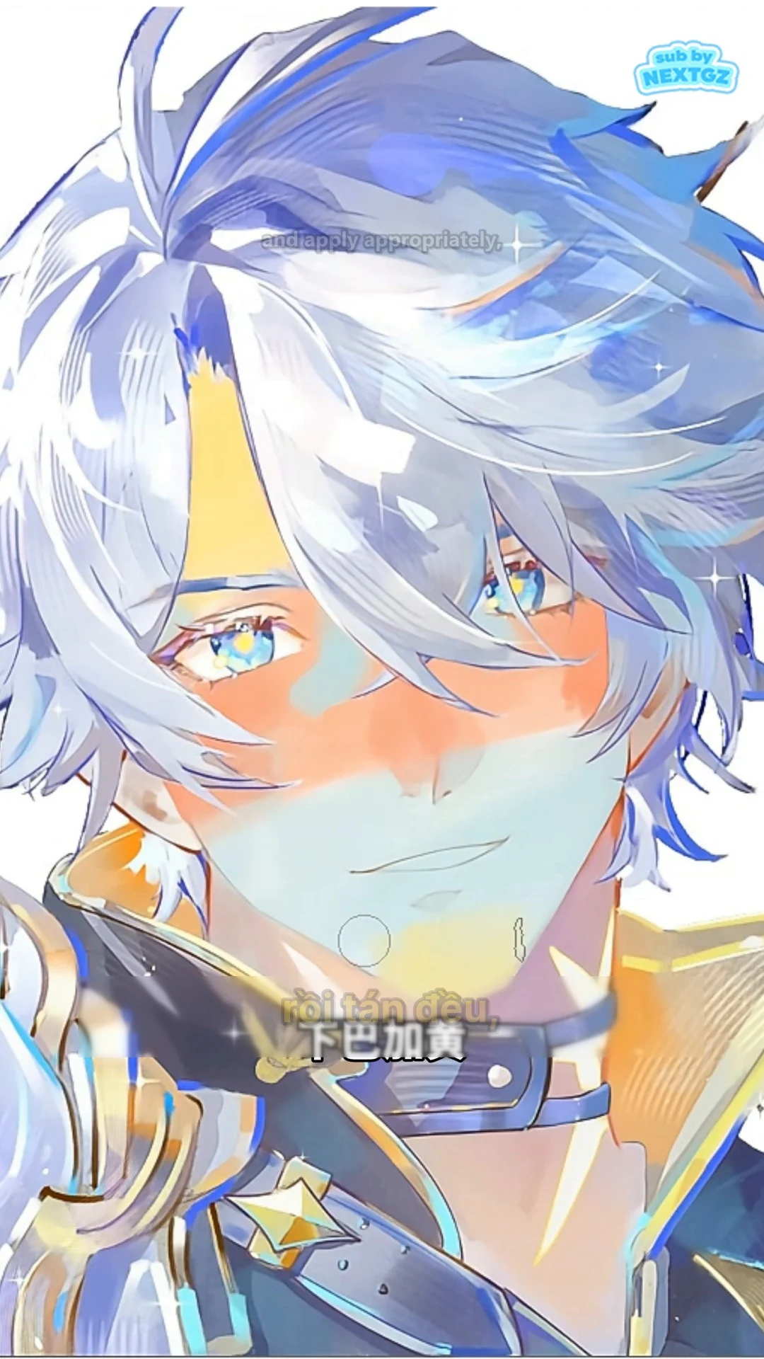
The video then places a pale yellow layer on the chin area. Yellow helps transition between the warm cheek area and the neck, while also making the skin look clearer and brighter.
How to Handle the Yellow Area
- Focus the color in the center of the chin and lightly spread it toward the jawline.
- Keep the yellow close to the base color; avoid lemon yellow or overly saturated yellow.
- Blend softly upward toward the lower lip to avoid creating a separate patch.
- Compare with the neck area so the chin doesn't appear unusually bright or warm.
In the video's color composition, blue creates depth, red creates vitality, and yellow maintains balance and softens transitions.
Step 5: Reduce Opacity to Blend the Colors into the Skin
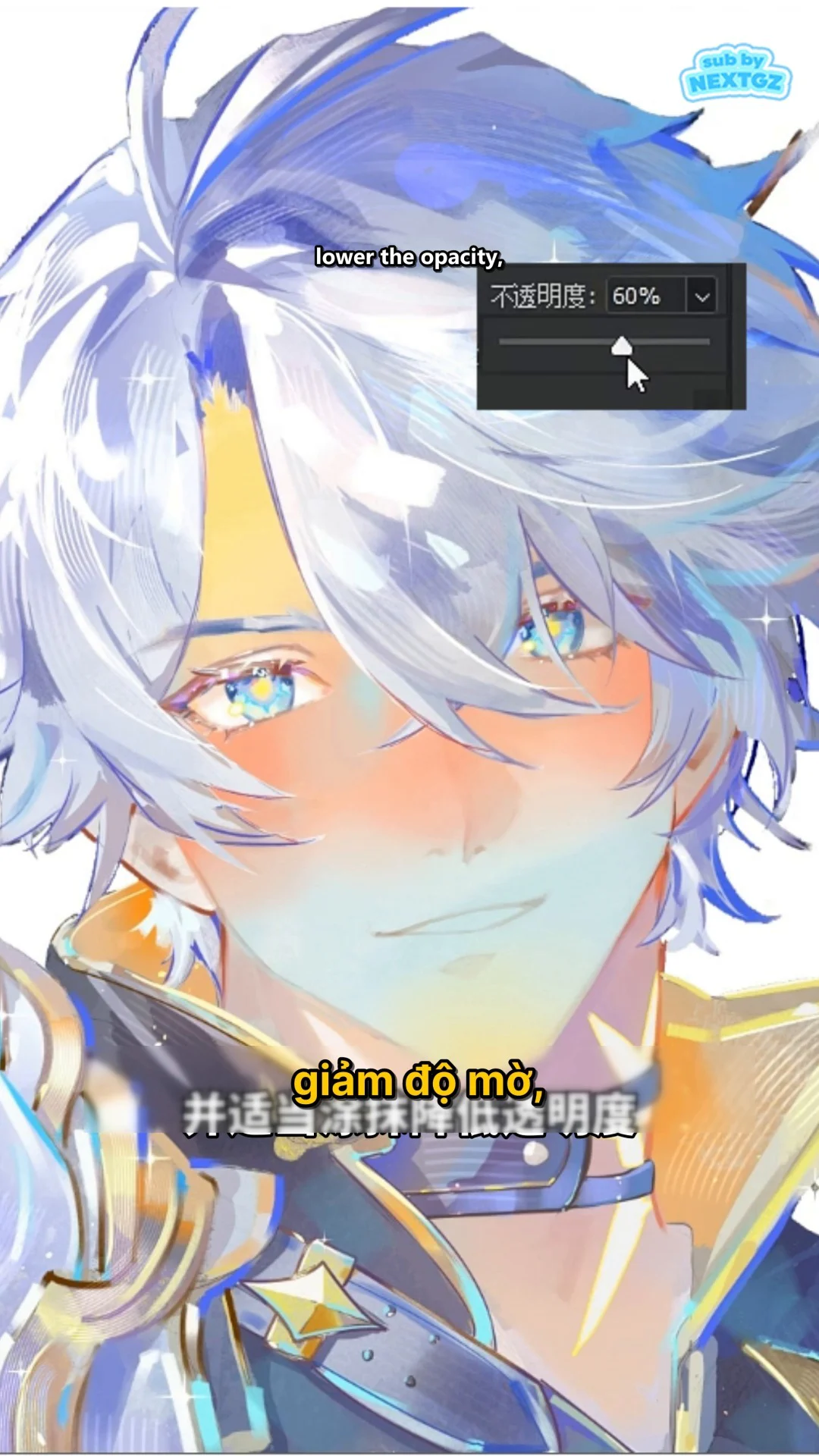
After placing all three color groups, the video reduces the layer opacity. This step is crucial because the initial color patches were intentionally painted quite clearly to make positioning easy to control.
There is no fixed opacity number for every painting. Reduce it gradually until:
- The blue no longer looks like bruises.
- The red no longer looks like separate makeup.
- The yellow doesn't make the chin look dull or discolored.
- The face still retains warm-cool variation when viewed at a small size.
A useful check is to toggle the layer on and off. If turning it off makes the skin look flat and pale, but turning it on doesn't reveal distinct blue-red-yellow patches, the blending level is close to ideal.
Step 6: Refine Boundaries, Saturation, and Highlights
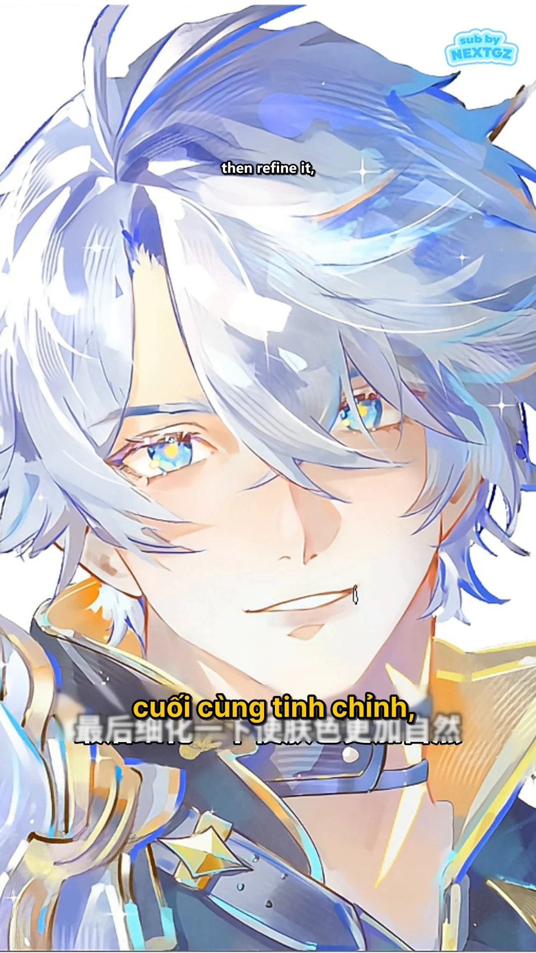
In the final part, the video continues refining to make the skin more natural. Instead of just blurring everything, check each area and preserve the color shifts that are useful for the facial structure.
Refinement Checklist
- Eye sockets: keep cooler than the cheek area, but not excessively dark.
- Cheekbones: keep warmth in the highlight areas or areas with natural skin flush.
- Nose: the tip can be warmer than the bridge to create a soft feel.
- Chin: the yellow tone is only a transitional layer, not a main color patch.
- Color edges: blend softly on flat skin areas, but can be kept sharper near shadows or structural lines.
- Light and dark values: colors must not disrupt the existing light-shadow structure.
If the painting looks "muddy," the cause is usually not using too many colors, but that the additional colors are too saturated, the layer is too heavy, or the color areas overlap without enough control.
--- ---Result: bright skin with depth while retaining the anime feel
The final result in the video shows the face is still bright and clean, but the eye area is deeper, the cheekbones and nose have vitality, and the chin has a soft color transition. This is a way of using color temperature to create a natural skin feel without rendering too many pore or texture details.
Quick practice formula for beginners
- Complete a bright and clean base skin.
- Create a new layer, clip it to the skin area.
- Add light blue at the eyebrows and eye sockets.
- Add a light reddish-orange at the cheekbones and tip of the nose.
- Add light yellow at the chin.
- Softly blend the edges.
- Reduce the layer opacity until the color blends into the base.
- Fine-tune the light and shadow masses and facial highlights.
Common mistakes and how to fix them
Blue makes the face look bruised
Reduce saturation, increase the brightness of the blue, or narrow the painted area to exactly the eye sockets. Avoid dragging the blue too far down onto the cheeks.
Red looks like blush
Switch to a reddish-orange closer to the skin tone, use a larger brush, and blend the color along the cheekbone mass instead of creating two symmetrical circles.
Skin looks gray or dirty
Check if the three colors are overlapping too much. You can erase some with a soft eraser, then reduce the overall layer opacity.
After lowering opacity, there's almost no effect left
Instead of increasing the whole layer again, gently add to each key area: eye sockets, cheekbones, tip of the nose, and chin. This method preserves clarity better.
Conclusion
The technique in the video can be summarized by one principle: don't look for a perfect skin tone; build the skin with intentional color temperature changes. Blue creates depth, red creates vitality, yellow creates transitions. When the colors are softly blended and opacity is properly reduced, the character will look more natural while still maintaining the bright, clean, and expressive anime style.
---






Bình luận
0 bình luận
Đăng nhập để tham gia thảo luận cùng cộng đồng!
Đăng nhập ngayĐang tải bình luận...