 Digital Painting








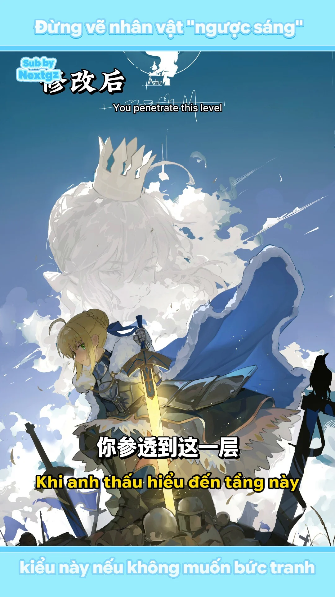
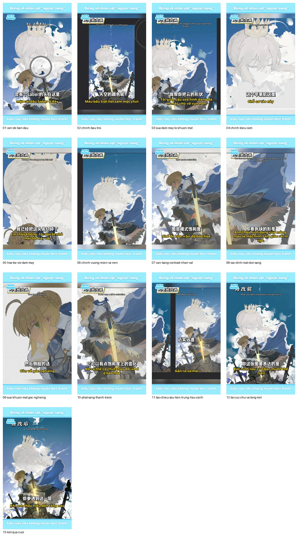
A backlit character doesn't mean the entire character has to be crushed into a solid dark mass. This video, over six minutes long, is a very comprehensive editing showcase: starting with the sky, cloud shapes, and the large portrait in the background; continuing with adjustments to the expression, facial anatomy, lines, and contrast of the foreground character; then reconstructing the light-facing areas, the sword's glow, the depth of foreground, midground, and background, and finally the text composition.
According to the transcript provided by the user, the character is called Saber or the King of Knights. The following article does not transcribe the dialogue second-by-second but instead converts the entire video content into a practical editing workflow. Terms that are unclear in the transcript are interpreted based on painting context: "phím" is understood as the main light source, "vẽ chia hai" is understood as a two-tone shading method close to cel shading, and the operation of selecting white areas is described by its function rather than guessing software shortcuts.
Overall diagnosis before editing
The painting has a good concept: a bright sky background, the main subject in the foreground backlit, a large portrait blending into the clouds behind, a glowing sword near the central axis, and the upper portion left empty for text. The problem isn't a lack of detail, but rather that the components don't yet serve a unified emotion and lighting system.
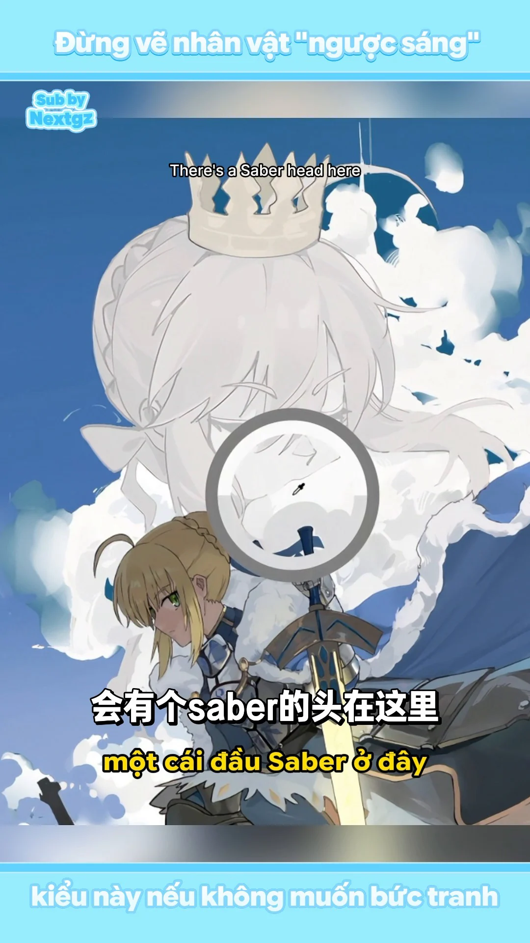
The video identifies six main groups of issues. First, the blue sky and white clouds are too gentle compared to the melancholic mood the artist wants to convey. Second, the cloud covers the large portrait's mouth, losing the expression and creating a humorous feeling like it's "eating clouds." Third, the line art and dark areas of the foreground character are too black, causing many details to fuse into a single mass. Fourth, the light-receiving areas on the dress, cloak, and armor haven't been defined with form; the light is mostly airbrushed softly, failing to create volume. Fifth, distant objects are still too clear and too dark, weakening atmospheric depth. Sixth, the three-quarter view face of the foreground character has errors in the forehead protrusion, nose placement, and ear size.
Step 1: Redefine the lighting story and emotion
Before adjusting colors, answer three questions: what feeling should the painting evoke in the viewer, where is the main light source located, and where should the first point of focus be? In this case, the reasonable answers are: a feeling of desolation or contemplation; the sky and clouds are the large background light source; the sword is a localized warm light source in the foreground; the character's face and the sword's highlight are the two priority points.
This step is crucial because a clear blue sky with fluffy white clouds usually evokes lightness and openness. If melancholy is desired, it could be changed to a cold sunset, overcast sky, or pre-storm atmosphere. The video doesn't replace the entire background but keeps the blue sky, then reduces its cheerfulness by graying out the two ends of the sky gradient, increasing saturation in a controlled way in the middle, and making the cloud shapes more fragmented.
Step 2: Rebuild the sky with intentional gradient
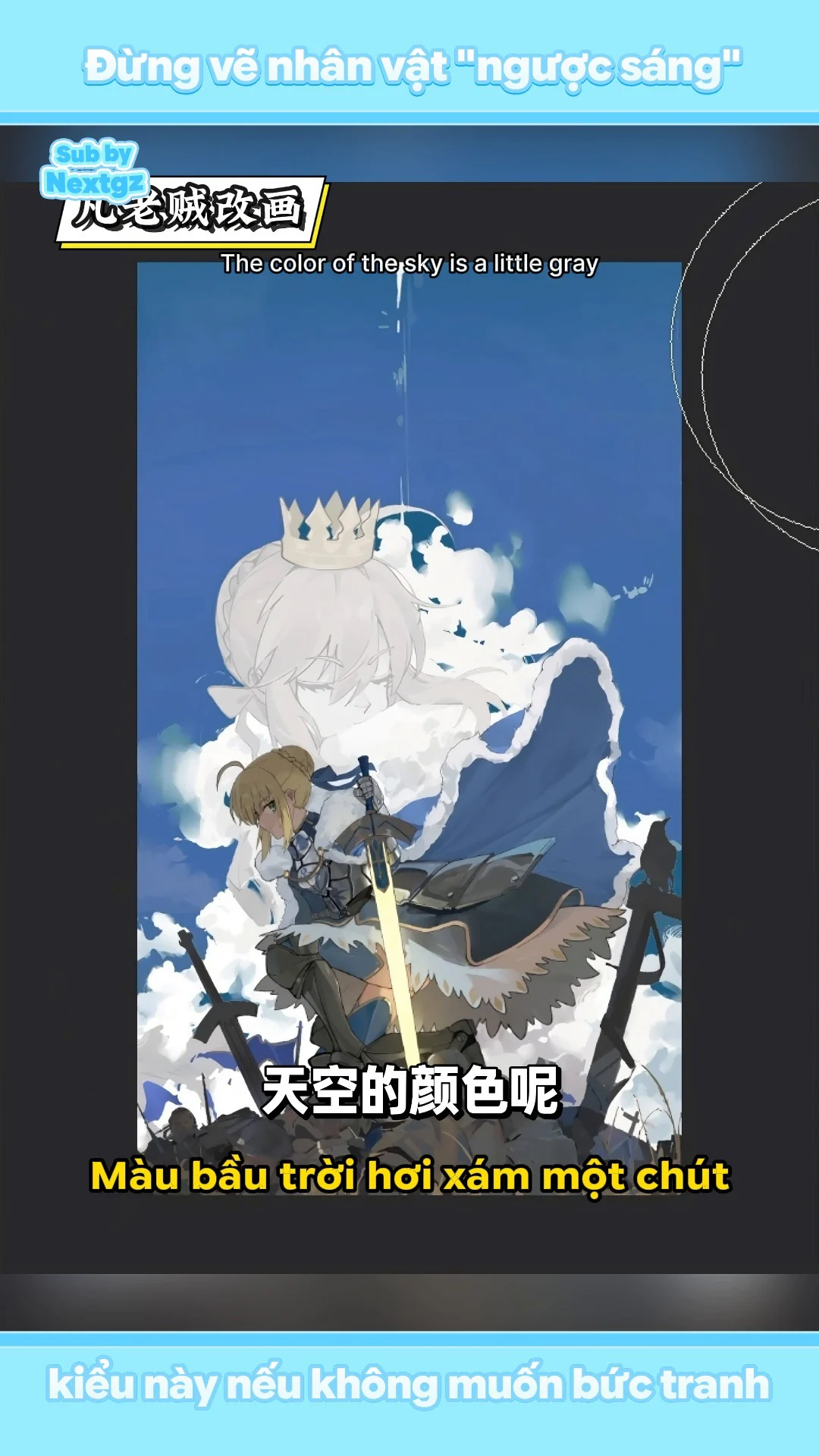
The video uses a large brush to sweep horizontally, creating a gradient. The middle area retains a clearer blue; the top is grayer and deeper; the bottom is lighter, more washed-out white due to proximity to clouds and light areas. This way, the sky still has color but is no longer flat.
In practice, separate the sky background onto its own layer. Use a large soft brush with low opacity and sweep horizontally to avoid creating vertical streaks that compete with the character. Don't just pull the Saturation slider down across the whole sky, as that makes it look dead. Change three elements simultaneously: value, saturation, and temperature. The part near the light source can be bright and slightly cool; the top area is darker, grayer; a cleaner color band in the middle prevents the background from becoming muddy gray.
After finishing, shrink the image to about 10–15% of its size. If the sky still reads as a single flat mass, the gradient isn't sufficient. If it splits into several distinct bands, the gradient is too harsh and needs softening.
Step 3: Adjust cloud shapes for the right mood and free the face
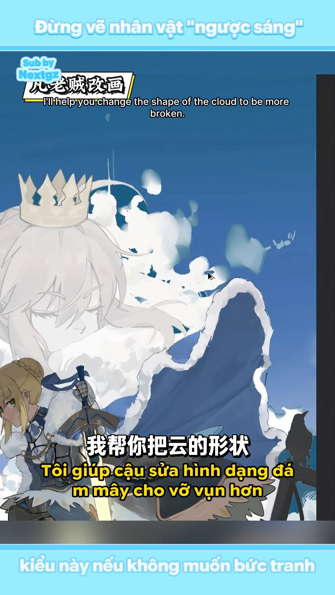
The original clouds had many round, bright, soft masses. This visual language suits cute or peaceful illustrations but not a desolate state. The video transforms the cloud edges into more fragmented, broken, uneven rhythms. Large masses are kept so the viewer can still read them as clouds, but the outer edges feature many gaps, streaks, and small details.
A more critical issue is the cloud covering the large portrait's mouth. The mouth is a strong emotional indicator; when covered, the face loses information. The cheek appeared slightly puffed, making the overall look resemble a character with their mouth full or eating clouds. The fix involves pushing the clouds in another direction, revealing the mouth line and the lower part of the nose, while designing the cloud boundary so the character still feels immersed in the clouds rather than cut off from them.
A principle applicable to any painting is: covering objects must enhance meaning, not accidentally obscure the exact part conveying emotion. If you want to cover the face for mystery, do it with intention and retain at least one emotional signal like the eyes, mouth, or head tilt.
Step 4: Adjust expression from cute to contemplative
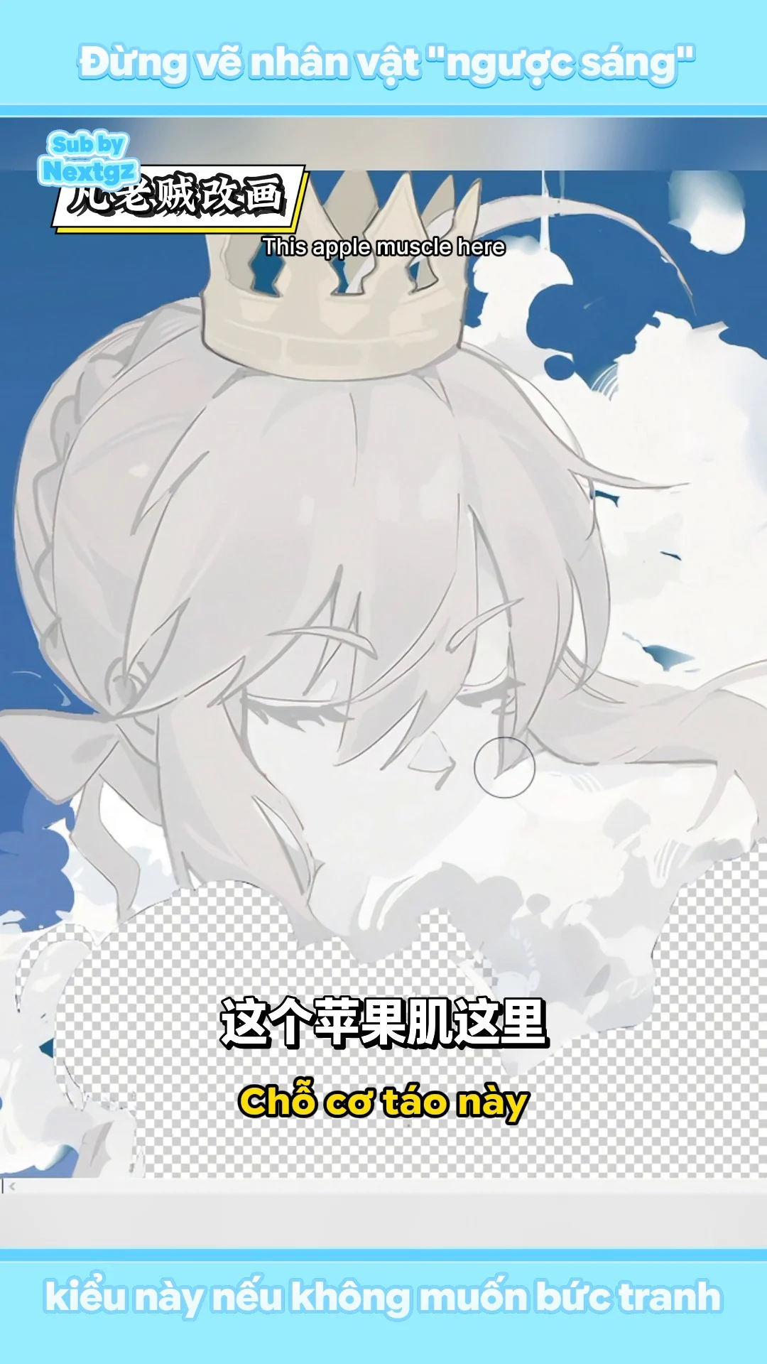
The video doesn't make the face dramatically sad. Instead, the artist adjusts the cheek area to reduce the puffy feeling, slightly pushes the brow bone structure, and furrows the eyebrows by a very small amount. The narration describes the frown as only about "2%": it still looks calm at a glance, but upon longer observation, a slight tension appears.
This is a good lesson in subtle expression. When drawing melancholy, you don't necessarily have to pull the eyebrows down sharply or draw tears. Simply changing the relationship between three elements suffices: eyebrow curve, eye opening, and mouth corner direction. If the cheeks are puffy, the mouth corners are short, and the eyebrows are too relaxed, the face will look childish. For a more mature look, tighten the cheek mass, make the eyebrows less curved, and create a slight compression around the eye socket.
Step 5: Unify hair, face, and clouds with the same edge language

The large portrait initially had quite clean lines, whereas the clouds were soft and diffused. These two different visual languages made the character look like a layer of line art placed on top of clouds. The video handles this by breaking down some hair strands into smaller parts, adding flyaway hairs by the cheek, breaking up some outlines, and guiding the hair shape in the direction of the cloud movement.
The goal isn't to blur every edge. The video emphasizes the state of being "both sharp and slightly blurred," but the blur isn't a Gaussian blur. This is the lost-and-found edge technique: some edges are kept sharp to define structure, some edges disappear by blending into light areas, and some edges are replaced with fragmented brush strokes. This makes the character's head feel larger, lighter, and truly embedded within the clouds.
In practice, select the brightest white area of the cloud to allow some light to spill over onto the hair or cheek. Then redraw some outlines with a textured brush, avoiding overly clean lines. Don't erase edges uniformly around the entire head; prioritize losing edges on the side near the bright clouds and keeping edges where the form needs to be readable.
Step 6: Adjust the crown and major directional lines
In the original, the crown didn't tilt enough according to the head angle, making it feel placed flat against the picture plane. The video adjusts its tilt to align with the head's axis and the flow of the clouds. This is a small detail but has a significant impact because the crown is in the upper area, has a clear silhouette, and easily reveals perspective errors.
Additionally, the directional lines of the clouds, hair, and cloak are guided towards the same flow. When multiple objects move in the same direction, the composition becomes cohesive. If the hair flows left, the clouds swirl right, and the cloak falls straight, the painting becomes divided by competing movements.
--- ---Step 7: Unblock dark areas and reduce overly black line art
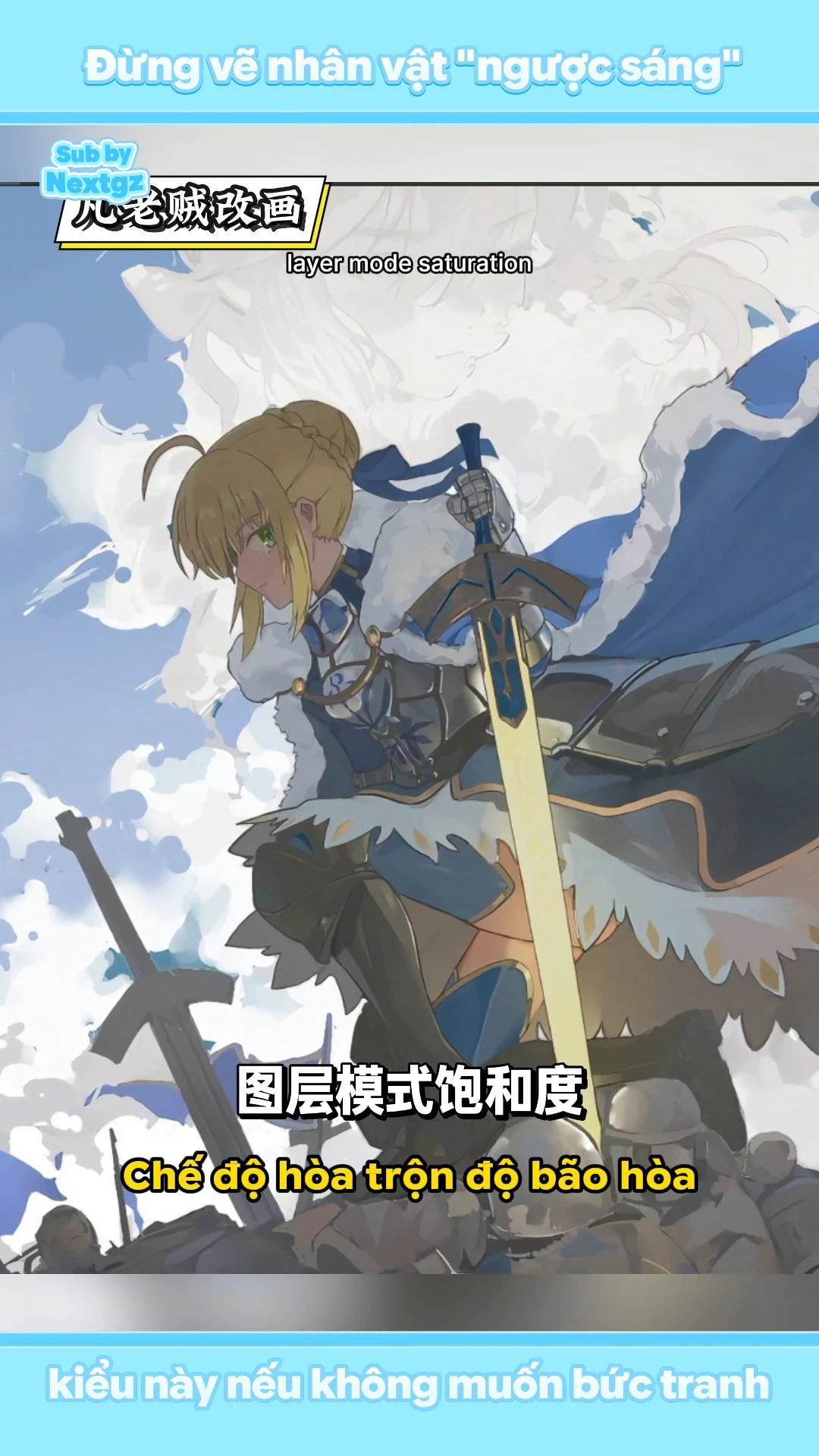
The foreground character is backlit, but the shadow areas should not completely lose their color. The video duplicates the layer, uses Curves to lift the shadows, then adds a saturation adjustment layer. The goal is to recover information in the armor, skirt, and cloak without making the character uniformly bright.
The lines near the sword and the armor gaps are also too black. The fix is to reduce black lines to dark blue-green, cool brown, or colors close to the object. However, the video does not remove all dark spots. The darkest areas still need to be kept in armor gaps, overlapping areas, contact points, and places where the form is hard to distinguish. This is "selective darkness": not using black to outline everything, only using it where the structure truly needs to be locked in.
An effective test is to convert the painting to grayscale. If the entire character's body becomes a black mass, the shadows are blocked. If after lifting Curves every surface is equally gray, you have lifted too much. You need to maintain value separation between armor, fabric, fur, and skin.
Step 8: Define light-facing planes using shapes, not generic airbrushing
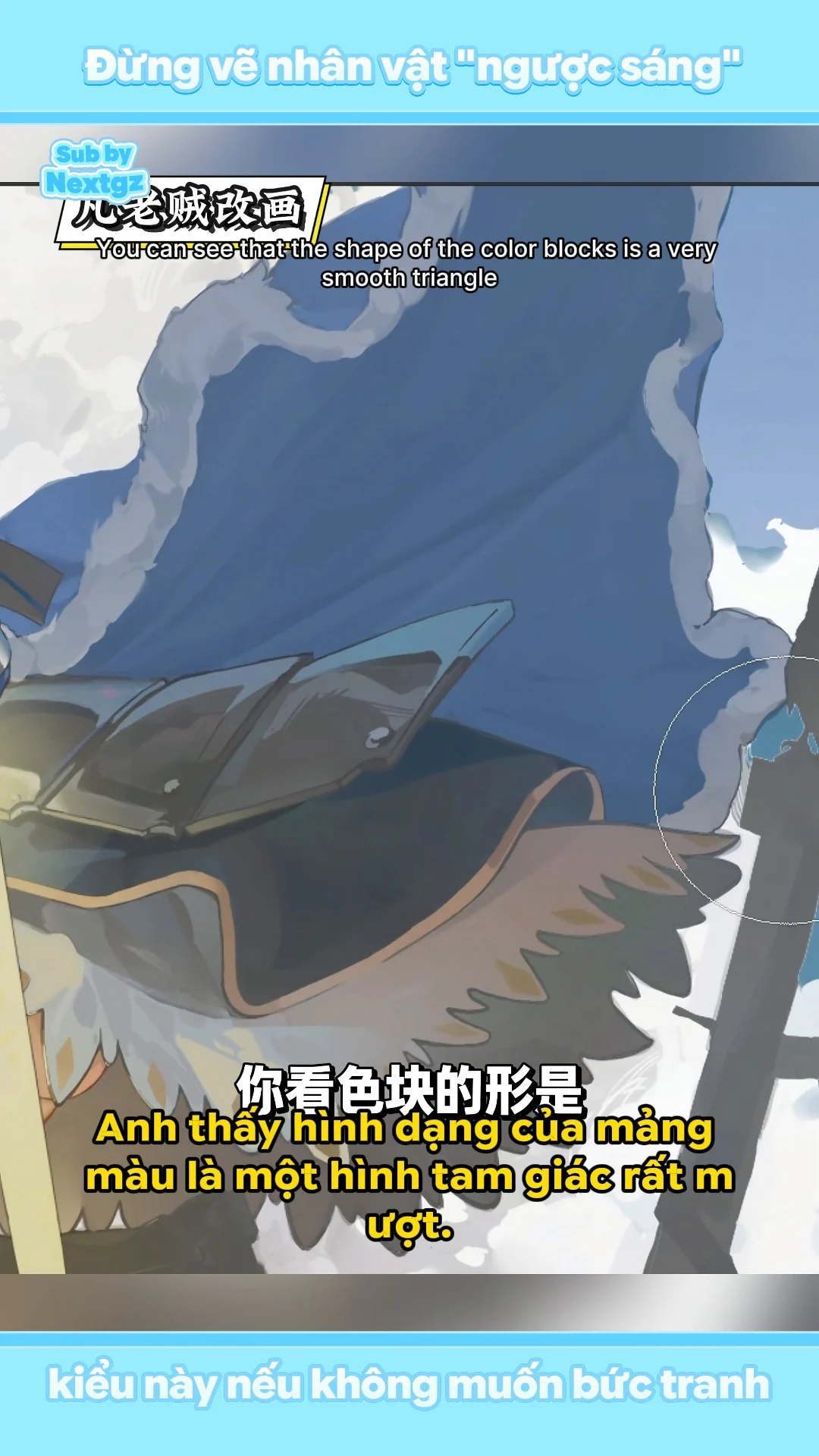
This is the most important technical part of the video. On the skirt and cloak, the side facing the main light source must be bright; the side facing away must be dark. The original used an airbrush to spray a soft light area, but this method doesn't tell the viewer which direction the surface is tilting.
The video rebuilds the light patches into triangles or wedge shapes that follow the fabric folds. The shadow color does not use black but chooses blue, because the sword emits warm light. The contrast between blue shadows and warm light feels more pleasant and also makes the sword pop.
The practical process consists of three passes. First pass: use a hard brush to draw the boundary between the light-facing and shadow-facing planes. Second pass: add small dark patches in fold crevices to restore depth lost when lifting the base. Third pass: use a very soft brush to blend some transitions, but do not erase the main shapes. If after blending the light patch no longer has a direction, go back to the hard brush.
The metallic armor on the light-receiving side also needs to brighten. Metal reacts to light more strongly than fabric, so you can use sharp edges, small highlights, and rapid value changes. The cloak with overlapping layers should not receive uniform light; where the fabric changes direction, there must be a light-dark shift.
Step 9: Fix facial anatomy in profile view
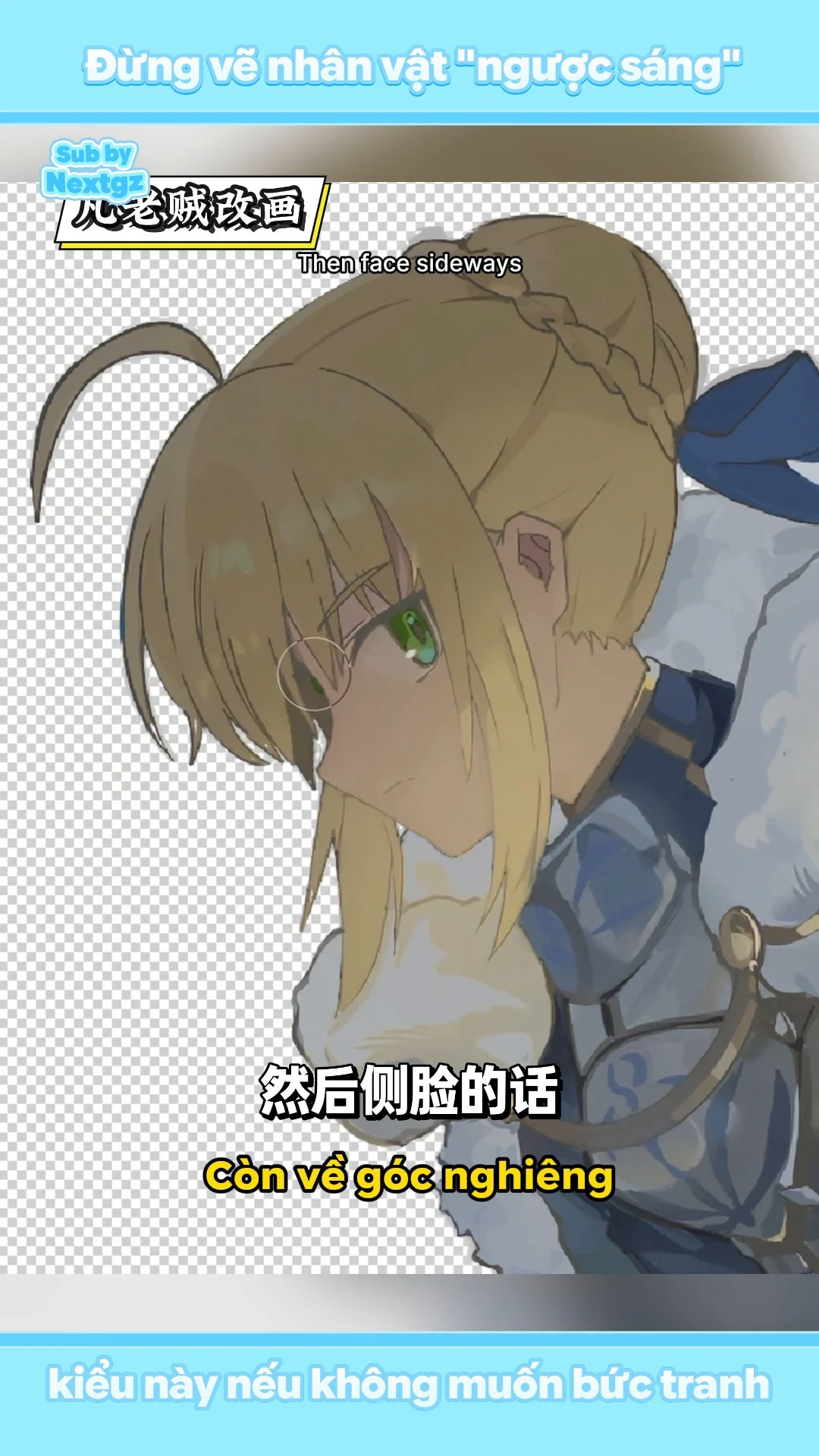
The video points out that the tip of the nose is placed too high, nearly level with the lower eyelid; the forehead is not pushed forward; the ears are too small relative to the pupil; the entire face risks looking flat. When drawing an anime profile, you can stylize but still need to maintain the logic of the skull volume.
Check the silhouette in this order: slight forehead protrusion, bridge of the nose changes direction, nose tip has protrusion, lips are set back from the nose tip, chin provides a clear endpoint. The ears usually lie between the eyebrow line and the base of the nose, depending on the angle. If the ears are much smaller than the eyes, the head will lose proportion.
The video uses a humorous comparison with a cartoon character's protruding nose to emphasize that a profile needs depth. The main point is not to draw a very long nose, but to avoid having the forehead, nose, lips, and chin nearly on a single vertical line.
Step 10: Make the sword glow using multiple layers
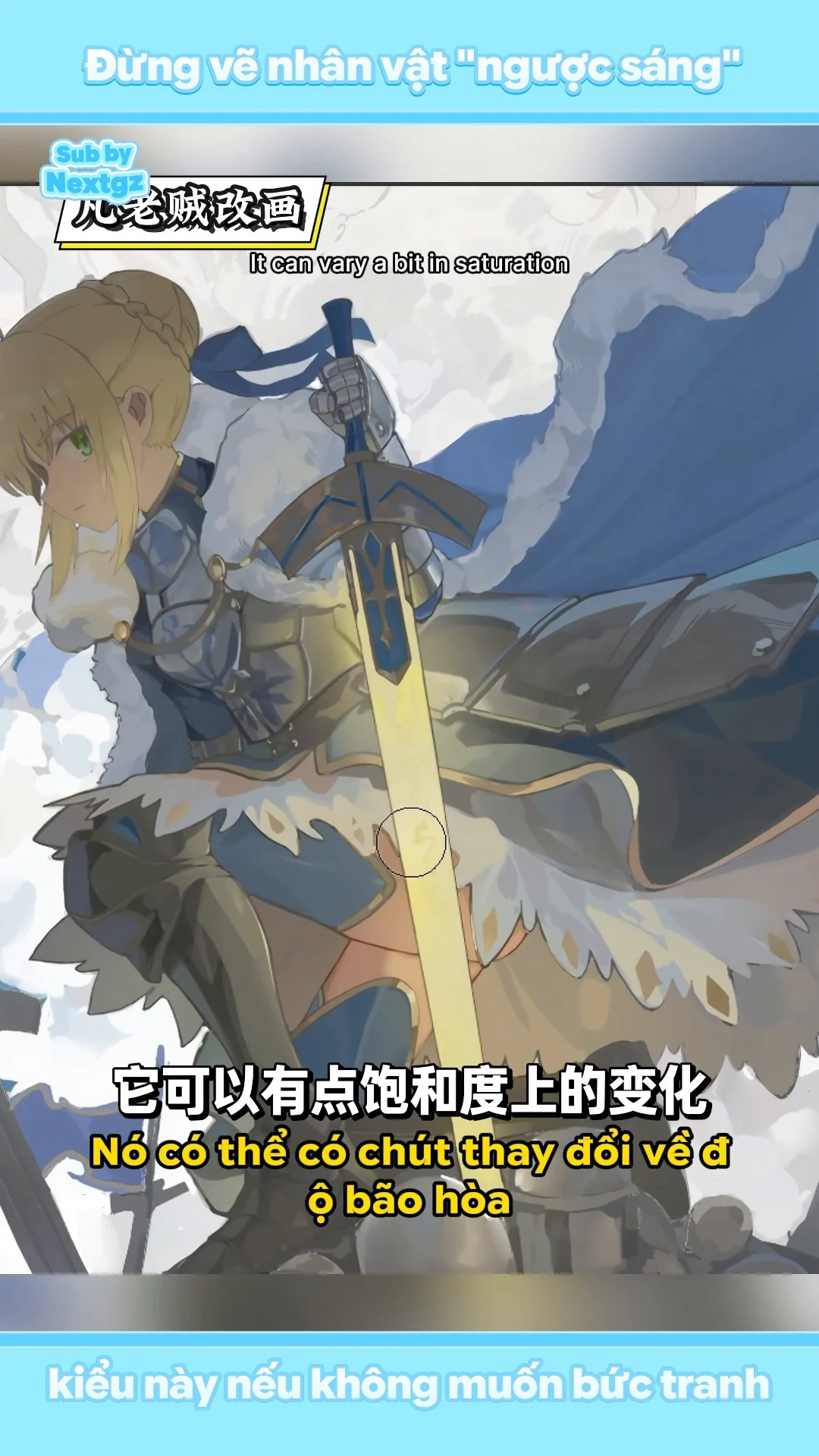
The sword initially had a fairly uniform color. The video adds changes in value and saturation to give the light depth. A convincing light source usually has at least three layers: a near-white core, a saturated yellow or orange body, and a soft halo spreading outward.
The halo is only meaningful when the environment reacts to it. Therefore, the video adds yellow light onto the armor, skirt, fur edges, and surfaces near the sword. Intensity decreases with distance and is interrupted by obstructions. Do not spray yellow uniformly over the entire character; determine which surfaces are turned toward the sword.
The cloak has translucent areas and many overlapping layers. Where the fabric is thin or where the fabric edge is near the light source, it can be brighter; areas covered by another layer must be darker. This unevenness creates a sense of material and thickness.
Step 11: Create depth using the principle of near-clear, far-blurred
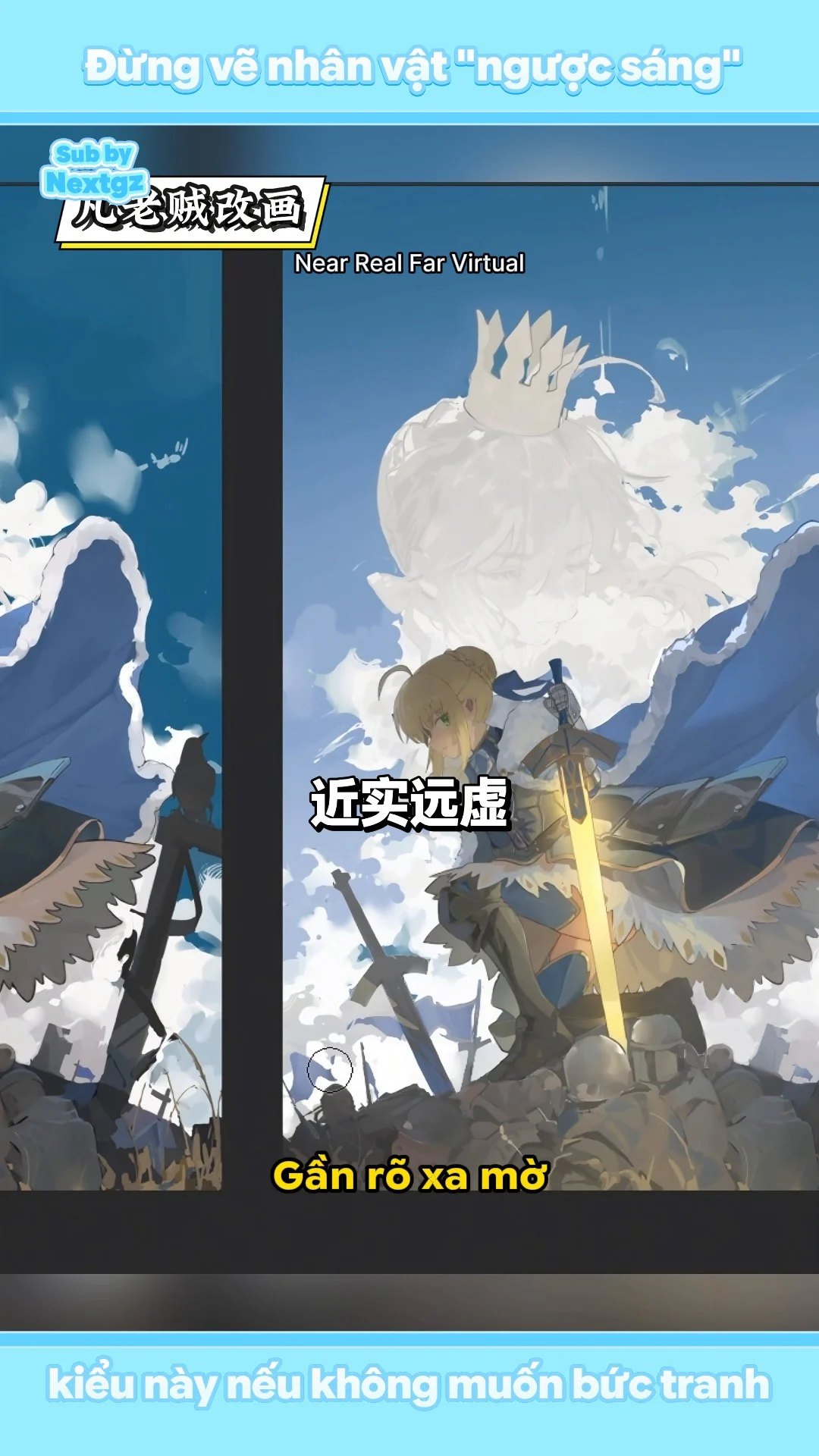
The foreground on both sides is darkened to create a frame, but the area near the sword remains bright due to the light. The upper part of the foreground can be darker, the lower part lighter depending on light and atmospheric dust. The flags, soldiers, and distant objects are tinted with the sky color to push them back.
Three elements create atmospheric perspective: reduce contrast, reduce sharpness, and shift color toward the environment color. Blurring the background alone is not enough. If a distant flag remains absolute black, it will jump forward even if blurred. Use the gray-blue of the sky, lift shadows, and reduce saturation.
The video also reduces the contrast of the sky and lowers brightness in some edge areas, then uses bright clouds to create opposition. As a result, the clouds are no longer a uniform white patch but become a deliberately placed bright area next to a dark background.
Step 12: Concentrate dark points on important structural locations
After lightening the line art and shadows, the painting risks lacking impact. The video restores dark points in closed crevices, armor overlaps, deep fabric folds, and places where two shapes have similar values. This uses occlusion shadows to lock in structure.
Do not scatter dark points evenly across the painting. If every outline is strong, the viewer's eye won't know where the focus is. Prioritize areas near the face, the sword hilt, strong light boundaries, and key intersection points. Distant details or those in clouds can use lighter lines.
Step 13: Text composition must go with the image, not just place a single line of text
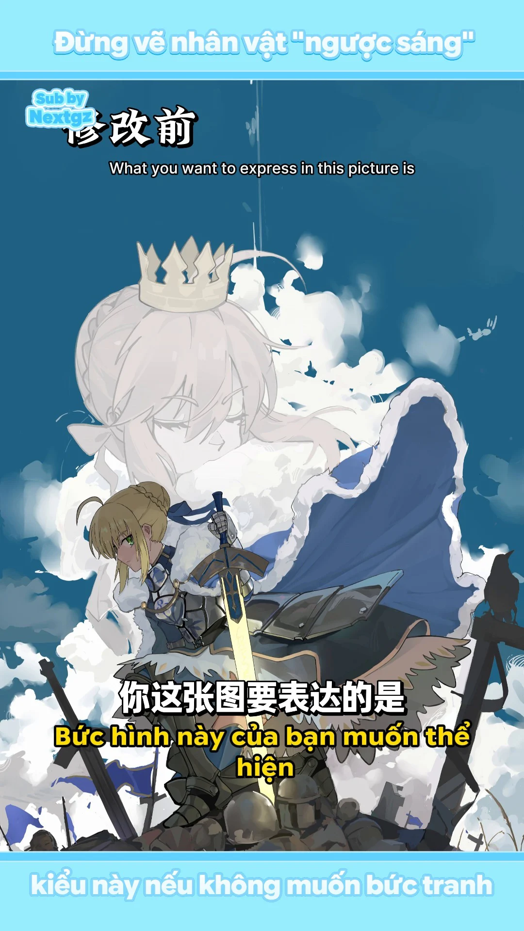
From the beginning, the artist wanted to keep the upper half empty for adding text. The video suggests not just typing a single line of text but combining the text with a small image or symbol, creating a primary-secondary cluster. Large text handles the theme; a secondary image or decorative stroke helps the text blend into the painting's style.
Empty space is not an "unpainted" area. It is a compositional element. Before adding text, check whether the silhouette of the crown, clouds, and character's head intrudes into the text area. Maintain breathing room around the text and avoid placing text over areas with many fragmented edges.
Core principle: backlighting does not mean losing all information in the shadows
The video's summary offers a principle worth remembering. The painting has a bright background, the character is in the middle of darkness, and yet light still filters in from the sword and the environment. The strongest contrast should be at the boundary between strong light and shadow, not in every crevice inside the dark area.
To protect the focal point, sometimes you must actively sacrifice contrast within the shadows. Small crevices inside the dark area can have close values; in return, the light edge along the character, the sword's rim, and the face area will have stronger contrast. If you keep every armor gap absolute black, the eye will be drawn to fragmented details instead of the main light boundary.
Think of the contrast hierarchy in three tiers. Tier one is the focal point: the face, the sword, and the most important light-dark boundaries. Tier two is the main structure of the armor, skirt, and cloak. Tier three is the background, distant clouds, flags, and minor details. Each subsequent tier needs to reduce contrast and sharpness compared to the previous tier.
--- ---Suggested layer workflow to reapply the lesson
- Sky group: color gradient, gray-out layer, and atmospheric layer.
- Cloud group: large blocks, chunky edges, brightest areas, and texture.
- Large portrait: base, expression, hair, edge integration, and cloud overlay.
- Foreground character: line or paint, base color, large shadow, light-facing area, and sword rim light.
- Sword: bright core, colored body, glow halo, and small sparkles.
- Foreground – midground – background: separate to easily reduce contrast and shift atmospheric color.
- Adjustment: Curves, Hue/Saturation, or Color Balance with localized masks.
- Typography: independent text and supplemental graphic group, placed after the image layout is stable.
No need to use the exact blend mode names from the video. What matters is understanding the purpose: Curves to open up dark areas, Saturation to restore color, glow layers to create halos, and environmental color layers to push objects further away.
Common mistakes when painting backlit scenes
Turning the character into a completely black silhouette
A black silhouette is only suitable when the graphic intent requires flat shapes. For illustrations with armor, fabric, and faces, shadows still need color and value variation to read the materials.
Using airbrush instead of structure
Airbrush softens transitions but doesn't define planes. Build light patches with a hard brush first, then soften some parts.
Glow not affecting the environment
A glowing object that doesn't cast light onto nearby surfaces looks like a yellow patch pasted onto the painting. Rim light needs direction, distance, and should be influenced by obstacles.
Background still using black and sharp edges
Distant objects must receive atmospheric color. Reduce contrast, sharpness, and saturation to push them back.
Obscuring important expressive features
Clouds, hair, or props can cover the face, but the cover must be intentional. Don't accidentally hide the mouth or eyes, turning the emotion into something comical.
Line art equally strong everywhere
Lines need hierarchy. Focus areas and important structural crevices can be dark; areas merging into light or clouds should be light, broken, or absent.
Checklist before finalizing
- Does the mood of the sky and clouds align with the character's expression?
- Are the mouth, eyes, and eyebrows clear enough to read the emotion?
- Can you still see color and material in the character's dark areas, or are they blocked up?
- Are the light-receiving surfaces on the skirt, armor, and cloak clearly shaped?
- Does the sword have a bright core, glow, and rim light cast onto the environment?
- Have distant objects been tinted with sky color and reduced in contrast?
- Are the darkest points concentrated in structural crevices and focal areas, or are they spread evenly?
- Is the space reserved for text truly clean and readable?
- When the image is shrunk down, do the face and sword remain the main focal points?
Result after editing
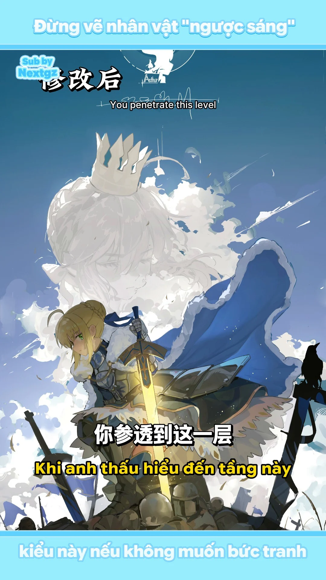
After editing, the sky retains its blue hue but feels more atmospheric; the clouds are less round and soft, creating a stronger rhythm; the large face reveals the mouth, with a more contemplative and mature expression; the hair and edges blend into the clouds; the foreground character's shadows are opened up while still maintaining the backlit feel; the light-receiving surfaces on the costume have structure; the sword glows and casts color onto the body; foreground, midground, and background are more clearly separated.
The biggest lesson from the video is not a specific Curves trick or a particular blend mode. The core is knowing how to distribute information: where to brighten, where to darken, where to sharpen, where to lose edges, and where to sacrifice detail so that the main light boundary becomes stronger. When you achieve that, backlit paintings will have depth and emotion instead of just being a dark character placed against a bright background.





Bình luận
0 bình luận
Đăng nhập để tham gia thảo luận cùng cộng đồng!
Đăng nhập ngayĐang tải bình luận...