 Digital Painting








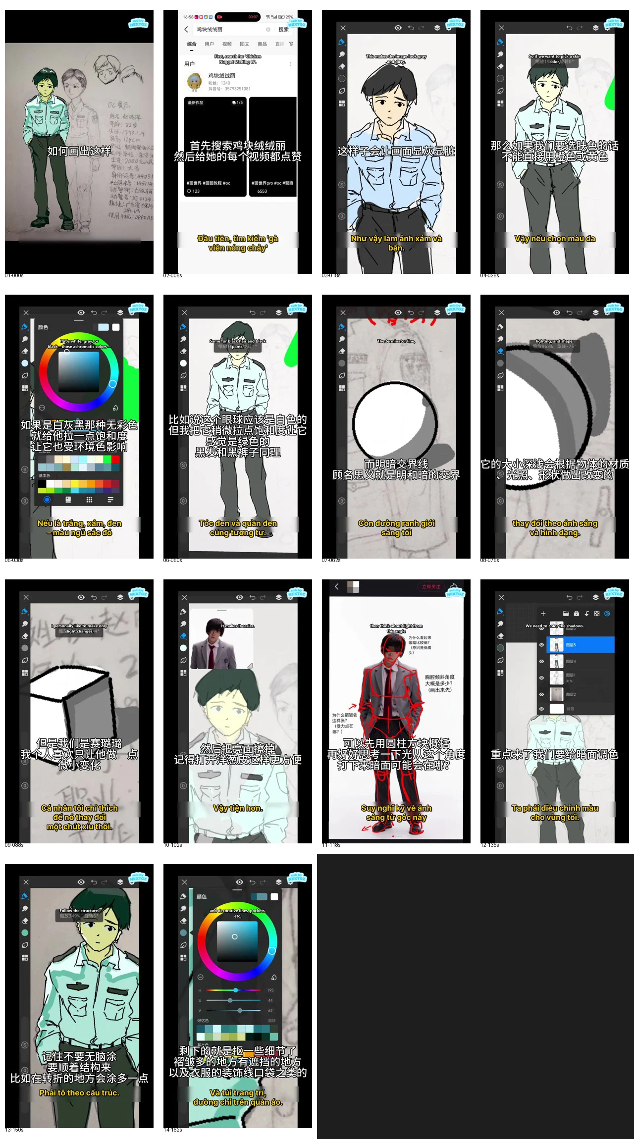
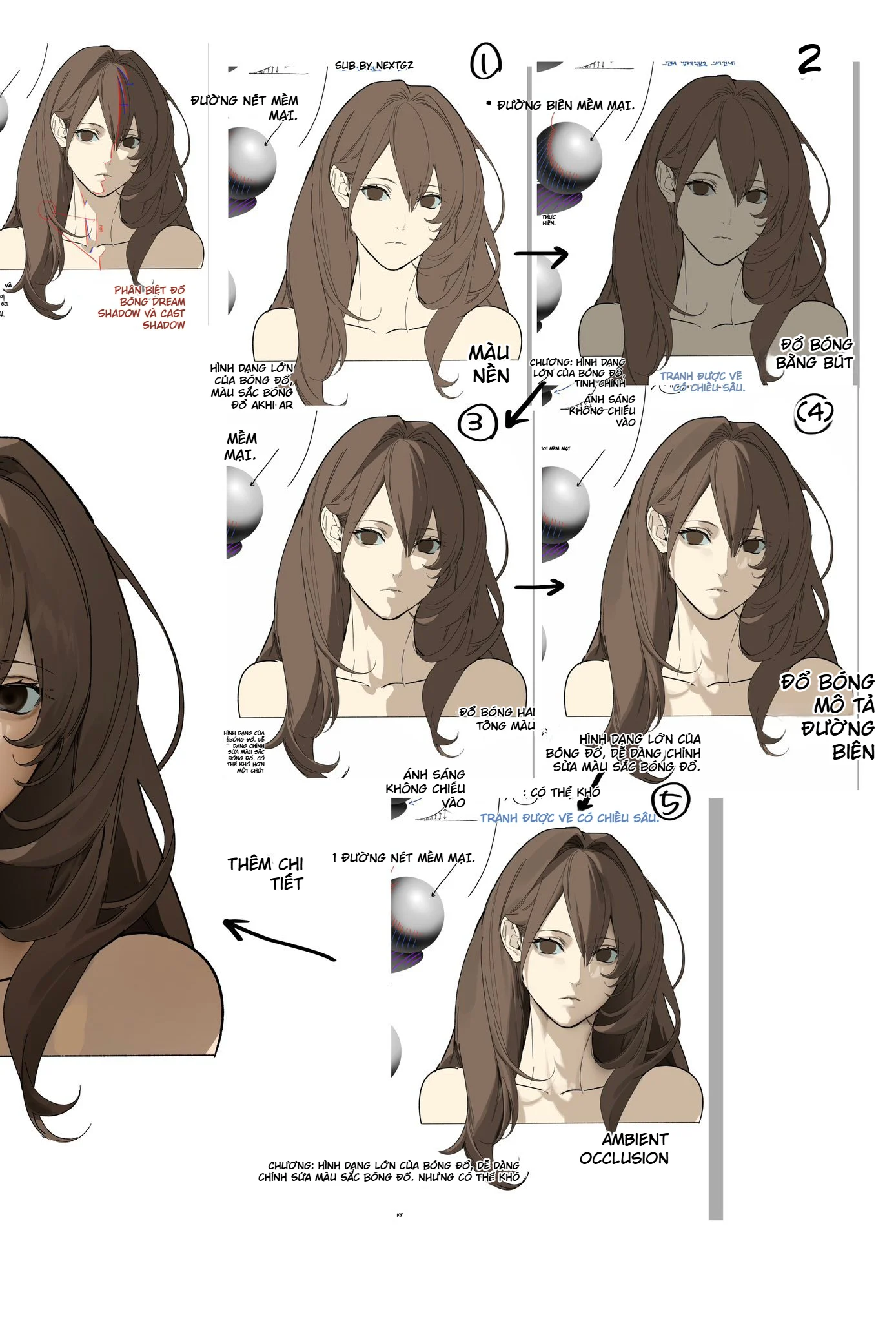
Classic cel shading is not about taking the base color and then adding a gray layer on top. The core of this technique lies in clearly organizing the intrinsic color, environmental color, light side, shadow side, light-shadow boundaries, and occluded areas. When these elements are arranged correctly, the character can show volume, material, and light direction with just a few flat color blocks.
The tutorial below is built directly from the entire video of about 2 minutes 46 seconds on the cel shading process in 画世界Pro. The content has been reorganized into a complete, easier-to-follow process: from checking line art, choosing a color palette, analyzing light, creating a shadow layer, defining light-shadow boundaries, to finishing folds and occluded areas.
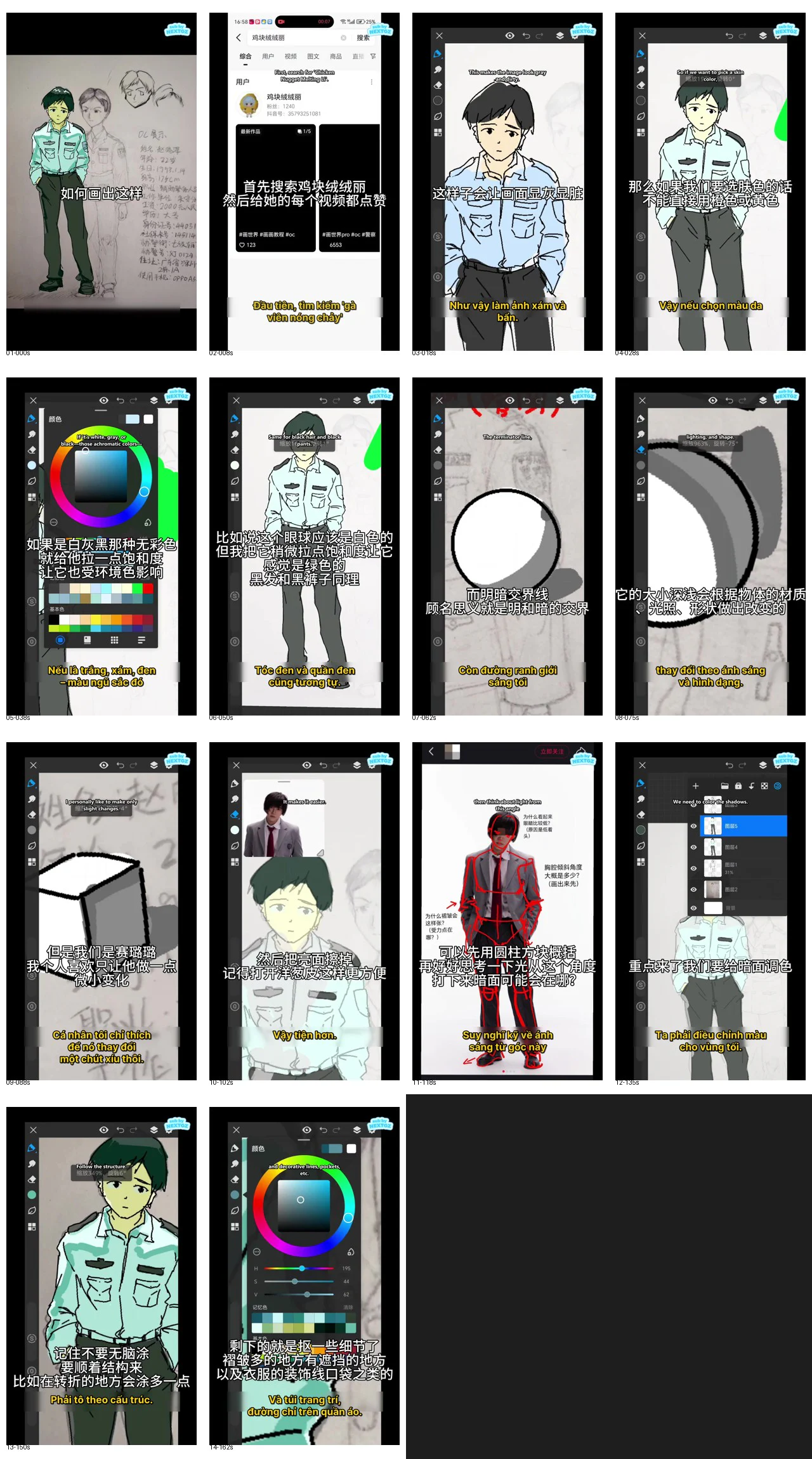
What problem is the entire video addressing?
The character in the video is wearing a light blue shirt, dark pants, and standing in a slightly relaxed front-facing pose. This is a suitable exercise for learning cel shading because the figure has many different surface types: skin, hair, light fabric, dark fabric, pockets, collar, shoulder seams, folds at the arms, and pants overlapping the hand.
The video divides the lesson into three main layers of thinking:
- The base color cannot be separated from the environment: skin, hair, shirt, eyes, and pants must all be influenced by the common light source.
- Cel shading is not just "split light and shadow": light-shadow boundaries must follow the volume, light direction, and material.
- Shadows must follow the structure: you need to distinguish between large volume shadows, fold shadows, contact shadows, and occluded shadows.
Key content markers in the video
- 00:00–00:20: introduction to the cel shading exercise, checking line art and preparing a clean draft.
- 00:20–00:55: determining environmental color, adjusting colors for skin, shirt, hair, eyes, and pants.
- 00:55–01:30: explaining the light side, shadow side, and the nature of light-shadow boundaries.
- 01:30–02:15: using a reference image to find the light direction, analyzing large volumes, and creating a shadow layer.
- 02:15–02:46: adjusting shadow colors, drawing the light-shadow boundary line, adding structural shadows, occluded crevices, and finishing details.
Part 1: Preparing clean line art and base colors
1. Check the drawing before coloring
Before choosing colors, check whether the line art is clean enough to define areas. Gaps in the hair, collar, sleeves, pocket, belt, or hands can cause the fill tool to spill into other areas. In 画世界Pro, beginners often want to color quickly with the fill tool, but if the lines are not closed, fixing the colors later will take much more time.
Line art used for cel shading needs to meet three requirements:
- The outer silhouette is clear, with no breaks in important areas.
- The material separation lines are readable enough: hair–skin, shirt–skin, shirt–pants, pocket–shirt body.
- Don't use too many small lines from the start, as cel shading will add most of the volume information.
2. Basic layer organization in 画世界Pro
A safe layer structure for this exercise consists of:
- Background or paper layer.
- Line art layer.
- Base color group for skin, hair, shirt, pants, and accessories.
- Overall shadow layer placed above the base colors.
- Structural shadow and occluded shadow layer.
- Color adjustment or final detail layer.
You can separate each material into its own layer or group all base colors together and use alpha lock. The important thing is that the shadows can be adjusted independently without damaging the base colors.
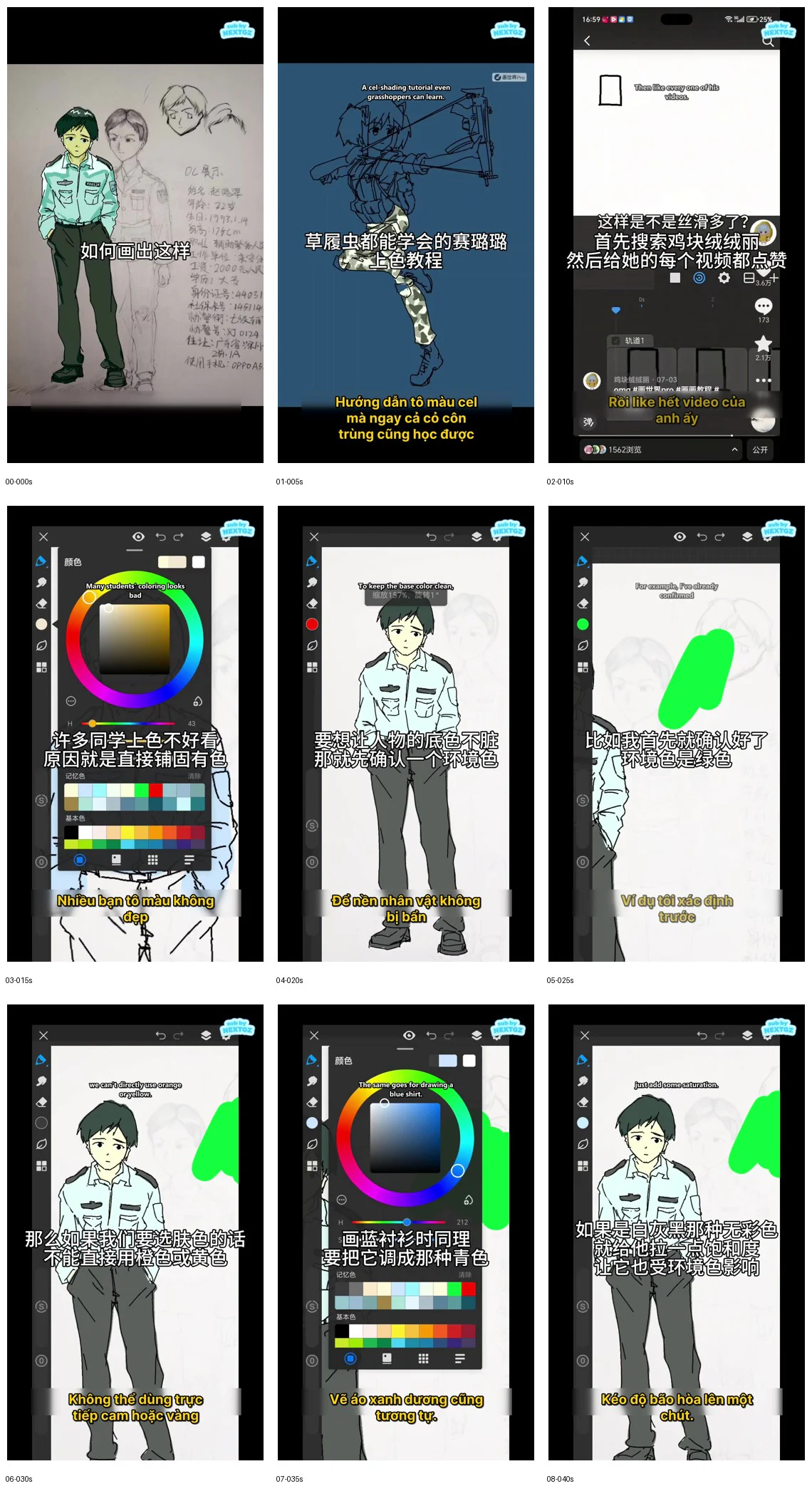
--- ---3. Don't pick colors directly from the default color swatches
The video highlights a common mistake: many people immediately pick skin color, blue shirt, or black from the default palette and apply it straight onto their character. The result often looks harsh, disjointed, and lacks a sense of coexisting within a single lighting environment.
A better workflow is to determine the environment color first. In the example, the environment is assumed to have a greenish tint. Therefore, the blue shirt color is shifted slightly towards cyan-green; near-whites, grays, and blacks are similarly influenced.
4. Skin color must blend with the overall atmosphere
Skin color should not be an orange or yellow tone isolated from the rest of the artwork. When the ambient light leans towards blue, the skin should still retain some warmth to distinguish it from the clothing, but the neutral areas and shadow regions can lean slightly towards the environment color.
For classic cel shading, only three levels of skin color are needed:
- The base skin color.
- The main shadow color, darker and slightly hue-shifted.
- A warm accent color for the ears, cheeks, nose tip, or fingers if needed.
There is no need to make the skin overly gradient. Clarity of light and shadow areas is more important than the number of colors.
5. White, gray, and black still have hue
One of the most important points in the video is: white is not necessarily absolute white, gray is not neutral gray, and black is not absolute black. They are all influenced by the environment.
For example:
- The whites of the eyes can be slightly greenish or bluish.
- A light blue shirt should have a more pronounced environmental hue in its shadow areas.
- Black hair can be a deep green or deep blue.
- Black pants can be charcoal blue, charcoal green, or cool gray.
If pure white and absolute black are used too early, the artist will have no room left to adjust lighting in later steps.
Part 2: Understanding the principles of cel shading correctly
6. "Dividing into light and shadow" is just the starting point
Cel shading is often described as dividing an object into a light side and a shadow side. This explanation is correct but insufficient. If an artist simply draws an arbitrary line and fills one half darker, the shadow will look flat and won't match the form.
A proper shadow area must answer the following:
- Which direction is the light source coming from?
- Is the surface facing towards or away from the light source?
- Is the object a sphere, a box, a flat surface, or soft fabric?
- Is any other object blocking the light?
- Should the shadow boundary be hard or soft?
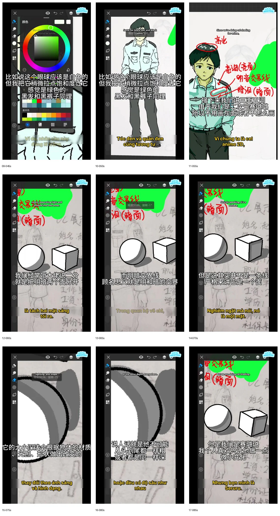
7. The light-shadow boundary is not a meaningless line
The video uses a sphere and a box to explain that the boundary between the light and shadow areas is essentially a surface region that is turning away from the light source. On a box, it can coincide with a geometric edge. On a sphere, it runs as a curved band following the surface.
In the cel style, this transition area is simplified into a clear line or boundary area. However, that line must still conform to the form. If a character turns their hand, leans their body, or folds their clothing, the shadow boundary must change direction accordingly.
8. The thickness and softness of the boundary depend on the material
The video shows that the light-shadow transition area cannot have the same width on all objects. On a rounded surface, the transition is usually longer. On a flat surface or a sharp fold, the transition can be very short. With classic cel shading, the artist can keep edges quite hard but should still vary them slightly:
- Skin: relatively soft and simple shadow edges.
- Hair: clear edges with breaks following the hair strands.
- Shirt fabric: edges change according to the planes and folds.
- Dark pants: large shadow areas, less detail than the light-colored shirt.
- Metal details or badges: higher contrast.
9. Not every area requires the same shadow depth
A curved surface does not mean the shadow must be uniform in thickness from start to finish. Shadow depth changes according to the direction of the form, the lighting angle, and the structure. This is why, when doing cel shading, the artist needs to observe the form rather than simply copying a shadow line with a fixed width.
Part 3: Using reference images to analyze light and form
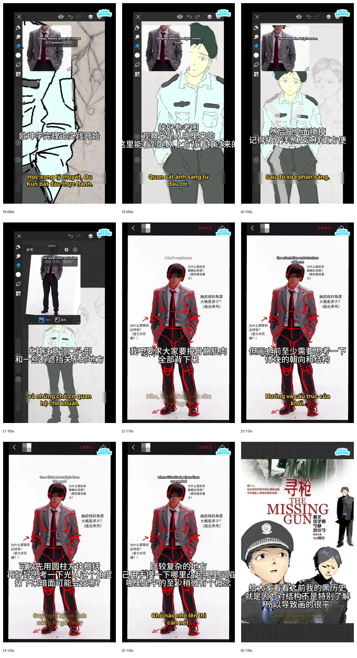
10. Choose a reference image with a pose and clothing similar to the character
The video uses an image of a person wearing a shirt and dark pants to observe how light travels across the body. The goal is not to copy the entire image but to find answers to three issues:
- The main light direction.
- Which direction the major forms are facing.
- Which areas are occluded by the collar, arms, pockets, torso, or folds.
The closer the reference image's angle, pose, and clothing style are to the character, the easier the analysis becomes. If the image is too different, it should only be used to reference principles, not to copy shadow shapes directly.
11. Temporarily ignore small anatomical details
The video advises against memorizing all bones and muscles before starting. Instead, simplify the body into major forms:
- Head as a sphere or rounded box.
- Ribcage as a tilted box.
- Hips as a smaller box.
- Arms and legs as cylindrical forms.
- Hands and shoes as wedge forms.
After understanding the orientation of these forms, the artist can then place the shadows on the correct side. This approach is especially useful for cel shading because even one shadow area facing the wrong direction can make the entire figure look flat.
12. Determine the lighting from the start
In the example, the light source is observed coming from above and slightly off to one side. The artist needs to mark the surfaces that receive light first: the forehead, bridge of the nose, shoulders, chest, part of the sleeves, and the front of the pants. Surfaces facing away from the light source will be grouped into the dark areas.
Don't treat each body part as a separate task. The light direction must be consistent from the head, neck, torso, arms, down to the legs.
13. Create a separate shadow layer, then erase the lit areas
In the video, the artist uses a very effective method for beginners:
- Duplicate or create a layer above the base color.
- Fill the entire character with the shadow color.
- Based on the light direction, erase or mask the areas that receive light.
- Keep the large dark areas first; don't process small folds yet.
The advantage of this method is that the artist can see the entire light-dark relationship immediately. Once the shadows are separated into their own layer, changing the color, adjusting saturation, and tweaking contrast also becomes easier.
14. Large shadows must be unified before small shadows
Before drawing pockets, sleeve folds, or necklines, check the character at a small size. If the head, upper torso, hips, and legs don't have clear form separation yet, adding details will only make the image more cluttered.
The order should be:
- Overall light and shadow forms for the whole body.
- Shadow boundaries on the head, neck, and torso.
- Large shadows on the arms and legs.
- Folds and contact shadows.
- Small details.
Part 4: Adjusting shadow colors and completing cel shading
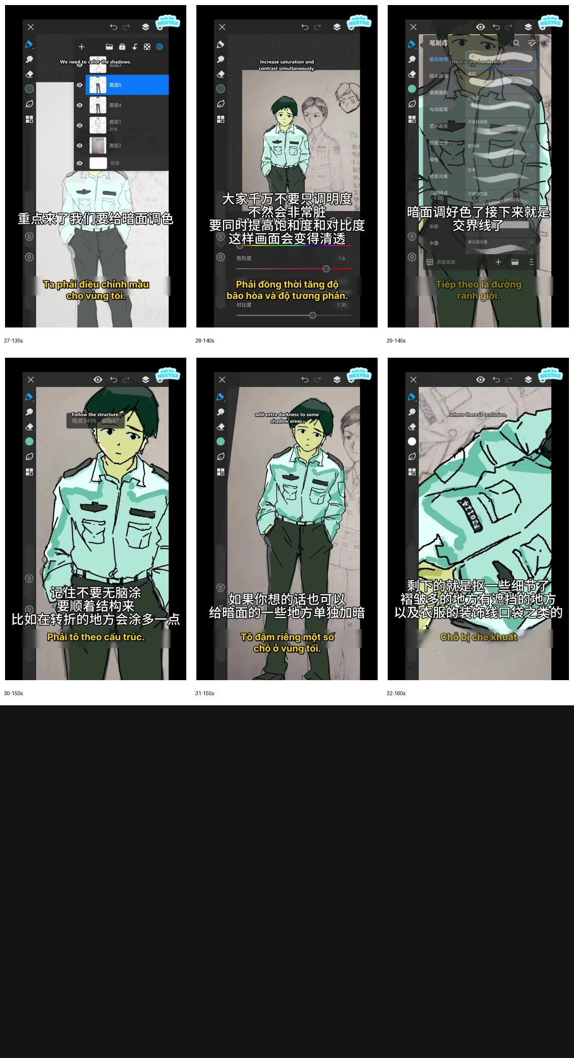
15. Don't just lower the brightness of the base color
When creating shadow colors, simply dragging the brightness slider down often makes the color look gray and muddy. The video emphasizes adjusting simultaneously:
- Brightness.
- Saturation.
- Contrast.
- Hue according to the environment.
The shadow areas of a blue shirt can be darker, more saturated, and slightly leaning toward green or cyan. The shadow areas of skin can have reduced brightness but still retain some warmth. Hair and pants should not turn into solid black patches.
16. Draw the light-shadow boundary according to structure
Once the overall shadow color is set, the next step is to refine the shape of the boundary. This is where the character's volume is determined.
On the shirt, the shadow edge needs to:
- Wrap around the shoulder following its spherical shape.
- Break at the collar and shoulder seams.
- Change direction according to the sleeve folds.
- Separate the front and side planes of the torso.
- Avoid running pointlessly straight across the entire body.
17. Shade according to folds, not by feeling
The video clearly states not to "shade from memory" or apply random shadows. Each fold should be understood as a small plane changing direction.
Where the fabric bulges outward, the surface facing the light is brighter. Where the fabric is indented or covered by another layer, the shadow is darker. Fold shadows should have a clear start and end point, not be drawn as long, unreasonable streaks.
18. Increase shadows in areas that need emphasis
After completing the large areas, you can intensify shadows in specific regions:
- Under the collar.
- Under the chin.
- The gap between the arm and the torso.
- Under the pocket flap.
- The hand area inside the pants pocket.
- The gap between the legs or the part of the pants covered by the shirt.
- Overlapping fabric areas.
These are occlusion shadows or contact shadows. They are usually darker than regular form shadows but should only occupy a small area.
19. Keep black lines selectively
Black line art keeps the cel style clear, but if every line is equally black and thick, the artwork becomes heavy. You can keep thick lines on:
- The outer silhouette.
- Overlapping seams.
- Deep shadow areas.
- Recognizable details like eyes, hair, and pockets.
Lines within light areas can be thinner or changed to a dark color close to the material.
Complete practice workflow in 画世界Pro
--- ---Step 1: Clean up the line art
Close off the areas that need filling, erase unnecessary lines, and check the silhouette.
Step 2: Choose the environment color
Determine whether the overall lighting leans warm, cool, blue, or neutral. In the sample piece, the environment has a greenish tendency.
Step 3: Flat color each material
Flat color the skin, hair, top, pants, and accessories. Avoid pure white, absolute black, and overly distinct colors.
Step 4: Check the light and dark values
Zoom out on the painting or view it in grayscale. The face, top, pants, and hair must be distinguishable from one another.
Step 5: Create a global shadow layer
Cover the entire body with a shadow color that relates to the environment, then use a mask or eraser to bring back the lit areas.
Step 6: Refine the large shadow shapes
Based on the volumes of the head, shoulders, chest, hips, arms, and legs, draw the light-shadow boundaries.
Step 7: Adjust the shadow color
Don't just lower the brightness; simultaneously adjust the hue, saturation, and contrast so the shadows remain clear.
Step 8: Add structural shadows
Paint shadows at the collar, sleeve folds, pockets, waist, areas where hands are in pockets, and any surfaces facing away from the light source.
--- ---Step 9: Add cast shadows
Increase density selectively in overlapping gaps and areas where light struggles to reach.
Step 10: Overall check
Zoom out, toggle shadow layers on and off, check that the light direction is consistent and the focal point remains clear.
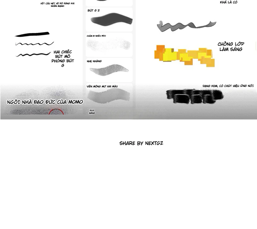
Recommended brush settings
- Hard brush: used for base colors, main shadow areas, and cel boundaries.
- Small soft brush: only used sparingly on skin or gentle transitions.
- Hard eraser: to reclaim clear highlights.
- Lasso or selection tool: to create large shadow areas with clean edges.
- Alpha lock or clipping: to keep shadows within the base color area.
Do not use a large airbrush to cast shadows over the entire character. That will ruin the flat-plane characteristic of cel shading.
Common mistakes when cel shading
Base colors too bright and not matching the environment
Reduce the saturation of secondary colors, pull neutral tones toward the same environmental hue, and keep bright colors for the focal point.
Using pure white and absolute black
Replace them with tinted white and shaded black. Reserve pure white for small highlights, deep black for important dark crevices.
Shadows are just gray overlays
Choose shadow colors with their own hue, influenced by the environment and material.
Light-dark boundaries not following the form
Rebuild the body using simple blocks, determine the light direction, then adjust the shadow areas.
--- ---Every fold has a shadow
Only keep folds that help describe structure, tension, or overlapping areas. Remove small folds that do not support the form.
Too much detail too early
Complete the overall light and shadow masses first, then work on pockets, collars, seams, and hidden areas.
60-minute cel shading practice exercise
- 10 minutes: clean up line art and separate layers.
- 10 minutes: choose environment color and background color.
- 10 minutes: analyze reference image, mark light direction.
- 15 minutes: create large shadow masses for the whole body.
- 10 minutes: adjust shadow boundaries according to structure and folds.
- 5 minutes: add occlusion shadows, adjust color, and check overall balance.
Pre-finalization checklist
- Do skin, hair, shirt, and pants all exist in the same environment?
- Are the whites, grays, and blacks too neutral or too absolute?
- Is the light direction consistent from head to toe?
- Do the large shadow masses help read the form at small sizes?
- Do the light-dark boundaries follow the figure's form?
- Do the fold shadows reflect the fabric's structure?
- Are the hidden areas and overlapping regions dark enough?
- Are the shadow colors muddy gray?
- Are there too many small details competing with the face?
- When the shadow layer is turned off, is the base color still clean and clear?
Conclusion
Effective classic cel shading does not depend on using many layers or many colors. What matters is understanding the relationship between intrinsic color, environment color, light masses, dark masses, and light-dark boundaries. When the artist starts from large masses, uses reference images to check light direction, and only adds shadows where the structure demands it, the character will have depth while the technique still maintains the flat, clean, and clear look of 2D anime.
In 画世界Pro, keep the process simple: a clean base color, one large shadow layer, one structural shadow layer, and a few occlusion dark spots. The precision of each mass is more important than the number of effects.









Bình luận
0 bình luận
Đăng nhập để tham gia thảo luận cùng cộng đồng!
Đăng nhập ngayĐang tải bình luận...