How to Draw Cool Manga Male Characters with Droopy Eyes, Glossy Black Hair, and Halftone
 Free
FreeThere are male characters who exude charisma at first glance. They don't need overly fierce expressions or complex poses; just a slightly lowered gaze, a thin smile, black hair with bright highlights and a few comic dot patterns are enough to make viewers pause longer.
cre
This set of notes is exactly that type. It's not a complete anatomy tutorial, but a collection of old observation tips on how to make male characters look cooler in black-and-white manga style. The original even reminds itself that these are "old notes" and may have some inaccuracies, so when learning from them, we should treat them as a reference for character design, not as strict rules.
Why do the characters in the images look so expressive?
The character's expression comes from three main elements: eyes, hair, and black-and-white contrast.
The eyes are drawn slightly lowered, with heavy outer corners and distinct upper eyelids. The hair has large black sections, then cut with strong highlights. The clothing uses fur collars, vests, ties, and halftone patterns to create a sense of elegance and comic book quality.
When these three elements come together, the character is no longer just a pretty face, but feels like someone with a personality: slightly confident, slightly aloof, slightly aware of their own charm.
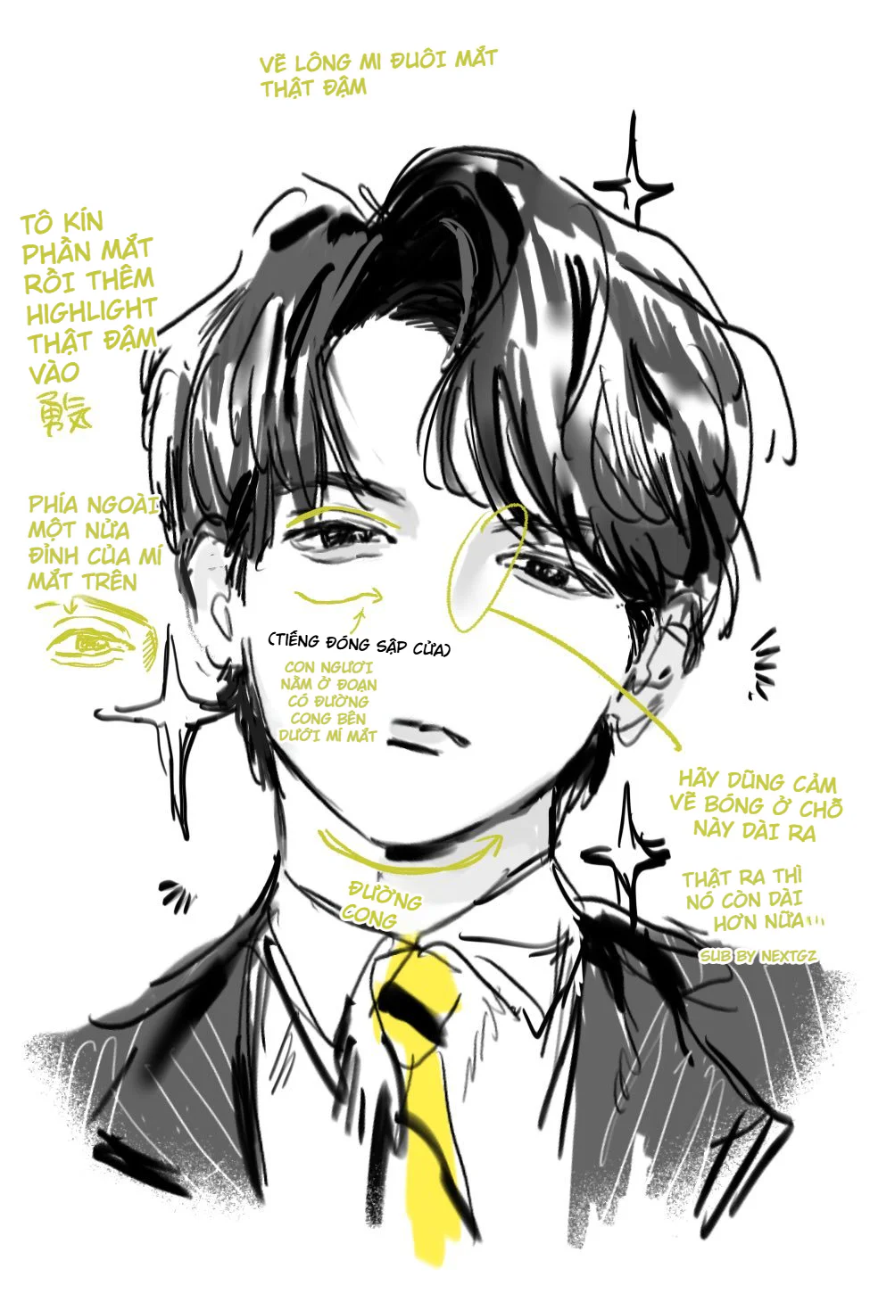
Lowered eyes are the key to a cool look
In the notes, there is a very memorable point: looking downwards is significantly cooler. This is an extremely easy tip to apply when drawing male characters.
When the eyes look down, the upper eyelid gently presses on the eyeball. The eye opening decreases, the gaze becomes less direct and less "naive." The character therefore feels more mature and mysterious.
If you want to apply this, you can follow this direction: reduce the eye opening, make the upper eyelid thicker than the lower eyelid, extend the outer corner of the eye slightly, and only reveal just enough of the eyeball. Don't make the eyes too round if you're aiming for a cool and refined male character type.
The heavier the outer eye corner, the sharper the expression
The second image emphasizes drawing the eyelashes at the outer corner of the eye very darkly. This is a small tip with a big effect. The outer eye corner determines whether the character looks gentle, sharp, tired, seductive, or dangerous.
With the male manga style in the image, the outer eye corner is emphasized with dark patches and thick lines. The outer part of the upper eyelid is also drawn more clearly. Thanks to this, even though the face is quite soft, the character doesn't become bland.
The important point is not to make the entire eye uniformly dark. If the upper eyelid, lower eyelid, eyeball, and eyelashes are all equally heavy, the eye will look stuffy. Let the outer eye corner be the main focal point, while other parts are lighter to give the eye rhythm.
Black hair should be built with masses, not individual strands
A very common mistake when drawing hair is trying to draw too many strands from the start. With black-and-white art, this method easily makes the hair messy and lacking shine.
In the image, the hair is processed with large black masses first. Then the author leaves or adds white highlight areas to create a shiny hair effect. This method builds hair volume much faster.
You can think of hair in three layers: main dark masses, large light gaps, and then a few small hair strokes. If you reverse the order, the hair will lose its volume.
Hair highlights must be strong but not evenly distributed
The notes in the image mention filling in the eye area and then adding very strong highlights to the hair. This is a very characteristic way to increase contrast in manga art.
Beautiful highlights don't come from quantity. They come from being placed correctly where the hair changes direction or where light hits the surface. For bangs falling onto the forehead, highlights should follow the curved rhythm of the hair. For hair at the back of the head, highlights can be larger but should be softer so as not to steal the gaze from the face.
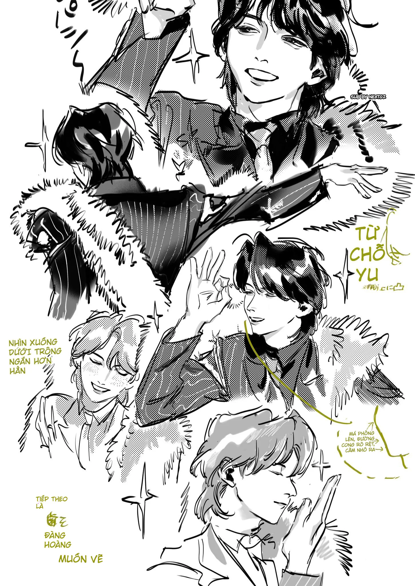
A small chin and curved cheeks help the character look more refined
An interesting point in the notes is about the cheeks and chin. The author mentions a feeling of slightly puffed cheeks, clearer curves, and a smaller chin. This is a very common stylization in beautiful male manga character art.
However, don't misunderstand this as "every male character must have a small chin." This method suits refined, elegant characters with an idol or gentleman-like aura. If the character is a warrior, fighter, or a rough adult, the chin and jaw might need to be wider.
Regarding the foundational structure, you should still understand the head's volume before beautifying the outline. Proko emphasizes reading the side plane, cheekbones, ears, jaw, and facial rhythm as structured volumes, rather than just drawing the outline.
Shadow under the chin makes the face look more three-dimensional
If you only draw beautiful eyes and hair but neglect the chin, neck, and shadows under the face, the portrait can easily look flat. In the second image, the area under the chin and the cheeks are suggested with gray patches. This gives the head more weight.
The shadow under the chin also connects very well with the shirt, tie, and vest. When the collar area has shadows, the character looks more "in form," not like a head pasted onto a body.
Fur collars and vests are tools for creating charisma
The clothing in the image isn't just for decoration. The fur collar helps create a border around the face, making the character stand out more. The vest and tie bring a sense of formality. The stripes on the clothes create visual rhythm, and the dark areas of the collar make the face brighter.
If you want to draw a cool male character in this style, use the clothing to support the face. Don't just focus on the face alone. A nice collar, a correct shoulder mass, a bit of fur or pattern can elevate the entire drawing significantly.
Halftone makes the art feel more like manga
The dot patterns in the image are a very important part. If you only shade with a soft brush, the art might be beautiful but will lose the comic book feel. Halftone gives the gray areas texture, a printing rhythm, and a clearer "manga" quality.
In Clip Studio Paint, a tone layer isn't just a dot image pasted on; it's a layer with its own settings like line frequency, density, tone type, and tone angle. This allows the artist to control the shade very flexibly when creating black-and-white comics.
You can use halftone for hair, clothes, fur collars, backgrounds, or cheek shadow areas. But don't cover everything. Leave clean areas white. Use solid black for heavy areas. Use dot patterns only for intermediate areas.
Line weight determines the sophistication of black-and-white art
In color art, colors can save quite a lot. But in black-and-white art, line weight is very apparent. This set of images uses quite expressive lines, sometimes thick, sometimes thin, sometimes broken, sometimes loose. Thanks to this, the art doesn't look stiff.
Some areas should be darker: the outer eye corners, dark hair, collars, area under the chin, shoulder edge closest to the viewer. Some areas should be thinner: the bridge of the nose, lips, cheek lines, a few stray hair strands, background details.
Just by controlling this, black-and-white art will have much more rhythm.
Suggested workflow to learn from this set of notes
First, sketch the head and shoulders with large masses, no details yet. Then choose the expression direction: looking down, looking sideways, or a slight smile. Next, finalize the eyes with heavy upper eyelids and dark outer corners. Once the eyes have spirit, build the hair with large black masses and white highlights. Then add shadows on the chin, neck, clothes, and outfit. Finally, place the halftone, accent lines, and sparkling effects.
This order helps prevent the art from getting messy. You won't get bogged down in hair details or halftone dots too early.
Common mistakes when learning from this image
The first mistake is making the entire eye too dark. The eye needs focus at the outer corner, not uniform darkness everywhere.
The second mistake is drawing too many hair strands. Hair should have masses first, strands later.
The third mistake is using too much halftone. Halftone looks good when it has contrast with white and black areas.
The fourth mistake is making the chin too small. A small chin helps with refinement, but too small makes the face look weak.
The fifth mistake is neglecting the neck and shoulders. For a male character to look cool, the neck, shoulders, collar, and body posture must also have strength.
The biggest lesson from these notes
The best thing about this set of notes isn't any single detail, but how it combines many elements to create charisma: lowered eyes, dark outer eye corners, shiny hair, a neat chin, clear collars, just enough halftone, and rhythmic black-and-white lines.
If it had to be summarized in one sentence, this article says: to draw cooler male manga characters, don't just draw "beautifully," draw the weight of the gaze, the rhythm of the hair, and the solidity of the black-and-white masses.
Frequently Asked Questions
Should I apply these notes exactly as they are to every male character?
No. These tips are suitable for refined, elegant, slightly cold male characters with a manga aura. For strong, rugged, or more mature characters, the chin, jaw, and eyes may need to be different.
Should male manga eyes be drawn big or small?
There is no fixed answer. If you want the character to be young, gentle, or cute, the eyes can be bigger. If you want them cool, mysterious, or mature, the eyes should be narrower, with heavier upper eyelids and clearer outer corners.
Does black hair have to be filled in completely?
Not mandatory, but with black-and-white art, large black masses give the hair more impact. The important thing is to leave highlights in the right places so the hair doesn't become a solid block.
Where is halftone appropriate to use?
Halftone is suitable for intermediate shadow areas, clothes, backgrounds, fur collars, hair, or cheeks. It shouldn't be applied to the entire drawing as it will make the piece look dirty and lose focus.
Đánh giá bài viết
More from author
So sánh các cách học Mẹo Vẽ Ký Họa Cảnh Đường và cách chọn hướng
Tự Học Clip Studio Paint Cơ Bản: Hướng Dẫn Toàn Diện Cho Người Mới Bắt Đầu
Bộ Sưu Tập 48 Brush Information Volume Tạo Chi Tiết Và Texture Cực Đỉnh Cho PS, Procreate, CSP
Cách tô màu tóc anime trong ibisPaint X theo quy trình 12 bước, lên khối đẹp mà không bị bệt
You might also like
Cách tô màu tóc bạc anime: quy trình đổ bóng, hòa màu và hoàn thiện tóc xám đẹp hơn
Cách tô màu tóc anime trong ibisPaint X theo quy trình 12 bước, lên khối đẹp mà không bị bệt
Hướng dẫn sinh tồn Cho Digital Artist 2026: Khi Kỹ Thuật Gặp Cá Tính
Bình luận
0 bình luận
Đăng nhập để tham gia thảo luận cùng cộng đồng!
Đăng nhập ngayĐang tải bình luận...