

Coloring chibi may seem simple at first glance, but to make the character soft, bright, and have depth, you can't just slap on a base color layer and add a few highlights. Chibi may be small, with a big head and simplified details, but precisely because the areas are small, every color decision is easily exposed. If the color is too pale, the character will sink. If the shadows are too heavy, the chibi loses its cuteness. If the lineart is too black, the drawing looks stiff and lacks softness.
This guide image set is well worth studying because it presents a fairly concise yet effective chibi coloring process: reduce the saturation and brightness of the base color, overlay with Multiply, add lighting with Overlay, add reflections with Screen, adjust the overall color, soften the lineart, and finish by painting more details, optionally using Gradient Map or Curves to pull the final mood.
Why should you adjust the base color before rendering?
The first step in the image is to reduce the saturation and brightness of the base color. This is a small but very important step. When the base color is too vivid or too bright, the subsequent color layers will have difficulty blending together. The character can become burnt out, skin can become too orange, hair too harsh, or the overall look lacks eye comfort.
With chibi, the cute feeling often comes from soft colors, moderate brightness, and little harsh contrast. Therefore, slightly lowering the initial vividness and brightness helps give the character a more manageable base color.
You can understand this step as calming the original before applying makeup. When the base is stable, the Multiply, Overlay, and Screen layers afterward will perform better.
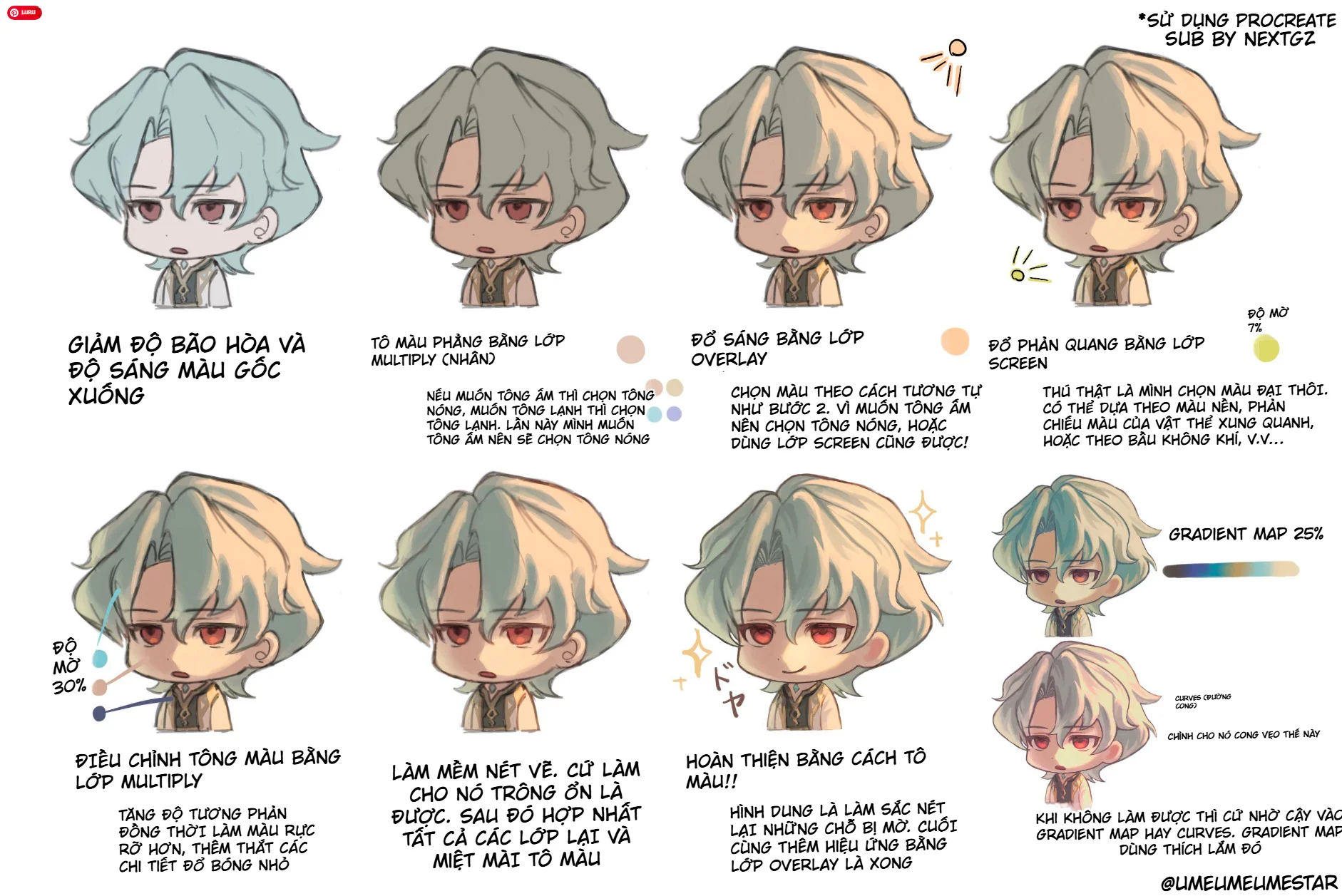
Step 1: Reduce saturation and brightness of the base color
At this step, look at the entire character first. If the hair is too blue, skin too pink, clothes too bright, or the overall look too vivid, slightly reduce the saturation. If the character is too bright and lacks dark areas, reduce the brightness a bit.
Don't reduce it too much. If you pull the color down too far, the character will become gray and lose life. The goal is only to soften the base so that the following steps are easier to control.
In the example in the image, the initially light blue hair color was pulled down to be more subdued, the skin became less bright, and the overall character became more neutral before adding warm light.
Step 2: Flat coloring with Multiply
After the base color has been softened, the author uses a Multiply layer to apply flat color. This step changes the atmosphere tone for the character.
If you want a warm tone, choose beige, light orange, light yellow, or light skin brown. If you want a cool tone, choose light blue, light purple, or blue-gray. In the image, the author chose a warm tone, so after this step the character feels soft, gentle, and closer to sunlight.
Multiply helps the new color layer blend into the underlying color without obscuring all the details. With chibi, this step is very useful because the character often has many small color areas. A light Multiply layer can unify the entire palette for more consistency.
Step 3: Add lighting with Overlay
Once you have a warm base color, the next step is to use Overlay to add light. In the image, the light is placed mostly on the hair, face, and the right side of the character. The colors used are often peach, light yellow, or light beige.
Overlay makes the artwork pop faster than painting highlights with regular colors. It gives the highlighted areas vitality while still preserving some of the underlying light-and-shadow structure. This is why the character's hair in the image after the Overlay step looks more volumetric, no longer as flat as the initial version.
When using Overlay, remember one thing: use little but in the right places. If you cover the entire drawing with Overlay, the colors will become harsh and lose focus. Prioritize areas that catch light, such as the top of the hair, bangs, cheeks, forehead, shoulders, or edges of clothing.
Step 4: Add reflections with Screen
After Overlay, the author uses Screen to add reflections. The reflections in the image are quite light, with low opacity, and the color can be yellow-green, cyan, or a pale color taken from the background.
This step makes the character blend into the environment. If the character is standing in a scene with blue light, you can use light blue. If the background is sunset, the reflections can be slightly orange. If the background is indoors, the reflections can be subtle and less saturated.
With chibi, reflections should not be too strong. Just a little on the hair, edges of the face, or clothing area is enough. The goal is to give the picture more atmosphere, not to create a stage lighting effect.
Step 5: Adjust overall color with Multiply
After adding light and reflections, the picture may become too soft or lack dark areas. Therefore, the image continues using Multiply with low opacity to adjust the overall color.
This step helps increase contrast, make colors clearer, and add a few small shadow details. You can use it on the hair roots, hair in shadow, under the chin, collar, inside clothing, or edge areas that need to be darker.
The important point is not to turn this step into a heavy shadow layer. With chibi, shadows should be just enough to create volume but still maintain a light feel.
Step 6: Soften the lineart
One of the reasons chibi drawings look stiff is lineart that is too black. When the colors have become softer and brighter, the original black lines can become heavy, making the character look outlined with a marker pen.
In the image, the author suggests softening the lineart. There are many ways to do this: change the lineart color to brown, blue-gray, or a color close to the area below; reduce the line's opacity; or lightly paint over the line with a suitable color.
However, don't make the lines disappear entirely. Chibi still needs lines to maintain clarity. Areas like the eyes, mouth, hair outlines, collar, and accessories should retain a certain sharpness. Only soften the line segments that are too black or no longer need to stand out.
Step 7: Merge layers and continue coloring
The image notes that once things look good, you can merge the layers and continue coloring. This is a workflow step. When the effect layers are stable, merging makes it easier to paint over, fix edges, add small shadows, or correct blurry spots.
But if you're not sure, duplicate the file or group the layers before merging. That way, if the coloring goes in the wrong direction, you still have a backup to revert to.
After merging, look back at areas that need fixing: are there any flat patches in the hair? Is the face rosy enough? Are the eyes sinking? Are the clothes lacking shadows? Then use a soft brush or a small brush to gradually refine it.
Step 8: Finish with Overlay, Gradient Map or Curves
At the end, the image suggests using a Gradient Map at about 25% or Curves to pull the color. This step is very suitable when you want to unify the mood after finishing the coloring.
Gradient Map helps apply a color palette over the highlights, midtones, and shadows. Used lightly, it can make the image more consistent without destroying too many details. Curves are suitable for adjusting the light-dark curve, increasing or decreasing contrast, pushing up highlights or pulling down shadows.
If you are a beginner, use it lightly. Just a little Gradient Map or Curves is enough to make the final colors look nicer. Overdoing it will push the character away from the original design colors.
How to choose colors for each layer
For Multiply, choose colors that are slightly muted and low in saturation. Colors that are too vivid will make the picture look dirty or harsh. For Overlay, choose brighter colors close to the light source. For Screen, choose light reflection colors, which can be cooler or warmer depending on the environment.
If you're not sure what color to choose, start from the general background color. For example, a warm background means choose light yellow, light orange. A cool background means choose light blue, light purple. Then reduce the opacity so the color blends into the picture.
Common mistakes when coloring chibi with blend layers
The first mistake is using Multiply too dark. This makes the chibi look heavy-faced and loses softness.
The second mistake is covering everything with Overlay. When everything is bright, the picture has no focal point.
The third mistake is using Screen too strongly. Reflections should only be secondary light, not brighter than the main light source.
The fourth mistake is not softening the lineart. The colors are soft, but the lines are still harsh black, which creates a conflicting feel.
The fifth mistake is using Gradient Map too heavily. If the opacity is too high, all the original design colors will be completely changed.
Quick formula to apply
If you want to quickly remember the process in the image, you can follow this order:
Reduce saturation and brightness of the base color.
Cover with a general tone using Multiply.
Add light using Overlay.
Add reflections using Screen.
Tighten shadows with a light Multiply.
Soften the lineart.
Merge layers if needed.
Paint additional details and finish with Overlay, Gradient Map, or Curves.
This is a fairly flexible formula. You can use it for chibi, stickers, avatars, small characters, or simple anime drawings.
Tips to make chibi drawings look softer and more expressive
Keep the face slightly brighter than the body so the viewer looks at the expression first. The hair should have clear highlights but not too harsh. The cheeks can have a little pink or light orange to give the character vitality. The eyes should maintain higher contrast than other areas, as the eyes are the main pull for emotion.
Also, don't forget to check the drawing at a small size. Chibi are often used as avatars, stickers, or small images on social media, so if it's still readable when scaled down – face, hair, and pose – then the coloring is good.
Conclusion
This guide is worth saving because it doesn't overcomplicate chibi coloring. Instead of building everything from scratch, the author uses blend layers to adjust colors smartly: Multiply to unify the tone and increase shadows, Overlay to add light, Screen to add reflections, then finally soften the lineart and finish with auxiliary color layers.
The most important point is not to use a lot of effects, but to use them in the right order and with the right intensity. When you know how to reduce the base color, apply a general tone, add light, add reflections, and adjust the lineart, the chibi character will become much softer, brighter, and have more depth.
Frequently Asked Questions
Is it mandatory to use Procreate?
Not mandatory. This process uses Procreate in the images, but the concepts of Multiply, Overlay, Screen, Gradient Map, and Curves can be applied in many other drawing software if they have equivalent blend modes.
What is Multiply used for in chibi coloring?
Multiply is commonly used to apply a tone, create shadows, and increase depth in dark areas. With chibi, use Multiply lightly to avoid making the character look heavy.
How is Overlay different from Screen?
Overlay is suitable for increasing brightness, contrast, and making colors pop. Screen is suitable for creating reflections or gentle secondary light.
When should I use Gradient Map?
Use it at the final step when you want to unify the color mood. Keep the opacity low, just enough to add a touch, and avoid losing the character's original colors.
Should I soften the lineart?
Yes. For soft-colored chibi, harsh black lineart can easily make the character look stiff. Changing the color or reducing the line's weight will help the drawing look more harmonious.

Bình luận
0 bình luận
Đăng nhập để tham gia thảo luận cùng cộng đồng!
Đăng nhập ngayĐang tải bình luận...