

Pink hair in anime is very easy to make look beautiful, but it's also very easy to make it look "fake candy". Just push the vibrancy too far, and the hair becomes a flat neon patch. But if you reduce the color too much, the hair becomes pale, powdery, and lacks focal points. What's good about the approach in this tutorial is that it doesn't just talk about light and dark, but focuses on saturation: which areas should be vibrant, which should be muted, which should be more opaque, and which need reflected light to make the hair feel translucent and softer. Technically speaking, Adobe describes Saturation as the parameter that adjusts color intensity, while Lightness is brightness; understanding these two parameters helps artists control pink hair better than just increasing or decreasing color by feel.
The core point of this workflow is: hair doesn't need to be uniformly vibrant all the time. A beautiful head of pink hair usually has high-saturation areas to catch the eye, low-saturation areas for the eyes to rest, lighter-colored bright areas to create a glossy feel, and cool reflective areas so the hair isn't monochromatic. Clip Studio Art Rocket also emphasizes that colors in digital painting shouldn't be separated from lighting conditions; local color is affected by colored light and reflected light in the environment.
Why is pink hair prone to looking flat?
Pink hair has a very "sweet" hue, but precisely because of that, it's prone to three common mistakes. The first mistake is increasing saturation across the entire head of hair, making every area equally harsh. When there's no resting area, the viewer's eyes don't know where to look. The second mistake is highlights that are too white or too pale, causing the bright areas to detach from the main color like a sticker. The third mistake is shadows that are only darkened but don't change in hue, making the hair look gray or dirty.
The method in the image solves these three mistakes by clearly separating each issue:
the light-shadow boundary needs relatively high saturation
areas of hair with opacity and reflected light will be softer
bright areas can have reduced lightness or controlled saturation to avoid burning out
finally, use saturation contrast so the hair is both vibrant and has depth
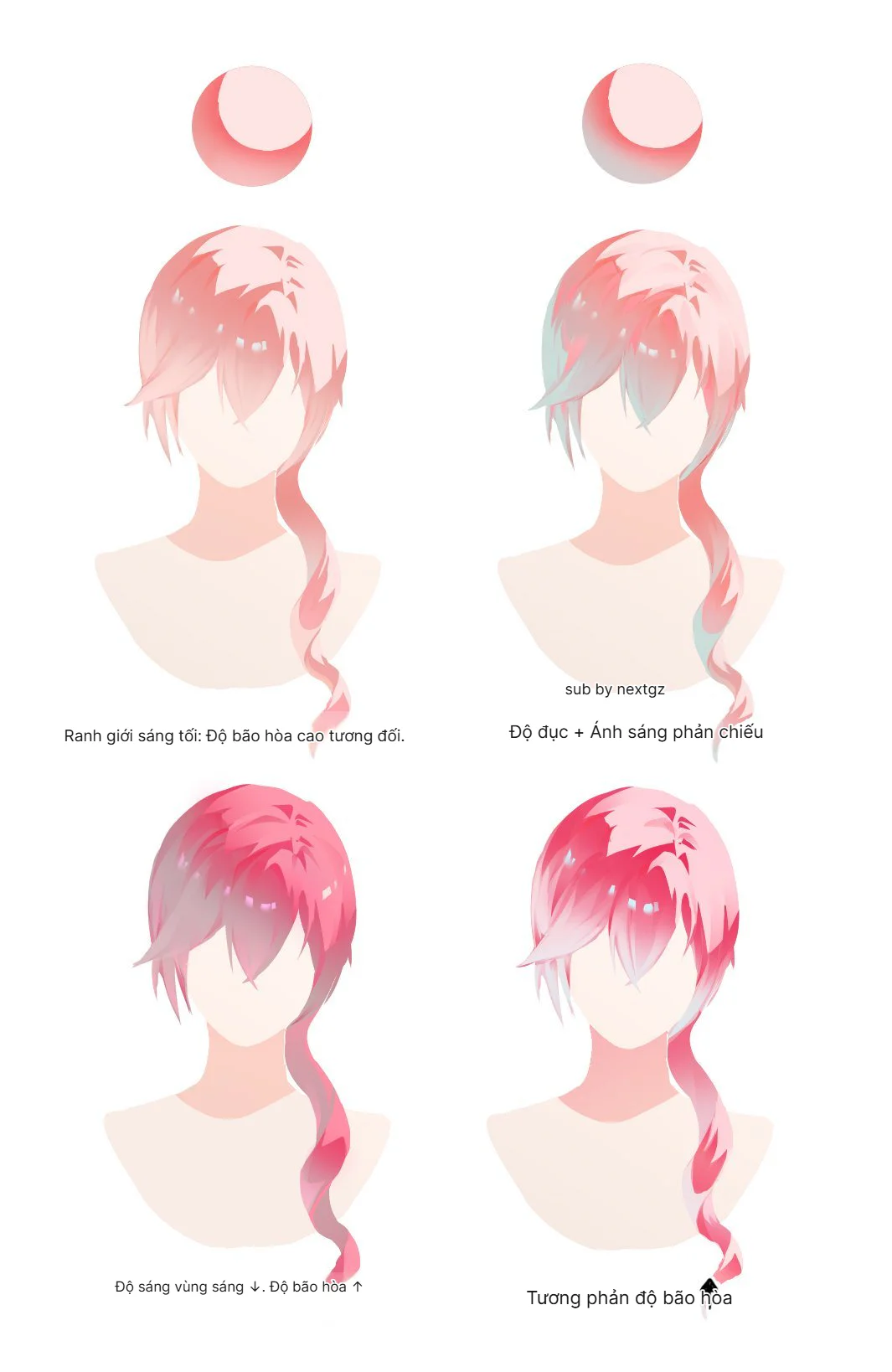
Step 1: The light-shadow boundary needs relatively high saturation
In the first version, the hair has a light pink hue, and the boundary between light and dark has noticeably higher saturation. This is a very valuable trick to learn. Many people only think of shadows as "darker colors," but in anime hair, the transition zone between light and dark is often where the color looks its best. If this boundary is too gray, the hair becomes powdery. If it's too dark, the hair becomes stiff. If it has just the right amount of darkness and sufficiently high saturation, the hair will feel soft, juicy, and luminous.
This way of thinking aligns well with color theory in digital art: color isn't just about hue, but also value and saturation. Adobe allows adjusting Hue, Saturation, and Lightness separately in the Hue/Saturation adjustment, meaning artists can increase color intensity without necessarily increasing brightness or changing the hue too drastically.
When coloring pink hair, try placing high-saturation areas in:
the lower edge of hair strands
the shadow-to-light transition zone
the edge of hair near the cheek or neck
the overlapping parts between hair clumps
These are places that easily create the feeling that the hair "has color" without making the whole head look neon.
Step 2: Add opacity and reflected light to make hair softer
The second version in the image adds opacity and reflected light, especially with a hint of teal/light blue weaving into the hair areas. This is the part that makes pink hair less monotonous. When the entire head of hair is only pink and red, it easily becomes overly warm. But if you add cool reflected light in a few areas, the hair will feel more translucent, lighter, and more integrated with the environment.
Art Rocket explains that colored light affects local color, and in their color example, warm light can accompany warm shadows and blue reflected light from the sky. Applying this to pink hair, you can understand it very simply: pink is the base color, while light blue or gray-blue is the reflective color that gives the hair atmosphere.
In this step, don't apply blue too strongly. Just a low-opacity layer in:
areas of hair in shadow
hair close to the neck
the ends of hair or lower strands
hair areas near a cool-toned background
The goal isn't to turn the hair blue, but to give the pink color a counterbalance.
Step 3: Reduce brightness in bright areas, increase saturation in areas that need to stand out
The third version clearly states: brightness in bright areas decreases, saturation increases. This is a very interesting idea. Many people think the brighter the highlight, the better, but with vibrant colors like pink, overly bright highlights can wash out the color. When bright areas are pushed too close to white, they are no longer pink, just a pale patch. Therefore, sometimes reducing Lightness a bit and increasing Saturation in bright areas will help the hair stay bright without losing its color.
Adobe defines Lightness as the parameter for adjusting brightness and Saturation as the parameter for adjusting color intensity in the Hue/Saturation adjustment. This explains why you can make bright areas "less white but more colorful" by not just pulling up brightness, but also controlling saturation separately.
Quick application tips:
large highlights should be bright but not necessarily pure white
bright areas near shadows should have a deeper pink hue
don't let the entire highlight area become washed out
if the hair looks pale, check the saturation before increasing the value
This is an extremely effective trick to make anime hair look vibrant yet soft.
Step 4: Use saturation contrast to create eye-catching focal points
The final version is the most "visually appealing" because it uses saturation contrast. Some areas are extremely vibrant, some are more muted, and it's this difference that creates depth. To put it simply: if the entire head of hair is at 90% saturation, no area truly stands out. But if the focal area is at 90% and the secondary areas are at 40–60%, the eye will automatically be drawn to the most vibrant part.
Saturation contrast is especially suitable for anime hair because hair is often stylized into large clumps. You can divide it as follows:
focal point areas: high saturation, clear edges
secondary areas: lower saturation, softer transitions
reflective areas: slightly shifted hue, moderate saturation
deep shadow areas: lower value, but don't let them become dead gray
Clip Studio Art Rocket also advises that when sketching anime hair, you should think about the large outline and flow lines first, rather than diving into small details; this applies very well to color, as saturation should also follow the flow of the hair strands rather than being applied uniformly.
Important lesson: beautiful hair isn't just about light and dark, but the relationship between light/dark and saturation
Coloring hair isn't just about picking a base color, a shadow color, and a highlight color. With pink hair, the artist needs to control three axes simultaneously:
Hue: Does the hair lean towards pink, red, orange, or purple?
Saturation: Which areas are vibrant, which are muted?
Lightness/Value: Which areas are bright, which are dark?
A head of pink hair can have the same value but different saturation, or the same saturation but different value. It is precisely separating these two concepts that helps you control color better. The Adobe Hue/Saturation adjustment also separates Hue, Saturation, and Lightness so users can adjust each color axis independently.
Practical workflow for coloring pink anime hair
If you want to apply this formula to your own artwork, you can follow this process:
1. Block in large hair sections first
Don't start with individual strands. Establish the hair shape, hair direction, and main light and shadow areas. Art Rocket also advises that when sketching anime hair, you should look at the overall outline first, using long, flowing lines without focusing on details too early.
2. Set a light pink or neutral pink base
The base shouldn't be too vibrant from the start. Leave room for high-saturation areas to appear later.
3. Create shadows using dark pink or reddish-pink
Don't just pull the color down to gray. Try increasing saturation at the light-shadow boundary to make the color more lively.
4. Add cool reflected light
Use light blue, light cyan, cool purple, or blue-gray with low opacity to make the hair less monochromatic.
5. Control the highlights
Highlights don't need to be completely white. For pink hair, highlights can retain a light pink hue to avoid losing the local color.
6. Create saturation contrast in focal areas
Choose a few main strands to push the color to be more vibrant. The remaining areas should be muted to create depth.
7. Only add stray hairs at the end
Once the color is stable, add a few small strands to increase rhythm; don't use stray hairs to fix incorrect color areas.
Common mistakes that make pink hair look fake
The first mistake is increasing saturation uniformly across the entire head of hair. This makes the hair look harsh but lacking depth.
The second mistake is highlights that are too white, causing the hair to lose its base color.
The third mistake is shadows that are gray, making the hair look dirty.
The fourth mistake is having no reflected light, making the pink color one-dimensional.
The final mistake is increasing brightness instead of increasing saturation, which makes the hair paler rather than more vibrant.
To fix this, remember: bright areas don't always need to be brighter; sometimes they just need to be more colorful.
Conclusion
The method for coloring pink anime hair in this tutorial is worth learning because it doesn't teach in the overly general "add shadows, add highlights" way, but goes straight into a very important issue: saturation contrast. When you understand that saturation is color intensity and lightness is brightness, you'll know how to make pink hair both vibrant and soft without burning out the color. Let the light-shadow boundary have sufficiently high saturation, add cool reflected light to give the hair atmosphere, reduce overly harsh brightness in highlights if needed, and then use saturation contrast to create eye-catching focal points. This is the way to make pink anime hair look much more translucent, soft, and "deliciously colorful".
FAQ
Where should I start when coloring pink anime hair?
You should start with large hair sections, the flow direction, and a neutral pink base. Don't get into small strands too early; lock in the shape and main light/shadow areas first.
What is saturation contrast?
It's the difference between vibrant color areas and muted color areas. In anime hair, saturation contrast helps the viewer's eye focus on important areas without needing to increase detail too much.
Why shouldn't pink hair highlights be too white?
Because overly white highlights will wash out the base pink color. Sometimes you should reduce Lightness a bit and maintain Saturation so the bright areas still have color.
Is reflected light necessary when coloring pink hair?
Yes. Cool reflected light like light blue or cool purple helps pink hair become less monotonous and feel more translucent. Art Rocket also explains that local color is affected by colored light and reflected light in the environment.
Can I use the Hue/Saturation adjustment to edit pink hair?
Yes. Photoshop allows adjusting Hue, Saturation, and Lightness separately, making it very convenient to increase color intensity, change hues, or adjust brightness without needing to repaint everything.

Bình luận
0 bình luận
Đăng nhập để tham gia thảo luận cùng cộng đồng!
Đăng nhập ngayĐang tải bình luận...