 Brushes & Tài nguyên






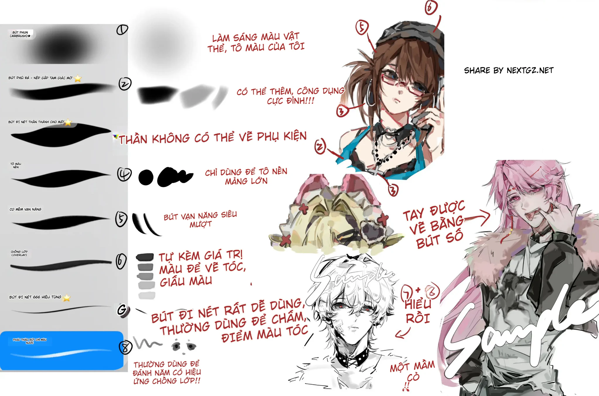
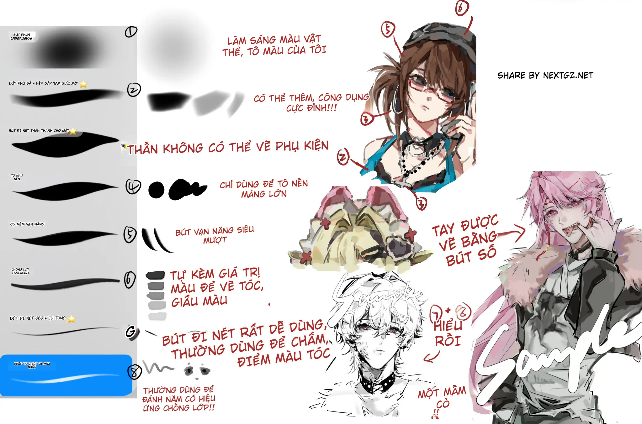
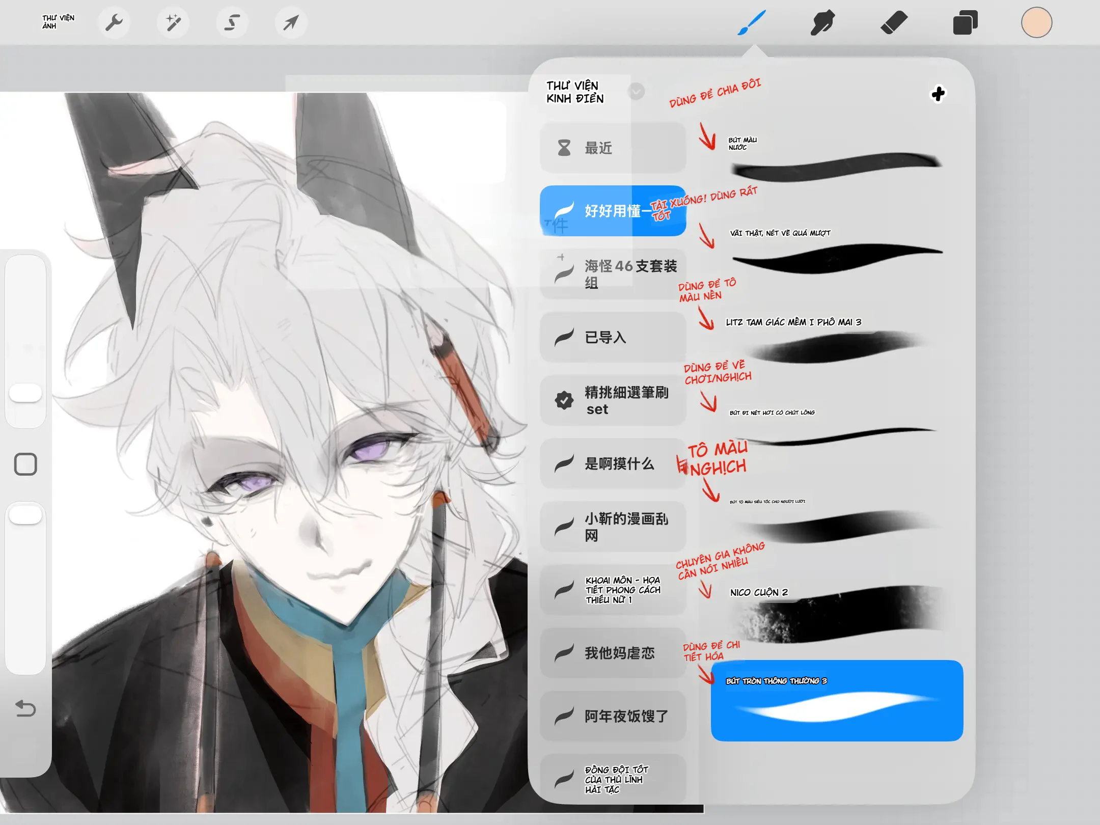
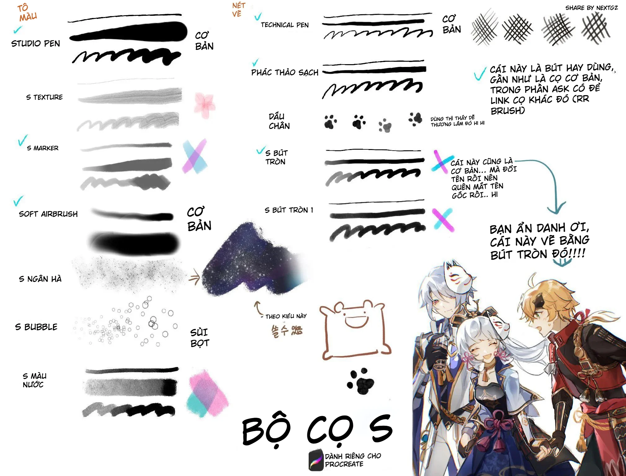
Share the versatile anime drawing brush set in this article, directly analyzed from the preview table featuring 8 brush tips, along with example illustrations of anime characters, chibi, lineart, and accessory coloring. What stands out about this brush set is not the large quantity, but how each brush handles a clear stage: softening light and shadow, building masses, filling backgrounds, inking lines, applying Overlay, dotting hair highlights, and sketching with a watercolor pencil feel.
This is the type of brush set suitable for artists who want to reduce time constantly switching brushes. Just by understanding the role of each brush tip, you can use a small group throughout the entire process from sketch to finish. The article will explain each brush based on the stroke marks shown in the image, suggest how to adjust size, opacity, pen pressure, and actual workflow so that beginners can also try it right away.
Note on compatibility: the preview table does not clearly show the software name or brush file format. Therefore, the article does not claim the brush set is exclusive to Procreate, Photoshop, Clip Studio Paint, or ibisPaint. Check the actual file extension before importing. The usage principles below still apply to most digital drawing software that supports pressure, opacity, and blending.
Quick overview: what stages does this brush set cover?
Looking at the entire brush test chart, the 8 brushes can be divided into four functional groups. The first group includes soft brushes and fill brushes for lighting, shading, creating gradients, or handling folds. The second group includes line art and base fill brushes, specializing in clean masses, sharp edges, and clear silhouettes. The third group includes a versatile soft brush and an Overlay brush for adjusting color, muting color, and enriching hair or skin areas. The final group includes fine stroke effect brushes and a textured sketch brush, used for dotting, creating hair strands, building lineart, or giving a traditional stroke feel.
| Brush No. | Main Role | Suitable Stage |
|---|---|---|
| 1 | Soft Airbrush | Lighting, soft shadows, blush, glow |
| 2 | Soft-edged fill brush | Building folds, filling masses, locking form |
| 3 | Thick line/mass brush | Thick lineart, accessories, silhouette |
| 4 | Large area base fill brush | Base color, flat background, color blocking |
| 5 | Versatile soft brush | Hair, skin, controlled blending |
| 6 | Overlay mode brush | Enhancing saturation, muting color, adding color light |
| 7 | Fine stroke effect brush | Stray hairs, color dots, light edges, details |
| 8 | Watercolor pencil sketch brush | Sketch, soft lineart, quick doodles |
Brush #1: Soft Airbrush for lighting and shading objects
Brush tip #1 has a dense center, a widely spreading edge, and almost no hard border. This is the typical structure of a soft airbrush. In anime art, this brush is most useful when you need to create large gradients without ruining the initial shapes. You can use it to add light to cheekbones, neck, shoulders, hair, or to darken areas under the chin, eye sockets, and the inside of clothing.
--- ---The key point is not to use the airbrush to "paint everything." If you overuse it, the artwork easily becomes blurry, flat, and loses its edges. A safe approach is to first lay down the base color with a flat brush, then use the airbrush on a separate layer, reduce the opacity, and only apply it to areas that need color transitions. For anime skin, use a brush size about 1.5 to 2 times larger than the area you're coloring to prevent the transition from turning into spots. For hair, only brush along large highlights, avoiding individual strands.
Recommended starting settings: opacity around 10–25%, low flow, large size, enable pressure for opacity if the software supports it. These are starting parameters, not the original brush settings in the image.
Brush #2: Flat brush for building folds and quickly blocking shapes
Brush #2 creates a long stroke with a thick body and slightly soft edges. Compared to the airbrush, it has a more defined form, making it suitable for building clothing folds, applying large shadows, or pulling color blocks in the direction of movement. In the illustration table, this brush is described as a tip that can assist with folds. That makes sense because the stroke shape has a tapered tip, a wide body, and is soft enough to pull into shadow strips.
When drawing jackets, skirts, scarves, or soft materials, first determine the direction of the fabric tension. Then place the brush at the stress point and drag it along the fold's direction. Avoid randomly painting many parallel strokes, as that will make the material look like hair. For large folds, use a large brush size and medium opacity. For small folds, reduce the size but keep the stroke direction consistent.
If you're using Clip Studio Paint and want to check out more brush sets specialized for folds, you can see the article Clip Studio Paint brushes for building form and painting folds. If you need a larger versatile set for both Procreate and Photoshop, the resource 160 brushes for anime drawing, inking, coloring, and airbrushing is a suitable choice for comparing workflows.
Brush #3: Thick line brush for faces, accessories, and silhouettes
Brush #3 has a very thick body, strongly tapered ends, and sharper edges compared to the soft brush group. This type of brush is suitable for creating solid black areas, drawing thick lines, or building accessories that need a clear graphic feel. In the character example above, arrows point to hair accessories, necklaces, straps, and costume trims. These are precisely the areas where this brush type excels: it quickly creates contrast and prevents accessories from blending into the hair or skin color.
--- ---With anime lineart, you don't need to keep a fixed line thickness. Increase pen pressure in shadowed areas, under the hair, under the chin, or where two objects overlap; decrease pen pressure in highlighted areas and at the tips of hair strands. If the brush has good pressure size sensitivity, a single stroke can naturally create a sharp tip, thick body, and tapered tail. If the pressure is too sensitive, increase the minimum size to prevent the line from breaking.
This brush is also useful for building silhouettes before rendering. You can fill the entire character shape with a dark color, check the overall posture, then separate the hair, face, collar, and accessories. This is a quick way to spot proportion errors when zoomed out.
Brush #4: Flat fill brush for large areas, clean and easy to control
Brush #4 is illustrated with both long strokes and solid round dots. This indicates the brush tip can create solid fills, with little texture, making it suitable for base colors. For anime art, this is one of the most important brushes because a clean base color layer determines how easy the subsequent shading will be.
A safe workflow is to create the lineart first, use a selection or reference layer to define areas, then fill the base color with brush #4 on separate layers: skin, hair, clothing, accessories, and background. Once the areas are clearly separated, you can enable alpha lock or clipping mask to shade without bleeding outside. Don't try to render while filling the base. The goal of this step is only to create flat, solid fills that are easy to select later.
For large areas like backgrounds or cloaks, significantly increase the brush size rather than sweeping many small strokes. Sweeping too many times creates unwanted light and dark streaks in the fill. If the brush tip still has transparency, increase the opacity or paint on a new layer and merge later.
Brush #5: Versatile soft brush for drawing hair, blending colors, and connecting forms
Brush #5 creates long, smooth strokes with tapered ends and a moderately soft body. Compared to brush #2, it's lighter and easier to control when handling hair. The note on the preview panel emphasizes its "versatility" and ability to smooth. This is often the brush artists use most because it sits between a fill brush and a blend brush: it still retains edges but is not too hard.
--- ---When drawing anime hair, first divide the hair into large clusters, use brush number 5 to pull shadow streaks along the curve of each cluster. Then reduce the size to add a few standout strands. Don't draw hundreds of strands from the start. Most of the hair's feel comes from large light and shadow areas, while small strands are just the finishing layer.
Brush number 5 is also useful for "hiding color", meaning using an intermediate color to cover overly harsh boundaries between two areas. Instead of using a strong smudge to blur the shape, you pick up color with the eyedropper and then paint over it in a controlled manner. This method preserves structure better and keeps colors clean.
If you prefer soft brushes that still keep clear strokes, the article super smooth brush set for Procreate has additional examples of brush groups for color blocking, color adjustment, and softening transitions.
Brush number 6: Use with Overlay to enhance color glow without breaking the base
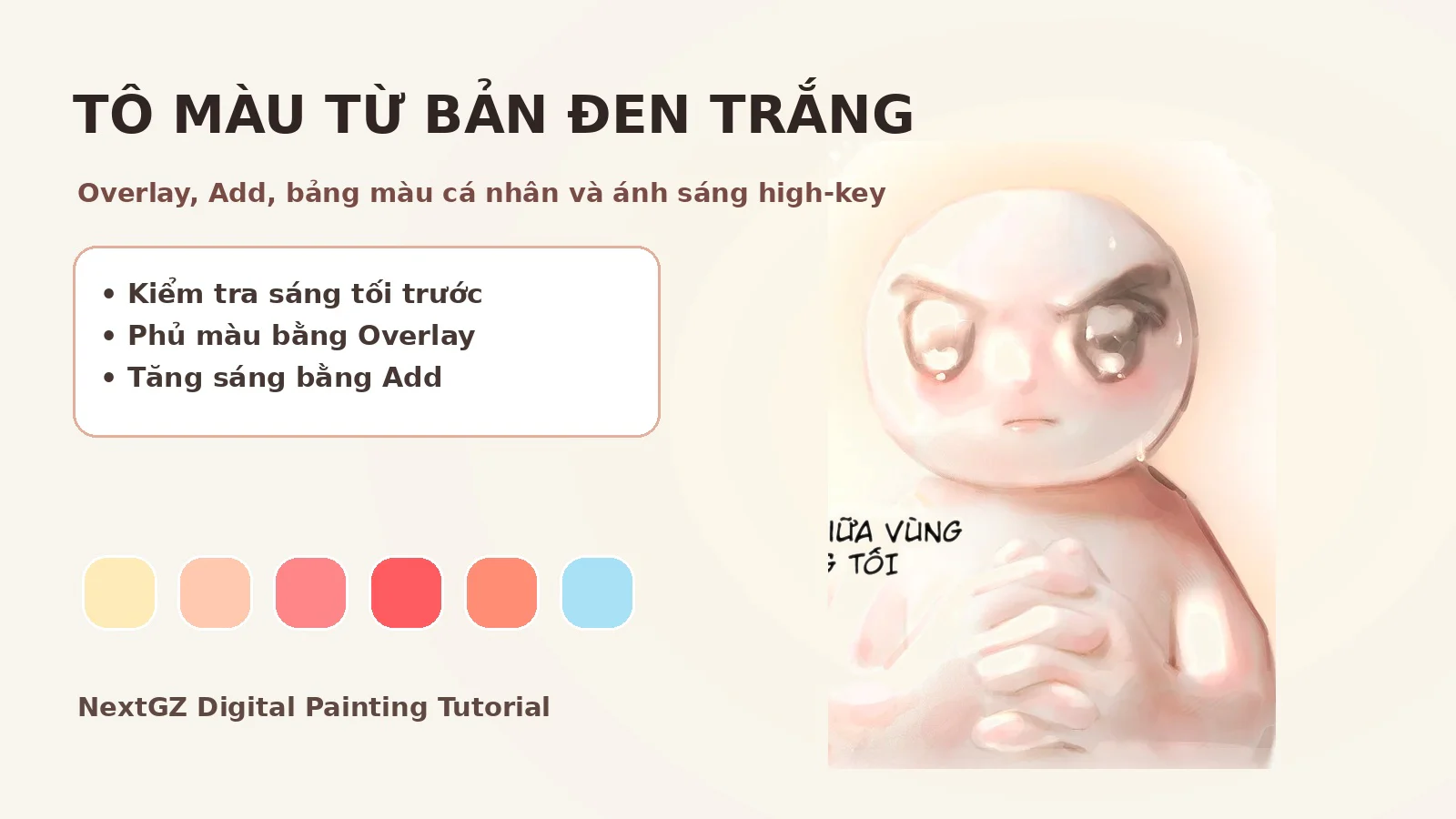
Stroke number 6 is thin, soft, and noted for use with the Overlay blending mode. In essence, Overlay makes bright areas brighter and dark areas darker based on the color you paint. This is a powerful tool but easy to overuse. If you paint too much, the skin will get burned out, hair becomes oversaturated, and contrast becomes unbalanced.
An effective way to use it is to create a new layer above the base color, set the blending mode to Overlay, then use warm colors for light areas and cool colors for shadow areas. For example, with brown hair, you can use a very pale red-orange to enhance the highlights; for hidden areas, use low-saturation blue-violet. Always reduce the layer opacity after painting. A good Overlay layer usually only makes the painting "feel more atmospheric" without making the viewer clearly realize you've used Overlay.
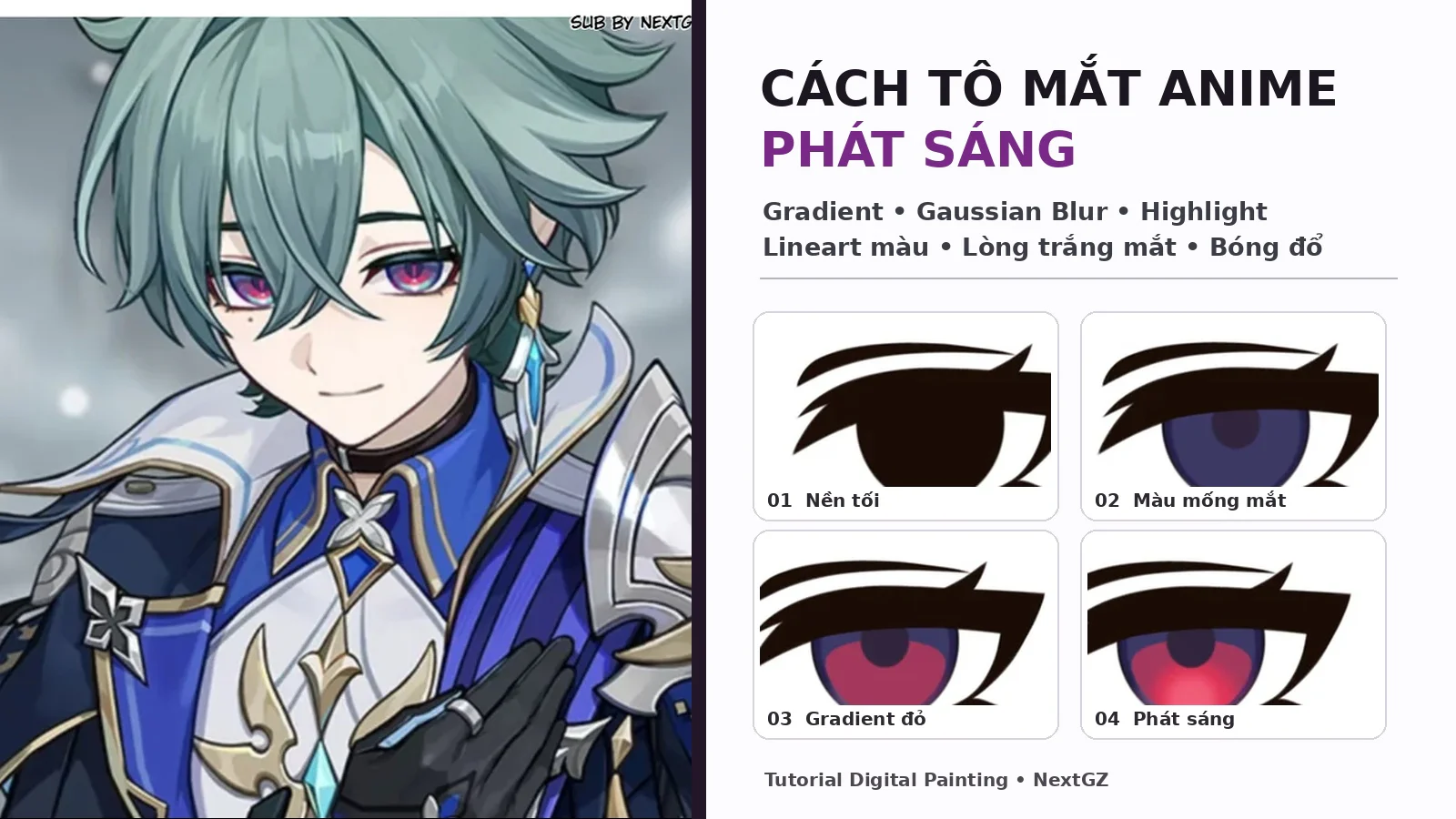
Besides Overlay, you can try Soft Light if you want a lighter effect, or Color Dodge for very small highlights. However, Color Dodge should be used minimally and only on targeted areas such as eyes, metal, hair edges, or glowing accessories.
Brush number 7: Fine line brush for dotting, creating baby hairs, and effects
---Brush number 7 gives a very fine stroke, a sharp tip, and a slight jitter. The note in the image indicates that this brush is commonly used for dotting hair colors, while the example on the right emphasizes the hand part drawn with brush number 7. This suggests it is a versatile lineart brush, fine enough for details but still with pressure sensitivity to vary thickness.
In the finishing stage, use brush number 7 for details with high visual impact: catchlight hair strands, eyelash edges, glove creases, jewelry strings, small folds, and highlights on clothing. Do not use it to cover the entire drawing. Small strokes are only effective when placed next to large areas; if every area has equal detail, the drawing will become cluttered.
To dot hair color, you can choose a color slightly lighter than the base, reduce the brush size, and place short strokes in clusters. Avoid spreading dots evenly across the entire head. Focus on areas near highlights, sideburns, the top of the head, and overlapping strands. For in-depth lineart practice, refer to the Talise lineart brush set for Procreate, which focuses specifically on thickness control and stroke rhythm.
Brush number 8: Watercolor pencil-style sketching brush for soft sketch and lineart
Brush number 8 appears on a blue background with a white stroke that has a slight texture, along with some jittery and dotted test strokes beside it. This is a sign of a sketching brush that mimics pencil or watercolor. It is suitable for quick sketches, soft lineart, expressive drafts, or creating edges that are not too clean to maintain a handcrafted feel.
The advantage of this type of brush is that it helps artists fear mistakes less. Because the natural texture hides stiffness, you can build the head, shoulders, hair, and outfit with many lightly overlapping strokes. Then use an eraser with texture to refine the form. For the final lineart, reduce the sketch opacity to 15–30%, create a new layer, and keep only the necessary lines.
In the black-and-white portrait illustration at the bottom, the sketching brush is combined with fine strokes to create a lineart sample with moderate roughness. This style is suitable for concept art, character sheets, mood paintings, or quick figure practice. If you need more brushes to increase information density and texture, you can check out the 48 Information Volume brushes for Photoshop, Procreate, and CSP.
Analysis of the three illustration examples in the brush chart
--- ---Example 1: Brown-haired character with many accessories
The brown-haired character above shows that this brush set is not only used for skin or hair shading, but also handles complex accessories well. The arrows mark multiple areas: hair, earrings, necklace, strap, hemline, and the colored patch below. A suitable combination is to use brush number 4 for the base, brush number 3 for dark areas and accessory outlines, brush number 5 for hair, brush number 7 for small details, and finally use number 1 or 6 to adjust lighting.
To prevent the accessories from looking cluttered, establish a contrast hierarchy. Areas near the face should have the clearest details; accessories that are farther away or obscured should have reduced contrast. Using a common dark color for multiple details will help unify the overall look rather than giving each item a different shade of black.
Example 2: Chibi with large color blocks
The chibi image in the middle features large color blocks, moderately soft edges, and few tiny details. This is a good test for brushes number 2, 4, and 5. Brush number 4 creates a clean base; brush number 2 builds shadows along the folds; brush number 5 connects the blocks and adds a few soft strokes. For chibis, deep rendering is not necessary. Just keep the silhouette clear, differentiate materials by edge hardness, and use small color points to guide the eye.
Example 3: Pink-haired portrait and black-and-white lineart
The pink-haired character on the right demonstrates a combination of sharp lineart, gray patches, and pink accents. Brush number 7 can be used for hands, eyes, stray hairs, and clothing folds; brush number 5 supports large hair sections; brush number 6 adds pink light highlights to the fur collar area or hair. Meanwhile, the black-and-white lineart sample below shows another usage approach: keeping the entire image nearly monochrome, focusing on stroke rhythm, and then only adding red to the eyes or accent points.
7-step workflow using the brush set from sketch to completion
--- ---- Sketch with brush number 8: build the head, shoulders, hair, and clothing with light strokes. Do not zoom in too close.
- Check the silhouette: use brush number 3 or 4 to quickly fill the character shape as a dark mass to check the pose.
- Block in base colors with brush number 4: separate layers for skin, hair, clothing, accessories, and background.
- Establish large shadows with brush number 2: place folds, shadows under the hair, under the chin, and inside the clothing.
- Softening with control using brush number 5: connect blocks, adjust hair, and hide overly harsh color boundaries.
- Add color accents with brush number 1 and 6: use airbrush for gradients, Overlay for atmospheric color shifts.
- Finish with brush number 7: add stray hairs, eyes, edge highlights, accessories, and intentional accent colors.
How to test brushes after installation
Don't judge a brush by a single test stroke. Create a small canvas and check four factors: size sensitivity based on pen pressure, opacity sensitivity, stability when drawing curves, and ability to create solid fills. For lineart brushes, draw circles, S-curves, and quick strokes from left to right. For fill brushes, try covering a large square to see if white gaps appear. For airbrush, test gradient transitions on a gray background to check for dirty edges.
If the brush jitters too much, increase stabilization moderately. If strokes lag, reduce stabilization or turn off dynamic smoothing. If the brush tip is too sharp and prone to breaking, increase minimum size. If fill coverage isn't solid, lower the spacing or use a different brush for base color. Don't force one brush to do everything when it's not suited for the job.
Common mistakes when using multi-purpose brushes
- Using airbrush too much: makes the image blurry, loses edges, and lacks a focal point.
- Blending every boundary: makes hair, skin, and fabric textures look the same.
- Drawing lines with the same thickness: makes lineart flat and lacks depth.
- Overlay too strong: causes color burning, especially on skin and light hair.
- Too much detail too early: using brush number 7 before the large forms are stable wastes time on corrections.
- Not separating layers: makes color adjustments and trying blending modes difficult to control.
Who is this brush set for?
This brush set is best suited for artists drawing anime, chibi, character illustrations, fanart, and character concepts. Beginners can use it as a framework to understand the role of each brush group. Experienced artists can take advantage of it as a minimal set, reducing time spent searching through a library of hundreds of brushes.
---If your style leans towards clean lineart, prioritize brushes number 3, 7, and 8. If you prefer painterly or semi-realistic, focus on numbers 1, 2, 5, and 6. If you are making stickers or chibis, brushes number 4 and 5 will be the two most used brush tips.
Conclusion
The strength of this anime drawing brush set is its clear functional division: one brush for soft edges, one for filling areas, one for thick lines, one for base coloring, one versatile soft brush, one Overlay brush, one fine line brush, and one sketching brush. When used in the correct order, you can complete almost an entire character illustration without needing to open a too large brush library.
Start by trying each brush on a separate canvas, noting the brush size and opacity that match your hand pressure. Then apply them to a small drawing consisting of hair, skin, clothing, and an accessory. The most effective way to learn is not to collect many brushes, but to understand clearly what type of edges, areas, and stroke rhythm each brush tip creates.


Bình luận
0 bình luận
Đăng nhập để tham gia thảo luận cùng cộng đồng!
Đăng nhập ngayĐang tải bình luận...