

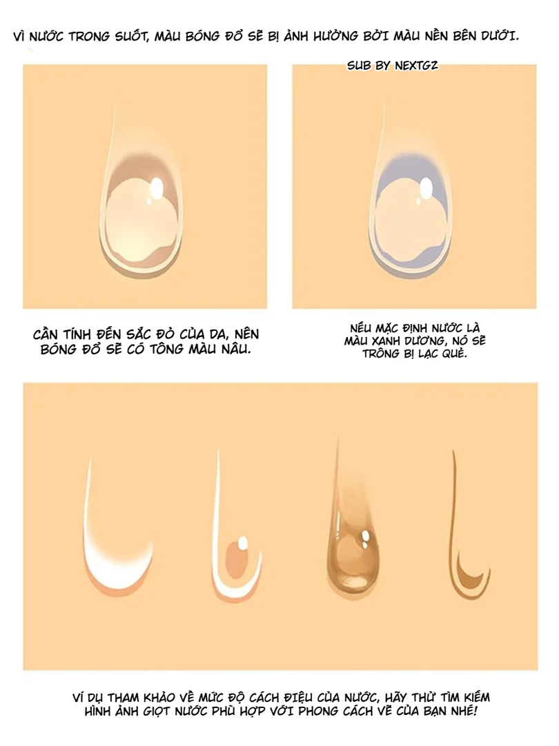
There are some paintings that you just look at and feel the force. The character charges straight into the frame, limbs thrust forward, harsh lighting, clear colors, a background with atmosphere, and a camera angle that makes the viewer feel like they are standing right in the scene. This type of painting looks like it just needs to be "drawn beautifully," but actually, behind it is a fairly rigorous process.
This tutorial set demonstrates exactly that.
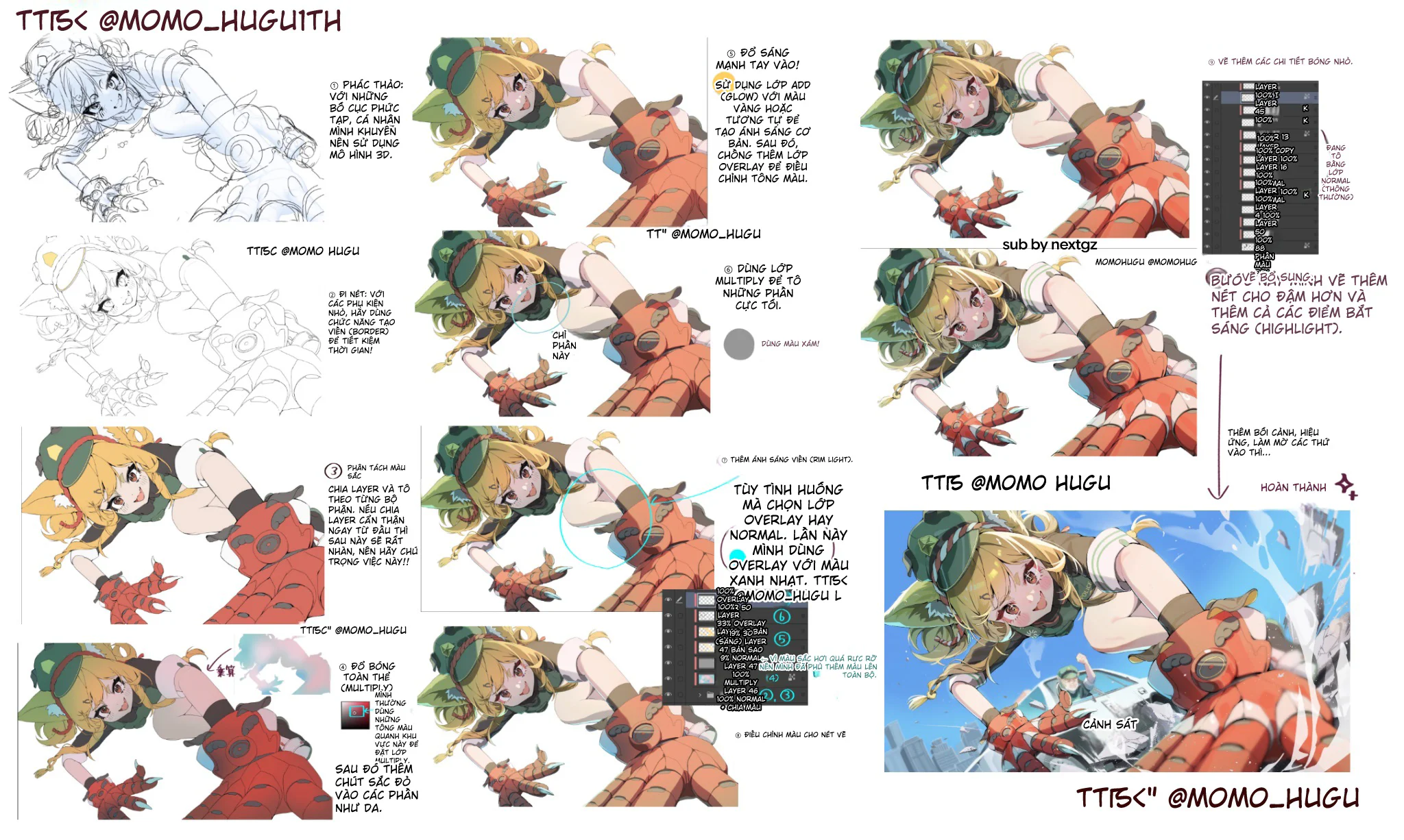
It doesn't teach quick one-step tricks, but follows a very methodical approach: lock in the composition first, gather just enough lines, separate colors cleanly from the start, apply overall shadows with Multiply, add separate deep shadows, run rim light using Overlay or Normal, then boost strong lighting with Add/Glow, and finally lock in the piece with small details and highlights.
Technically speaking, this is a very logical process. ibisPaint explains that Multiply is a mode that multiplies the color of the top layer with the bottom layer, so the result is darker or remains the same; at the same time, the app also uses Add for bright areas in the hair coloring tutorial. Adobe describes Overlay as a mechanism that is both Multiply and Screen depending on the background, while preserving the highlights and shadows underneath.
Start with composition, not with details
The tutorial begins with a very rough sketch, then recommends using a 3D model for difficult compositions. This is practical advice. With dynamic angles, the hardest part isn't beautiful hair or eyes, but:
how much the hand near the camera is enlarged
how the shoulder is rotated
how the head, chest, and hips are off-axis
whether the outstretched hand still fits within the logic of the body
If you don't lock that down from the start, you'll end up fixing things endlessly.
What's worth learning is that the author only uses the sketch as a skeleton. By the next step, the lines are still adjusted so the painting doesn't feel mechanical.
Lines only need to be clean enough to serve the color
Many beginners make the mistake of thinking that the more detailed the lines, the better the painting. But with this type of illustration leaning towards lighting and dynamic force as seen in the image, too many lines only slow down the rhythm.
This tutorial takes a smarter approach: just enough lines to block out the shape, differentiate materials, and define the main edges. The sense of completion comes from:
light and dark areas
colors
the thickness and thinness of strokes in the final step
glint points
This is a method that is both fast and easy to fix.
Separating layers from the start is the most worthwhile investment
The flat color step in the image looks simple, but it's actually the foundation of the entire piece. The author emphasizes dividing layers by body part. This is a principle that anyone who colors for a long time will inevitably have to return to.
When layers are well separated, you can:
change the skin color without affecting the hair
push shadows on the armor without bleeding onto the clothes
add rim light separately for hair and hands
try different color tones very quickly
Jokingly, this step is like cleaning the kitchen before cooking. It takes a bit of effort at first, but saves a huge amount of trouble later.
Multiply should be used to lock in the big shadows first
This image set shows a very reasonable rendering method: apply the overall shadow first, then handle the deep shadows. ibisPaint describes Multiply as a multiplication between the color of the top layer and the bottom layer, so the result is darker; in the highlight and shadow tutorial, ibisPaint also uses Multiply for the shadow part.
The important thing here is that the overall shadow doesn't just darken the painting. It creates three things:
unifies the light source
groups the character into the same environment
immediately determines which forms face the light and which face the shadow
When this step is done correctly, the painting is already halfway "standing."
Don't merge deep shadows with the overall shadow
This is a mistake many beginners often make. They use one Multiply layer for everything, from big shadows to very deep shadows. The result is that the painting becomes uniformly heavy, lacking rhythm.
In the image, the author separates the darkest parts into an additional pass. This is very correct. Deep shadows should be used sparingly for places like:
hair crevices
armor folds
hidden parts of the hand
border areas between nearby forms
Thanks to this, the overall shadow still maintains atmosphere, while the deep shadow is used to lock in structure.
Rim light is a very powerful tool for describing form
The rim light in this tutorial appears at the right time, after the forms are stable. The author uses Overlay or Normal depending on the situation, and this time chooses Overlay with a light blue color. Adobe describes Overlay as a mode that combines Multiply or Screen depending on the background, while still preserving the highlights and shadows of the base layer. This makes it very suitable for rim light, because the rim can follow the existing form instead of covering everything with white.
If you look closely, the rim light in the image doesn't run everywhere. It only clings to the edges that need to be separated from the background:
hair
hands
body curves
some edges of the armor
It is this restraint that makes the painting look more polished.
Strong lighting should only be added when the forms are done
ibisPaint clearly describes in their tutorial that Add is used to depict bright areas, and opacity can be reduced to avoid harshness. This image set follows that logic: strong lighting is placed in a late stage, after shadows and rim light are stable.
This is a very important point. If you add harsh lighting too early, the painting can easily become:
blown out
lose form
look spectacular but empty
unclear where the focal point is
In this tutorial, the strong bright areas are used to create a sunny feeling, brightening the hair, skin, and some metallic surfaces, but without breaking the overall rhythm.
Overlay is not a magic cure, but a refinement layer
Many beginners love Overlay because they feel it makes the painting "pop" quickly. But if the light and shadow forms aren't correct, Overlay only makes the mistakes look prettier; it doesn't turn mistakes into correctness.
Adobe explains that blending modes determine how the pixels of layers interact; Overlay specifically is a combination of Multiply and Screen depending on the background brightness. Therefore, it is best used when you already have a fairly stable light and shadow foundation and just want to increase color vibrancy or enhance the feeling of light.
That's how this tutorial uses it: not to save the painting, but to perfect it.
Highlights and accent lines are the "locking in" layer
The final part of the image emphasizes adding bold strokes and light-catching points. This is a very small step but carries significant weight. Glint points in the right places will make:
the eyes more lively
the armor more material-like
the hair less heavy
the hand near the camera look more realistic
As for accent lines, they help lock in the visual focal point. Where you want the viewer to look first, the strokes are thicker and slightly harsher. Where things recede into the background, ease up.
Why does this process make the painting feel forceful?
Clip Studio explains that value is the lightness or darkness of an object, and value contrast helps parts separate from each other more clearly; furthermore, shadow and highlight are ways to suggest volume on a 2D plane. Simply put, what makes this piece strong isn't just the beautiful colors, but because the author controls the values very well.
In the final product:
the hand near the camera has clear light and dark values
the face retains enough bright area so the expression isn't lost
the clothing has large dark areas to maintain form
the bright blue background serves as a pedestal for the character to pop out
That's why the painting has that "forward momentum."
Common mistakes if you learn from this tutorial
The first mistake is trusting 3D too much and letting the painting become stiff. 3D should only be a framework.
The second mistake is not separating layers carefully, leading to smudging in later steps.
The third mistake is putting all shadows into a single Multiply layer.
The fourth mistake is running rim light all around the character's edges.
The fifth mistake is overdoing Add/Glow, causing the painting to burn out.
The last mistake is adding highlights everywhere, leaving the viewer's eye with no place to focus.
How to apply this formula to your own painting
If you want to learn quickly from this tutorial, you can follow this order:
Sketch the composition and lock in perspective first.
Draw just enough lines.
Separate colors and layers cleanly.
Apply overall shadow with Multiply.
Emphasize deep shadows in a few key places.
Add rim light very sparingly.
Add harsh bright areas with Add or an equivalent bright mode.
Lock in the piece with accent lines, highlights, and background.
It sounds like few steps, but doing them in this correct order will make the painting much smoother.


Bình luận
0 bình luận
Đăng nhập để tham gia thảo luận cùng cộng đồng!
Đăng nhập ngayĐang tải bình luận...