Top 10 Most Popular Free Fonts in 2026: Supporting Vietnamese and Commercial Use
---
Summary of the 10 most popular free fonts in 2026 including Inter, Roboto, Open Sans, Montserrat, Poppins, Lato, DM Sans, Manrope, Playfair Display and Merriweather; with Vietnamese support, commercial license, font pairing and webfont optimization guide.
---
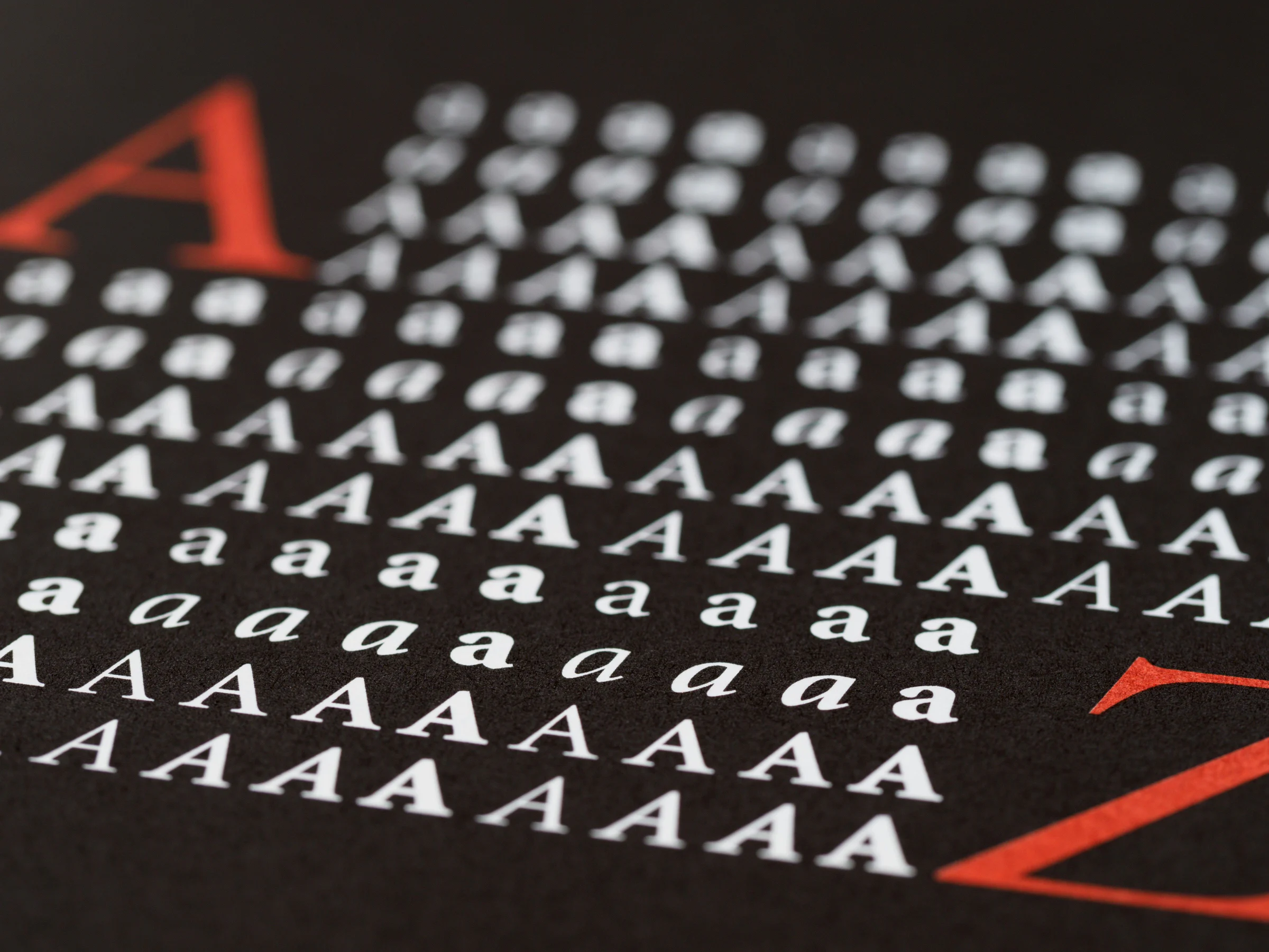
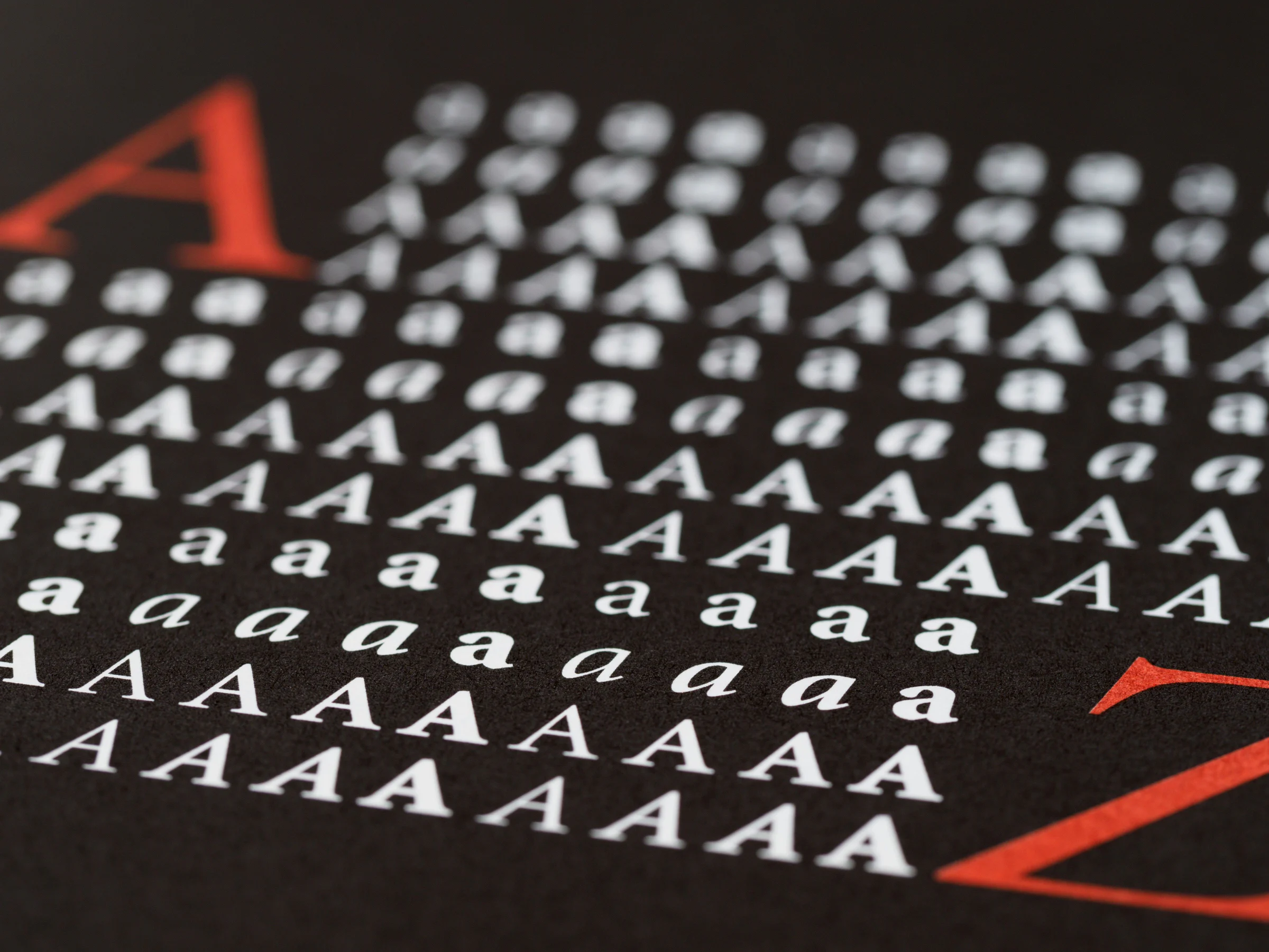
Sample letter A in various typography styles. Photo: Brett Jordan/Pexels.
Top 10 free fonts of 2026: Vietnamese support and commercial use
A good font does more than make a design look better. It determines how quickly readers absorb information, the sense of trust a brand conveys, clarity on small screens, and even page load performance. In 2026, typography trends continue along two parallel paths: flexible, UI-optimized sans-serif still dominates digital products, while character-rich serif is making a stronger comeback in editorial, fashion, cosmetics, and luxury brands.
The list below focuses on ten free font families with high recognition, widely used in websites and design, with transparent release sources, licenses permitting commercial applications, and character sets suitable for Vietnamese. The order is an editorial ranking based on current popularity, versatility, family quality, web deployment capability, and relevance to 2026 design needs; it is not a single absolute download chart.
All ten choices can be downloaded from Google Fonts or official source repositories. Google Fonts defines the families in its library as open-source fonts, usable for personal and commercial projects under their accompanying licenses. When redistributing, making deep modifications, or embedding fonts into products, users must still retain the license file and comply with each family's specific terms.
Quick reference table of 10 free fonts for 2026
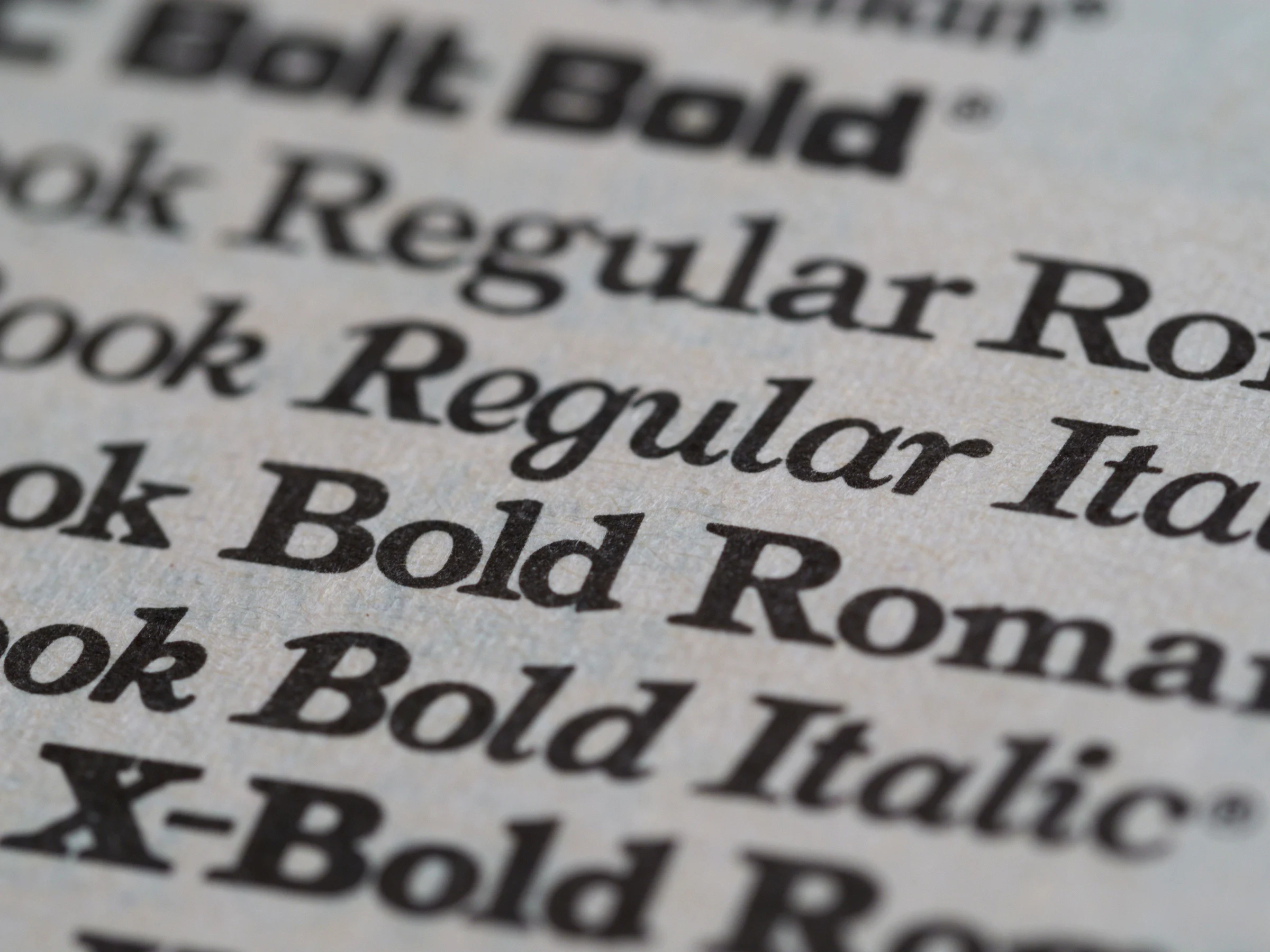
Bold, Regular, and Italic font styles on a printed sample. Photo: Brett Jordan/Pexels.
Rank
Font
Category
Best suited for
Suggested pairings
1
Inter
Screen-optimized sans-serif
UI/UX, SaaS, dashboards, websites
Playfair Display, Merriweather
2
Roboto
Neo-grotesk sans-serif
Apps, system interfaces, documents
Merriweather, Playfair Display
3
Open Sans
Humanist sans-serif
Long-form text, corporate websites
Montserrat, Playfair Display
4
Montserrat
Geometric sans-serif
Headings, branding, landing pages
Merriweather, Open Sans
5
Poppins
Geometric sans-serif
E-commerce, startups, social media
Merriweather, Lora
6
Lato
Humanist sans-serif
Services, education, presentations
Playfair Display, Merriweather
7
DM Sans
Modern sans-serif
Product design, fintech, mobile apps
DM Serif Display, Playfair Display
8
Manrope
Modern geometric grotesk
Technology, minimal UI, luxury tech
Playfair Display, Merriweather
9
Playfair Display
High-contrast serif
Editorial, fashion, cosmetics
Inter, Open Sans, Lato
10
Merriweather
Screen-optimized serif
Long-form blogs, journalism, ebooks, education
Montserrat, Inter, DM Sans
Is "free" really usable for commercial projects?
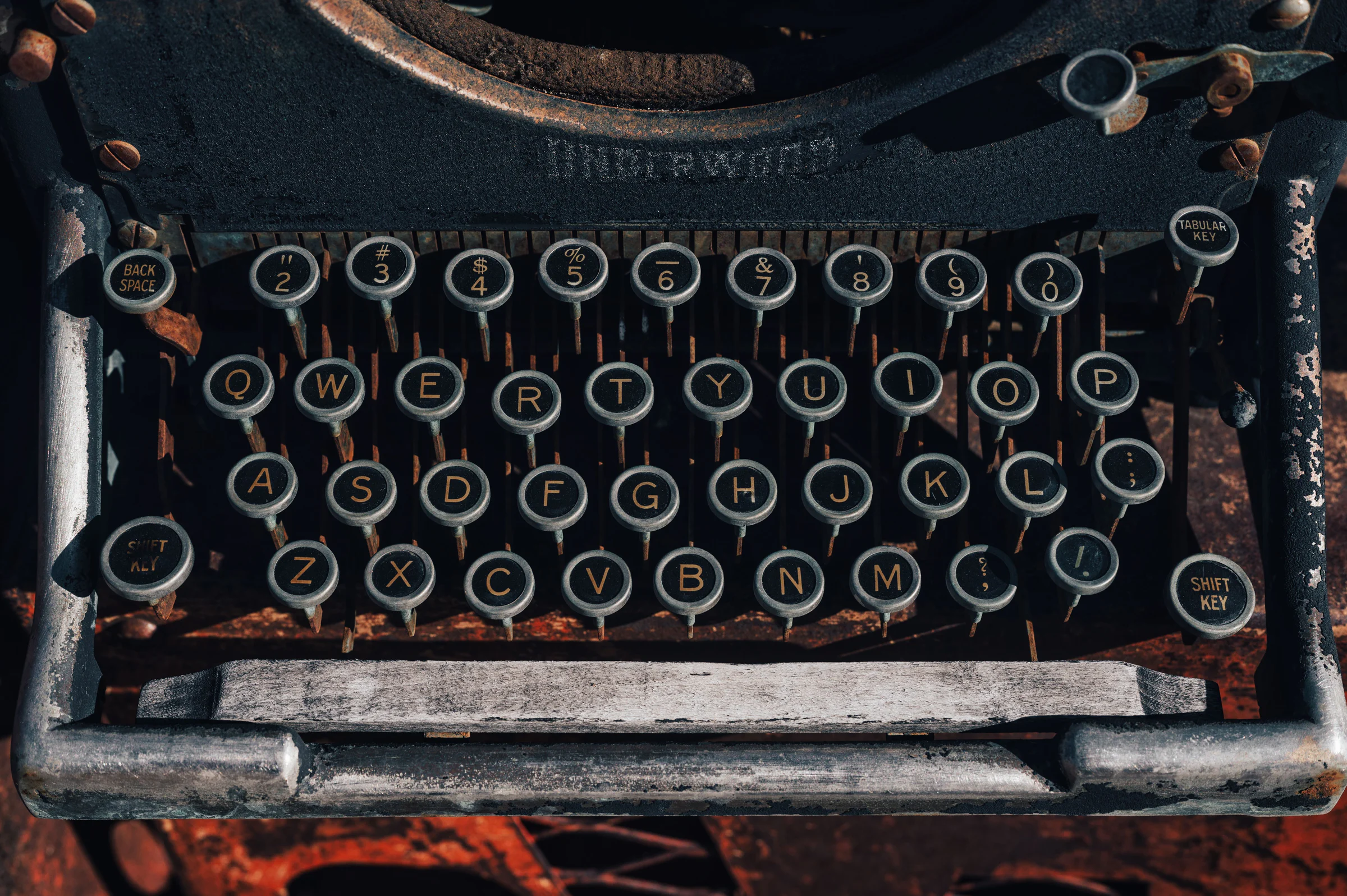
Letter keys on a vintage typewriter. Photo: Alfo Medeiros/Pexels.
Most families on this list use the SIL Open Font License 1.1, often abbreviated as OFL. This license permits using the font in logos, websites, applications, videos, books, advertisements, printed products, and paid projects. The font may also be embedded in PDFs, websites, or software within the scope of the license terms.
The key distinction is that using a font in a design is different from reselling the font file itself. OFL allows sharing and modifying the font, but the font file cannot be sold independently as a standalone product. When modifying a family, a new name may need to comply with Reserved Font Name terms if declared by the author. The license file and copyright information must be retained in the distribution package.
Roboto in the Google Fonts library was previously distributed under the Apache License 2.0, another open-source license that also permits commercial use. Whether downloading fonts from Google Fonts, GitHub, or other installation packages, always read the accompanying LICENSE file for the actual version, as families may change their source repository, structure, or terms between releases.
1. Inter – the most comprehensive choice for digital interfaces in 2026
Designer working with a digital layout on a computer. Photo: Jonathan Borba/Pexels.
Inter is designed specifically for computer screens. The family features a high x-height, clear apertures, and numerous useful OpenType features such as tabular figures, slashed zero, and contextual alternates. These characteristics make Inter highly readable in information-dense interfaces, dashboards, admin software, and SaaS products.
Inter offers a wide range of weights, suitable from body text to display headings. Within a single design system, one variable font can handle titles, labels, buttons, data, and paragraphs while maintaining consistency. This is why Inter often becomes the new default choice for startups, fintech, and productivity tools.
When is Inter most suitable?
Inter excels in UI/UX, web apps, dashboards, mobile applications, tech landing pages, product portfolios, and digital documents. The family also includes a complete Vietnamese character set, with clear diacritics even at small sizes.
How to pair Inter
Inter can stand alone in an interface. To create editorial contrast, use Playfair Display for large headings or Merriweather for article titles. A safe configuration is Inter 400 for body text, 500 for labels, and 650–750 for headings.
Points to consider
Inter appears in so many digital products that a brand may become overly familiar. Distinction should be created through type scale, spacing, color, imagery, and content voice rather than relying solely on the font family.
2. Roboto – the familiar standard for apps and the Android ecosystem
Roboto is one of the most widely recognized fonts in the digital environment. The family was once the default typeface for Android and Chrome OS and is closely tied to the Material Design language. Its letter structure combines geometric frameworks with natural curves, creating a technical feel that is not overly cold.
Roboto has a full Roman and Italic range from thin to bold. The family adapts well to interfaces, documents, tables, and long-form content. Vietnamese users are also fully supported with diacritics and extended Latin characters.
When is Roboto most suitable?
Roboto is ideal for Android apps, internal software, system design, instruction manuals, service websites, and interfaces that need a familiar feel. In cross-platform projects, Roboto helps reduce readability risks because users have been exposed to it for years.
How to pair Roboto
Roboto pairs well with Merriweather for blogs or educational content. Playfair Display creates stronger contrast for brand introduction pages. For purely product interfaces, Roboto can be used independently through weight and size variations.
Points to consider
Its high popularity also makes Roboto prone to feeling like a "system font." A clear art direction system will help the project avoid a default appearance.
3. Open Sans – top readability font for long-form content
Open Sans is a humanist sans-serif designed by Steve Matteson. Open forms, generous letter spacing, and friendly proportions help the family maintain good readability in paragraphs, emails, documents, and text-heavy websites. The project now has a variable font version and continues to be maintained in the official source repository.
When is Open Sans most suitable?
This is a strong choice for corporate websites, portals, blogs, reports, help centers, email marketing, and educational content. Open Sans causes less eye strain than many display sans when used for long passages.
How to pair Open Sans
Montserrat creates a clear sans–sans pairing: Montserrat for headings, Open Sans for body text. Playfair Display is suitable when adding an editorial touch. Body text at 16–18 px with a line-height around 1.55–1.7 typically provides a comfortable reading rhythm.
Points to consider
Open Sans leans toward neutrality and functionality. Logos or campaigns requiring strong personality will be more effective with a dedicated display face.
4. Montserrat – a standout choice for headings and modern branding
Montserrat is inspired by the signage and urban typography of the Montserrat neighborhood in Buenos Aires. Clear geometry, wide structure, and a rich weight range make the family one of the most popular choices for headings, wordmarks, posters, social media, and landing pages.
When is Montserrat most suitable?
Montserrat excels at medium to large headings, tech branding, real estate, education, events, banners, and social media design. The family supports Vietnamese and includes Roman and Italic styles across a wide weight range.
How to pair Montserrat
Merriweather creates a very balanced geometric sans and serif pairing. Open Sans offers an all-sans-serif solution suitable for corporate websites. Montserrat 600–700 for headings with Open Sans 400 for body text is a safe formula.
Points to consider
Montserrat in light weights and small sizes may lose clarity on low-resolution screens. The family performs better in headings, while long body text should use weight 400 or higher, or switch to a dedicated text face.
5. Poppins – round, youthful geometry, perfect for e-commerce
Poppins stands out with its nearly monolinear geometric structure, clear circular forms, and modern proportions. The family is widely used in startups, e-commerce, consumer apps, card UI, social media advertising, and brands targeting younger audiences.
When is Poppins most suitable?
Poppins works well for product titles, calls-to-action, banners, store categories, wordmarks, and friendly interfaces. Its weight range from very thin to very bold allows for clear hierarchy without needing a third family.
How to pair Poppins
Merriweather or Lora helps balance Poppins' geometry in long articles. For an all-sans design, body text can use Inter or Open Sans.
Points to consider
Poppins' round structure takes up relatively more horizontal space. Long paragraphs should use larger font sizes and wider line-height; high-density interfaces are better suited to Inter or Roboto.
---
6. Lato – Friendly yet professional
Lato, designed by Łukasz Dziedzic, combines a serious structure with slightly rounded details and a warm feel. The family is neutral enough for corporate use but has more personality than many system sans-serifs.
When is Lato most suitable?
Lato is suitable for service websites, schools, social organizations, presentations, courses, blogs, and brands that need a friendly feel. Bold weights create solid headings, while Regular maintains good readability in body text.
How to pair Lato
Playfair Display adds elegance and high contrast. Merriweather provides a good pair for educational or publishing content. Lato can also be used alone across an entire slide deck.
Points to consider
All-caps headings in Lato need proper tracking to avoid a dense feel. A slight letter-spacing helps titles breathe better.
7. DM Sans – A strong choice for product design and fintech
DM Sans is a modern sans-serif family developed for digital environments. The typeface features clean geometry, compact proportions, clear numerals, and a flexible variable font, making it suitable for products that need to present a lot of data while still feeling friendly.
When is DM Sans most suitable?
DM Sans is especially suited for fintech, mobile apps, booking platforms, dashboards, startups, and digital brand websites. The clear numerals help the family perform well in product prices, statistics, and data tables.
How to pair DM Sans
DM Serif Display is a matching pair from the same ecosystem, creating contrast while maintaining visual harmony. Playfair Display is an alternative when a stronger editorial feel is desired.
Points to consider
When presenting financial tables, enable tabular figures if the version and software support it, so numerals align in columns. This is more important than simply choosing a bold weight.
8. Manrope – Minimalist, tech-savvy, and with just enough personality
Manrope is a modern geometric grotesk that combines a technical structure with soft details. Compared to Inter or Roboto, Manrope often feels more premium and distinctive while retaining the cleanliness needed for UI.
When is Manrope most suitable?
The family is suitable for tech brands, AI products, minimalist landing pages, agencies, architecture, smart devices, and luxury tech. The variable weight range from light to bold handles most of the hierarchy.
How to pair Manrope
Playfair Display creates a counterbalance for editorial headings. Merriweather is suitable for long reading content. A tech website could use Manrope for headings and Inter for body text when readability is a priority.
Points to consider
Manrope does not have as rich an italic system as some older families. Projects requiring many italic quotes or complex editorial styling will be better served by Open Sans, Lato, or a serif with a complete italic set.
9. Playfair Display – A standout free serif for editorial and premium brands
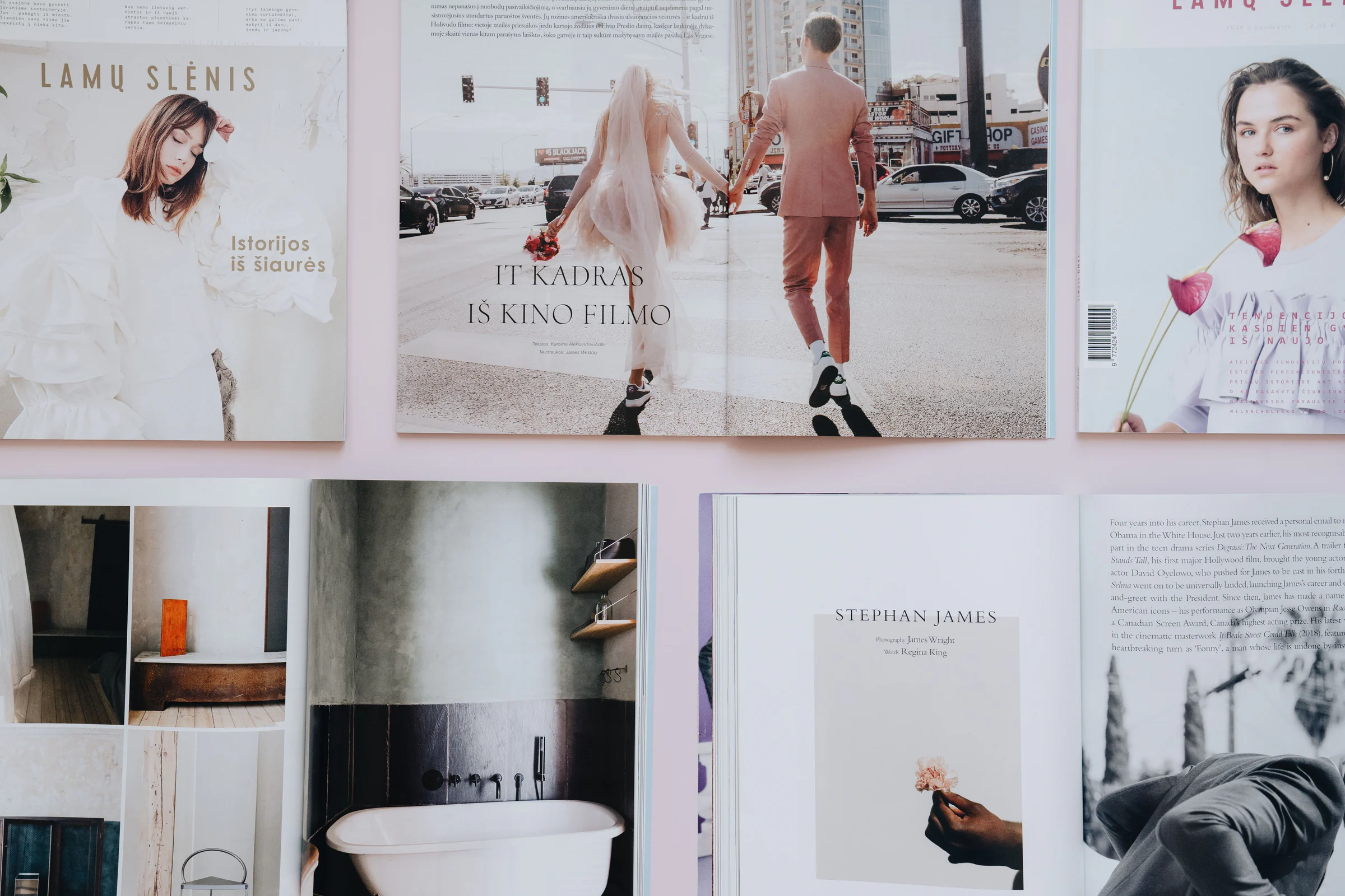
Magazine layout and editorial typography. Image: alleksana/Pexels.
Playfair Display is a display serif with high stroke contrast, evoking transitional typography from the late 18th century. Strong vertical strokes, delicate hairlines, and graceful details give the family a feel of fashion, cosmetics, art, and premium publishing.
When is Playfair Display most suitable?
The family shines in hero headings, campaign names, article covers, quotes, logotypes, restaurant menus, cosmetics, fashion, and magazines. Playfair Display supports Vietnamese and comes with multiple weights and italics.
How to pair Playfair Display
Inter is the most modern and implementable pair. Open Sans suits blogs or brand websites. Lato brings a soft and friendly feel. Playfair should retain the display role, while a sans-serif handles body text and interface elements.
Points to consider
The fine hairlines of Playfair reduce clarity when used at small sizes. At large sizes, with good background contrast and moderately tight line-height, the family's true beauty is revealed.
10. Merriweather – A readable serif for blogs, ebooks, and in-depth content
Merriweather is designed for screen reading, with a large x-height, sturdy serifs, and moderate contrast. Unlike display serifs, Merriweather remains clear in body text and is well-suited for long articles.
When is Merriweather most suitable?
This is a strong choice for in-depth blogs, journalism, ebooks, knowledge sites, courses, research organizations, and brands needing a trustworthy feel. The family supports Vietnamese, with multiple weights and italics to handle quotes, captions, and emphasis.
How to pair Merriweather
Montserrat is a common pair for modern headings with traditional body text. Inter or DM Sans suit product interfaces that have editorial content. Merriweather 400 body text paired with headings at 650–700 weight creates clear hierarchy.
Points to consider
Merriweather has many files if you load all weights and italics. A website should only serve the variants actually used, or prioritize a variable font if target browsers support it.
Choosing fonts by design goal
For websites and app interfaces
Inter is the most balanced choice. Roboto suits the Android ecosystem and familiar interfaces. DM Sans brings a modern product personality, while Manrope fits minimalist tech art direction.
For blogs and long-form content
Open Sans is a safe sans-serif choice. Merriweather creates a richer publishing reading experience. Lato sits between the two: friendly, professional, and readable enough.
For brands, posters, and social media
Montserrat is strong for headings and posters. Poppins feels young, round, and commercial. Playfair Display suits fashion, cosmetics, and luxury. A visual identity is often most effective with one display face and one text face rather than many competing families.
For data tables and dashboards
Inter, Roboto, and DM Sans have clear numerals, multiple weights, and support for tabular figures. Check negative signs, percentages, currencies, decimals, and numeral spacing in an actual prototype.
Five easy-to-apply font pairing formulas
Heading
Body
Style
Application
Playfair Display
Inter
Modern editorial
Fashion, cosmetics, brand blogs
Montserrat
Merriweather
Strong and trustworthy
Education, real estate, corporate
Poppins
Open Sans
Young and approachable
E-commerce, startups, communities
Manrope
Merriweather
Premium tech
AI, architecture, premium products
DM Sans
DM Serif Display
Cohesive yet contrasting
Fintech, product sites, editorial apps
How to check if a font truly supports Vietnamese
Basic Latin letters alone are not enough for Vietnamese. The font must correctly render diacritics, diacritic height, spacing, and the shapes of characters such as ă, â, ê, ô, ơ, ư, đ, along with all tone mark combinations.
Before committing to a brand, test a passage with a high density of diacritics:
“Trải nghiệm phông chữ tiếng Việt rõ ràng, hài hòa, giàu nhịp điệu và không làm mất dấu ở kích thước nhỏ.”
Test at 12 px, 14 px, 16 px, large headings, bold, italic, and all caps. A family with Vietnamese glyphs but poorly positioned diacritics can still feel unprofessional.
Optimizing webfonts to keep your website fast
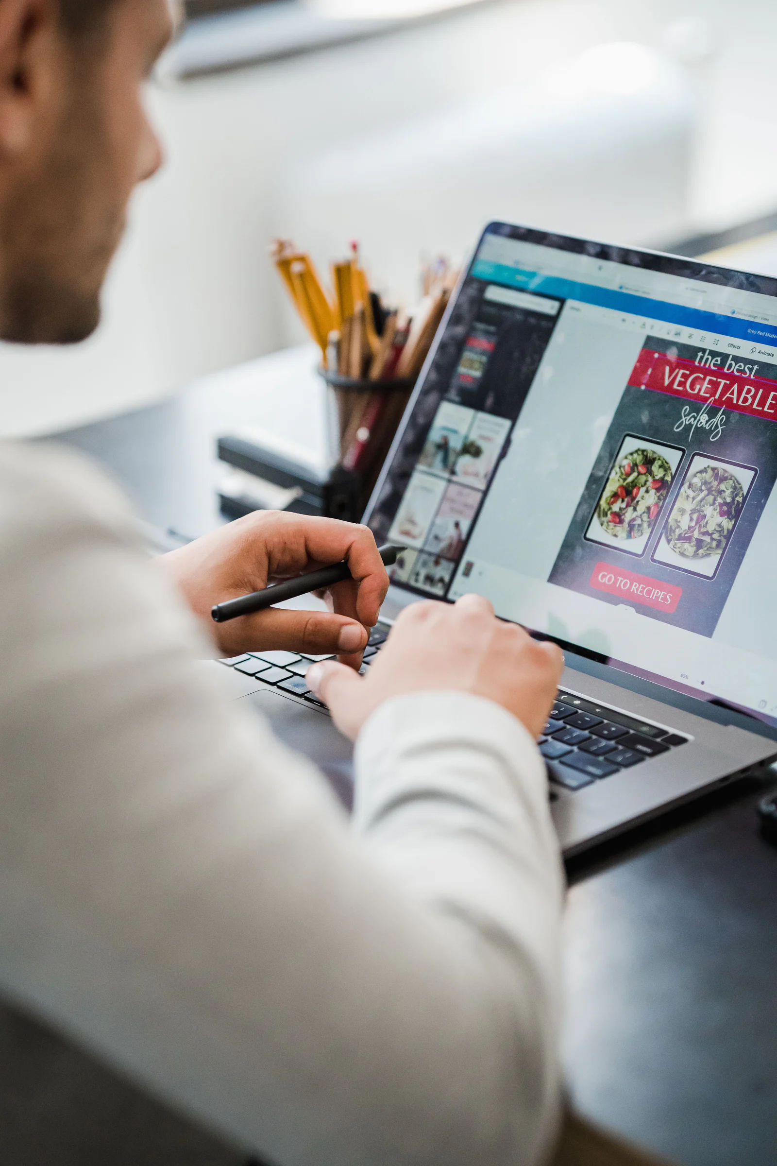
Testing layout and typography on a laptop. Photo: Mizuno K/Pexels.
Beautiful fonts are great, but loading too many files increases text display time and affects Core Web Vitals. A typical website only needs 2–4 actual variants. For example, body 400, label 500, heading 700, and italic 400.
Prioritize WOFF2 for modern browsers.
Use variable fonts when multiple weights are needed and the total file size is smaller than equivalent static files.
Only preload files that appear immediately on the first screen.
Use font-display: swap or a suitable strategy to ensure text appears early.
Subset by language when your build system and license allow it, but keep full Vietnamese glyphs.
Self-hosting gives you control over cache, privacy, and versioning; Google Fonts CDN is more convenient for small projects.
Typography is just one part of the design foundation. Beginners building a visual system can also check out the 90-day Digital Art learning roadmap to connect type, layout, color, and hierarchy.
Typography trends in 2026 influencing how fonts are chosen
Variable fonts continue to expand because they let designers adjust weight, width, and optical size more flexibly within a single family. Minimalist sans-serif still dominates UI, but brands are finding ways to escape the "same SaaS look" through intentional use of serifs, display faces, and letter-spacing.
Serifs are making a comeback, not to replace sans-serif everywhere. Their most effective role is establishing a brand voice in heroes, headings, and editorial content, while sans-serif handles navigation and interface body text. The pairing of Playfair Display with Inter, or Merriweather with Montserrat, reflects this very trend.
Google Sans Flex has become a notable name in 2026 after being open-sourced, but its ecosystem and adoption outside Google products is still evolving. Noto Sans, Source Sans 3, Lora, Oswald, and Raleway are also solid choices to try when the top ten families don't quite match your brand voice.
Font selection checklist for real projects
Determine whether the font is for body text, headings, UI, or logos.
Check all Vietnamese diacritics and numerals.
Read the license for the exact version you are downloading.
Test on phone screens, laptops, and print if applicable.
Measure readability at small sizes, not just large heading samples.
Check total WOFF2 file size and number of requests.
Test fonts with actual brand content.
Stick to a maximum of two main families for most systems.
The best font is the one that serves its purpose
Inter tops the list thanks to its balance of readability, variable system, OpenType features, and suitability for digital products. Roboto and Open Sans remain very strong choices due to their stability. Montserrat, Poppins, DM Sans, and Manrope offer more nuanced options for modern brands. Playfair Display and Merriweather show that serifs still play a vital role in a world full of sans-serif interfaces.
No single family wins for every design. An effective choice must simultaneously suit the content, audience, platform, performance, language, and licensing. When those factors are addressed, free fonts can absolutely produce professional, commercial-grade results.







Bình luận
0 bình luận
Đăng nhập để tham gia thảo luận cùng cộng đồng!
Đăng nhập ngayĐang tải bình luận...