Drawing anime eyes looks simple, but in reality, it's a part that can easily make a drawing "lose its mood." Just a flat iris, lines that are too dark, or a highlight placed incorrectly, and the character immediately loses emotion. Conversely, if you handle the gradation, reflections, eye rims, and eyelashes correctly, even a small pair of eyes can brighten up a face.
This tutorial set is worth learning because it doesn't just color the iris. It works from the inside out: building up the eye color first, creating reflections and highlights, then handling the eye rims, eyelids, eyelashes, and skin tone around the outer corner of the eye. This coloring method helps the eyes not look pasted onto the face but integrated into the character's overall look.
Why do anime eyes need multiple color layers?
Anime eyes don't function exactly like realistic eyes. They are a heavily stylized area, often using gradation, bright areas, and highlight points to express emotion. Therefore, even for small eyes, it's good to have a few basic layers:
a base color, a dark area on top, the pupil, a soft reflection, a sharp highlight, a warm eye rim, and recolored lineart.
If one of these layers is missing, the eyes might still look okay, but they will usually lack depth.

Step 1: Create the eye shape and apply the base color
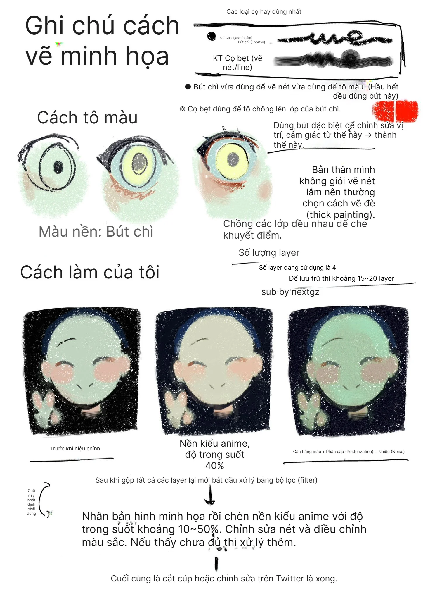
First, create the eye shape and fill in the base color for the iris. For the red-pink eye style in the image, the base should be pinkish-orange or light red. Don't choose a color that's too dark right from the start, as the following steps need room for brightness to create transparency.
The eye shape should have a clear upper eyelid and a softer lower eyelid. The upper rim can be thicker because this is where the eyelid and lashes create shadows. A slightly sharper outer corner will give the character more personality.
Step 2: Apply a darker color to create gradation
After the base layer, add a dark red color to the upper part of the iris. This layer creates a sense of depth, as the upper part of the eye is often shaded by the eyelid and lashes.
The easiest way is to use a soft brush or a gradient layer, pulling from top to bottom. The top part is darker, while the bottom part retains the light color. With just this step, the eye will look much less flat.
Step 3: Darken the upper part to make the eye deeper
The next step is to add more dark color to the upper half. This layer gives the iris weight. For red-pink eyes, you can use wine red, reddish-brown, or a very light reddish-purple.
Don't darken the entire eye completely. Let the bottom part retain its brightness, as this is the area that makes the eyes sparkle and look cute.
Step 4: Add the pupil
The pupil is the anchor point for the gaze. In the image, the pupil is drawn simply with a dark reddish-brown color. For small eyes, this method works well because it doesn't clutter the eye.
If drawing larger eyes, you can add an inner ring, small patterns, or secondary bright areas. But for chibi eyes or small-sized eyes, the simpler it is, the easier it is to look good.
Step 5: Use Screen to create a soft reflection
After you have the base and the pupil, use a Screen layer to add a reflection. Screen is a blending mode that lightens, creating the opposite effect of Multiply and making the resulting color brighter than the original, making it perfect for creating a soft light layer inside the iris.
The reflection should be a blueish-white, light blue, or light pink depending on the character's color palette. Here, a light blue reflection helps tone down the redness of the eye and makes it look clearer.
Step 6: Use Add to add highlights under the eye
This step uses Add to create highlights. Add adds the color information of the top layer to the layer below, making that area brighter; Add Glow is even stronger than Add. When used for eyes, just a few small dots are enough.
The highlights should be placed according to the same light source direction. If the light source is top-left, the main highlight should also be near the top-left area or the part of the iris that catches the light. Don't place highlights randomly, as the eye will lose its logical lighting.
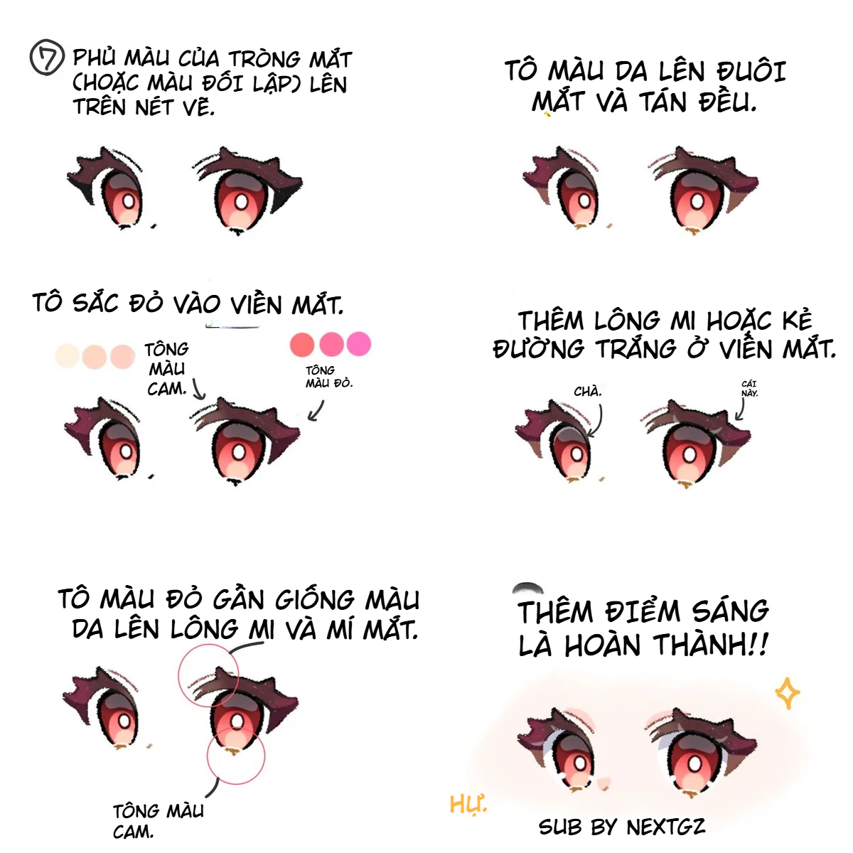
Step 7: Apply iris color onto the lineart
Once the inside of the eye looks good, work on the lineart. This is the step most people skip. If the lineart around the eye remains completely black, the eye will look stiff and detached from the face.
You can apply wine red, purplish-brown, or a color close to the iris onto the lineart. If you want it to stand out more, use a slightly contrasting color, but be subtle. The goal is to make the eye rim blend with the overall color, not to erase the lineart.
Step 8: Blend skin color at the outer corner of the eye
The outer corner of the eye needs to blend into the skin. Use a skin tone, light orange, or light pink and blend it gently at the outer corner of the eye. This step makes the eye softer and gives the feeling it sits within the eye socket.
If you skip this, the eyes can look like they are pasted onto the face. This is a very common mistake when coloring chibi characters.
Step 9: Add red tones to the eye rim
Adding red/orange to the eye rim makes the eye look livelier. It can be placed on the lower lash line, the inner corner, and the outer corner of the eye. For cute characters, pinkish-orange tones work well. For colder or darker characters, you can use reddish-purple or reddish-brown.
The important point is not to color it too heavily. The red rim should only suggest warmth and softness, not make the character look like they have an eye infection.
Step 10: Add eyelashes or a white line on the eye rim
The image suggests adding eyelashes or drawing a white line on the eye rim. These are two different finishing approaches.
Eyelashes make the eye sharper and give it more personality. A white line on the eye rim makes the eye look moist, bright, and clearer. For small eyes, even a very thin white streak is enough to create an effect.
Step 11: Apply reddish, skin-close tones to the eyelashes and eyelids
Don't leave the entire lash line solid black if your drawing style is soft and light. Apply a bit of reddish-brown, orange-red, or dusty pink to the eyelashes and eyelids. This method makes the eyes less heavy and helps the red-pink eye color blend better with the skin.
This step is especially suitable for pastel-colored art, chibi art, characters with light hair, or warm color palettes.
Step 12: Add the final highlights
Finally, add the very small highlights. This is the step that locks in the emotion. Just one bright dot in the right place can make the eyes light up immediately.
The final highlight should be sharper than the Screen reflection. If the reflection is soft light inside the eye, the final highlight is a sharp, bright point on the surface.
Tips for making red-pink eyes not look harsh
Add a little orange or skin tone to the eye rim to soften the red. Use light blue or blueish-white for the reflections to balance the warmth. Avoid using pure red for the entire eye, as it can easily make the character look tense or fiercer than intended.
If you want cute eyes, keep the lower part of the iris bright. If you want mysterious eyes, make the upper part darker and reduce the size of the highlights.
Common mistakes when coloring anime eyes
The first mistake is using overly strong black lineart. This makes the eyes stiff.
The second mistake is coloring the iris with only one color. The eye will look flat immediately.
The third mistake is using too many highlights. The eyes will look cluttered and lack focus.
The fourth mistake is ignoring the eye rim. The eyes look good in isolation but don't match the face.
The fifth mistake is using too harsh a red everywhere. The eyes will look tired or overly fierce.
Create the eye shape first.
Fill with a red-pink base.
Add a gradient with a dark top and light bottom.
Add the pupil.
Use Screen for a soft reflection.
Use Add for sharp highlights.
Recolor the lineart around the eye.
Blend skin color at the outer corner.
Add red/orange to the rim.
Finish with a few small highlights.
Conclusion
To color beautiful anime eyes, don't just focus on the highlights. A soulful pair of eyes needs enough layers: base, shadow, pupil, reflection, eye rim, eyelashes, and surrounding skin tone. This image set is great because it reminds us that the area outside the iris is just as important as the inside.
Just follow the correct order, and the eyes will become much softer, brighter, and more expressive.
Frequently Asked Questions
Is it mandatory to use Screen and Add?
Not mandatory, but very convenient. Screen is good for creating soft reflections, while Add is good for creating strong highlights. In other software, you can use equivalent brightening modes.
What color shadow should be used for red-pink eyes?
You can use wine red, reddish-brown, reddish-purple, or dark pink. Avoid using too much dark gray as it can easily make the eye look dirty.
Why do I need to recolor the lineart around the eye?
Because black lineart makes the eye look stiff. When you apply a color close to the iris or skin tone onto the lineart, the eye blends better with the face.
Should I add skin color to the outer corner of the eye?
Yes. Skin color blended at the outer corner of the eye helps it look soft and reduces the feeling that it's pasted onto the face.






Bình luận
0 bình luận
Đăng nhập để tham gia thảo luận cùng cộng đồng!
Đăng nhập ngayĐang tải bình luận...