How to draw folds of skirts and dresses in digital art: coloring soft blue-white fabric, with volume and light-catching effects
 Free
Free
Drawing clothing folds in digital art is not just about adding a few wrinkles to the fabric surface. A beautiful outfit needs clear fold directions,合理的 light and shadow areas, readable texture, and clean colors. Especially with flared skirts, white shirts, puffy sleeves, or fantasy costumes, if you don't understand how the fabric falls, the drawing can easily look flat or messy.
This tutorial guides you through a very easy-to-apply process: prepare a color palette, determine fold directions, divide large light and shadow areas, add gray areas, soften transition edges, sweep in highlights, stack layers for depth, and finally increase saturation to finish. This method is suitable for anime art, character illustrations, costume design, and basic digital painting.
Why is drawing clothing folds often messy?
Many beginners often draw folds by adding lots of thin lines onto the garment. But many folds don't necessarily mean correct folds. If the folds don't adhere to the pull points, pressure points, and the fabric's fall direction, the clothing will look more like crumpled paper than real fabric.
Fabric is always affected by gravity, body movement, seams, belts, waist, shoulders, elbows, hemlines, and overlapping fabric layers. Therefore, before rendering beautifully, you need to understand where the fabric is being pulled from and in which direction it falls.
For the dress in this tutorial, the most important part is the waist. From the waist, the skirt flares downwards, creating long folds pointing towards the hem. The sleeves are controlled by the arm shape, sleeve edge, and bodice, so the folds are shorter and sharper. The white shirt is on top, so it has fewer folds and needs to remain bright and clean.
Step 1: Prepare the color palette
First, prepare a simple color palette. In the image, the skirt and sleeves are covered in light blue, while the bodice and outer train use white-gray. This step establishes the base colors for the outfit.
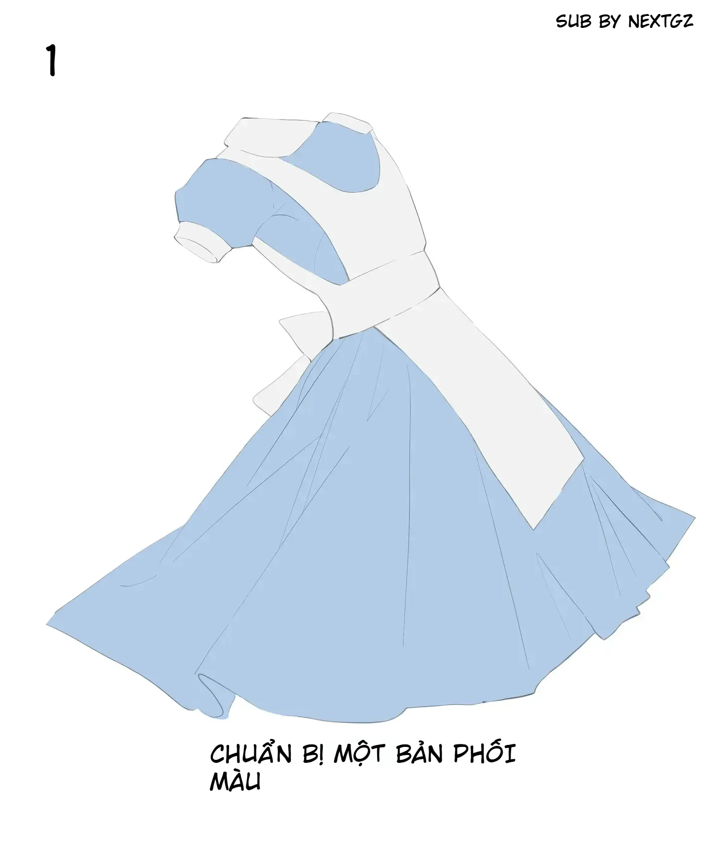
At this stage, there's no need for complex shading. The important thing is to clearly separate each part of the fabric: where is the blue skirt, where is the white bodice, where are the sleeves, where is the belt, and where is the outer drape.
The base color should be moderate, neither too bright nor too dark. If the base color is too dark, it's hard to add shadows later. If the base color is too light, there's no room for highlights. For the blue skirt, start with a slightly grayish light blue. For the white shirt, use off-white or very light gray instead of pure white.
Step 2: Understand the fold directions of the clothes
After establishing the base colors, determine the fold directions. This step decides whether the clothing looks logical or not.
For a flared skirt, main folds usually start from the waist and fall down to the hem. These folds can spread out like a fan. Near the waist, folds are often narrower and denser because the fabric is gathered. The further down, the wider and softer the folds become as the fabric has space to spread out.
For sleeves, folds often concentrate at the underarm, the sleeve edge, and where the fabric is bent. For a belt or white train, folds will run in the direction the fabric is pulled horizontally or overlaps the layer underneath.
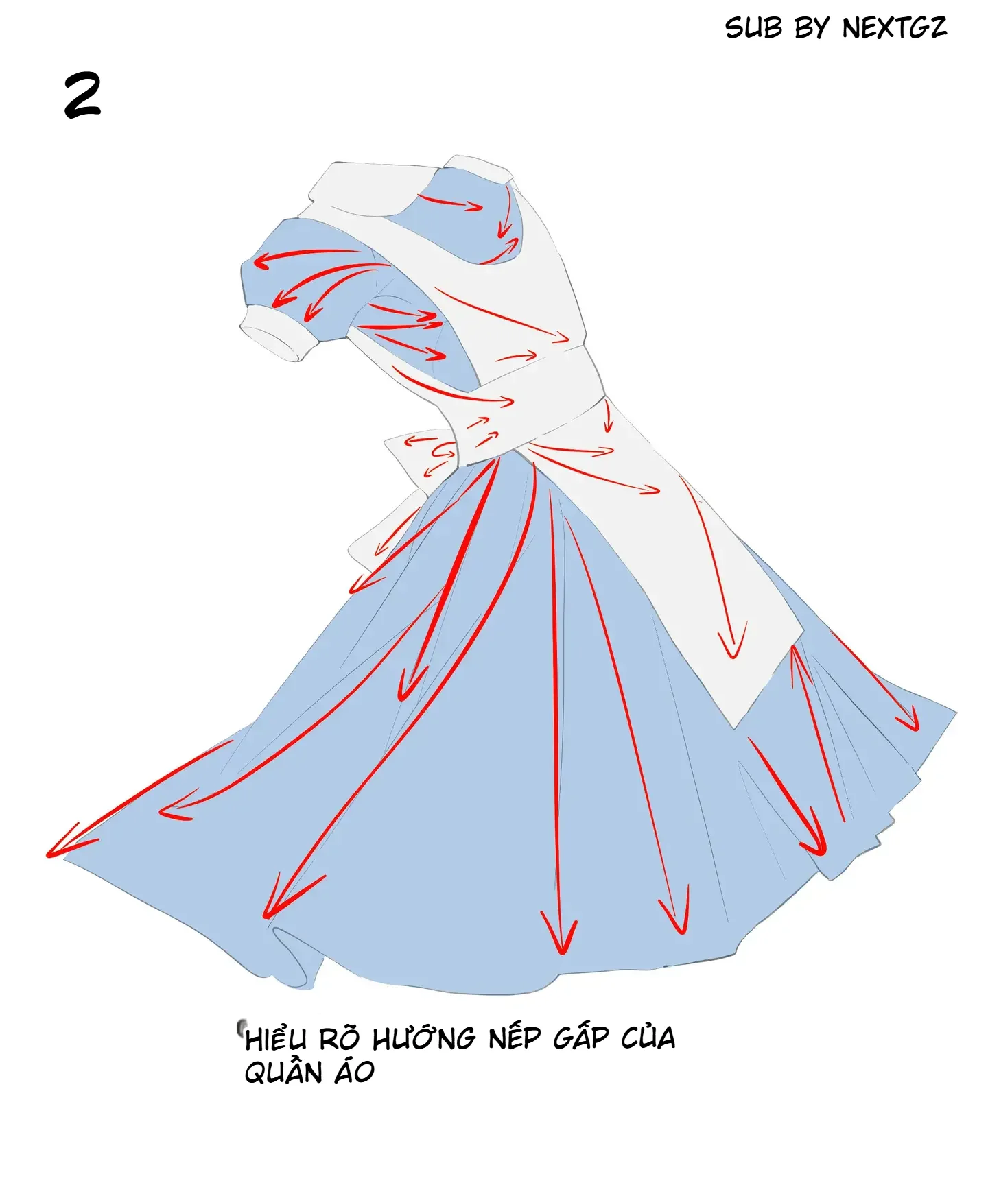
Before shading, look at the overall picture: which folds are the main folds, and which are just minor details. Don't give all folds equal importance.
Step 3: Divide into two large color areas, then add smaller areas
Once you understand the fold directions, start dividing light and shadow. At this step, separate the clothing into two large areas: light areas and dark areas. Then add smaller areas in places with deep folds.
This is a very important tip. If you jump straight into small folds, the drawing will look fragmented. If you divide the large areas first, the fabric will gain volume much faster.
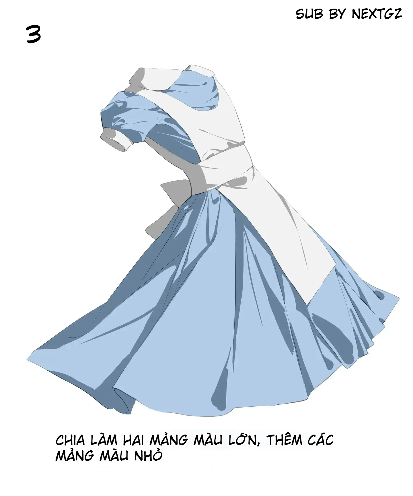
For the blue skirt, dark areas are usually inside deep folds, near covered fabric edges, under the white train, and on parts facing away from the light source. Light areas are on the fabric surfaces facing outward, receiving direct light. For the white shirt, shadows should be lighter and less saturated to keep a clean feel.
Step 4: Add gray areas for midtones
After establishing the main light and dark areas, add midtone gray areas. This step helps soften the fabric.
For the blue skirt, the gray areas can lean towards blue-gray or indigo-gray. For the white shirt, the gray areas should be light and clean, avoiding black or overly dirty grays. These areas should be placed in the transition zones between light and dark, under the fabric edges, on the inner sides of folds, and in areas covered by another layer of fabric.
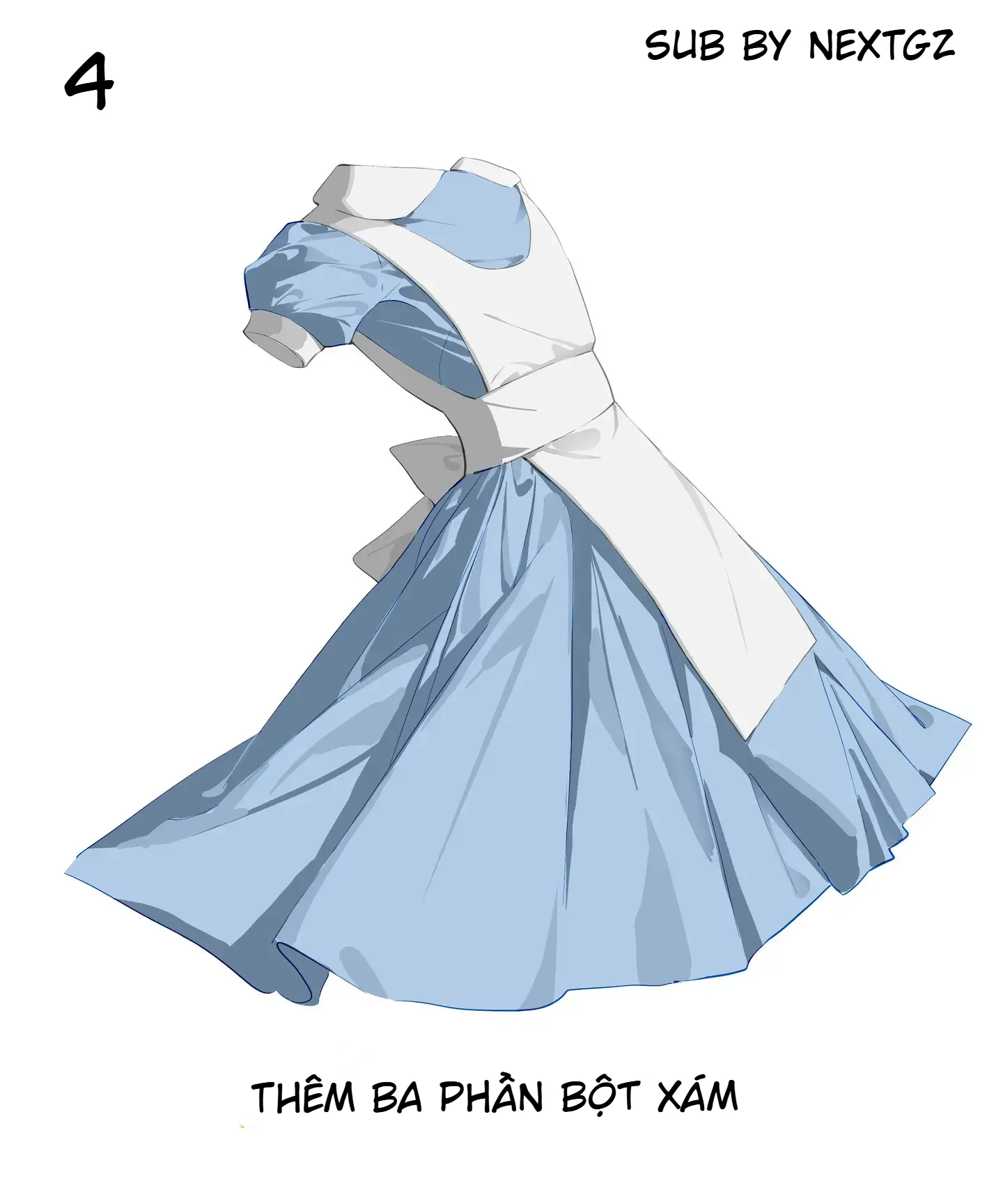
Gray areas don't need to be overly abundant. Just enough to connect the large blocks together.
Step 5: Soften transition edges
Once the shadow areas are in place, soften the necessary transition edges. Not every fold needs to be sharp. Some puffy fabric areas, areas with gentle light transitions, or wide surfaces should be slightly blurred for a more natural look.
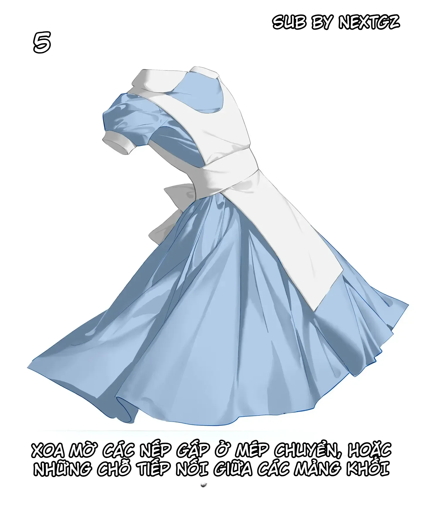
This can be understood simply: deep folds have sharper edges, puffy areas have softer edges, overlapping fabric edges are sharper, and shadows spreading across the fabric surface are softer.
This step helps the clothing feel less like cut paper. The fabric starts to feel soft, curved, and dynamic.
Step 6: Sweep highlights on edges near cast shadows
After softening the edges, lightly sweep white or very light blue onto the light areas near the cast shadows. This step creates the illusion of fabric catching light.
For the blue skirt, highlights should be placed on the fabric surfaces facing the light source. Don't sweep white over the entire surface as it will wash out the blue color. For the white shirt, highlights need to be even more restrained, as the shirt itself is already light. Just add a bit of clean white to the fabric edges, shoulders, train, and convex areas.
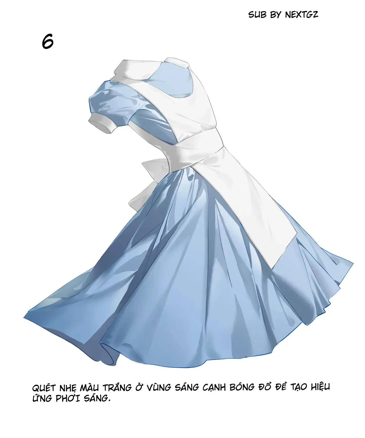
This step creates a slight sheen on the fabric, especially suitable for an anime style.
Step 7: Stack layers by block to increase depth
When the clothing has basic light and shadow, stack additional layers by block to darken the shadow areas. You can darken the inner sides of skirt folds, the underside of the train, the hem edge, hidden sleeve areas, and where fabric overlaps.
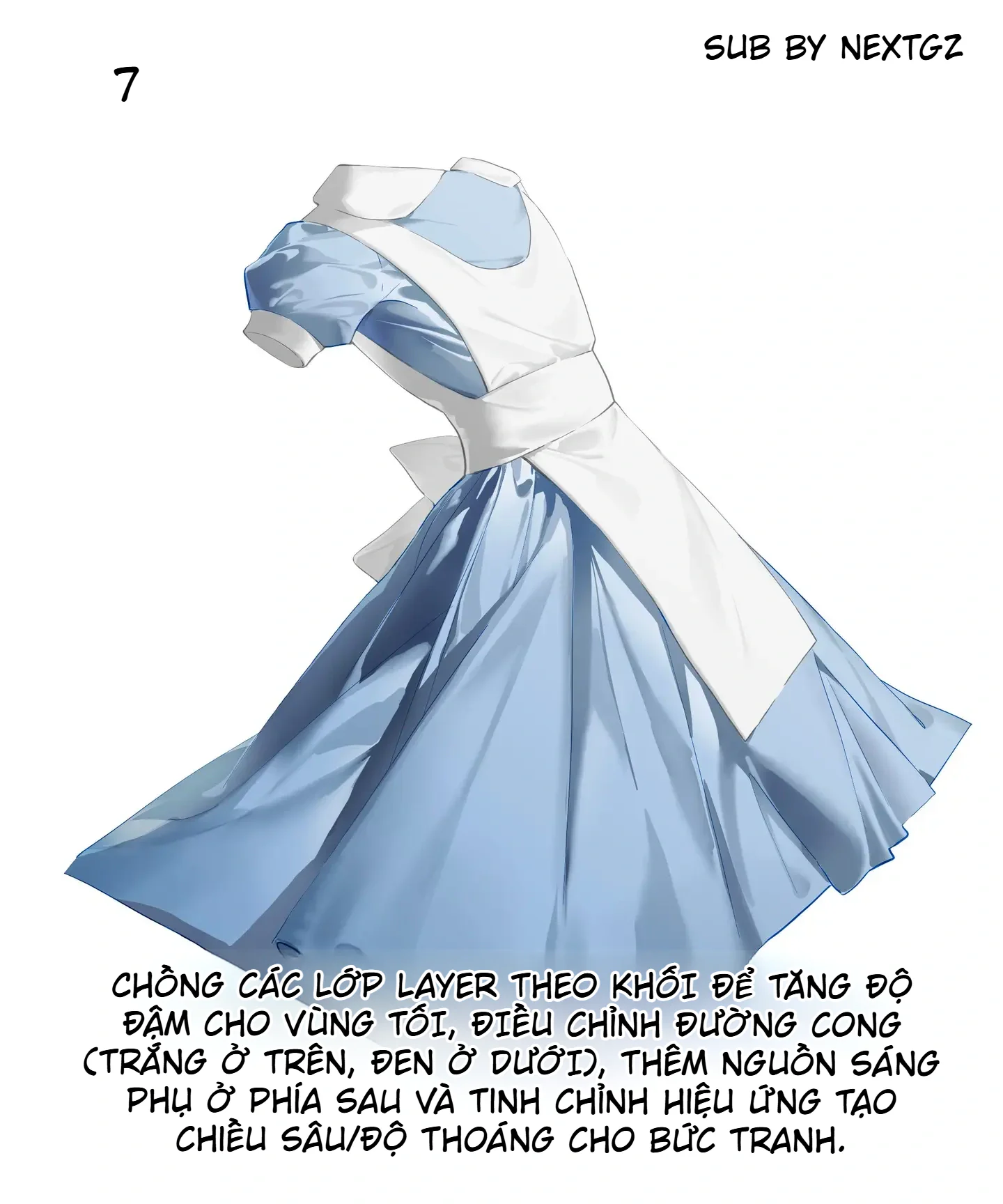
If your software has a curve adjustment tool, you can use it lightly to increase contrast. But don't push it too hard, as light blue fabric and white shirts easily become dirty in color.
At this step, you can also add a backlight source to separate the skirt edge from the background. Just a thin rim of light helps the clothing gain depth.
Step 8: Increase saturation just enough to finish
Finally, increase the saturation to an appropriate level. After many layers of gray and shadow, the blue color might become too pale or dull. A slight saturation boost makes the skirt fresher and more vibrant.
However, don't overdo it. A beautiful blue skirt has a certain clarity and softness. If the color is too harsh, the fabric texture will be lost and the clothing will look like plastic.
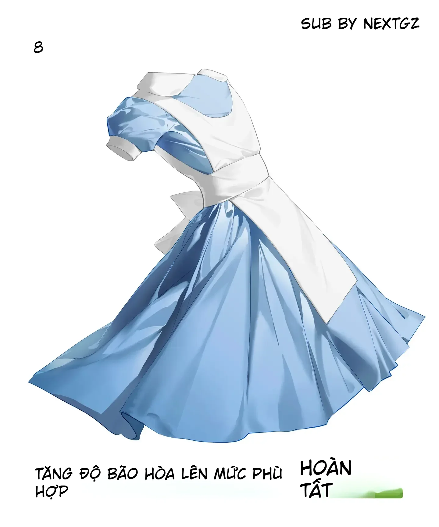
After this step, check the overall picture: Is the white shirt still clean? Is the blue skirt deep enough? Are the fold directions correct? Are the highlight areas blown out? If everything looks good at both large and small sizes, the piece is complete.
Tips for drawing a more beautiful flared skirt
Always remember that flared skirt folds usually go from the waist down to the hem. Don't draw too many horizontal folds without reason. Large folds should be few but clear; small folds are only for supplementation.
The area near the waist often has deeper shadows because the fabric is gathered. The hem area can be softer and may have some gentle curls. If you want the skirt to have movement, allow a few fold directions to deviate slightly according to wind or the character's spinning pose.
How to handle white fabric without it getting dirty
White fabric gets dirty very easily if you use shadows that are too dark. Use cool gray, blue-gray, beige-gray, or light purple-gray. Avoid using pure black for shadows on white fabric.
Additionally, white fabric doesn't need too many folds. A few shadows at the folds, fabric edges, and covered areas are enough. Keeping plenty of clean white space helps the clothing look bright and elegant.
Common mistakes when drawing clothing folds
The first mistake is drawing folds randomly without anchor points. Folds must have direction and a reason.
The second mistake is adding too many small folds. Many small folds but lacking large areas will make the drawing messy.
The third mistake is using shadows that are too black for white fabric. This makes the shirt look dirty and loses its clean feel.
The fourth mistake is softening all fold edges. If all folds are soft, the fabric becomes blurry and lacks structure.
The fifth mistake is forgetting to boost the color at the end. After many gray layers, the fabric color might become pale; it needs a slight adjustment to bring life back into the drawing.
Quick and easy-to-remember process
Prepare base colors.
Determine fold directions.
Divide light and shadow into large areas.
Add smaller areas in deep folds.
Add midtone grays.
Soften transition edges.
Sweep highlights on light-catching areas.
Stack layers to increase depth.
Increase saturation just enough to finish.
Conclusion
To draw beautiful clothing folds, don't start by drawing lots of wrinkle lines. Start with the structure: where the fabric is pulled, which direction it falls, which layer is on top, which layer is underneath, and where the light source comes from.
This tutorial is worth learning because it follows a clear order: base colors first, fold directions next, light and shadow areas, then softening, highlights, and color adjustment. Once you understand this process, you can apply it not only to a blue and white dress but also to princess dresses, uniforms, cloaks, puffy sleeves, and many other styles of anime clothing.
Frequently Asked Questions
Where should a beginner start drawing folds?
Start from the anchor points and the fabric's fall direction. For a flared skirt, look at the waist and hem first.
What color should be used for shadows on white fabric?
Use cool gray, blue-gray, purple-gray, or light beige-gray. Avoid using pure black as it easily dirties the fabric.
Should I draw a lot of small folds?
No. Divide into large areas first, then only add small folds where emphasis is needed.
When should I soften shadow edges?
Soften them in areas with gentle light-to-shadow transitions, puffy fabric surfaces, or where block shapes connect. Keep deep folds and overlapping fabric edges sharper.
Why increase saturation at the end of the piece?
To make the fabric colors fresher after adding many layers of gray, shadows, and effects. Only increase enough to maintain the fabric's natural quality.
Đánh giá bài viết
More from author
Phân tích cấu trúc cơ lưng nam trưởng thành: khung xương, cơ bắp và chia sáng tối
Top 5 Bảng Vẽ Wacom Dưới 2 Triệu Năm 2026: Đánh Giá Chi Tiết Và Lời Khuyên

Bỏ Phố Về Quê: Hành Trình Cải Tạo Nhà Vườn 4 Mùa Bình Yên & Bài Học Tiếng Trung Chữa Lành
Khám Phá "Ao Monet" Tuyệt Mỹ Dưới Mưa & Bài Học Tiếng Trung Về Sự Bất Ngờ
You might also like
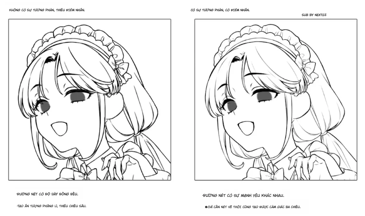
Mẹo vẽ Line Art: Cách tạo nét vẽ sống động và sử dụng Vector Layer hiệu quả

OC Color Palettes Based On Your OCs: Cách Build Bảng Màu Nhân Vật Dễ Thương, Dễ Nhớ, Tô Là Đẹp
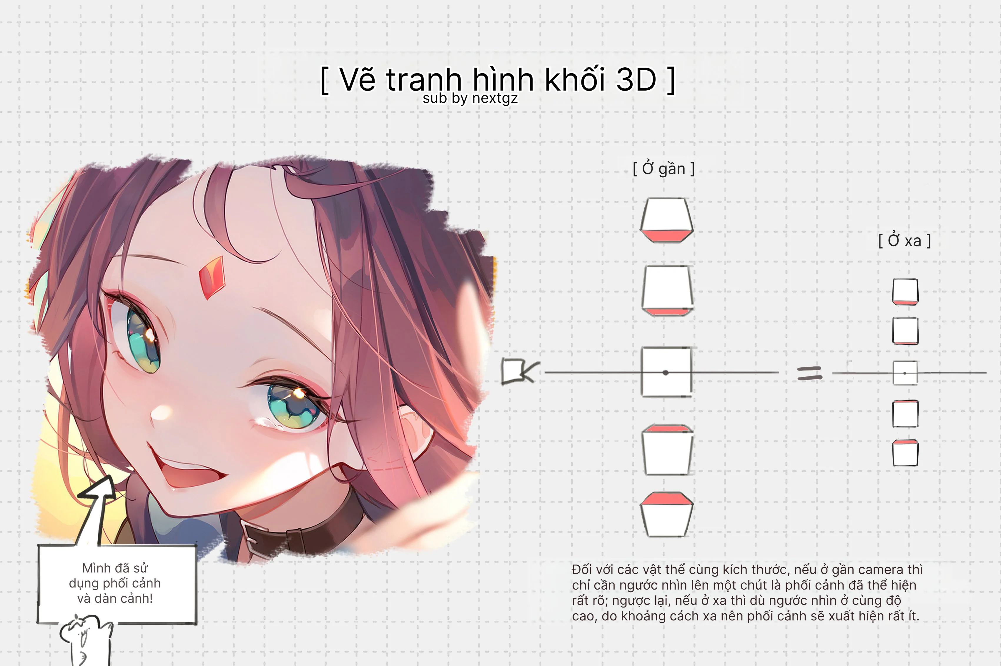
Cách vẽ tranh hình khối 3D trong anime: phối cảnh gần xa, góc cao và hiệu ứng cận cảnh


Bình luận
0 bình luận
Đăng nhập để tham gia thảo luận cùng cộng đồng!
Đăng nhập ngayĐang tải bình luận...