CLIP STUDIO PAINT Color Match: Tạo Nhiều Hướng Màu Từ Ảnh Và Gradient
Hướng dẫn dùng Color Match trong CLIP STUDIO PAINT để thử nhiều hướng màu từ ảnh tham chiếu và gradient, kiểm soát Intensity, Maintain brightness và xây color key có chủ đích.
Color Match trong CLIP STUDIO PAINT là công cụ thử hướng màu nhanh trên một lớp raster đã hoàn thiện. Thay vì tự kéo từng kênh màu rồi ghi lại hàng loạt thông số, bạn có thể lấy một ảnh tham chiếu hoặc một gradient làm “bản đồ không khí”, xem trước kết quả và điều chỉnh cường độ ngay trong một hộp thoại. Điểm mạnh của Color Match không nằm ở việc tự quyết định màu thay người vẽ, mà ở khả năng tạo nhiều phương án để bạn so sánh có chủ đích: cảnh nên ấm hay lạnh, tương phản màu cần mạnh đến đâu, và mức sáng tối ban đầu có nên được giữ lại hay không.
Hướng dẫn này xây dựng một quy trình thực chiến từ khâu chuẩn bị layer, mở đúng lệnh, chọn Image hoặc Gradient, kiểm soát Intensity và Maintain brightness, cho tới cách nhập ảnh tham chiếu và quản lý gradient set. Mục tiêu cuối không phải một cú bấm “đẹp ngay”, mà là một file làm việc có phương án màu rõ ràng, dễ đánh giá và không phá hỏng bản gốc.
Color Match giải quyết việc gì trong quy trình vẽ?
Ở giai đoạn gần hoàn thiện, nhiều tranh gặp một vấn đề rất quen: hình, ánh sáng và chất liệu đã ổn nhưng tổng thể màu vẫn chưa kể đúng câu chuyện. Bạn có thể muốn chuyển cảnh từ buổi trưa sang hoàng hôn, làm nhân vật nổi khỏi nền bằng cặp màu bổ túc, hoặc thử một bảng màu gần với ảnh tham chiếu. Nếu chỉnh thủ công bằng Hue/Saturation, Color Balance, Tone Curve và các blending mode, mỗi phương án có thể mất nhiều phút. Khi cần so sánh sáu đến tám hướng màu, thời gian thử nghiệm nhanh chóng phình ra.
Color Match rút gọn phần tìm kiếm phương án. Công cụ phân tích phân bố màu từ ảnh hoặc gradient đã chọn rồi chuyển màu trên lớp đích theo hướng tương ứng. Kết quả vẫn cần mắt người kiểm tra, bởi cùng một preset có thể hợp với tranh có value rõ nhưng làm bệt tranh vốn ít tương phản. Hãy xem Color Match như một bàn thử màu: nó đưa ra nhiều mẫu, còn bạn quyết định mẫu nào phù hợp với nội dung, chất liệu da, màu nhận diện nhân vật và nhịp sáng tối.
Nếu bạn mới làm quen giao diện, nên đọc trước bài tự học CLIP STUDIO PAINT cơ bản. Việc hiểu Layer palette, selection và cách nhân bản layer sẽ giúp toàn bộ quy trình dưới đây an toàn hơn.
Chuẩn bị file để thử màu mà không mất bản gốc
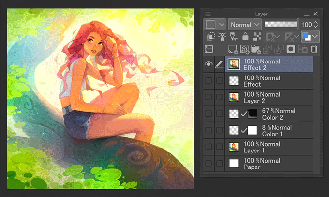
Color Match áp dụng tonal correction lên một lớp raster màu. Vì vậy, trước khi mở công cụ, hãy xác định chính xác lớp nào sẽ nhận thay đổi. Nếu tranh đã được chia thành nhiều lớp lineart, base color, shadow, light và hiệu ứng, bạn có ba cách chuẩn bị phổ biến.
Chỉ chỉnh một thành phần: chọn trực tiếp lớp raster của nhân vật hoặc background. Cách này phù hợp khi bạn muốn đổi không khí của riêng một vùng.
Chỉnh một nhóm đã hợp nhất: sao chép các lớp cần thử, rồi dùng Merge selected layers trên bản sao. Bạn vẫn giữ được cấu trúc layer gốc ở phía dưới.
Chỉnh toàn cảnh: dùng Merge visible to new layer để tạo một ảnh phẳng mới ở trên cùng. Đây là lựa chọn thuận tiện nhất khi cần so sánh color key cho toàn bộ tranh.
Đừng merge trực tiếp toàn bộ file đang làm. Một bản thử màu tốt phải có đường lui rõ ràng. Hãy đặt tên lớp mới theo mục đích, chẳng hạn “CM_warm_01” hoặc “CM_night_02”, rồi tắt lớp đó khi cần đối chiếu với bản gốc. Nếu chỉ muốn tác động lên nhân vật, hãy tạo selection trước khi mở Color Match. Phần ngoài selection sẽ không bị thay đổi.
Chọn đúng lớp raster màu trước khi mở Color Match. Ảnh: CELSYS/CLIP STUDIO TIPS.
Trong Layer palette, hãy kiểm tra biểu tượng và màu hiển thị của lớp. Color Match cần lớp raster có Expression color đặt là Color. Nếu lệnh bị mờ, nguyên nhân thường là bạn đang chọn folder, vector layer, text layer, layer mask hoặc một loại lớp không tương thích. Hãy tạo bản raster mới từ nội dung cần thử rồi chọn lại.
Mở Color Match đúng đường dẫn
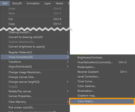
Sau khi chọn lớp đích, vào Edit → Tonal Correction → Color Match. Color Match là tonal correction trực tiếp, khác với Correction Layer có thể chỉnh lại bằng cách mở thuộc tính layer. Vì vậy, bước nhân bản lớp trước khi thao tác là thói quen quan trọng. Bạn có thể hoàn tác ngay sau khi áp dụng, nhưng một lớp thử riêng giúp so sánh lâu dài và tránh làm rối lịch sử Undo.
Đường dẫn Edit → Tonal Correction → Color Match. Ảnh: CELSYS/CLIP STUDIO TIPS.
Nếu bạn đang dùng một phiên bản cũ và không thấy lệnh, hãy kiểm tra phiên bản CLIP STUDIO PAINT. Color Match được giới thiệu trong thế hệ phiên bản 3.0. Trên file nhiều lớp, việc tạo một lớp tổng hợp mới trước khi mở lệnh cũng giúp hộp thoại phản hồi nhanh và cho kết quả dễ dự đoán hơn.
Chọn Image hay Gradient: hai cách định hướng màu khác nhau
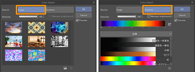
Trong hộp thoại Color Match, mục Source có hai lựa chọn: Image và Gradient. Hai nguồn này đều định hướng màu nhưng phù hợp với hai loại quyết định khác nhau.
Color Match cho phép chọn nguồn Image hoặc Gradient. Ảnh: CELSYS/CLIP STUDIO TIPS.
Image phù hợp khi bạn có ảnh tham chiếu mang không khí cụ thể: một con phố lúc chạng vạng, căn phòng dưới đèn vàng, rừng có sương xanh hoặc khung hình phim có bảng màu mong muốn. Công cụ lấy phân bố màu của ảnh đó làm cơ sở. Vì ảnh có nhiều vùng màu và tỉ lệ sáng tối phức tạp, kết quả thường đa dạng và giàu sắc độ hơn.
Gradient phù hợp khi bạn muốn một hướng màu gọn và có thể lặp lại. Gradient set thường hữu ích cho các mục tiêu như lạnh hóa bóng tối, đẩy vùng sáng sang vàng cam, tạo cảm giác đêm tím hoặc thử nhanh một bảng màu giới hạn. Đừng nhầm Gradient trong Color Match với Gradient Map. Color Match quan tâm đến tập màu của gradient; đảo chiều gradient không làm kết quả thay đổi theo cách Gradient Map làm.
Trong bài tập đầu tiên, hãy tạo hai bản sao từ cùng một lớp tổng hợp. Áp dụng một ảnh tham chiếu cho bản sao thứ nhất và một gradient cho bản sao thứ hai. Đặt cả hai cạnh bản gốc, rồi đánh giá theo ba tiêu chí: silhouette có còn rõ không, da nhân vật có bị lệch khó chịu không, và điểm nhấn có còn là vùng sáng nhất hoặc tương phản nhất không.
Đọc preset bằng quan hệ màu, không bằng cảm giác ngẫu nhiên
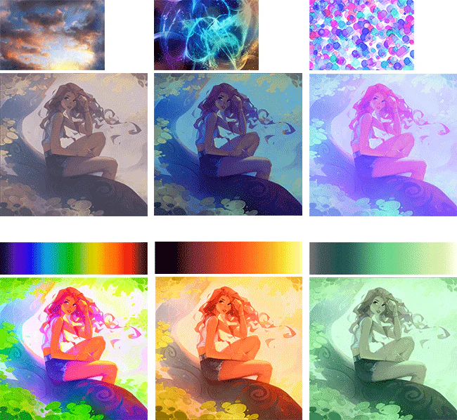
Khi chọn Image, Color Match cung cấp một số ảnh preset. Khi chọn Gradient, bạn có thể duyệt các gradient đã đăng ký. Đừng bấm liên tục cho đến khi thấy “lạ mắt”. Hãy đặt câu hỏi trước khi thử: tranh cần ấm hơn để gần gũi, lạnh hơn để xa cách, giảm bão hòa để trầm, hay tăng đối lập nóng–lạnh để tạo kịch tính?
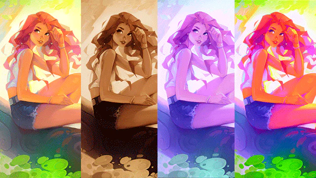
Một nhóm ảnh và gradient tham chiếu có thể tạo ra các kết quả màu rất khác nhau. Ảnh: CELSYS/CLIP STUDIO TIPS.
Quan sát ví dụ sẽ thấy mỗi nguồn không chỉ “phủ một lớp màu” lên tranh. Nguồn xanh đậm có thể đưa bóng tối sang xanh lam và giữ vùng sáng tương đối ấm; nguồn hồng tím làm các vùng trung gian chuyển mạnh hơn; nguồn có màu trung tính tạo kết quả gần đơn sắc. Điều quan trọng là nhận ra quan hệ giữa màu gốc và màu mới. Nếu tóc, da, quần áo đều trôi về một dải màu giống nhau, hãy giảm Intensity thay vì bỏ ngay preset.
Một cách làm hiệu quả là chụp nhanh bốn đến sáu phương án ở kích thước thumbnail. Thu nhỏ canvas để toàn bộ tranh chỉ còn khoảng 10–15 cm trên màn hình. Ở kích thước này, bạn sẽ dễ nhận ra phương án nào giữ được điểm nhìn, phương án nào làm background tranh chấp với nhân vật. Đây cũng là tư duy hữu ích khi xây dựng color script cho truyện tranh hoặc chuỗi minh họa.
Điều chỉnh Intensity theo mức thay đổi cần thiết
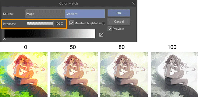
Intensity quyết định mức độ ảnh hưởng của nguồn màu lên lớp đích. Giá trị 100 tạo hiệu ứng mạnh nhất, còn 0 gần như trả về màu ban đầu. Trong thực tế, mức 100 thường phù hợp để khảo sát giới hạn của preset, nhưng hiếm khi là kết quả cuối cùng tốt nhất.
Intensity kiểm soát độ mạnh của hiệu ứng Color Match. Ảnh: CELSYS/CLIP STUDIO TIPS.
Hãy bắt đầu ở 100 để hiểu preset đang kéo bảng màu về đâu, sau đó giảm dần xuống 80, 50 và khoảng 25. So sánh từng mức với bản gốc. Với tranh nhân vật, vùng da thường là “cảnh báo sớm”: nếu da chuyển quá xanh, tím hoặc xám, Intensity đang cao hoặc nguồn tham chiếu không phù hợp. Với background, hãy theo dõi độ tách giữa tiền cảnh, trung cảnh và hậu cảnh. Color Match mạnh có thể làm ba lớp này gần nhau về màu và giảm chiều sâu.
Một mẹo thực tế là chọn mức hơi mạnh hơn kết quả mong muốn, áp dụng, rồi giảm opacity của lớp đã xử lý. Cách này cho bạn thêm một núm điều khiển sau khi đóng hộp thoại. Bạn cũng có thể thêm layer mask để chỉ giữ hiệu ứng ở background hoặc vùng bóng. Nếu chưa quen mask, bài Layer Mask trong CLIP STUDIO PAINT sẽ giúp bạn kiểm soát vùng tác động mà không xóa pixel.
Maintain brightness: giữ value hay đi theo nguồn tham chiếu?
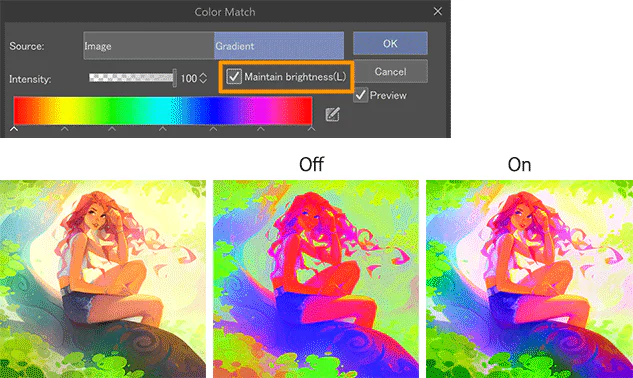
Tùy chọn Maintain brightness giữ độ sáng tổng thể gần với ảnh gốc hơn. Khi tắt, Color Match có thể đi xa hơn theo phân bố sáng tối của nguồn; khi bật, công cụ ưu tiên bảo toàn cảm giác value ban đầu. Đây không phải nút “tốt hơn”, mà là lựa chọn theo mục tiêu.
Maintain brightness giúp giữ cấu trúc sáng tối gần với tranh gốc. Ảnh: CELSYS/CLIP STUDIO TIPS.
Hãy bật Maintain brightness khi tranh đã có hệ value chắc: gương mặt nổi rõ, ánh sáng chính đã được thiết kế và các lớp không gian tách nhau tốt. Trong trường hợp này, bạn chỉ muốn đổi quan hệ màu chứ không muốn làm lại ánh sáng. Tùy chọn này đặc biệt hữu ích khi thử bảng màu cho nhân vật đã render kỹ.
Hãy thử tắt Maintain brightness khi bạn chủ động muốn biến đổi không khí mạnh, chẳng hạn chuyển cảnh sáng sang u tối hoặc thử một concept gần poster. Tuy nhiên, sau khi áp dụng cần kiểm tra histogram bằng mắt: vùng tối có bị bít, vùng sáng có mất chi tiết và điểm nhấn có còn đúng không. Chuyển ảnh về xem tạm ở grayscale cũng là cách nhanh để phát hiện value bị lệch.
Đừng đánh giá màu trên một màn hình quá sáng. Hạ độ sáng màn hình về mức làm việc ổn định, tránh đặt canvas cạnh giao diện trắng chói và nghỉ mắt vài phút trước khi chốt. Color Match giúp tạo phương án nhanh, nhưng khả năng so sánh vẫn phụ thuộc vào điều kiện quan sát.
Nhập ảnh tham chiếu đúng cách
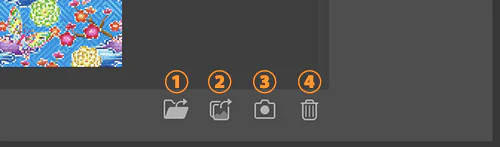
Color Match cho phép thêm ảnh của riêng bạn vào nhóm Image. Trên máy tính, dùng nút nhập file. Trên máy tính bảng hoặc điện thoại, giao diện có thể thêm lựa chọn lấy từ thư viện hoặc camera. Danh sách có thể lưu nhiều ảnh, vì vậy nên xây dựng một thư viện nhỏ có chủ đích thay vì gom ảnh ngẫu nhiên.
Các nút nhập và quản lý ảnh tham chiếu trong Color Match. Ảnh: CELSYS/CLIP STUDIO TIPS.
Ảnh tham chiếu tốt cho Color Match nên có bảng màu và ánh sáng gần với nhiệm vụ của bạn. Nếu tranh là chân dung, ưu tiên ảnh có tỉ lệ da, tóc và background tương tự. Nếu tranh là environment, chọn ảnh có cấu trúc không gian và thời điểm trong ngày tương ứng. Một ảnh hoàng hôn có 80% bầu trời đỏ sẽ tạo ảnh hưởng khác hẳn một căn phòng tối chỉ có một vùng đèn cam nhỏ.
Trước khi nhập, hãy crop bỏ viền trắng, chữ, giao diện trang web và những vùng không liên quan. Các vùng đó làm sai phân bố màu. Bạn cũng nên tránh ảnh đã bị filter quá nặng hoặc có dải màu đứt gãy, trừ khi chính hiệu ứng đó là mục tiêu. Định dạng phổ biến như PNG, JPG, TIFF, BMP, TGA, CLIP, PSD, PSB và WebP đều có thể dùng theo phiên bản hỗ trợ.
Về bản quyền, ảnh tham chiếu không tự động trở thành tài sản được phép sao chép. Color Match chỉ dùng quan hệ màu, nhưng bạn vẫn nên chọn ảnh do mình chụp, ảnh có giấy phép phù hợp hoặc tài liệu nội bộ được phép sử dụng. Không nên vẽ lại bố cục, nhân vật hay chi tiết nhận diện của ảnh chỉ vì bạn đã dùng nó làm nguồn màu.
Nạp và quản lý Gradient Set
Ở chế độ Gradient, nút Add gradient set from materials cho phép nạp các bộ gradient đã có trong Materials. Đây là cách biến Color Match thành một hệ thống thử màu có thể lặp lại giữa nhiều file. Thay vì mỗi tranh lại tìm một ảnh mới, bạn có thể chuẩn bị các bộ gradient theo ngữ cảnh: bình minh, trưa nắng, chiều mưa, đêm neon, nội thất ấm hoặc cảnh hồi tưởng ít bão hòa.
Nút nạp thêm gradient set từ Materials. Ảnh: CELSYS/CLIP STUDIO TIPS.
Mỗi bộ chỉ nên có số gradient vừa đủ để nhớ công dụng. Một set 60 gradient không có tên rõ ràng khiến bạn lại rơi vào việc bấm thử ngẫu nhiên. Hãy đặt tên theo tác dụng, chẳng hạn “Night_blue_shadow_warm_light” hoặc “Memory_low_sat”. Khi tìm được hướng tốt, ghi lại tên set, tên gradient, trạng thái Maintain brightness và mức Intensity trong tên layer hoặc ghi chú file.
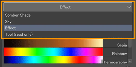
Chuyển Gradient Set để thử nhanh nhiều hướng màu. Ảnh: CELSYS/CLIP STUDIO TIPS.
Trong danh sách, bạn có thể chuyển giữa các set như Somber Shade, Sky hoặc Effect. Hãy nhớ rằng hướng của gradient không điều khiển trực tiếp vị trí sáng tối trong Color Match. Nếu bạn cần ánh xạ chính xác màu ở đầu trái vào vùng tối và màu ở đầu phải vào vùng sáng, Gradient Map mới là công cụ phù hợp. Color Match dùng tập màu để tìm một kết quả hài hòa tổng thể.
Quy trình tạo sáu color key trong 15 phút
Quy trình dưới đây phù hợp khi bạn cần chốt không khí cho một tranh hoặc một khung truyện:
Tạo một lớp tổng hợp bằng Merge visible to new layer và giữ bản gốc ở dưới.
Nhân lớp tổng hợp thành sáu bản, đặt tên A đến F.
Chọn ba ảnh tham chiếu và ba gradient có mục tiêu khác nhau.
Áp dụng Color Match ở Intensity 100 để thấy rõ hướng biến đổi.
Giảm opacity từng lớp hoặc tạo thêm bản ở Intensity 50–80.
Bật từng phương án ở kích thước thumbnail; loại ngay phương án làm mất silhouette hoặc sai màu nhận diện.
Với hai phương án tốt nhất, kiểm tra lại da, vùng sáng nhất, vùng tối nhất và độ tách nhân vật–nền.
Chọn một phương án làm nền, sau đó chỉnh tay bằng layer thường, mask hoặc correction layer.
Nếu file của bạn có nhiều thao tác lặp để dựng layer thử, có thể tham khảo bài tạo Auto Action cho bộ layer trong CLIP STUDIO PAINT. Auto Action không thay quyết định màu, nhưng có thể tự động hóa phần nhân lớp, đặt tên và sắp xếp folder.
Khi làm manga màu hoặc webtoon, đừng áp cùng một preset ở cùng Intensity cho mọi khung. Cảnh cận có da và biểu cảm cần mức nhẹ hơn cảnh toàn. Background có thể nhận Color Match mạnh để thống nhất không khí, trong khi nhân vật chỉ cần một lớp màu nhẹ hoặc mask chọn lọc. Bài làm background webtoon trong CLIP STUDIO PAINT có thể giúp bạn đặt việc chỉnh màu vào toàn bộ quy trình dựng nền.
Bảy lỗi thường gặp và cách sửa
Lệnh Color Match bị mờ
Bạn đang chọn sai loại layer, layer không ở Expression color: Color, hoặc phiên bản phần mềm chưa hỗ trợ. Hãy tạo một lớp raster màu từ phần cần xử lý rồi thử lại.
Kết quả quá gắt và màu da bị sai
Giảm Intensity, bật Maintain brightness hoặc giảm opacity sau khi áp dụng. Nếu chỉ background cần đổi, tạo selection hoặc mask để bảo vệ da. Không cố cứu một preset không phù hợp bằng hàng loạt chỉnh sửa nhỏ.
Tranh mất chiều sâu
Nguồn tham chiếu có phân bố màu quá đồng đều hoặc Color Match đã kéo tiền cảnh và hậu cảnh về cùng một dải. Tách background và nhân vật thành hai lớp thử riêng, dùng nguồn khác nhau hoặc Intensity khác nhau.
Màu đẹp khi phóng to nhưng yếu ở thumbnail
Bạn đang đánh giá chi tiết thay vì cấu trúc. Thu nhỏ tranh, tạm chuyển grayscale và kiểm tra điểm nhấn. Color Match không thể bù cho value chưa rõ.
Ảnh tham chiếu cho kết quả khó đoán
Crop bỏ viền, chữ và vùng màu không liên quan. Chọn ảnh có tỉ lệ vùng sáng–tối và loại chủ thể gần với tranh. Một ảnh “đẹp” không đồng nghĩa với một nguồn màu phù hợp.
Gradient nào cũng cho kết quả gần giống nhau
Các gradient trong set có tập màu quá gần nhau, hoặc Intensity đang quá thấp. Hãy thử các set có quan hệ nóng–lạnh, bão hòa và độ sáng khác nhau rõ hơn.
File có quá nhiều lớp thử và khó quản lý
Đặt tất cả phương án trong một folder, chỉ bật một lớp tại một thời điểm và xóa các bản đã loại. Giữ lại bản gốc, bản được chọn và một phương án dự phòng. Cách tổ chức layer rõ ràng cũng quan trọng như lựa chọn màu.
Bài tập thực hành: một tranh, ba câu chuyện màu
Chọn một tranh đã hoàn thiện có nhân vật và background. Tạo ba mục tiêu: “buổi sáng trong trẻo”, “chiều mưa trầm” và “đêm neon”. Với mỗi mục tiêu, chuẩn bị một ảnh tham chiếu và một gradient. Tạo hai biến thể ở Intensity 60 và 90, tổng cộng sáu phương án.
Chấm mỗi phương án theo thang 1–5 ở bốn tiêu chí: đọc silhouette, giữ màu nhận diện nhân vật, tách không gian và truyền đúng cảm xúc. Đừng chấm “đẹp” chung chung. Một bảng tiêu chí cụ thể giúp bạn hiểu tại sao một phương án hiệu quả và tái tạo được quyết định đó ở tranh khác.
Sau khi chọn phương án tốt nhất, không dừng ở kết quả tự động. Thêm một lớp thường để sửa vùng da, một lớp ánh sáng để khôi phục tiêu điểm và mask bớt hiệu ứng ở nơi cần giữ màu gốc. Nếu bạn cần trao đổi về brush hoặc workflow tô màu, có thể tham khảo chủ đề nhập môn tô màu trên CLIP STUDIO PAINT và cộng đồng brush CLIP STUDIO PAINT trên Forum.
Checklist trước khi chốt màu
Lớp gốc vẫn còn nguyên và phương án Color Match nằm trên bản sao.
Ảnh tham chiếu phục vụ đúng bối cảnh, không chỉ vì có bảng màu bắt mắt.
Intensity đã được so sánh ở ít nhất hai mức.
Maintain brightness đã được thử cả bật và tắt.
Da, màu nhận diện và điểm nhấn không bị trôi ngoài ý muốn.
Silhouette vẫn rõ khi thu nhỏ canvas.
Tiền cảnh, trung cảnh và hậu cảnh còn tách được bằng value hoặc nhiệt độ màu.
Tên layer ghi đủ nguồn preset, gradient set và mức Intensity để có thể lặp lại.
Kết quả đã được chỉnh tay ở các vùng quan trọng thay vì dùng nguyên trạng.
Color Match phát huy tốt nhất khi được dùng như công cụ ra quyết định. Nó giúp bạn mở rộng phạm vi thử nghiệm, nhìn cùng một tranh dưới nhiều không khí và chốt hướng màu nhanh hơn. Nhưng chất lượng cuối cùng vẫn đến từ việc đặt mục tiêu trước khi bấm, bảo vệ cấu trúc value, kiểm soát cường độ và chỉnh tay có chọn lọc. Khi quy trình này trở thành thói quen, bạn sẽ không còn dùng Color Match để tìm một hiệu ứng ngẫu nhiên, mà dùng nó để xây dựng color key có lý do rõ ràng.







Bình luận
0 bình luận
Đăng nhập để tham gia thảo luận cùng cộng đồng!
Đăng nhập ngayĐang tải bình luận...