Krita Fill Tool Nâng Cao: Threshold, Close Gap Và Drag-Fill Cho Lineart
Hướng dẫn Fill Tool trong Krita để tô base lineart sạch: chọn vùng, threshold, Close Gap, Grow Selection, Reference và Drag-Fill.
17 min read
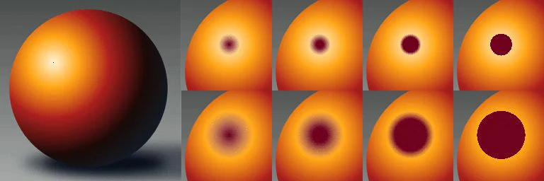
Hướng dẫn Fill Tool trong Krita để tô base lineart sạch: chọn vùng, threshold, Close Gap, Grow Selection, Reference và Drag-Fill.
1:04 ước tính · Chưa có giọng vi-VN
Fill Tool trong Krita thường bị hiểu như một chiếc “xô màu” chỉ cần bấm vào vùng trắng. Cách dùng đó đủ cho hình đơn giản, nhưng sẽ nhanh chóng phát sinh viền trắng, màu tràn qua khe hở, vùng nhỏ bị bỏ sót hoặc kết quả thay đổi thất thường giữa các layer. Thực tế, Fill Tool là một hệ thống chọn vùng theo màu và đường biên. Khi hiểu rõ cách Krita xác định pixel nào được chọn, bạn có thể tô base cho lineart nhanh hơn, sửa ít hơn và giữ cấu trúc layer sạch để tiếp tục đổ bóng.
Bài hướng dẫn này tập trung vào một quy trình thực chiến: chuẩn bị lineart, chọn chế độ vùng, chỉnh ngưỡng, xử lý khe hở, mở rộng màu xuống dưới nét và dùng drag-fill cho nhiều mảng liên tiếp. Mục tiêu không phải tìm một bộ thông số “đúng cho mọi tranh”, mà là biết thông số nào cần thay đổi khi nhìn thấy một lỗi cụ thể. Nếu bạn đang xây nền tảng dài hạn, có thể đặt bài này vào giai đoạn luyện workflow trong lộ trình Digital Art 90 ngày.
Khi bạn nhấp vào một điểm, Krita không “đổ màu vào khoảng trống” theo nghĩa trực quan. Phần mềm bắt đầu từ pixel dưới con trỏ, đọc màu và độ đục của những pixel lân cận, sau đó quyết định vùng nào đủ giống hoặc đủ liên tục để được đưa vào kết quả. Đường lineart chỉ đóng vai trò ranh giới nếu các pixel của nét đủ khác với nền theo tiêu chí đang chọn.
Vì vậy, cùng một bức vẽ có thể cho kết quả khác nhau khi bạn đổi layer tham chiếu, threshold, feathering, grow selection hoặc kiểu region filling. Một nét xám nhạt trên nền trắng có thể không chặn được màu nếu ngưỡng quá rộng. Một vùng có anti-aliasing có thể để lại quầng sáng nếu màu dừng trước các pixel bán trong suốt. Ngược lại, mở rộng vùng quá mạnh có thể khiến màu vượt qua nét mảnh.
Bạn có thể chọn Fill Tool trên thanh công cụ rồi mở Tool Options để thấy toàn bộ nhóm tùy chọn. Trước khi chỉnh thông số, hãy xác định ba điều: layer nào chứa lineart, layer nào sẽ nhận màu và Krita sẽ đọc ranh giới từ layer nào. Ba câu hỏi này giải quyết phần lớn lỗi tô màu tưởng như ngẫu nhiên.
Một cấu trúc tối thiểu nên có layer lineart ở trên và layer base color ở dưới. Không tô trực tiếp lên layer nét nếu bạn còn muốn thay màu, tạo clipping group hoặc chỉnh line weight về sau. Với tranh nhiều nhân vật, hãy nhóm lineart theo đối tượng hoặc ít nhất gắn color label cho các layer cần dùng làm tham chiếu. Cách tổ chức này giúp Fill Tool đọc đúng đường biên mà không bị nhiễu bởi background, texture hay ghi chú.
Lineart không cần kín tuyệt đối, nhưng phải có chủ đích. Các khe hở ở tóc, cổ áo, nếp vải và điểm giao nhau thường là nguyên nhân màu tràn. Trước khi tô, phóng to ở mức vừa phải và kiểm tra những nơi nét kết thúc. Nếu khe hở là một phần phong cách, bạn không nhất thiết phải vá nét; hãy dùng Close Gap hoặc Selection Boundary. Nếu khe hở là lỗi, sửa lineart trước sẽ bền hơn việc tăng thông số cực đoan.
Độ đục của nét cũng quan trọng. Nét cọ có texture, nét xám hoặc nét dùng opacity pressure tạo nhiều pixel trung gian. Những pixel này làm ranh giới mềm hơn và dễ sinh viền sáng. Với lineart sạch, ba cấp nét trong bài Line Weight Cho Lineart Nhân Vật giúp bạn kiểm soát silhouette, overlap và chi tiết mà vẫn giữ vùng tô dễ đọc.
Fill Mode quyết định phạm vi ban đầu mà Krita xem xét. Đây là bước nên chọn trước khi động đến threshold. Nếu chọn sai mode, bạn có thể chỉnh rất nhiều thông số nhưng kết quả vẫn không ổn định.
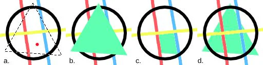
Chế độ này tô toàn bộ vùng chọn hiện tại. Nó phù hợp khi bạn đã tạo selection bằng công cụ khác, chẳng hạn chọn silhouette nhân vật rồi muốn đặt một màu base đồng nhất. Ưu điểm là kết quả dễ dự đoán; nhược điểm là Fill Tool không còn tự quyết định ranh giới theo điểm nhấp. Nếu selection có feathering, mép màu cũng sẽ mềm theo.
Đây là chế độ phổ biến nhất cho lineart. Krita bắt đầu tại điểm nhấp và chỉ mở rộng qua những pixel liền kề đáp ứng điều kiện màu. Một đường nét kín sẽ chia canvas thành các “phòng” riêng. Khi tô tóc, áo hoặc da, bạn thường muốn Contiguous Region vì nó không tự nhảy sang vùng có màu tương tự nhưng nằm ở nơi khác.
Chế độ này chọn mọi vùng có màu tương tự pixel gốc, kể cả khi chúng không nối liền. Nó hữu ích khi một thiết kế có nhiều chi tiết cùng màu, ví dụ các nút áo, hoa văn lặp hoặc nhiều khoảng nền trắng cần đổi cùng lúc. Tuy nhiên, nó dễ chọn nhầm vùng nếu lineart chứa nhiều sắc xám gần nhau. Hãy dùng threshold hẹp hơn và kiểm tra kết quả ở các chi tiết nhỏ.
Krita cung cấp các cách diễn giải khác nhau về vùng cần tô. Hãy xem đây là lựa chọn thuật toán, không phải mức mạnh–yếu. Chuyển đúng chính sách thường hiệu quả hơn việc tăng threshold quá cao.
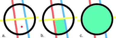
Current Selection dùng selection có sẵn. Contiguous Pixels đi qua các pixel liền nhau từ điểm nhấp. Regions of Similar Color tìm các pixel tương tự trên phạm vi rộng hơn. Với một hình có nhiều đường cắt nhau, Contiguous Pixels thường là điểm xuất phát an toàn. Với họa tiết lặp đã được tách khỏi phần còn lại, Regions of Similar Color tiết kiệm nhiều lần nhấp.
Threshold xác định mức khác biệt màu mà Krita vẫn chấp nhận. Ngưỡng thấp giữ vùng chặt nhưng dễ để lại quầng trắng quanh anti-aliasing. Ngưỡng cao ăn sâu hơn vào các pixel gần màu nền, nhưng có thể vượt qua nét xám. Hãy tăng từng bước nhỏ và quan sát ở mép nét, không chỉ nhìn vùng lớn. Nếu kết quả vẫn có viền dù threshold đã hợp lý, lỗi nhiều khả năng nằm ở grow selection hoặc opacity spread.
Opacity Spread đặc biệt quan trọng với ranh giới bán trong suốt. Thông số này kiểm soát cách độ đục được suy rộng từ vùng nguồn. Với nét cọ mềm, tăng spread có thể giúp màu tiếp cận mép nét tốt hơn. Nhưng nếu nét có texture thưa, spread quá mạnh sẽ tạo các mảng màu không đều. Quy tắc thực hành là đặt threshold trước, sau đó mới tinh chỉnh spread; không thay cả hai cùng lúc vì bạn sẽ khó biết thay đổi nào tạo ra kết quả.
Close Gap cho phép Fill Tool xem một số khe nhỏ như đã được đóng. Đây là lựa chọn rất hữu ích cho tóc, lông, nếp áo và lineart có đầu nét thuôn. Thay vì vẽ thêm một đoạn nối không mong muốn, bạn giữ nguyên ngôn ngữ nét và để thuật toán dựng ranh giới tạm thời trong lúc tô.
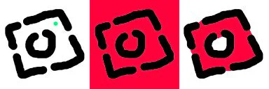
Hãy bắt đầu với mức thấp. Nếu màu vẫn tràn, tăng dần cho đến khi khe được xem là kín. Đừng đặt Close Gap lớn cho toàn bộ tranh chỉ vì một vị trí khó; nó có thể nối nhầm hai biên gần nhau, đặc biệt ở mắt, ngón tay hoặc phụ kiện nhỏ. Khi chỉ một khu vực có vấn đề, cách tốt hơn là zoom vào, dùng selection để giới hạn hoặc tạo một layer “color boundary” riêng.
Close Gap không sửa lineart. Nó chỉ thay đổi cách vùng tô được tính. Nếu bạn xuất file lineart hoặc dùng nó cho công đoạn khác, khe vẫn tồn tại. Vì vậy, hãy phân biệt khe mang tính thẩm mỹ với khe do thao tác. Khe thẩm mỹ có thể để nguyên; khe lỗi nên được sửa để các bước sau như Colorize Mask, selection hoặc chuyển nền không gặp lại vấn đề.
Khi lineart rất mở hoặc bạn chỉ muốn tô một phần của vùng lớn, selection là hàng rào đáng tin cậy hơn việc tăng Close Gap. Bạn có thể khoanh vùng nhân vật, một mảng tóc hoặc một nhóm phụ kiện, sau đó để Fill Tool hoạt động bên trong. Cách này đặc biệt hiệu quả khi background và nhân vật dùng chung nhiều đường chéo khiến thuật toán khó hiểu đâu là biên thật.
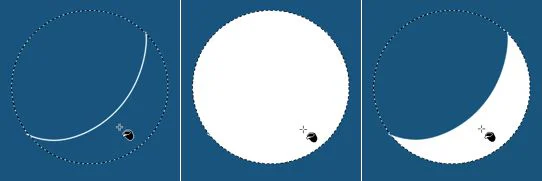
Quy trình đơn giản gồm ba bước: tạo selection bao quanh khu vực, chọn Fill Tool, rồi nhấp vào vùng cần tô. Selection không cần bám chính xác từng pixel lineart nếu nó chỉ đóng vai trò giới hạn ngoài. Hãy đặt ranh giới selection đi qua vùng chắc chắn không cần màu. Sau khi tô xong, bỏ selection và kiểm tra mép ở độ phóng đại 100%.
Nếu selection có feathering, màu sẽ mờ dần ở biên. Điều này phù hợp với hiệu ứng không khí nhưng không phù hợp cho base color sắc nét. Hãy đặt feathering về 0 khi tô lineart. Trường hợp cần một khoảng đệm dưới nét, dùng grow selection của Fill Tool thay vì làm mềm selection.
Anti-aliasing tạo ra dải pixel bán trong suốt quanh nét. Nếu màu chỉ dừng tại vùng trắng hoàn toàn, một quầng sáng sẽ xuất hiện giữa màu và lineart. Grow Selection mở rộng vùng tô thêm một số pixel để màu nằm dưới nét, nhờ đó quầng sáng biến mất khi nhìn ở kích thước thực.
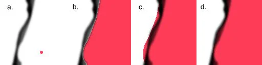
Giá trị grow phù hợp phụ thuộc độ phân giải và độ dày nét. Ở canvas lớn, vài pixel có thể vẫn quá ít; ở icon nhỏ, cùng giá trị đó có thể ăn xuyên qua nét. Hãy kiểm tra tại 100%, bởi zoom quá lớn khiến quầng một pixel trông nghiêm trọng hơn thực tế. Bắt đầu nhỏ, tăng đến khi viền sáng vừa biến mất.
Stop Growing điều chỉnh việc mở rộng theo độ tối của đường biên. Khi bật, vùng tô có thể dừng thích ứng ở nét tối thay vì mở rộng máy móc cùng một khoảng ở mọi nơi. Điều này hữu ích cho lineart biến thiên độ dày. Tuy nhiên, nếu nét quá nhạt hoặc màu nét gần màu nền, thuật toán không có tín hiệu đủ rõ. Khi đó, hãy làm nét tham chiếu đậm hơn hoặc tách một bản lineart phục vụ riêng cho việc tô.
Hai biểu tượng trong Tool Options đại diện cho hai cách lan vùng. Chúng không thay đổi màu bạn chọn; chúng thay đổi cách Krita tìm đường đi qua các pixel và nhận diện ranh giới. Việc phân biệt hai thuật toán giúp xử lý các vùng có cấu trúc khác nhau mà không cần ép threshold.

Flood Fill lan từ điểm nhấp ra ngoài qua các pixel đáp ứng điều kiện. Nó trực quan và phù hợp với vùng kín, nền phẳng, lineart tương đối rõ. Khi vùng có nhiều nhánh nhỏ, Flood Fill sẽ theo các đường nối liên tục; một khe hở nhỏ có thể dẫn màu đi rất xa. Hãy kết hợp với Close Gap hoặc selection nếu cấu trúc có nhiều lối thoát.

Boundary Fill ưu tiên việc xác định biên chặn. Nó hữu ích khi ranh giới có tính nhất quán rõ hơn màu bên trong vùng. Với lineart đậm trên nền sáng, Boundary Fill có thể cho kết quả ổn định ở các khu vực phức tạp. Nếu nét có quá nhiều màu hoặc độ đục thay đổi mạnh, bạn cần điều chỉnh tiêu chí biên hoặc quay về Flood Fill.
Một cách kiểm tra nhanh là tạo bản sao nhỏ của vùng khó và thử cả hai thuật toán với cùng threshold. So sánh ở ba nơi: mép anti-aliasing, khe hở nhỏ và chi tiết hẹp. Chọn thuật toán ít tạo lỗi hệ thống hơn; đừng chỉ chọn kết quả trông đúng ở một điểm nhấp.
Trong Tool Options, phần Reference quyết định Krita lấy dữ liệu ranh giới từ đâu. Current Layer chỉ đọc layer đang active. Chế độ này dễ hiểu nhưng không phù hợp nếu bạn tô trên layer rỗng dưới lineart, vì layer màu chưa có đường biên. All Layers đọc toàn bộ layer đang hiển thị, tiện cho file nhỏ nhưng có thể bị ảnh hưởng bởi texture, sketch hoặc background.
Color Labeled Layers là lựa chọn mạnh cho file phức tạp. Bạn gắn cùng một color label cho các layer lineart cần tham chiếu, rồi yêu cầu Fill Tool chỉ đọc nhóm nhãn đó. Kết quả là màu base không bị bóng, hiệu ứng hay ghi chú can thiệp. Đây là một thói quen đáng xây dựng ngay từ đầu nếu bạn thường xử lý nhân vật nhiều phụ kiện.
Nếu màu không bị chặn dù lineart nhìn có vẻ kín, hãy kiểm tra Reference trước khi chỉnh threshold. Rất nhiều trường hợp chỉ đơn giản là Fill Tool đang đọc layer màu rỗng. Nếu màu bị chặn bởi những chi tiết không mong muốn, chuyển từ All Layers sang Color Labeled Layers thường giải quyết ngay.
Drag-Fill cho phép giữ và kéo con trỏ qua nhiều vùng thay vì nhấp từng vùng. Đây là công cụ tiết kiệm thời gian khi tô tóc chia nhiều lọn, họa tiết áo, phụ kiện hoặc các khoảng nền nhỏ. Bạn có thể chọn điền mọi vùng đi qua hoặc chỉ những vùng có màu tương tự vùng đầu tiên.
Để dùng ổn định, hãy tô một vùng mẫu trước và xác nhận threshold, grow cùng reference đã đúng. Sau đó mới kéo qua các vùng còn lại. Nếu chưa kiểm tra, một lỗi nhỏ có thể lặp hàng chục lần. Với “Fill Regions of Similar Colors”, điểm nhấp đầu tiên đóng vai trò mẫu; hãy bắt đầu ở vùng đại diện rõ nhất, không bắt đầu tại mép anti-aliasing.
Kéo theo đường ngắn, có chủ đích. Một đường kéo xuyên qua mắt, miệng và tóc có thể tô nhầm nhiều vùng khó phát hiện. Hãy chia theo nhóm vật liệu hoặc màu: da trước, tóc sau, trang phục cuối. Sau mỗi nhóm, ẩn lineart tạm thời để nhìn xem base color có lỗ hay tràn không.
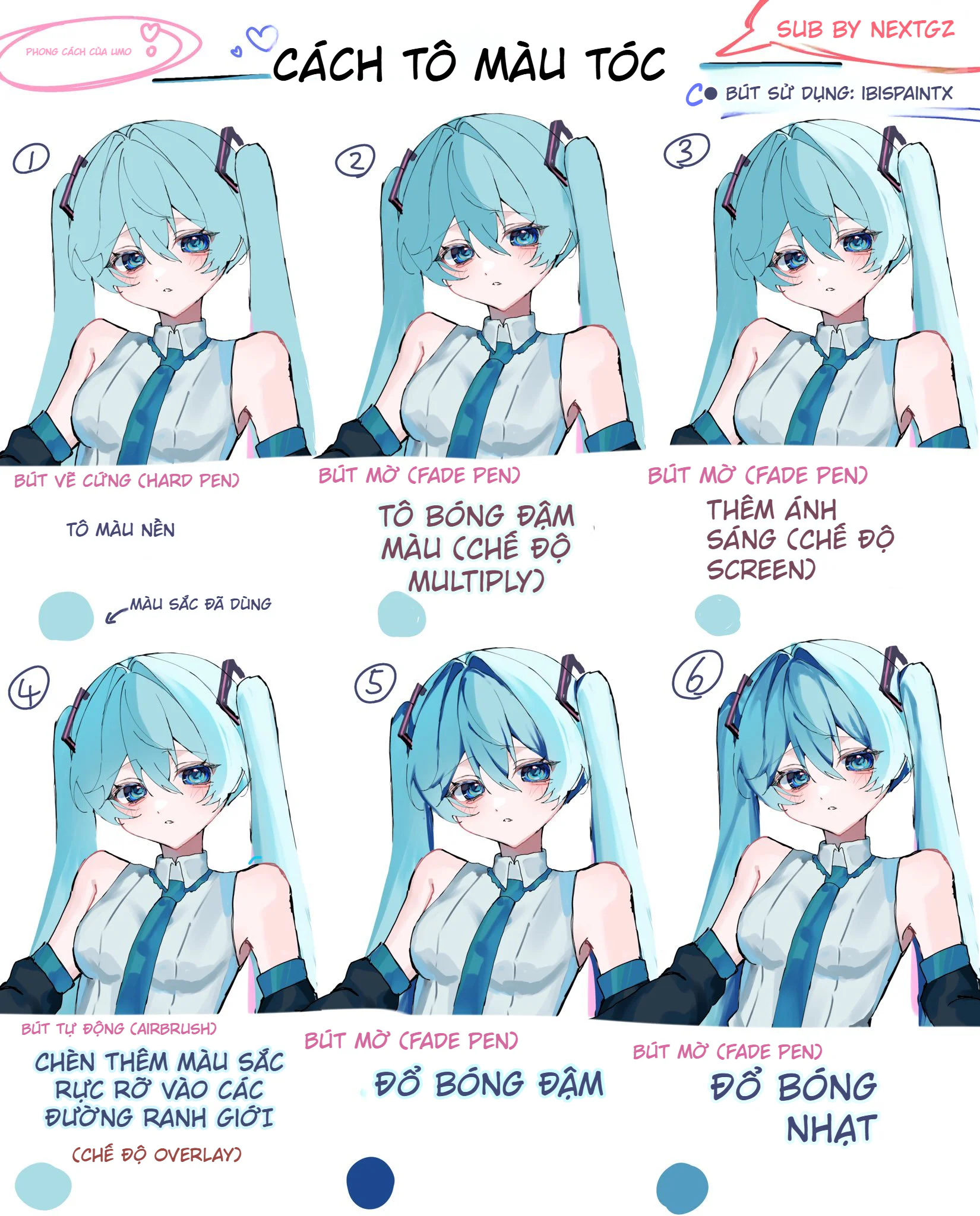
Sau khi base sạch, bạn có thể chuyển sang clipping group, alpha inheritance hoặc layer mode để đổ bóng. Quy trình tô màu tổng thể trong hướng dẫn từ line art đến hoàn thiện giúp nối bước base color với ánh sáng và chiều sâu. Nếu cần phủ texture lặp lên trang phục hoặc background, bài Krita Pattern Fill là bước tiếp theo hợp lý.
Kiểm tra layer tham chiếu, khe hở lineart và Fill Mode. Nếu đang tô trên layer rỗng với Reference là Current Layer, Krita không thấy ranh giới. Chuyển sang All Layers hoặc Color Labeled Layers. Nếu reference đúng, bật Close Gap ở mức thấp hoặc dùng selection chặn khu vực.
Tăng Grow Selection từng chút, sau đó kiểm tra Opacity Spread. Đừng tăng threshold quá cao ngay lập tức vì nó có thể làm mất ranh giới nét xám. Xem tranh ở 100% và thử ẩn lineart để đánh giá vùng base thực tế.
Threshold có thể quá hẹp, vùng quá nhỏ so với thiết lập hiện tại hoặc grow đang làm hai biên gặp nhau. Zoom vào chi tiết, giảm grow và nhấp ở pixel trung tâm. Với nhiều chi tiết giống nhau, thử Regions of Similar Color sau khi giới hạn bằng selection.
Giảm threshold, grow hoặc Close Gap. Nếu nét mảnh còn bán trong suốt, tạo bản lineart tham chiếu đậm hơn trong một group ẩn khỏi bản xuất cuối. Stop Growing có thể giúp vùng mở rộng dừng tại pixel tối thay vì vượt qua nét.
Điểm nhấp đang nằm trên các pixel có màu hoặc opacity khác nhau. Chọn vùng mẫu sạch, tránh mép anti-aliasing. Kiểm tra xem background, texture hay layer hiệu ứng có đang được đưa vào Reference hay không. Với file lớn, dùng Color Labeled Layers để giảm biến số.
Chọn một lineart có ba loại tình huống: vùng lớn kín, khe hở nhỏ và chi tiết hẹp. Tạo ba bản sao layer màu. Ở bản thứ nhất, giữ threshold thấp và grow nhỏ. Ở bản thứ hai, tăng threshold. Ở bản thứ ba, giữ threshold vừa nhưng bật Close Gap và Stop Growing. Tô cùng ba vị trí rồi so sánh quầng sáng, tràn màu và độ sạch dưới nét.
Ghi lại thiết lập hiệu quả cho độ phân giải và loại brush lineart đó. Preset không nên chỉ có con số; hãy ghi cả điều kiện sử dụng, chẳng hạn “nét mực đen 8–20 px trên canvas 3000 px” hoặc “nét xám có opacity pressure”. Khi đổi canvas hoặc brush, xem preset là điểm khởi đầu chứ không phải quy tắc cố định.
Cuối cùng, bật và tắt lineart. Khi bật, tranh phải không có viền sáng. Khi tắt, các mảng base vẫn nên liền lạc, không có lỗ ngẫu nhiên và không tràn xa khỏi silhouette. Nếu đạt cả hai điều kiện, thiết lập Fill Tool của bạn đã phù hợp với file hiện tại.
Fill Tool mạnh nhất khi bạn xem nó như một hệ thống đọc vùng, không phải thao tác đổ màu một lần. Fill Mode chọn phạm vi; Reference chọn dữ liệu; threshold và opacity spread xác định mức tương đồng; Close Gap xử lý khe; Grow Selection đưa màu xuống dưới nét; Flood Fill, Boundary Fill và Drag-Fill quyết định cách lan vùng. Mỗi thông số có một nhiệm vụ riêng.
Hãy chẩn đoán theo triệu chứng và chỉ thay một biến mỗi lần. Cách làm này chậm hơn vài phút ở lần đầu, nhưng nhanh hơn rất nhiều so với việc sửa hàng trăm viền trắng hoặc vùng tràn sau khi đã đổ bóng. Một layer base sạch cũng giúp mọi bước tiếp theo—clipping, mask, texture và color grading—dễ kiểm soát hơn.

 Digital Art
 Game Development
 Godot
Godot
 Digital Painting
 Digital Painting
 Digital Painting
 Digital Painting
Đăng ký miễn phí, lấy link riêng và giới thiệu NextGZ cho người cần học tiếng Trung hoặc Digital Art.

Cộng đồng thực chiến
Tham gia nhóm để nhận tài nguyên, cập nhật công cụ và trao đổi cách xây dựng digital business cùng AI.
Tham gia nhóm Zalo
Cộng đồng sáng tạo
Kết nối với cộng đồng Digital Art, chia sẻ tác phẩm và học hỏi quy trình sáng tạo mới.
Tham gia DiscordCộng đồng thực chiến
Tham gia nhóm để nhận tài nguyên, cập nhật công cụ và trao đổi cách xây dựng digital business cùng AI.
Tham gia nhóm ZaloCộng đồng sáng tạo
Kết nối với cộng đồng Digital Art, chia sẻ tác phẩm và học hỏi quy trình sáng tạo mới.
Tham gia Discord
Bình luận
0 bình luận
Đăng nhập để tham gia thảo luận cùng cộng đồng!
Đăng nhập ngayĐang tải bình luận...