Line Weight for Character Lineart: 3 Levels of Thickness to Keep the Image from Being Flat
Guide to controlling three levels of line weight for character lineart: silhouette, overlap, and secondary details, along with an 8-step workflow, 7-day practice exercises, and a self-assessment rubric.
Introduction: Why does your lineart look flat even though your lines are beautiful?
Have you ever spent hours meticulously drawing a character's lineart, but when you look back, it seems like a cut-out paper collage – lacking volume, lacking life? That is the sign of lineart that is 'flat' in terms of line weight. Many new artists only focus on the accuracy of the lines, forgetting that the thickness and thinness of the stroke (line weight) is the key factor in creating depth and structure for the character.
In this article, I will introduce you to a 3-tier line weight system that will help your lineart no longer be flat: main silhouette, overlap/structure, and secondary details. The Bargue Drawing Course 1866–1871 prints used in this article serve as reference material for observing contour, block-in, and structural form. The three-tier line weight system is the practical method of this article, not a theory attributed to Charles Bargue.
Get ready to transform your lineart from a boring flat surface into a piece with volume, movement, and soul.
Goals, Audience, and Tools
Goals of the article
This article helps you master and apply the 3-tier line weight system to character lineart. You will understand the role of each tier, how to combine them, and most importantly, how to diagnose and fix flat lineart. Finally, you will have a 7-day practice curriculum with a clear roadmap.
Target Audience
For intermediate-level Vietnamese digital artists – who already know basic lineart drawing, are familiar with a drawing tablet and software, but want to upgrade their lineart from 'beautiful individual strokes' to 'beautiful overall composition'. If you are a beginner, please refer to the 90-day learning roadmap here: 90-day digital art learning roadmap for beginners to build a solid foundation before diving deep into line weight.
Tools
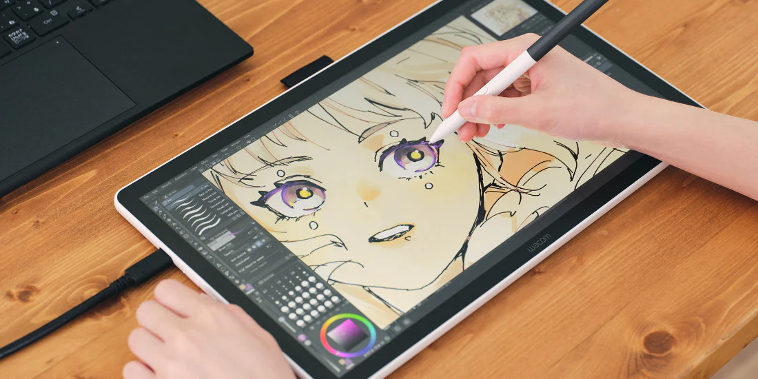
You don't need special software or brushes. Just any drawing program that supports pressure sensitivity and a drawing tablet. Throughout the article, I will not mention specific brush settings or fixed DPI, because the goal is principles, not numbers. Please use the default round brush with opacity changing according to pressure.
Diagnosing Flat Lineart: 5 Signals You Need to Know
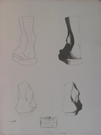
Foot study in Bargue Drawing Course I, plate 6. Public domain, Wikimedia Commons.
Before learning how to draw volume, you need to know which signs warn that your lineart is flat. Here are 5 common signals, based on the absence of the 3 line weight tiers.
Broken or too thin silhouette: The outer contour of the character (silhouette) should be the thickest lines, but if you draw it weakly, the character will blend into the background and lose its form.
Lack of overlap between parts: When two parts overlap (e.g., an arm in front of the torso), if there is no difference in line weight, they stick together like a flat mass.
Neglected points of tension: Places where bones protrude, muscles tense, or stress folds need thicker lines. If you draw with even pressure, the character looks flabby and lacks structure.
The shadow side is not emphasized: In monochrome lineart, the shadow side (opposite the light source) should have thicker lines to create the illusion of volume. If you skip this, the drawing loses depth.
No gradation in distance between details: Details closer to the viewer need thicker lines than distant details. If you draw evenly, the lineart loses a sense of space.
Quick check tip: Zoom in on your lineart. If you cannot distinguish which are the main contour lines, which are overlap lines, and which are small details, then you have a flat lineart problem. Get ready to read on.
The 3-Tier Line Weight System: Main Silhouette, Overlap/Structure, Secondary Details
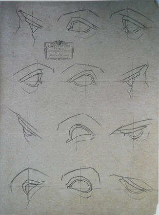
Eye studies in Bargue Drawing Course I, plate 1. Public domain, Wikimedia Commons.
This is the core. The 3-tier system helps you actively control line thickness, instead of drawing 'by feel'. Each tier has its own role in building volume and space.
Tier 1: Main Silhouette
Definition: The contour line surrounding the entire character or large mass blocks (e.g., body contour, arm and leg contours). This is the thickest line among the three tiers.
Role: Creates the overall shape, separates the character from the background. When practicing on Bargue prints, temporarily disregard tone and observe the silhouette alone to see if the form is still readable when details are omitted.
Practice method: When starting lineart, draw the silhouette stroke with noticeably more pressure than the inner lines. This line needs to be continuous, without breaks. You can layer multiple strokes to increase thickness, but remember to stay on the exact contour.
Tier 2: Overlap/Structure
Definition: Lines representing overlap between parts, or internal structure (bones, major muscles). Medium thickness, thinner than silhouette but thicker than secondary details.
Role: Creates depth and volume. When you draw overlap (e.g., the dividing line between the front arm and the torso), a thicker line shows which part is in front, creating a 3D illusion.
Practice method: Carefully observe where forms intersect. For each overlap, draw a line of medium thickness, enough to separate layers but not competing with the silhouette. For example, when drawing arms crossed over the chest, the contact line between the arm and torso should be darker than the abdominal muscle line beneath.
Tier 3: Secondary Details
Definition: Small lines such as wrinkles, stray hairs, veins, or patterns on clothing. These are the thinnest lines.
Role: Adds subtlety and personality. But if you draw them too thick, they will compete with the silhouette and overlap, making the lineart messy.
Practice method: Use light pen pressure and keep the strokes noticeably smaller than the other two tiers. These lines are usually drawn last and rarely need emphasis. When practicing on prints, only keep the internal lines that help explain the structure; decorative lines should not overwhelm the main forms.
Important note: These three tiers are not a rigid formula. Depending on your style (manga, semi-realistic, realistic), you can adjust the degree of contrast. But for beginners, adhere strictly to build good habits.
8-Step Workflow Applying the 3-Tier Line Weight System
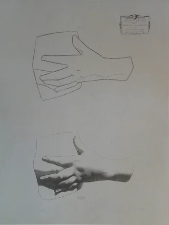
Hand study in Bargue Drawing Course I, plate 15. Public domain, Wikimedia Commons.
For easy application, I have built an 8-step process, from sketch to finished lineart. You can adjust the time for each step depending on the complexity of the character.
Basic block sketch: Draw simple shapes (circles, cylinders, boxes) to establish proportions and pose. At this stage, line weight is not important; just use faint lines.
Define the silhouette: Draw a contour line around the entire character with thick strokes (tier 1). Don't worry about internal details, just focus on the shape. This line will be the 'skeleton' of the lineart.
Draw structural overlaps: Add overlapping lines between parts (tier 2). For example: where the arm meets the hip, where legs cross. At this point, the drawing begins to have volume.
Emphasize points of tension: Darken points like elbows, knees, chin, shoulders – where bones or muscles create pressure on the skin surface.
Handle the shadow side: Draw thicker lines in areas where light does not reach, based on your established light source. This creates the illusion of volume without shading.
Adjust near-far distance: Parts closer to the viewer (e.g., a hand reaching forward) should have thicker line weight than parts further away. You can reduce the thickness of lines at the back.
Add secondary details: Draw fine lines (tier 3) such as wrinkles, eyes, stray hairs, clothing seams. Ensure they do not disrupt the existing structure.
Check and refine: Zoom out on the entire drawing and see if any lines are uniform. If you find the silhouette too thin or overlap lacking, increase pen pressure and add overlapping strokes. This is the step where you can go to the forum to ask for feedback on character design from the community.
Practice this workflow on a simple drawing (a standing character) before moving on to complex poses.
Taper and Pressure: The Secrets to Mastering Line Weight
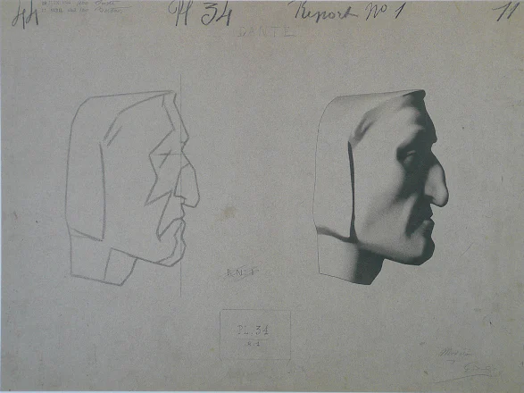
Profile portrait in Bargue Drawing Course I, plate 34. Public domain, Wikimedia Commons.
These two concepts often go hand in hand. Taper (lines thinning at the beginning and end) and pressure (pen pressure) are how you create smooth transitions between tiers.
Taper: A beautiful lineart stroke usually has a smaller start and end than the middle. This reduces the stiffness of the line, making the lineart more fluid. To achieve taper, practice hand movement: start with light pressure, increase gradually, then decrease to the end. Avoid drawing lines as uniform as electrical wire.
Pressure: Your drawing tablet registers pressure and translates it into line thickness. You need to get used to three pressure zones: light for details, medium for overlap, and stronger for silhouette. Practice this transition on individual strokes before applying it to a drawing, instead of trying to stick to a fixed pressure ratio.
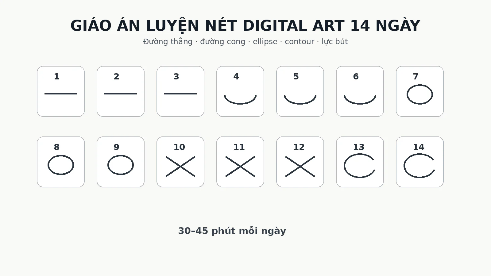
You can practice taper by drawing simple curves with varying thickness. Spend 15 minutes each day, drawing long 'C' strokes from start to end, trying to control the pressure evenly. Combine this with the stroke training exercises in the 14-day digital art stroke training course to quickly master your hand.
Specific Applications: Eyes, Hands, Feet, Tilted Head, Full Body
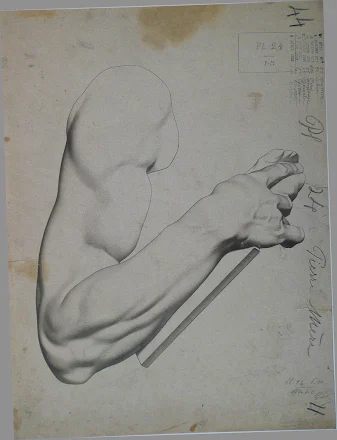
Arm study in Bargue Drawing Course I, plate 24. Public domain, Wikimedia Commons.
That's the theory; applying it to specific parts will help you visualize better.
Eyes
When drawing eyes, the upper curve of the eyelid (eyelash line) is usually the eye's silhouette, so it should be the thickest line. The lower lash line is thinner because it bears less tension. Details like individual lashes, pupil: fine lines. Overlap occurs where the upper and lower lids meet at the eye corners – apply gentle emphasis there.
Hands
The outer contour of the arm and hand: thick silhouette. Where fingers overlap each other: overlap (highest tier 2). Finger creases, veins: secondary details, draw thinly. If the hand is loosely clenched, points of tension at the knuckles need darker lines.
Feet
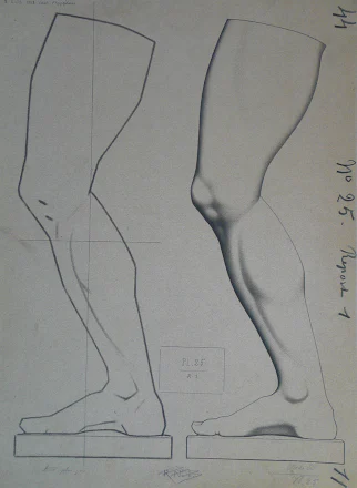
Foot study in Bargue Drawing Course I, plate 25. Public domain, Wikimedia Commons.
The contour from leg to buttock: silhouette. Overlap occurs at the thigh and calf area when legs cross. The knee is a point of tension. Pant wrinkles: secondary details, but note that wrinkles on the shadow side should be drawn slightly darker.
Tilted Head (3/4 view)
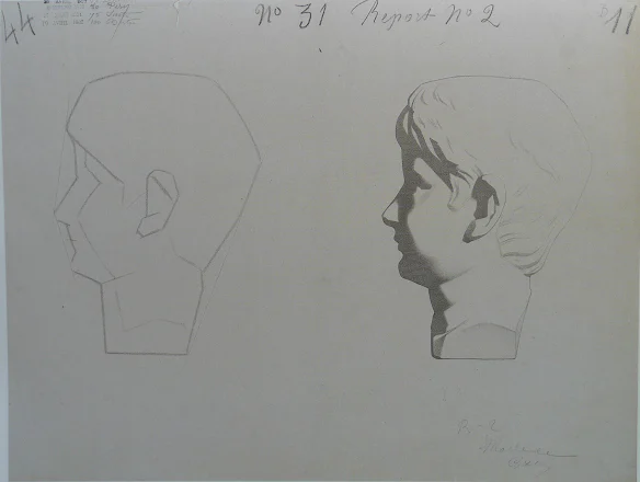
Tilted head study in Bargue Drawing Course I, plate 31. Public domain, Wikimedia Commons.
This is a challenging test. When the head is tilted, one side of the face is closer, the other further. The main silhouette is still the outer contour of the head. But overlap is crucial: the chin line overlaps the neck, the bridge of the nose overlaps the far cheek. Draw the nose bridge line slightly thicker than the internal lines to create the feeling of the nose protruding. The shadow side (the shaded side) of the head should also have thicker lines.
Full Body
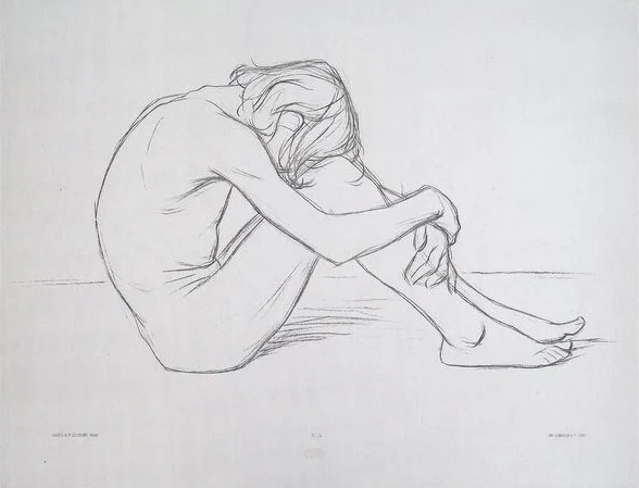
For a full-body character, start with the silhouette encompassing the entire figure. Then add overlap between the torso and arms, torso and legs. Points of tension: shoulders, pelvis, knees. Secondary details: clothing folds, hair. With full-body Bargue prints, use the pose and contour as reference, then apply the three line weight tiers according to the exercise's goal.
How to Fix Flat Lineart: Common Mistakes and Fixes






Bình luận
0 bình luận
Đăng nhập để tham gia thảo luận cùng cộng đồng!
Đăng nhập ngayĐang tải bình luận...