How to Paint Wet Skin in Digital Art: A Process for Rendering Glossy Skin, Sweat, and Wet Fabric
 Free
Free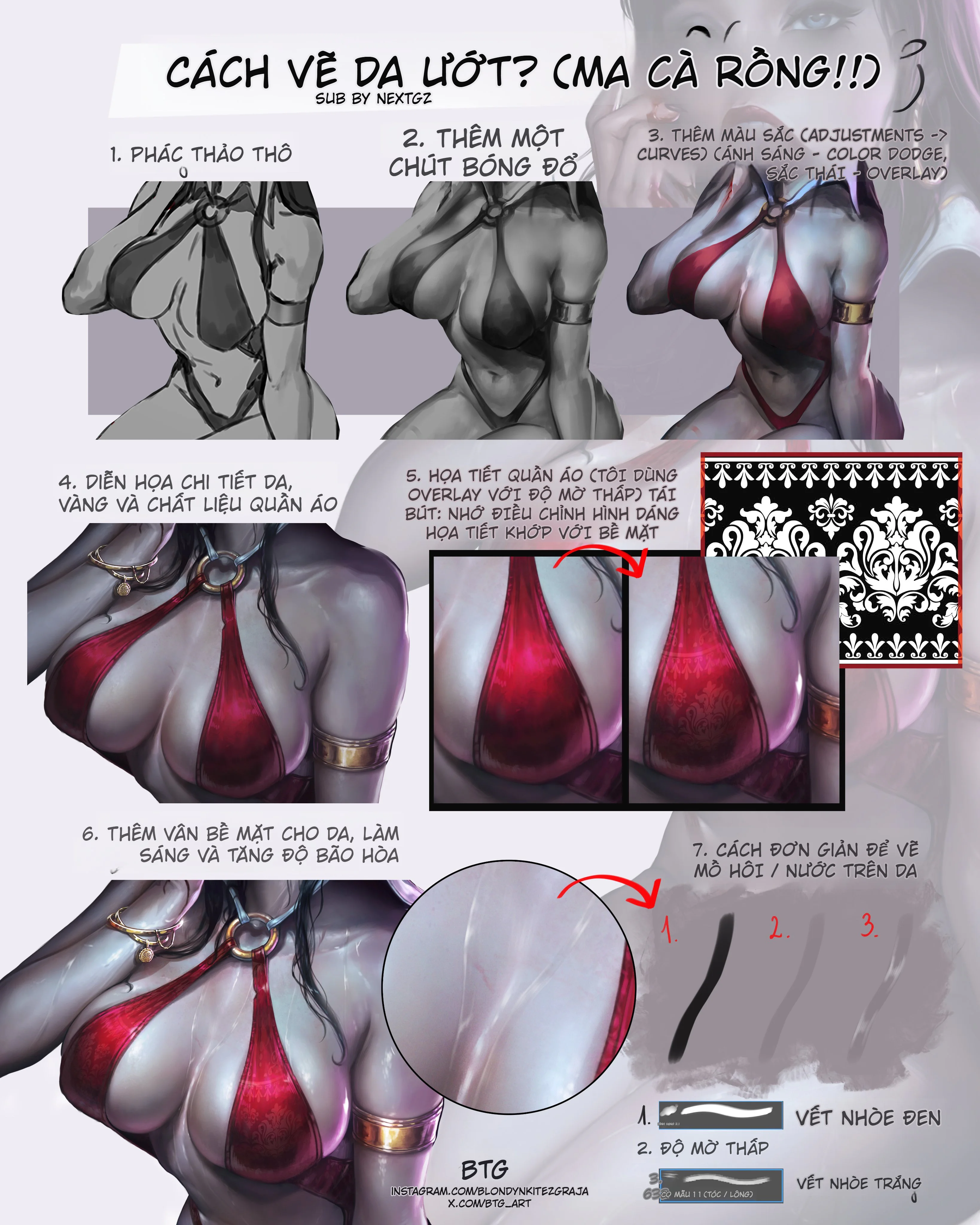
Wet skin is one of the most lucrative textures to render, but it's also one that can easily look fake if handled incorrectly. The most common mistake is slathering a bunch of white streaks on the skin and calling it water. That approach might create an initial flashy impression, but it fails to capture the moist, slick, light-adhering quality. The workflow in this article is much more on point: it doesn't start with the effect, but with form, value, and material. In short, for skin to look wet, it must first be skin with proper form, and only then can it have reflective highlights, environmental colors, and water streaks placed correctly.
The strength of this process is its clear division of roles for each step. First, establish a grayscale to lock in the form. Then add red shadows to give the skin life. Next, use adjustments and blend modes like Curves, Color Dodge, and Overlay to boost contrast, push highlights, and enrich the color. Adobe describes Curves as a tool for adjusting color and tone, including highlights, midtones, and shadows; while Color Dodge brightens the base color to reflect the blend color, and Overlay is a blending mode that combines Multiply and Screen to increase contrast while preserving the light and dark structure. (Adobe Curves, )
Why does wet skin look different from dry skin?
The core lies in surface reflection. The smoother a surface and the lower its roughness, the sharper and more "light-catching" the reflective area becomes. The Blender Manual describes that for glossy surfaces, the roughness parameter controls the sharpness or softness of the reflection: low roughness yields sharp reflections, high roughness yields softer, more diffused reflections. Although this is 3D documentation, this material principle applies very well to digital painting: wet skin looks shinier because the artist is simulating a surface layer with sharper reflections than dry skin. (Blender Glossy/Surface, )
To put it more simply, dry skin is typically read well through soft transitions and diffused light. Wet skin, in addition to its basic form, needs sharper, brighter, more directional specular highlights, especially on protruding areas like the shoulders, chest, arms, collarbones, abdomen, and muscle edges. That's why this tutorial doesn't haphazardly cover everything in white, but saves adding thin light streaks following the surface flow for the very end.
Step 1: Rough sketch and grayscale block-in first
In the first step, the entire character is built using grayscale. This is the most important foundation because if the form isn't solid, the wet effect will only make the flaws more obvious. When rendering skin, especially wet skin, what needs to be locked down first is:
the large forms of the shoulders, chest, waist, arms
concave and convex areas
light source direction
the boundary between skin and fabric
Curves can adjust tone later, but Curves can't save incorrect anatomy. Therefore, building grayscale first is logical both for workflow and form logic. Adobe also describes Curves as a tool for adjusting tone after you have image content, not a replacement for the initial form-building.
A tip to keep in mind at this stage is not to make the grayscale so "pretty" that you're afraid to break it. It just needs to be sufficient for you to see:
where the main light is
where the core shadows are
which skin areas will need stronger reflections later
Step 2: Add a touch of red shadow to give the skin a lifelike hue
The second step in the image is adding a layer of red shadow. This is a very smart move. A clean grayscale often looks aesthetically pleasing in terms of form, but can appear quite "lifeless" in terms of skin texture. When you blend a layer of purplish-red or reddish-brown into the dark areas, the skin starts to feel more alive, warmer, and closer to a real body.
In terms of tools, this can be done with a normal layer, a light Multiply, or a color adjustment depending on the workflow. Adobe notes that before adjusting color and tone, artists often need to consider hue, saturation, brightness, and contrast as an interconnected system; specifically, the Hue/Saturation adjustment is also a standard way to change the hue and saturation of a color layer.
The important thing is that this red layer must not turn into an even "makeup" coat. It should appear in logical areas such as:
the shadow edges of the chest
the elbow crease
the edges of arm muscles
skin areas close to fabric
areas that will later receive red reflected light from the clothing
This way, in the next step when pushing highlights with Color Dodge or Overlay, the skin won't become overly gray and cold.
Step 3: Use Curves, Color Dodge, and Overlay to pump up light, depth, and atmosphere
This is the step that shifts this tutorial from "colored grayscale render" to "wet, glossy skin". The image clearly shows three groups of operations: Adjustments/Curves, Light/Color Dodge, and Hue/Overlay.
Curves is a very suitable tool for reshaping the entire light-to-dark range. Adobe describes Curves as allowing you to adjust highlights, midtones, and shadows by adding points on the curve and pushing them up or down. This is extremely useful when you want to:
force stronger highlights in light-catching areas
maintain deep shadows without losing midtones
increase the soft transition between light and dark before adding specular effects
Next, Color Dodge is used to push the highlight areas. According to Adobe's official description, Color Dodge brightens the base color to reflect the blend color. In digital painting practice, this is a very powerful blend mode for creating the sensation of light bursting on the wettest parts of the skin. However, because it's very intense, overuse can make skin look like glowing plastic instead of naturally moist.
Finally, Overlay is the step for enriching color. Adobe describes Overlay as a mode combining Multiply and Screen, helping to preserve highlights and shadows while blending in additional color. This is why Overlay is suitable for:
applying cool/purple hues to recessed skin areas
applying warm/red hues from clothing onto reflected areas
increasing the "color adhesion" between skin and environment without breaking the original form
To summarize their roles:
Curves to lock down the light/dark structure
Color Dodge to create a moist sheen
Overlay to make the surface richer in color
Step 4: Render skin details, gold, and clothing material
Once the skin has form and light, the tutorial moves on to materials. This is a very correct order. Wet skin cannot look good if the surrounding fabric and metal are still flat, because the "moist" sensation of skin often stands out more when placed next to materials that react to light differently.
At this step, the gold metal needs to be handled with stronger, sharper, harsher reflections than the skin. The Blender Manual describes glossy surfaces as using microfacet reflections, and metal or shiny surfaces will have very distinct characteristic reflections. Although this is shader documentation, the material principle still applies well to digital painting: metal must read as a completely different material from skin, thanks to sharper reflections and stronger contrast.
As for the red fabric in the image, it's kept quite soft in the dark areas, but brightens up very "silky", almost with a bit of sheen. To achieve that feeling, you shouldn't apply white highlights directly onto the fabric as if it were plastic; let the highlights follow the surface curvature and remember that fabric still has a woven structure, not a completely flat surface.
Step 5: Overlay clothing patterns with low-opacity Overlay
This is a step worth learning because many people add patterns to fabric like "applying a decal". This image does it better: using Overlay with low opacity and then adjusting the pattern shape to match the fabric surface. Adobe describes Overlay as a mode that increases the interaction between light and dark colors, making it very suitable for introducing texture or pattern onto a surface without completely losing the underlying shading. Adobe also explains that blending modes in general are ways for layers to combine with each other according to different rules, helping effects like texture or light integrate better into the image.
The key point in this step isn't just choosing the right blend mode, but also:
warping the pattern according to the curvature of the chest and fabric
not letting the pattern run straight as if on flat paper
keeping opacity low so the material remains primary, and the pattern is just a secondary layer
This makes the fabric look more "woven", more "printed", and less fake.
Step 6: Add surface texture to skin, increase brightness and saturation
After the skin and fabric are settled, the tutorial then adds light texture to the skin. This step helps the skin avoid looking "too smooth and CG". But it must be emphasized that surface texture does not mean detailed,密密麻麻 pores. For this illustrative style, texture should be extremely restrained:
a few very subtle value shifts
some streaks with slight hue variation
highlight areas with varying softness of bounce light
shadow areas with a touch of environmental purple, red, or blue
Adobe also recommends that adjustment layers like Curves, Levels, Hue/Saturation should be used to purposefully control tonal range, color balance, and saturation, rather than increasing everything uniformly. Meaning, when increasing saturation, increase it in the areas most deserving, not the entire body.
In this image, increasing brightness and saturation towards the end makes the skin glossier because the form is now solid enough; increasing them too early usually makes the painting look blown out and lose structure.
Step 7: A simple way to draw sweat or water on skin
The final part of the tutorial provides a very easy-to-remember formula for drawing sweat:
a soft dark streak
a lower-opacity transition layer
a soft white streak on the lit edge
This is a way to simulate a drop or moist streak using soft edge contrast + a lit edge. Material-wise, a shiny surface with lower roughness yields sharper reflections; meaning, simply placing a thin light streak correctly on the lit edge makes the surface feel noticeably wetter.
To make sweat streaks look natural, remember three things:
they must follow the body's topography
they shouldn't be uniformly thick from start to finish
the bright white area should be offset towards the light source, not placed mechanically in the center
Suitable places to place attractive sweat are often:
shoulders
upper chest
cleavage
outer arms
abdomen where there's a clear convex plane
areas close to clothing or jewelry
Common mistakes that make wet skin look fake
The first mistake is applying white to the skin too early.
The second mistake is lacking a red/warm layer in the shadows, making the skin look like plaster.
The third mistake is overusing Color Dodge, turning skin into glowing plastic.
The fourth mistake is fabric pattern not conforming to the surface, looking like a pasted image.
The fifth mistake is sweat streaks not following the form, making them look like white lines drawn on the body.
If you correct these mistakes, the "wet" quality will come through much faster.
A concise workflow you can use right away
If you need an ultra-compact formula to remember, follow this order:
Solid grayscale form first
Blend in red shadows to give skin a lifelike hue
Use Curves to lock down light and dark
Use Color Dodge for moist highlight areas
Use Overlay to pump in environmental and material color
Apply texture/pattern in a controlled manner
Add water streaks and thin highlights last
Conclusion
To draw beautiful wet skin, don't start with "water". Start with skin form, then add the moist layer on top of it. The workflow in the image is very worth learning because it follows the correct order: build grayscale, add red shadows for a lifelike skin hue, use Curves to reshape the light/dark range, use Color Dodge to push specular highlights, use Overlay to enrich color, then render fabric and metal materials, and finally add sweat in the last step. Curves, Color Dodge, and Overlay are all standard adjustment/blend modes used to control tone, brighten base color, and increase contrast/color between layers.
To sum it up in one sentence:
Wet skin isn't skin with lots of white streaks; it's skin with correct form, a surface with sharper reflections, and environmental color layers pushed into the right places.
FAQ
Where should you start when drawing wet skin?
Start with grayscale or basic light/dark blocking. For skin to look wet, it must first have correct form.
What is Curves used for in this workflow?
Curves is used to adjust color and tone, especially highlights, midtones, and shadows, helping to lock down the light/dark range before adding stronger effects.
What does Color Dodge do when rendering wet skin?
Color Dodge brightens the base color to reflect the blend color, making it very suitable for moist highlight areas and strong speculars.
Is Overlay suitable for adding texture and environmental color?
Yes. Overlay combines the logic of Multiply and Screen, making it very suitable for enriching color, adding texture, or applying environmental hues while still preserving the underlying form.
How to make drawn sweat look more natural?
Use a combination of a soft dark streak, a low-opacity transition layer, and a thin white light streak on the lit edge. Also remember to place them according to the body's form, not drawing them as stiff white lines.
Đánh giá bài viết
More from author
Cách vẽ nhân vật nam manga ngầu bằng mắt cụp, tóc đen bóng và halftone
So sánh các cách học Mẹo Vẽ Ký Họa Cảnh Đường và cách chọn hướng

Tự Học Clip Studio Paint Cơ Bản: Hướng Dẫn Toàn Diện Cho Người Mới Bắt Đầu
Bộ Sưu Tập 48 Brush Information Volume Tạo Chi Tiết Và Texture Cực Đỉnh Cho PS, Procreate, CSP
You might also like
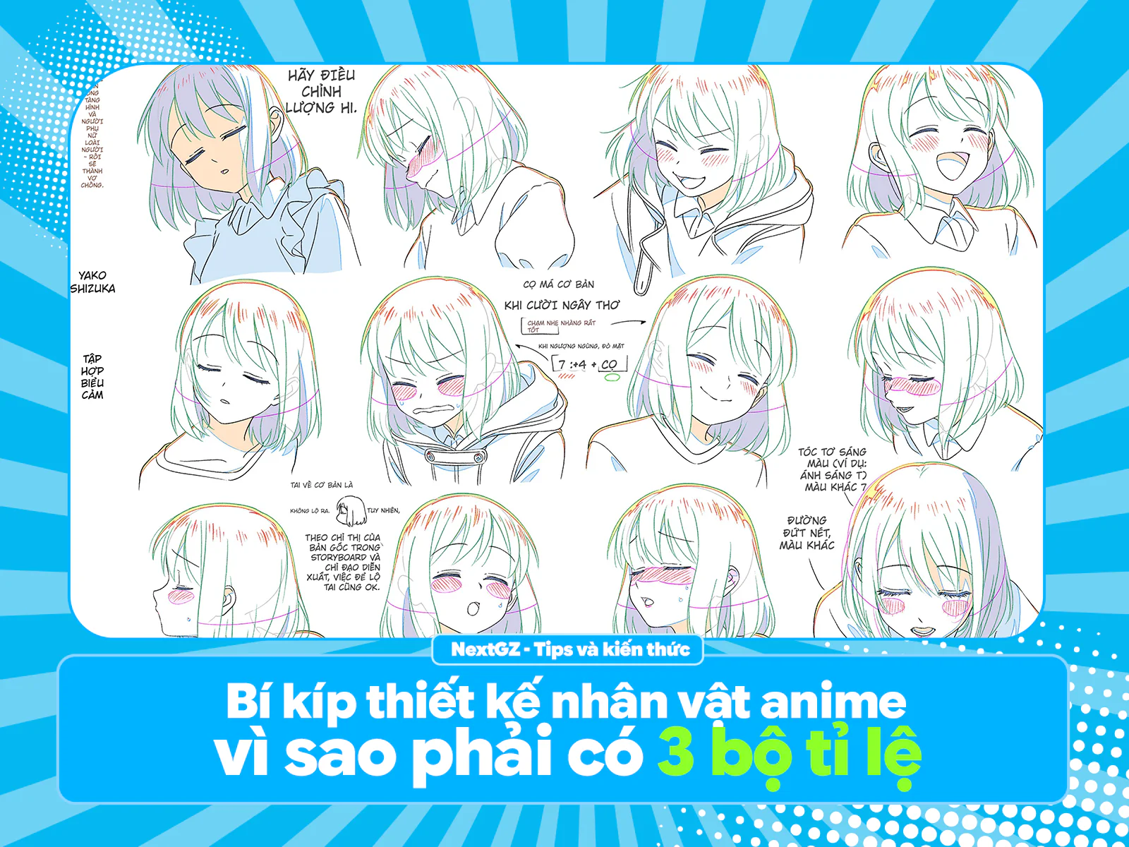
Bí kíp thiết kế nhân vật anime: vì sao phải có 3 bộ tỉ lệ và ~50 biểu cảm?
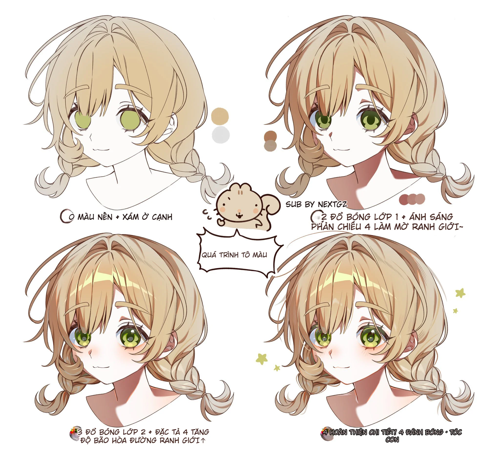
Cách tô tóc anime vàng mềm mịn: quy trình 4 bước từ màu nền đến hoàn thiện chi tiết
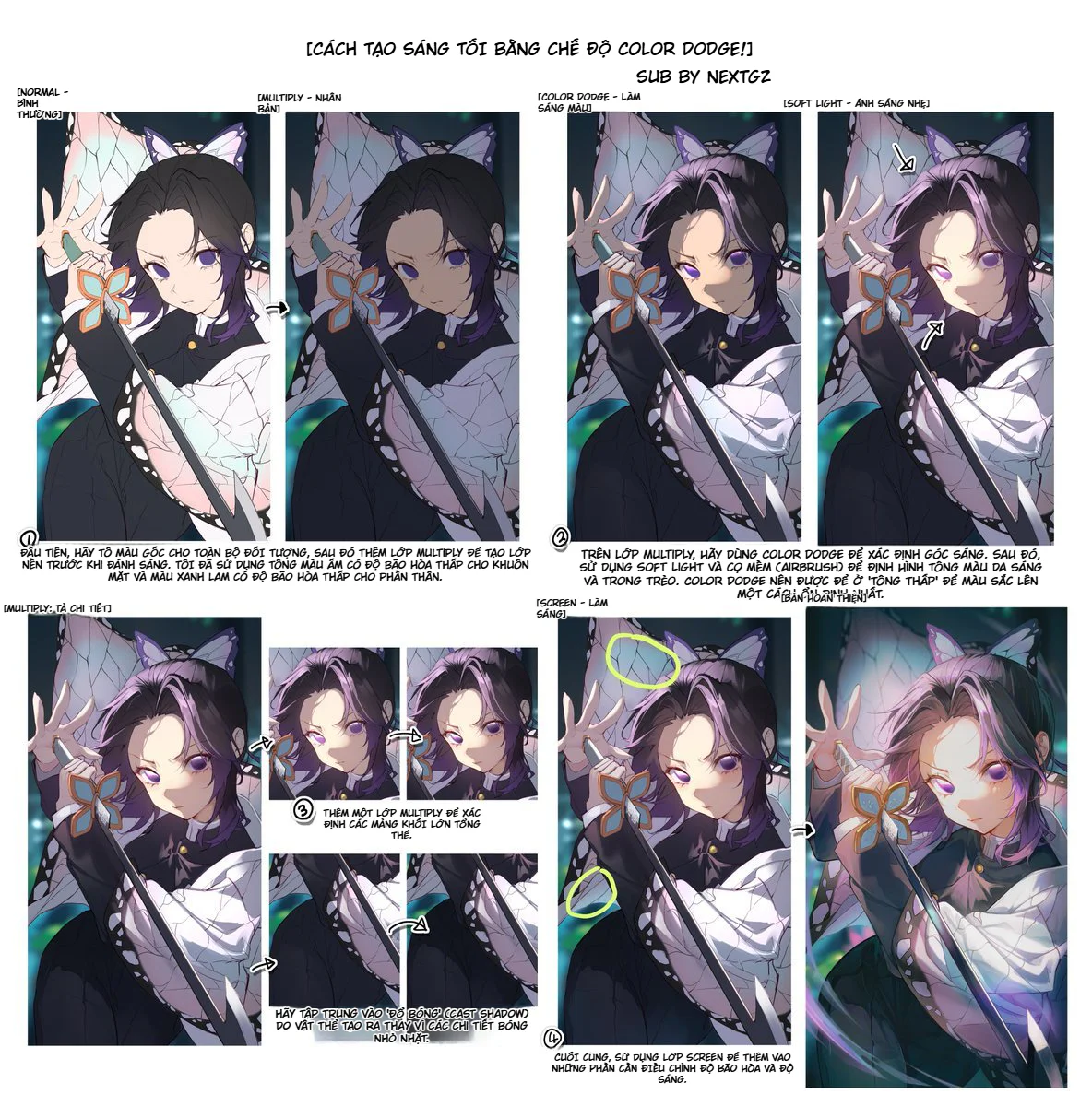
Cách tạo sáng tối bằng Color Dodge: workflow render ánh sáng cho tranh anime
Bình luận
0 bình luận
Đăng nhập để tham gia thảo luận cùng cộng đồng!
Đăng nhập ngayĐang tải bình luận...